The author says:
If there is one thing that binds the cosmos, it is that only the strongest prevail. Kidnapped and genetically altered by a brutal race, human slaves are forced to fight in an alien war. Hope appears in the form of an alien underground rebellion led by mysterious beings—the Gryphon. Together they engage in a desperate battle. The human heroine, Lianndra, faces a grim reality—sometimes the only way to protect power is to use it.
Nathan says:
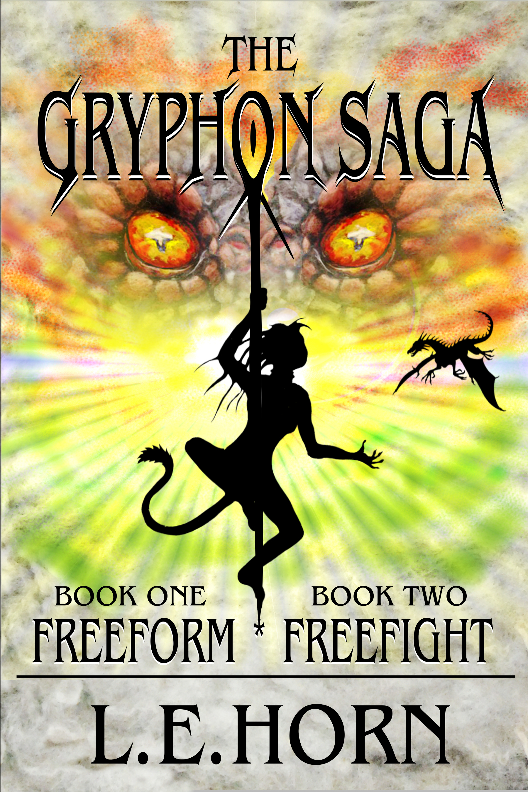
The first impression is that you have a pole-dancing cat-cosplayer on the cover. Probably not what you were going for.
I think a large part of the problem is also that your color scheme doesn’t suggest a “grim reality”; it’s too bright and colorful.
One way to suggest oppression is to have the image representing the more powerful antagonist looming over the smaller protagonists. They don’t have to look like they’re actually in the same space; people are familiar enough with the visual language of movie posters to understand the meaning. Here’s a five-minute redo to show the concept:
(Plucky freedom fighters stolen from the poster for Tomorrow When the War Began.)
Other ideas?
For starters, there are just too many things going on…exacerbated by a clashing mix of styles.
Most of my colleagues here already know that I have a prejudice against silhouettes. They are all too often a substitute for a more informative image…and even at best they are tricky to use, since their very nature inclines them to look like flat black holes in a cover. In this case, you put the black cut-out in the dead center of the cover, exactly where the eye tends to go…and there is nothing to see.
The use of the silhouette in this case is particularly unfortunate since you have a protagonist–judging by what her silhouette suggests–who would seem to be visually interesting.
The dragon simply looks tacked on as an afterthought.
On top of everything else, the cover positively screams “fantasy!” while the description sounds pretty solidly science fiction. You need to convey to the potential reader just what sort of book this is.
I would agree with Nathan that you need to abandon the silhouette and replace it with something that is more compatible with the background art stylistically and that is more informative. This could be the company of heroes that he suggests or it could be a rendering of your heroine large enough to be the central, dominant element of the cover.
————-
And, yes, she does look like a pole dancer.
Here is my take, combining a fantasy image with a scifi typeface and sky while making the girl sexy rather than slutty.
https://i.imgur.com/gYsUa3S.png
Another option is something along the lines of the poster for Reign of Fire, except with spaceships and gryphons rather than Apaches and Dragons.
https://i.imgur.com/BgWOyb0.jpg
Whatever is done, this cover needs to be rethought entirely from scratch.
I think that perhaps before anyone gets too involved in suggesting alternatives, we need to know more about the book itself.
I agree with Ron–we need to know a lot more about the book to try to help on this cover. The brightness of the existing design definitely clashes with the description–bright and grim really don’t go together. The slightly off-center pole for the pole dancer is making the OverEyes (Nagilim, as we refer to those on another website) look cross-eyed, unfortunately–you need to re-align those eyes, if you want to use them on the cover, and then center the pole and dancer on them. Otherwise, they’re going to continue to look cockeyed…so to speak.
This reminds me, powerfully, of another cover that CC.com helped on, way back when it first started–you guys remember the elf on the Adult book, the one going through the jungle/forest? I can’t remember the title, but you guys know what I’m talking about, doesn’t this cover strongly suggest this one? (I’ll go scroll through our NEW ARCHIVE [woot woot] and find it). It’s not just the silhouettes, it’s more than that.
Cripes. Nathan, please fix the cursed ems, wouldja?
Breakers of the Code, and the sequel to it–we saw both here, at CC.com. The first one is here: https://covercritics.com/?p=1106 . It’s not merely the silhouettes–the overall feel of it is very similar. (Same cover designer, perhaps?)
To me, nearly all silhouettes on covers send the message “I wanted a full illustration but I couldn’t afford it.” And this is no exception.
But I think Ron hit the main problem: Everything on this cover is dragons and gryphons, but the plot summary is “alien underground rebellion.” If this is sci-fi, like it sounds, you need to start over and use imagery appropriate to that genre.
I also agree regarding silhouettes. I came close to having them on one of my covers until I realized making them dimensional and barely lit added far more interest, even for a image not intended to be completely realistic.
My example was mainly to show how you can depict both fantasy and scifi.
In spite of my strong prejudice against them, I have used silhouettes 2 or 3 times (out of maybe 200+ covers). But they need to be used very, very carefully and with a lot of discretion and they need to serve a real purpose.
Thanks All,
The author and I are partners in this publishing endeavour. She is a talented multi-media artist as well as author. Yes, I agree the cover needs a complete overhaul. This best describes the book:
Lianndra and Michael were just normally going through their lives. Lianndra gets an unexpected free trip to California, which is a welcome break from the Canadian winter, school, and her recent breakup with her boyfriend of several years. So, she’s off to see California, not realizing she’s being manipulated to go. Once there, she runs into Michael and two of his friends, also on a vacation, and is invited to join them. She and Michael have an attraction to each other that’s hard to define, but they’re open to seeing how it goes.
Once the four are isolated on a diving excursion, a team swoops in and kidnaps all of them. Rendered unconscious, they awaken in a warehouse with other captives, obviously part of a well-organized human trafficking operation. However, all of the captives are forced into physical training, more like boot camp than slavery. Each of them is collared with a high-tech device that delivers pain on command from their captors, with the lesson clear: obey or be punished. The women are trained in a general athletics and acrobatic format; the men, however, are being forced to learn how to fight each other with swords. None of the captors let the new slaves know what’s going to happen, and several of them die either through punishment or training.
After a time, the surviving group is sterilized thoroughly and rendered unconscious. This time, when they wake up, they’ve been separated into male and female groups and cut off from each other. More drastically, they’re on a spaceship run by aliens that have been using Earth as a slave resource for a very long time. Lianndra is now in training to be a Blooddancer, human prey for the male Tlok’mk, who use them for entertainment, stress relief, and distraction, while Michael is sent to the planet surface to fight as a slave soldier using the primitive weaponry that can get past the protective field surrounding the planet.
The Gryphon Saga is Space Opera at its best. L.E. Horn doesn’t focus on the science of how things work, but on the story, the action and the character development. Like Andre Norton, Anne McCaffrey or classic L Ron Hubbard, Horn has created a vast story, with a lot of the history just tantalizingly teased along. She leads the reader into this new universe step by step unfolding the story in pieces, usually through the eyes of Lianndra and Michael. The characterization is well done, particularly with the human personalities. The story flows pretty non-stop, changing from one location to another and between different viewpoints. The two parts of the series, Freeform and Freefight, are enough for a good long weekend of entertainment.
Reviewed by Bradley Allen San Francisco Book Review
I wouldn’t even know where to start after reading that, so I’m out. You need an artist who can create specific imagery based on descriptions from the book.
Including the review was unnecessary, but more so since paid reviews are meaningless.
So where is the dragon in all this, then? There are two on the cover and none in the description.
What we need is just a shot of our main couple in sci-fi slave garb inside a spaceship, which probably requires custom art, since I don’t think there’s a ton of stock art of this sort of thing.
I included the review as it describes the book from a reader point of view. The blurb I included obviously needs rewriting. The full synopsis I have is long–too long.
The dragon is an integral part of the story, but stating its role in the description is a spoiler. The eyes are the alien’s (antagonist), not the dragon’s.
The sample covers all of you posted provide valuable insight, as do the comments.
We’re not here to buy your book so don’t worry about spoilers. If you want constructive feedback you need to be forthcoming with key elements.
I concur with Gwen–I think the current cover is endeavoring to do what our Ron Miller talks about–the Kitchen Sink mode. Trying to tell too much of the story, rather than simply doing its job–clickbait. I know, I know, nobody ever wants to think that, but that is, after all, the cover’s job. “Click me, click me!”
The “easier” route is Gwen’s suggestion–two hotties in space garb (the woman’s, of course,, being scant, as befits a sex slave), and some type of recognizable collar or restraints–leg irons, or what-have-you. Your basic “Slaves in Space Saga.” Not deriding the plot–just encapsulating it for the cover. I woulda said “Spartacus in Space,” but this week, I just can’t bring myself to go there.
So…no dragon, as that’s a spoiler. We don’t need the alien, really–the UberEyes–because with any luck, the ship or maybe even an alien in the background on the Slave Ship cover image. Two slaves, one ship. Or, maybe, they’re running away, on the alien ship, on a background like this: https://pixabay.com/en/tunnel-science-fiction-twisted-3385624/ . Or the ubiquitous, “out the front view window” view: https://pixabay.com/en/universe-travel-spaceship-interior-1800259/ . Or intrepid, chained heroes, in front of this beauty: https://pixabay.com/en/space-port-space-ship-scifi-3120607/ . My point is, there are many ways to convey that concept. Or this alien, in the background, with our carefully photoshopped heroes: https://pixabay.com/en/science-fiction-halo-action-figure-965258/ (love that guy).
Tropes? SURE. Doesn’t matter. As unique as the artwork is that’s presented, nobody can tell what it’s trying to sell. While the Spartacus-in-Space cover may not have screaming uniquity going for it, the buyers will take a look, and pretty instantly get the idea. Perhaps, as you ladies have mad artistic skills, you can do custom artwork for the slaves.
Anyway…as I said, Gwen’s quite right–don’t overthink it. Or Kitchen-sink it. The distilled story is fairly simple–enslaved freedom fighters [in space]. That’s what you need to convey.
Just my $.02.
Or:
https://pixabay.com/en/ufo-cosmos-universe-forward-alien-1265186/
https://pixabay.com/en/fantasy-biomechanically-2659483/
https://pixabay.com/en/tunnel-corridor-space-outer-space-3233082/
https://pixabay.com/en/alien-backdrop-background-3233076/
https://pixabay.com/en/climate-change-course-space-2388401/
https://pixabay.com/en/space-station-planet-space-forward-2723066/
https://pixabay.com/en/fantasy-tunnel-women-love-light-3186646/
https://pixabay.com/en/fantasy-forward-end-time-2508330/
https://pixabay.com/en/fantasy-landscape-mystical-rock-2721371/ (minus the Eagle)
https://pixabay.com/en/forward-planet-universe-space-2723067/
Thank you all again. Working on this series for years certainly has clouded my judgement on the cover–I never saw a pole-dancing cat-cosplayer but there she is–and in a black hole of a silhouette. Silhouette was done to avoid giving the protagonist a face, some readers hate having a visual, so I’ve been told. Making figures dimensional and barely lit (B.L. Alley) seems like a better way to go. The author does have mad artistic skills. Back to the drawing board. Literally. This site is great. All the feedback was insightful and appreciated.
Well, that’s why we’re here–because it’s perfectly normal that authors get so involved with their work that they do what you’ve done. 🙂 Not a damn thing unusual about it. We’re all happy to help, and I know we’d all love to see the next iteration.