The author says:
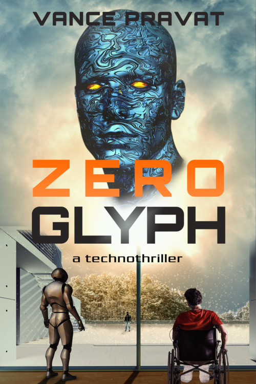
The book is a sci-fi technothriller set 10-15 years in the future. It involves AI, robots, a tech theft, and a home invasion. Think Ex Machina meets Rear Window meets trolley problems. I want it to appeal to scifi readers who like Michael Crichton-style technothrillers / Hard sci-fi / Asimov’s robot novels. The cover is not a mockup, but I want to get other opinions before I publish the book. Specifically: 1)Does it convey the genre expectations? 2)Does it stand out? 3)Does it make you want to click on it and find out more about the book?
Nathan says:
It definitely says “techno.” I’m not sure about the “thriller” part.
When I look at the “technothrillers” category, here’s what I see (click to see it large):
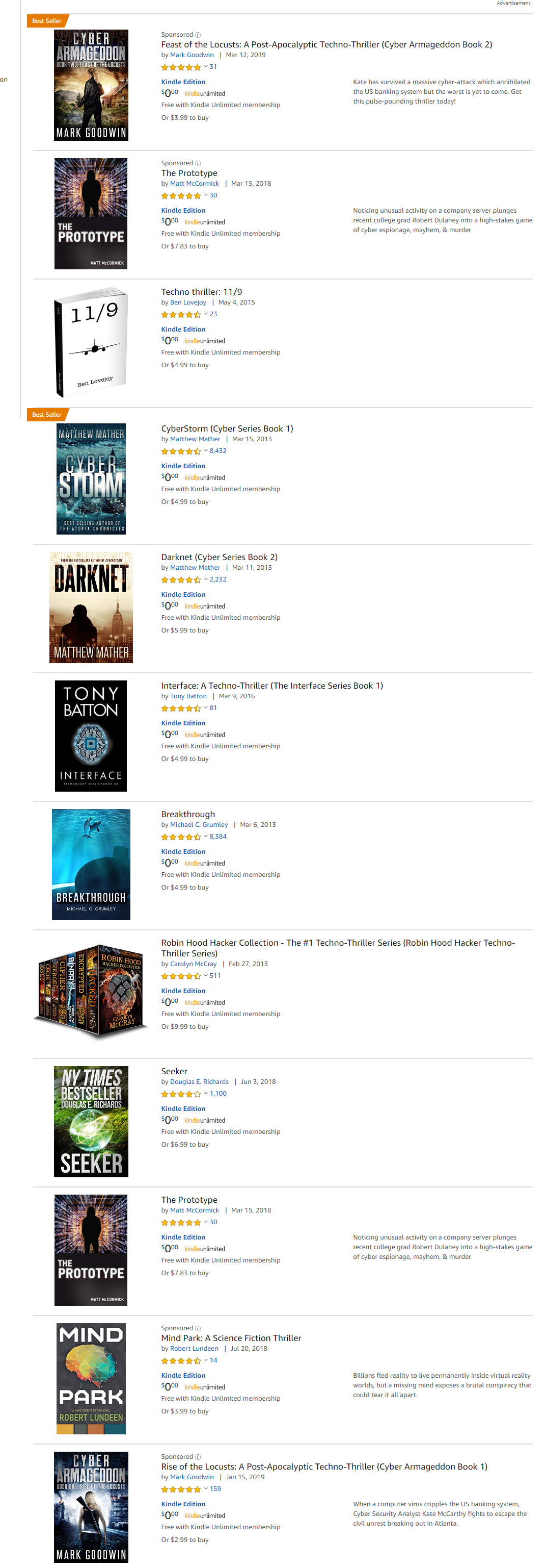 Here are some commonalities I see:
- More often than not, a thin sans-serif font.
- A lot of silhouettes.
- High-contrast color schemes dominated by one color (a cold one, most likely).
I know you wanted the cover to “stand out,” but before it does that, it needs to draw the attention of your target audience, which means it needs to contain the instantly recognizable cues that that audience looks for to find books aimed at them. I think if you tweaked your existing cover with those visual cues in mind, you’d have a winner.
Other comments?