The author says:
A look at living with an incredible child. Imaginative, creative, and beyond belief. A blog turned into a narrative of real life.
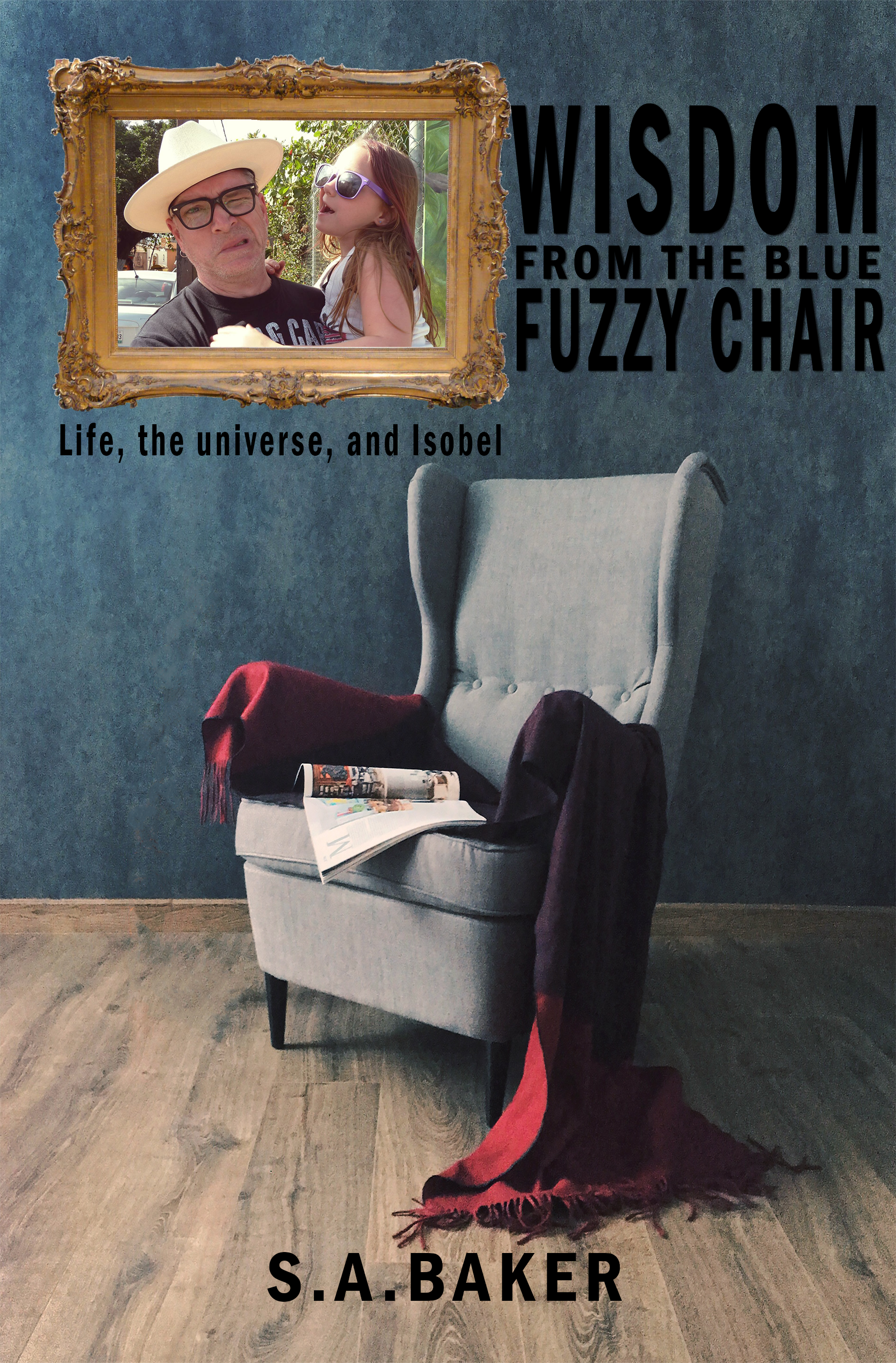
Nathan says:
I suppose it’s okay that the cover looks like no subject in particular, as the contents are probably pretty random. But you’ve got two focal images here: The chair, and the man-and-child. You should pick one or the other, and of the two, I’d go with the chair because the people in the photograph are unfamiliar to the reader (unless, of course, you’re only marketing to friends and family), and the photo isn’t remarkable to carry the cover on its own.
My own inclination, though, would be to use a photo that both conveys adult/child interaction and universalizes that interaction (because, as I said, nobody who sees the book for the first time is going to be familiar with those particular people). I’d look for a soft-focus, sunny photo of adult and child hands doing something together.
(Obligatory note about the cover as is: The title gets lost, both by being wedged to make room for the photo, and by being black text against a blue background.)
Other comments?
A little too much…and too much that doesn’t match. The image of the chair in the room is very, very nice and very evocative. But the picture frame looks pasted-in and the photo looks pasted into that.
Just because your title includes the phrase “Blue Chair” doesn’t mean that you need to show one.
I am sure that the photo is very meaningful to you…but it is going to have no significance to anyone who is not already familiar with you or the book.
Since the book is supposedly about “A look at living with an incredible child. Imaginative, creative, and beyond belief” I would focus entirely on that as the source of inspiration for your cover.
And in choosing an alternate image—such as what Nathan suggests—you should try to be as objective as possible. Choose an image that will be attractive to potential readers and not meaningful just to you.
The ideal image would, I think, be this precocious child in the blue chair, perhaps with the adult who is telling this story.
I’m gonna take a divergent opinion here: This is a book about your life, so the audience is your friends and family. So I’d say all you need is a nice big photo of you and your kid.
I second what Gwen says. Unless the blog has a quarter-million followers or so–or at least 100K–the people who buy the book are going to be friends and family. If the book is culled from the blog, then the existing blog readers won’t be buyers–they’ve already read it. So, if you’re going to sell to friends and family, then an image that’s meaningful to you and them is probably the right way to go. Use a much larger picture of you and the kid.
And that’s a definite consideration — if the people you expect to buy your book are going to buy it because of a pre-existing relationship, then our advice on the cover is irrelevant. All of our critiques are based on the idea that the potential reader will first encounter both you and your book through your cover.
I’d lose the picture or work it into the scene. (make it smaller and on the wall behind the chair in the same color tones of your room but that might be beyond your photo editing skills, but the chair is a nice image on its own and fine for literary type novels. The text centered in a light brown/yellow shade, maybe pull a color from the floor and lighten it, but the tagline in a handwritten script would be awesome
Eh, mixing advertising for two different target audiences is not going to work here, especially since putting a frame for an oil painting around a photograph and pasting it into the picture isn’t going to make that photograph look like an oil painting or like it belongs in the picture at all. In addition to cut and paste, this cover might earn a photobombing tag on Lousy Book Covers. The gal’s a cute kid and the chair’s a rather distinctive piece of furniture, but the two pictures just aren’t going to get along with each other.
My recommendation: make two covers, one for the friends and family, and one for general audiences. For friends and family, fill the cover with the photograph at full size. For the general audiences, just use the picture of the blue chair.
Then, as already advised, make the text more readable by using some color scheme other than black against a dark blue background.
Instead of that photo why not a crayon drawing of the man and the child. A caricature would definitely help put the idea across of the ‘living with a child’ element. Plus the casually laid magazine on the chair and the dark toned colours give the idea of a deep universal truth that the readers can find through the pages of the book. Which contrasts with the caricature. Thus, making a perfect cover for the book.
FYI, as a follow-up…this cover was changed, to the extent that they plunked a blue bean-bag chair on it.
A year down the road, since publication-which occurred around the time that we critiqued the cover–it’s had a single review.
{shrug}. Oh, well. (Interestingly, although the author claims it’s derived from his popular blog, he doesn’t link the blog to the book, in any discernible way; the LITB also seems to assume that you’ll just take the hilarity and the child’s brilliance on faith…)
Curious… I’m not seeing any reviews on the sales page.
Really? What country are you in, RK? I see one, from a Canadian reviewer, which is hardly surprising as he’s a Canadian author. (Under “international reviews.”
I was always a bit curious about this one, because the submitter and author (can’t know if they’re the same person) went on about this “remarkable” and gifted child, right? So, out of idle curiosity, when this book came in to CC.com, I looked for what I thought would be the (obvious) blog, to no avail.
Today, rummaging around LBC and here, I thought, hmmm, wonder how that book is doing, and saw one review. Thought I’d look and find out, finally, what blog this kid was the center of, to be ungrammatical and yup, STILL no blog linked; no Author page, nothing.
It’s just odd, IME.
I’m here in the good old U.S.A. Gotta say, this is interesting: if you change the dot-com in that address to dot-ca, suddenly two reviews show up. I didn’t know Amazon was segregating its reviews by country that way.
Okay–that’s damned weird, as I’m also here in the Yew-Ess-Aaay.
Well…my curiosity is still unsated, though. There’s nothing in the LITB that speaks to a remarkable or unusually gifted child–which is why I went looking in the first place. Harumph.
http://wisdomfromthefuzzybluechair.blogspot.com/
I saw that, but I assumed it had been continued elsewhere, as the newest posts there are 6 years old. I’d assumed that the readers of a blog about a gifted kid would be the audience, but that can hardly be true if the stories about said kid stopped 6 years ago.
Well…curiosity satisfied, then.
I’m not sure she’s even gifted, more like a “the things kids say” that sometimes strike adults as profound. The whole blog/book/audience/subject remains a puzzle to me, not to mention why they submitted their cover here and ignored every single suggestion.
People gonna do what they gonna do, I guess.
I didn’t want to say anything along those lines, as clearly, the Dad thinks she is. I tried reading a small piece of the LITB (which seems to indicate that the book is VERY short) and it seems to be more ruminations about being a Dad, and retelling a few of the usual stories that you get from parents.
Nothing wrong with that, of course, but I would suggest to the author that if he is trying to sell the book as the adventures of a gifted or genius child that he might want to populate the LITB with stories that actually show that. Otherwise, it does just come across as a parental memoir and musings on parenthood and “kids say the damndest things.”
Offered FWIW.(And yes, I too was disappointed that the CC.com suggestions about the cover were completely, completely ignored. Oh, well. We can recommend; we’re not the Cover Stormtroopers, LOL. If you go back through time and actually look at the participants’ and submitters’ covers, more often than not, that is what happens–nothing.)