The author says:
A travel guide covering Australias East Coast. It is targetted at young men and has more of a focus on adventure activities and nightlife than your usual travel guidebook.
Nathan says:
…Sorry. What were you saying?
You know what? I’m going to leave the critiques on this one entirely up to our commenters, because I’ve got nothing.
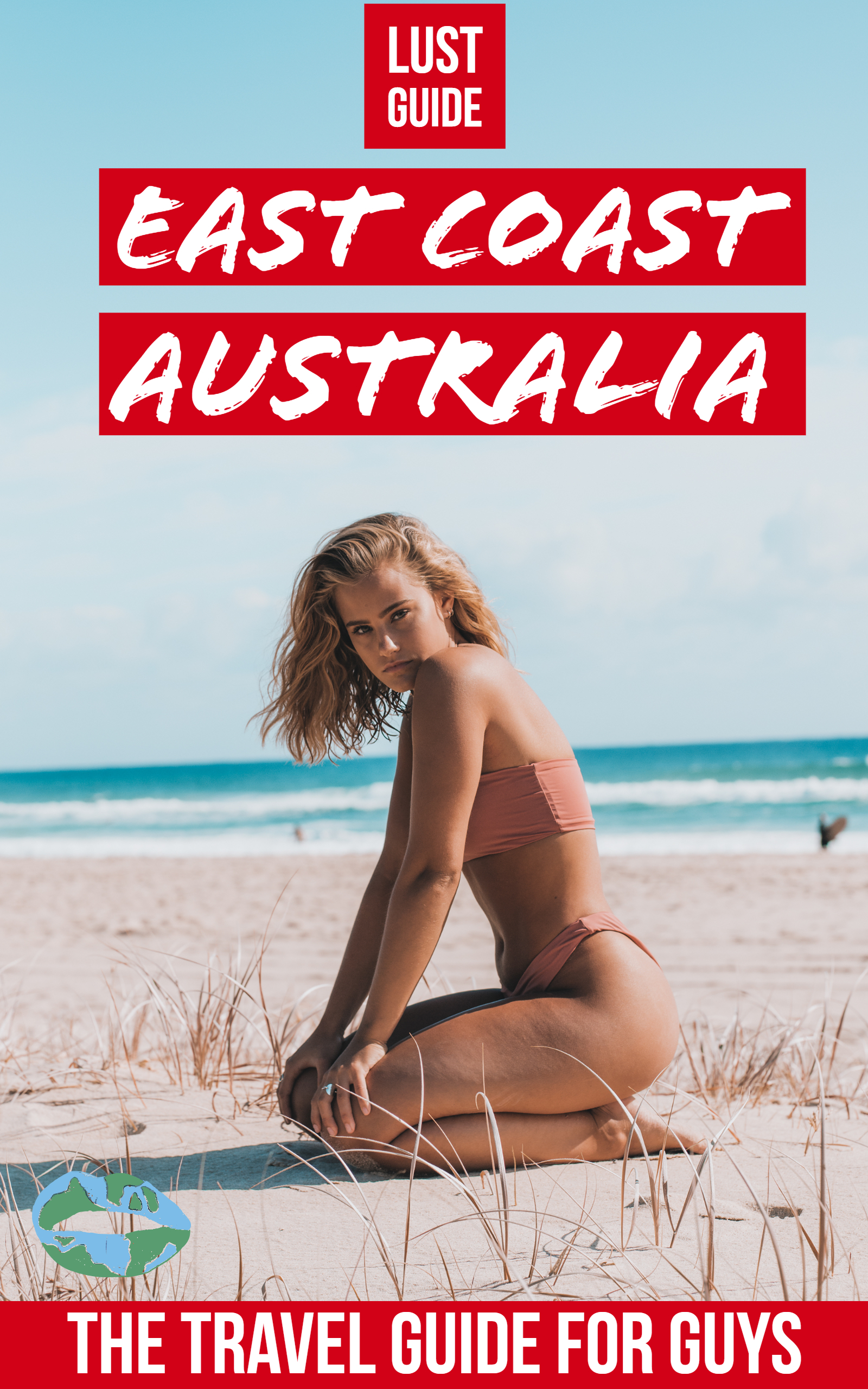
I knew immediately what this book was about, which is the goal of a book cover.
I don’t care for the red bands, though. There must be a better way to make the type stand out.
Well…I’m not the target audience, either. However, I would, as Tracy suggested, nuke the red bands. You could replace the red bands for “Lust Guide” and “East Coast Australia” by the simple expedient of removing them, and changing up the font color, to red or…bright green, perhaps? Or even black (yeah, I know, boring, but…). You could use brighter colors, as long as you limn them with something so that they are readable, e.g., a bright yellow, limned with black, navy, red…anything that makes the text readable.
I’d simply swap out the red band at the bottom for a black or navy band; I don’t think that one is a big issue, myself.
I assume that the globe-colored lips are a logo, is that right? I would consider placing that within the black or navy band at the bottom, so that they’re (it’s?) visible. Right now, it kinda blends into the sandy background.
I don’t really agree with Tracy that the intent of the cover is instantly discernible IF the text is removed. If we use the Ron Miller Test–change the language to something you don’t speak, and try to tell what the book is about–it could be almost anything, probably non-fiction. A book on tanning; on safe sunning, on swimming, beach life, etc.
Now…if this is a brand of existing books, then that concern may be irrelevant. Sure, she’s a hottie–I am inferring that this book is basically “how to troll for action,” yes? But she doesn’t look particularly inviting, to me. By which I mean, inviting the man who’s looking at her, other than appearing to be inviting simply because she’s very attractive. She doesn’t have the ubiquitous come-hither look, to my eyes. I would consider a model that’s clearly more, uh…enthusiastic?
It’s not terrible, don’t get me wrong. But if you view an image like this, instead: https://stock.adobe.com/images/id/191633674?as_channel=affiliate&as_campaign=pixabay&as_source=arvato&tduid=12345688&as_channel=affiliate&as_campclass=redirect&as_source=arvato&as_content=api&tduid=12e3774a2f068cb6f3c6436c91f48d69&as_channel=affiliate&as_campclass=redirect&as_source=arvato , now, THAT is a come-hither girl.
FWIW.
You’re almost there: when I saw this in thumbnail, “travel guide for perverts” was the first thing that came to mind; not far at all from what you’re hawking here, yes? While they’re rather cheap and garish looking, the white-lettering-on-red-bars titles and bylines are reminiscent of trashy almost-but-not-quite-porno jackets for direct-to-video VHS fare. Showing an attractive gal scantily clad in just her bailey (Metroid reference!) on a beach is also a fairly straightforward appeal to beach bums and other laid-back guys looking for a certain kind of good time with some good-time gals while on their Spring break or Summer vacation or whatever the Australian equivalents of those things are.
On closer examination, however, the cover needs a great many tweaks:
1. Even contrasted against a sky blue background, white lettering on bright red isn’t quite bright enough; hot pink bars with neon ruby red lettering would work better.
2. I didn’t even notice that hickey mark painted up to look like a cheap map of the world in the thumbnail, and I’m not seeing how it adds anything of value to this cover at full size; either go with the traditional ruby red lipstick look and put that mark somewhere up near the title (preferably slanted at a bit of an angle to add some dynamic energy to it), or just lose it altogether.
3. The horizon’s crooked; not something people are likely to notice once they see the cover closer up, but this flaw fairly leaped out at me from the thumbnail, which is what most prospective readers are likely to see first on sales sites like Amazon and Barnes & Noble. Straighten it out.
4. Sure, the gal’s got a great body and she looks quite enticing in the thumbnail, but once you get a better look at her from close up, that sour look on her face says “One wolf whistle out of you, and I’m going to call the cops to come arrest you and call my lawyer to help me sue you blind for sexual harassment, pervert!” Hitch is right about her needing to look more inviting; specifically, she needs to look like she’s offering to make your day (even if she’s actually just teasing) rather than ruin it.
5. Going to the beach is one way to have fun on your vacation and you’ve got one attractive young gal on the cover, but isn’t this supposed to be about several ways to have fun on your vacation and don’t the young single guys usually go chasing after the young single gals in groups in these settings? Seems to me the camera should be turned around so we have a good background shot of the entire resort where these flirtatious adventures are to be taking place, and we should have a whole group of these enticing young good-time gals gathered there to welcome the vacationing young good-timing guys when they arrive at the resort in their cars (usually also in groups, since splitting the bills three or four ways among them helps reduce every individual’s travel expenses).
Basically, this is a guide for guys on where all the action is at those vacation resorts on Australia’s eastern coast; so try making everything on your cover a little more active, see?
Case in point: don’t these three girls look like they’re ready to show you a good time? I can almost hear them saying “Hello, boys!” right now.
Yes, indeedy, those three ladies certainly look like exactly what the book’s purchasers are seeking–RWAs. (Ready, Willing and Ables). Works for me, although I also agree that some resorty-looking stuff in the background would help. Something like this:
https://depositphotos.com/138045120/stock-photo-beautiful-women-on-beach-enjoying.html
or https://depositphotos.com/192331872/stock-photo-women-on-beach-enjoying-cocktails.html
or even this one, altho it’s less “come-hither,”: https://depositphotos.com/191673960/stock-photo-jumping.html or this one:
https://depositphotos.com/30511355/stock-photo-girls-with-blank-board-on.html (Which you could use for the title, possibly. I’d have to see the layout, to know if it’s viable or crap.)
Anyway…RK’s image is good, and there are probably millions out there that would be somewhat better than the attractive, but a wee bit, er, disinviting young lady you have now. RK’s right, she does kinda look like she’s warning you–don’t get fresh, buddy, and I think that’s the opposite of what you’re selling.
FWIW.
Of course, the one major problem with group shots in stock photos is that most of them are done with a landscape layout, whereas book covers (like this one) are in portrait layout. So naturally, you’ll need a picture that will still have everybody in it after you crop it and enough “dead space” areas where you can put titles and the like without blocking out anything important in the image. With the example I gave, that would probably be rather difficult since those lively ladies tend to spill over the frame any way you crop it. Fortunately, however, there’s a whole series of stock photos featuring those three inviting girls, and some you can probably crop without losing anything too important; maybe this one, for instance.
(Then too, I suppose you can always “cheat” by letterboxing the photo and putting your titles in the blank spots at the top and bottom. Just be aware that doing so usually makes the cover look rather cheap and tacky and its designer in turn awfully amateurish. So… better to seek out a photo that still fills the entire frame after you crop it, and save that letterboxing technique as an absolute last resort for when all else fails.)
I wish that no one had pointed out the earth lips logo to me.
You and me both, brother.
(We’re both Millers, but Ron’s not really my brother. 🙂
Not to my knowledge at any rate.
I generally agree with Hitch and RK in this case. It’s pretty good for what it is, but it would be improved by picking a different cheesecake photo and getting rid of the red bars. And the lips.
Of course, if you look at the competition, your book is already miles ahead.