
The author says:
My previous submissions for this project were all self created and variously unsatisfying. (some were so broken that not even the arrayed talent here at Cover Critics could fix them) After running a very exciting and intense cover design competition at 99Designs I have three finalists to choose between. If this book were a standalone I would be happy to have any of these three as its cover. However, this is intended to launch a series so I need a strong brand identity and a layout that is flexible enough to stretch across all the different characters and situations. (At the moment my heart favours one design and my head a different one) Which would you choose? or Have I missed something fundamentally terrible about them all?
Proto-blurb: The Aether Guard has patrolled the Borderlands for aeons protecting the nations of the Rationalle from the encroaching Realm of Chaos and its vile Spawn. When a flesh eating shape shifter slips past a renowned Patrol Captain, both personal ambition and the sanctity of the most sacred relic in the cosmos are put at risk. Can the monster be found and stopped before it is too late, or will Chaos finally reign for all of eternity?
(Original submission and comments here)
Nathan says:
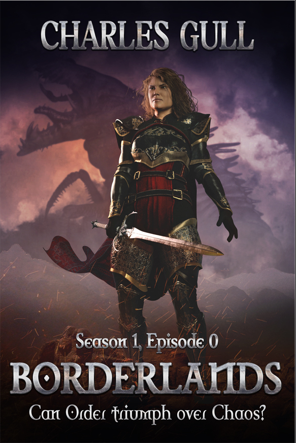
Designating them “#1,” “#2” and “#3” in the order they appear here, I would go with the artwork for #3, although possibly with the title treatment from #1 (it’s more distinctively branded). Then you just need to make sure that the covers for the following books in the series also feature a dynamic close-up character portrait.
Other opinions?
They’re all very good, but I immediately went for #3.
I like #3 as well.
3 is nice but DANG is there any way to get that roaring beast from 2 into it? That’s SO cinematic and exciting to me.
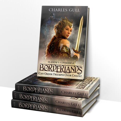
So I guess my opinion is #2 (possibly with a more dynamic pose) and the text from #3.
I’m most partial to #1, then #3, then #2. But it should be noted that I heavily prefer illustration over photography, and failing that I prefer photography of things (the full face helm) over models (the woman’s face). I do not believe this is a common preference in the market, and you should give my views on that point less weight as a result. I think Nathan’s comments about the text treatment on #1 are spot-on, and in addition to his points it is more readable (especially in thumbnail) which is among the more important aspects of a cover for online sales purposes.
For reference: I have written a draft novel where I specifically avoided all mention of skin, hair, or eye color to leave character appearance/race entirely up to the reader, but also because I have no idea how any of the characters look and don’t honestly care. My biases regarding the human form are skewed in very unusual ways.
Interesting.
I actually keep the gender of the main character ambiguous until quite late in the book. I use the late reveal as a decoy to unbalance the reader before the final twist.
#2, I guess, since there’s no way to really identify them. I only wish that the dragon in the background was a little more immediately readable.
Thanks for the comments so far. I am relieved that nothing terrible has been pointed out about any of them. (I blew my complete end of year bonus to fund the competition!)
As part of the competition, I was able to run an opinion poll on social media. I mostly got responses from my Beta Readers (so, people already familiar with the story). Interestingly, #2 came out on top. Comments suggest it has the closest aesthetic to the writing (not sure what that says about my writing!). For a couple of other reasons #2 is also my head’s favourite.
On the other hand my heart keeps telling me #3 is the best. It is gorgeous. Also, the over the shoulder ‘come with me’ pose fits very well with the 1st person present narrative voice. HOWEVER, after working with the designer on roughs for other episodes, it is clear that VERY little stock material exists of characters in this pose. Other poses are nice but are missing something of the intimacy.
“HOWEVER, after working with the designer on roughs for other episodes, it is clear that VERY little stock material exists of characters in this pose. Other poses are nice but are missing something of the intimacy.”
You have run up against a problem that faces too many designers who depend totally on working with preexisting materials. The problem, of course, being that if they cannot find a stock image they are stymied. This was the subject of a lengthy discussion recently on another website where I pointed out one obvious solution: create your own material when you cannot find already existing stock art.
Here are three paragraphs from the long article I posted:
____________
Why depend on found images? Why not create your own? If you have a camera—and anyone with a new cell phone already has a camera perfectly capable of taking images of more than good enough quality for a book cover—why give up if you cannot find the right image on line? Why not take your own photos and work from them? Then you will not only get exactly what you want, you will have something unique to your book.
A camera, some willing friends or relatives, a few props, an appropriate setting and you are good to go. Depending on one’s skill in photo manipulation and rendering, these images can be used either more or less as is or developed into something elaborate, depending on one’s needs and abilities.
Almost every medium to large town or city has a community theater. There is a very active one here where I live, and my town has only 4000 inhabitants. Even if you do not have a local community theater, there will almost surely be a high school or college with a dramatics department. These can be invaluable resources for costumes and props…and even willing volunteers for your models. The local community theater here has an entire floor of a building devoted to housing literally thousands of different costumes from every imaginable historical epoch, to say nothing of props of every description.
______________
I pointed out that there are a couple of real advantages to doing this. The first is that you get exactly what you want rather than having to settle for what comes closest. The second is that you avoid any possibility of the same art appearing on other books.
I have taken my own advice with a very large number of the covers and illustrations I have done. Here are some examples http://black-cat-studios.com/photocovers/index.html
The whole thing is really just an application of imagination.
You make some excellent points here. Please, see my large comment below for my detailed response.
I’d pick #3, although I do also like the creature in the background in #2. They’re all very slick and professional. Unfortunately, they’re also…kinda generic? Person with armor and sword and a monster. Okay. But I don’t see much that would specifically motivate me to pick up this book as opposed to any other Person With Sword fantasy book.
Two other suggestions: “Season 1, Episode 0” irritates me; it feels like you’re just calling it that because it’s More Special than just saying “Book One.” Just say Book One.
And the tagline doesn’t add anything. Not only is is a rhetorical question, but virtually every fantasy novel features some variety of order/good triumphing over some variety of chaos/evil. It just serves to reinforce my impression that I’m in for the most generic fantasy novel imaginable.
TL;DR: Great quality, but too generic.
Well…I prefer #1. I’m not wild about the trope of female warriors; they seem to be everywhere, and somehow, they are simply not my preferred reading. I think that 1 is far more dynamic, and I love the critter, too.
I want to strongly second what Gwen said about the “episode” stuff. I find that very offputting. It feels…precious, or twee, and not in a good way. I can’t tell if you’re saying “ohhhh, maybe some TV producer will come along, and this’ll be the next GOT,” or…what. Whatever it is, if it’s not in film, I wouldn’t call it episode anything. An “episode” is defined as one event or occurrence, among many, sure. But the common usage is clearly connected with TV, radio, etc., and as far as I know, that’s not what this is.
(I’m also underwhelmed by any book that is published, newly, as episode 1 of XXXX. Unless the other books are written, done, ready for uploading and deliberately being held for a specific time period for marketing purposes, it’s not really “of XXX” yet.)
I further agree that the tagline adds absolutely nothing. If you don’t have X triumphing over Y, you don’t have an adventure/fantasy novel, so…you might want to tweak that to add something that will intrigue the reader; something that isn’t “du-uh, no kidding.”
All that being said, they are all perfectly serviceable. I would not tie myself down with the whole “everybody else in this series has to be in the same pose,” because as Ron pointed out, if you’re not going to pay for artwork, that’s going to put you in a bind. Sticking with the theme, colors, fonts, and general feel will serve. I devoutly hope that you don’t plan to have X characters, in armor or robes or what-have-you, looking over their shoulders–that could be rather bizarre. Just keep the essentials and you’ll be fine.
I like them all (my favorite is 3)but I have to disagree about using the font treatment in book one. It’s very nice, don’t get me wrong, but it’ll be hard to match that same style in all the books. Book 2 would have the best matchability but if you already know the future titles you could envision it better and decide which will work best.
Hello everyone,
again, many thanks for all the comments and suggestions. It is all good stuff. I am picking up the following main threads (please correct this summary as need be, as I know you are happy to):
1. None of them are terrible (phew!)
2. Each has its strengths and weaknesses (fair enough)
3. More excitement / energy / tension would be welcome
4. Portraits are more attractive than full body poses
At this point in the discussion, I believe it is fair to give an update on what has been happening at my end. The end of the 99Designs competition has now passed. The final date for me to pick a winner earlier this week. The winner I chose was #2 (full body pose). HOWEVER, I did not pick the DESIGN so much as the DESIGNER.
There are several reasons for this (good communication and support, nice personality, skill at the task at hand, etc…). The BIGGEST reason actually relates back to the comment from Ron Miller. #1 and #3 were created using a ‘traditional’ cut and paste stock image type work flow. #2 is unique in being 3D rendered. The fact that the designer can create an image of ANY figure in ANY pose on an ad hoc basis really swung the decision. It really is ‘photo’ quality rendering, so has no disadvantage compared to the ‘photoshop’ route (as opposed to the rather pastey plastic looking renderings one often comes across in book cover design). Indeed, in the extreme case, I could really create ALL the covers in the same over the shoulder pose shown here in #3 (if I chose too).
I shall now be working together with this designer to trim the design still further (based on all your good suggestions) and also develop a brand identity for the following books.
All your further comments and suggestions at this stage remain very welcome. Nevertheless, there is bound to be a resubmit coming along in the medium future.
🙂