The author says:
I posted this book cover months back on your website, and I am very grateful for your feedback, as well as the feedback of your followers. I have since tweaked the cover a bit, and would appreciate if you could post this with the original. I am really curious what people think of this new one versus the original.
[original submission and comments here]
Nathan says:
Since most of the specific suggestions on the original submission came from the commenters, I’ll let them do the heavy lifting this time around. My only comments are that a couple of the tweaks seem like steps backward to me:
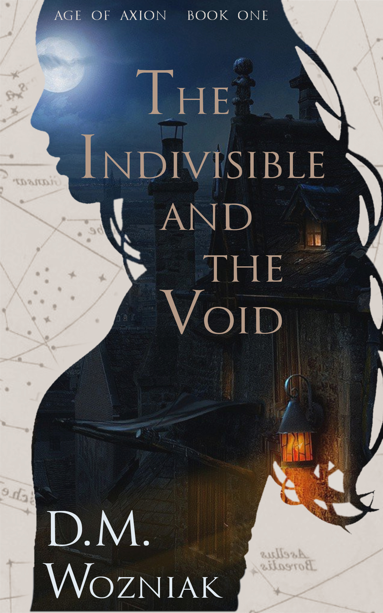
- Having the “D.M.” of the byline in a larger font size looks like misplaced emphasis.
- The map you’ve added in the background is clearly mirrored — all the text is backward.
Other comments?
Several things distract me from the cover overall: What is that object to the left of the door lantern? The moon is kinda, but not quite, where the gal’s eye socket would be. And I also don’t know why the D.W. would be larger than the last name.
I continue to think it’s good overall, but it just needs a little tidying up. The map is not only backwards but too low-res, and the landscape image is also grainy at full res (but you can fix this by simply scaling down the full-size image). The silhouette outline is also not smooth; you ran an eraser over it to get rid of the jaggies, but now it has eraser marks.
I want the girl to face the other way…lol. Just moving the moon a tiny bit would fix that eye problem. I like the cover quite a bit! if I were nit picking I’d say add some age to the background paper but this is awesome!
Though I like the concept of the cover, the mask of the woman needs work. It looks like she is leaning back at a very obtuse angle and the body is too thin. I would insensate the breasts a little and make it more of a body shape than bumps to show gender. This will thicken the body a little and make the outline more natural.
I would also make the subtitle:
The Age of Axion
Book One
having it on two lines will add to the look in my opinion.
Looking carefully at the “D.M.” in your byline, I think the initials seeming larger than your last name is actually an optical illusion. The initials merely look larger because they’re completely in large capital letters, whereas your last name is partially in small caps. I’d recommend ditching the small caps and just putting the whole byline in large caps.
The reversed lettering on what appears to be a star map in the background is easily fixed, of course: if you must reverse the map, simply be sure to re-reverse all captions on the map to put them back to their proper orientation. Also, while you can get away with expanding a picture slightly when there’s not nearly enough of it to fill the frame, the map and the silhouette of the girl are both pretty obviously attempts at expanding a lower-resolution picture too much; no amount of softening or blurring is going to fix that. To fix that problem, you’ll just have to find (and acquire) higher-resolution versions of whatever images you used for this cover.
Something else concerns me while looking back at your earlier draft: whatever editing program you’re using to make this cover, it’s obviously compressing the pictures a little too tightly. The scummy-looking dithered pixels around the titles and byline on this cover and the jagged “ringing” artifacts around the edges of the silhouette on your previous cover are both common artifacts of JPEG images that sacrificed just a little too much picture quality keeping the file size down. To avoid having so many of these artifacts on your image, I recommend A) using lossless compression (as PNG and TIF images do) while editing the pictures together and B) if you insist on making your finished image a JPEG, finding and changing the compression settings on your editing program to favor higher quality over lower file size; when you’re designing a cover, that’s no time to be getting miserly with the available space on your hard drive. According to some of the experts who created it, the JPEG compression scheme is actually capable of producing lossless compression; and even if your editing program is incapable of setting the quality that high, a JPEG using sufficiently high quality lossy compression is usually entirely indistinguishable to the human eye from the one using lossless compression.
I don’t have much to add, other than to reinforce what Douglas Owen mentioned–the girl’s very odd posture really distracts me. Even in the thumbnail, when I view it, I’m instantly distracted, thinking “how peculiar!,” which is not what you want your prospective readers thinking, in my humble opinion.
I like the concept, I like quite a bit of the execution, but I wish you could find a silhouette that doesn’t look like she’s trying to back away from the cover.
The moon really does read as a subliminal “eye” so to that end I wish it were a little more to the right of its present position.
And I agree with Hitch and Douglas about the posture.
This has been a solid compositional idea from the start. The silhouette-of-a-face-as-a-frame-containing-other-visual-elements is a popular trope but one with enough potential for variation that it’s not a completely over-used cliché.
Depending on exactly what and how the images are used it’s an arrangement that can be used to convey a whole bunch of different moods, genres and broad ideas. The flipside of how versatile this composition is, is how precisely right you have to get it to convey the exact mix of those things appropriate to your book.
So when I say I think every element in this version is slightly off, please don’t take it as a damning criticism! You’re close, but the devil is in the detail with something like this. These ideas with just a bit of tweaking could become something really beautiful.
This is how I would approach the mystery/woman/city/fantasy elements you have in play
https://www.kathrynrosamiller.com/blog-1/the-indivisible-and-the-void
The first thing I’ve addressed is the woman’s silhouette. I think your current silhouette is lacking in a couple of ways: the hard, simple outline doesn’t chime with the fantasy genre. Its mostly reminds me of books from the pick-up-artist genre. I’ve chosen a photo that captures something a bit more moody and adds in a softer, illustrative touch more appropriate to the fantasy genre (actually it’s a photo, but once it’s layered under and over the other stuff it feels illustrated). This face conveys some slightly ambiguous, but appropriate emotion. We see enough of her to be mysterious, and this is a mystery story.
Next I’ve looked at the city. I’ve used a much simpler city illustration than yours. I don’t think your city is really reading at first glance. It’s an awkward fit for the shape of the body and slightly too complicated a scene for the viewer to immediately figure out what it is. I’ve got a much simpler skyline with enough there to convey its fantasy nature.
On your current cover there’s not a lot of sympathy between the two elements, the woman and the city. My version connects them through a shared moodiness, and the arrangements of their shapes. I’ve moved bits around and layered them up to create shapes that interact with the face/neck. It sells the idea much more immediately of this woman and this place being connected. She is disappearing into it, just like in the plot.
Next I’ve swapped out your pale surround for a colour and texture that matches the rest of the illustration. Again, a consistent moodiness that ties all these separate parts together to tell a single story. I can see your logic in the pale background – to bump out the important part of the cover – but I think your current neutral background is deadening everything, and that this kind of composition should be about consistency rather than contrast.
Finally the text treatment. The first thing I’ve done is take the title away from being framed by the woman’s shape. There are books which use a silhouette with the title typography shaped to fit it…
https://images.gr-assets.com/books/1344401905l/6948436.jpg
https://images-na.ssl-images-amazon.com/images/I/51HhcQYpC3L._SX324_BO1,204,203,200_.jpg
… and covers which use face silhouettes to frame another illustrative element…
https://i.pinimg.com/236x/19/1e/94/191e9439d6fb1766a7a39c094e07597a–thriller-childrens-books.jpg
https://i.pinimg.com/236x/79/4d/6c/794d6c2e36eed3e40cf7321417db73d4–book-covers-silhouette.jpg
… But not ones that do both at the same time. Your title needs to be away from the main part of the silhouette/city.
Secondly your title is simply not well suited to that kind of treatment: the word ‘Indivisible’ amongst the otherwise short words for it to look anything but awkward and it would be a great shame to weaken the impact of an evocative title.
You chose a very classical serif font which is a solid choice for a fantasy novel, but after experimenting with a few approaches I think this cover benefits from a little more flourish.
I have also shown in that link some working images it might be useful for you to see how I played around with different possibilities to reach the conclusions I did. You can often only work things out by trying them out and pinning down what’s not working one bit at a time. For example I tried out a different photo of a woman and a different city, but found her expression of looking upwards and the details of the city had the whole thing look too science fiction instead of fantasy.
Finally I worked out that the white background had to go, partly because they’re a problem on Amazon etc, but mostly because isolating the girl against a white background and placing the city entirely inside her shape implied the wrong thing: it implied she was the heroine, rather than a mysterious and intriguing figure as the city is. So I had the city spill out of her shape and had the blue palette continue beyond her.
What I have done might look slicker and potentially difficult to achieve but it’s all actually quite straightforward on a Photoshop level. There are just three layers and two transparency settings here creating the main effects,. I didn’t even have to use the erase tool to have the city fit inside the silhouette, it’s almost all in choosing the right transparencies!
The real skill is in choosing the images and understanding how they have to work. And a lot of that simply comes in trial and error, as you can see a bit of in those rough images. Always remember that you can play around with the watermarked preview images off shutterstock before committing to buying any image, to see how it works!
Thank you everyone for the feedback – especially Kata and her elaborate write-up and gorgeous prototypes on her website.
To clarify – the book is technically “Science Fiction”, in the sense that the magic system is explained by science, and there are other worlds. But the feeling is more fantasy. I prefer the term “Speculative Fiction” as it’s less genre-bound.
I mirrored the map on purpose, since I didn’t want english lettering or commonly known stars and constellations. I hoped that my mirroring the map, it wouldn’t be obvious and would look more like fantasy lettering. In a subsequent revision, I have tweaked the words a bit to look less mirrored.
I have also reduced the font size of my byline, such that the D.M. and Wozniak are both on the same line.
Thank you!!! Great crowd here full of professional feedback. Love this site.
-Dave