Category: Covers

Many Worlds Trilogy: Book 1

The author says:

A science fiction writer struggles with his sanity when the parallel worlds he creates collide with reality. Theme: The observer effect from quantum mechanics. Conscious thought creates reality. Yes, I am a amateur attempting to design a book cover because my funds are going to a professional editor. Looking for input on title and pen name. I plan to republish a refined product on Smashwords in the near future.

Many Worlds Book Cover

Many Worlds Book Cover

Nathan says:

Note: An earlier version of this cover ended up at lousybookcovers.com, where it got solidly punched around. This version lacks some of the main offences.

I’m formulating a new dictum for indie publishers designing their own covers (I hope to be presenting on that subject at an upcoming writers conference).  It’s this:

“The two most important parts of your cover are (1) typeface and (2) color scheme.”

Looking at this cover in light of that advice, the first thing I see is that the typeface is common — “vulgar,” if one can be so bold.  There are plenty of sci-fi/futuristic/mechanistic free fonts out there (make sure the one you choose is readable!), and it would only take a very slight texture or other distressing effect to give the “shaky sanity” vibe I get from your description.

Also: If I understand right, one of the central themes you’re trying to portray in the cover is “single observer/multiple realities,” yes? If so, then I submit that the various eyes actually work against that since they imply many observers.  Something like a single person or head, overlapping as it looks in several directions at once, might convey the appropriate concept better.  But doing that well might be beyond your technical skill.

Remember, the point of your book cover is to attract the readers who would enjoy the book.  So what would tell the appropriate audience, “This is a book I want to read?”  How do other books about fractured reality present themselves?  That can be your best guide.

Other ideas, anyone?
Gemworld

The author says:

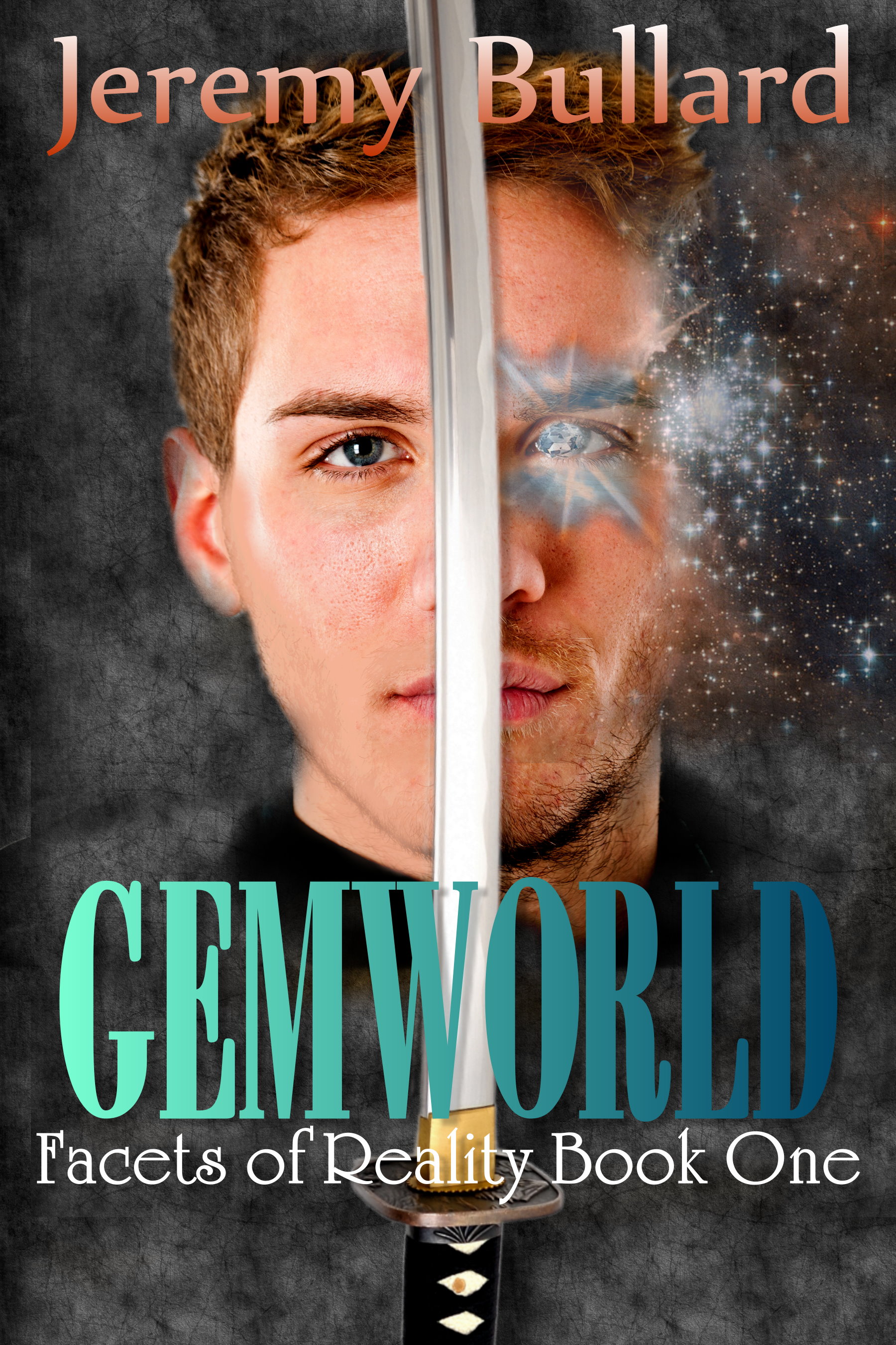
Gemworld is an epic fantasy novel, the first of three books set in a world of magic. It features a US Navy SEAL who finds himself in this world, and follows his adventures as he goes from displaced soldier to magic user and rebel leader. Target audience ranges from young adult to adult, Christian to secular, hardcore fantasy to easy reading.

gemworld final centered (1)

gemworld final centered (1)

Nathan says:

This is a very strong cover design.  I’d only tweak a few things before calling it finished:

  1. The sparkle around the left eye seems oddly dull.  I’d make it a whole lot brighter.
  2. The fade from left to right in the title makes the latter half of the word blend into the background. Maybe you should keep the green-to-blue transition but step back on the light-to-dark transition.
  3. I have an aversion to the Flair Roman font you used for the series title. Others may not have the same reaction, though.

Overall, very strong. Other thoughts, people?

Chrono Crime

The author says:

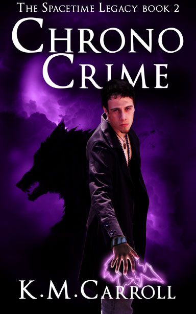
YA urban fantasy, set in modern-day Phoenix, AZ. Summary: Indal, chronomancer werewolf, is dragged home from exile, because Michelle, his would-be girlfriend, has discovered her own dead body, sent back from the future. But the body is actually a deathless killing machine, and Indal’s investigations reveal smugglers, alchemists, and a far-reaching plot that will shake the entire multiverse.

chronocrime-cover-mockup2

chronocrime-cover-mockup2

Nathan says:

It’s got a good thumbnail, which is important; book covers need to be engaging at small size these days.

A few things crop up at full size:

  • Trajan is a great workhorse font, but it’s also overused these days, and one of the consequences of reader familiarity with it is that little boo-boos about its use stand out. For instance, the spacing between the two lines of the title crows the “C” of Crime against the “H” of Chrono.  I’d also play with the kerning to make the letters look like they hang together better.
  • The male model’s head obviously doesn’t belong to that body (or maybe it’s his face that doesn’t belong to that head). Either way, it’s disconcerting.
  • The wolf silhouette seems cartoony in comparison to the human.  (And you’ll probably get a ration-o’-crap from the commenters here about “Wolfie,” because wolves show up so darned frequently on the covers of run-of-the-mill urban fantasies and paranormal romances.)
  • The hand with lightning seems crowded by the byline.  One suggestion: Move the title to the top (where the series title is), shift the male model up a big to give the hand more room, and fit the series title under the book title on the left on two lines, in that space above the wolf and to the left of the model.

One other thing: It sounds like a nifty feature of the book is mixing urban fantasy with sci-fi, and that’s missing from the cover.  Could there be cogs/circuits/something indicative of technology in the background clouds, maybe at the top behind the title, to give some of that science-fantasy flavor?

Other ideas, people?

Paladin’s Odyssey [resubmit]

PaladinsOdyssey1

PaladinsOdyssey1

Nathan says:

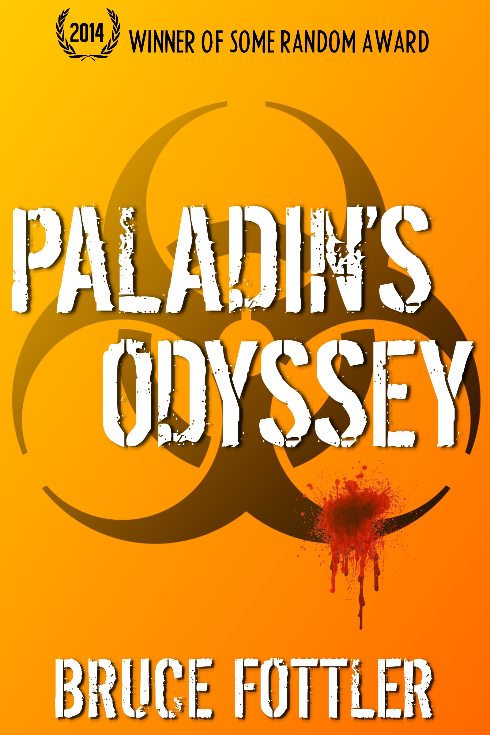
You remember those Reese’s Peanut Butter Cup ads where two well-meaning klutzes accidentally combine their peanut butter and chocolate? (I never figured out, in one of them, why a robot was eating peanut butter, but there you go.)

I think neither of the cover you’ve shown us individually work as well as you want.  But if you mash them together — if you add the biohazard symbol of this one in behind the torn flag of the previous one, and similarly if you add an orange tone from this one to the cloudy texture of the previous one — I think you’ll really have something.

Anyone disagree?

Rumpelstiltskin’s Child [resubmit]

rumpel cover 5

rumpel cover 5

Nathan says:

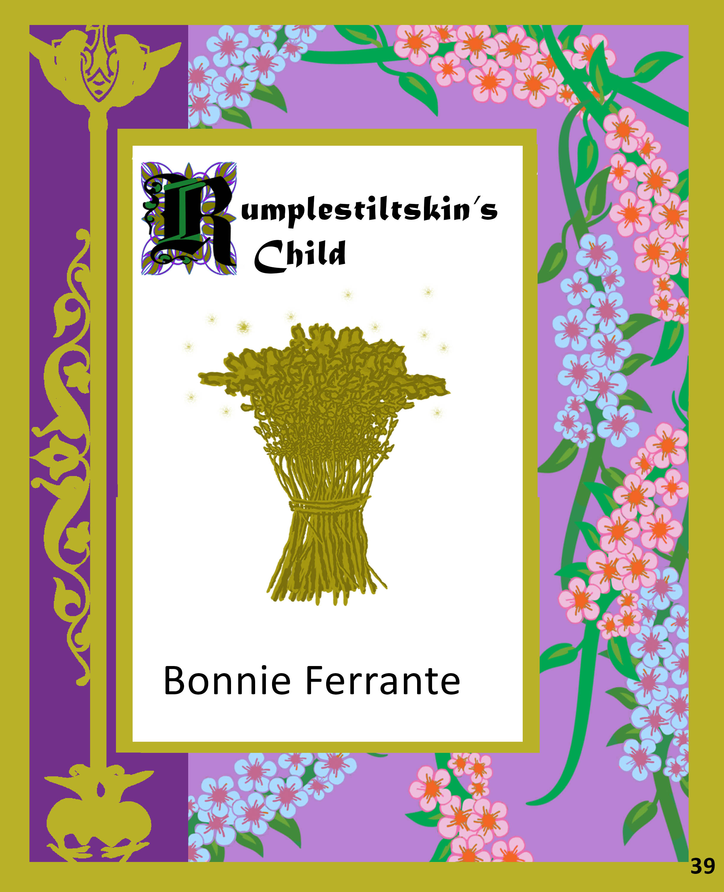
I think you’re just exchanging your old problems for new ones.  Is there any reason that the white rectangle isn’t centered inside the borders? Of that the title is confined in that white space? Expand it out! The flowers on the right aren’t going to feel bad if you cover them up.  The title’s important; the flowers are background.

I understand what you’re trying to do with the gold ornamentation and gold flax, but this “gold” looks like dull brass, especially against that white background — not the impression you want to make.  In fact, the flowers on the border are a lot more eye-catching than the brassy flax-blob (which is what it ends up as in the thumbnail).

My first inclination would be to start over from scratch, but if I were to work from these elements, I’d:

  • eliminate the white rectangle entirely and fill the background with the flowers;
  • enlarge the title to fill the cover almost from edge to edge, and put it in white with a darker border to help it stand out from the border;
  • enlarge the byline and put it in a better font;
  • turn the flax bundle on its side and make it really stand out as golden — I might even experiment with it becoming more golden from left to right, with a full glow on the  right instead of random sparkles.

Other opinions?