The author says:
Gemworld is an epic fantasy novel, the first of three books set in a world of magic. It features a US Navy SEAL who finds himself in this world, and follows his adventures as he goes from displaced soldier to magic user and rebel leader. Target audience ranges from young adult to adult, Christian to secular, hardcore fantasy to easy reading.
Nathan says:
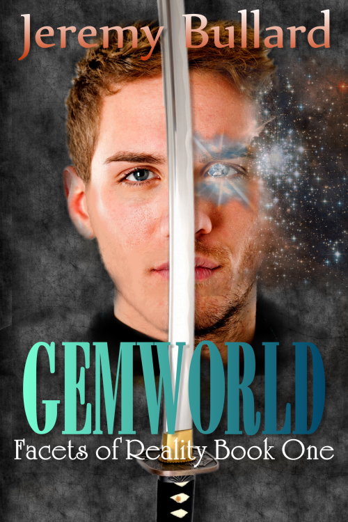
This is a very strong cover design. I’d only tweak a few things before calling it finished:
- The sparkle around the left eye seems oddly dull. I’d make it a whole lot brighter.
- The fade from left to right in the title makes the latter half of the word blend into the background. Maybe you should keep the green-to-blue transition but step back on the light-to-dark transition.
- I have an aversion to the Flair Roman font you used for the series title. Others may not have the same reaction, though.
Overall, very strong. Other thoughts, people?


I like it too! Nice overall. Strong, clear image and the background is textured but tasteful. I agree with Nathan for the most part, including on the use of University Roman (Flair Roman) on the series title. It’s good you want something softer and different there, but I don’t think UR is it. Not only is it overused at times, it doesn’t fit the genre. Maybe try to find something with a fantasy vibe that’s not too flashy or curvy. Or just use the same font as the by-line.
As for the coloring in the title, if you didn’t want to try Nathan’s suggestion, you could try doing a three-part gradient green-blue-green, so the start and end of the title are the same and the blue falls in the middle across the light sword blade.
Now, the thing I have trouble with is the choice of sword. It’s a Japanese kitana. Some might say “no big deal,” but I think avid fantasy fans might notice and wonder about the Asian-element it layers on the story. Does he use a kitana or was that just the sword image you liked? I’d consider something more generic like a broadsword, but it’s up to you. I like the subtle curve and the slender blade.
Finally, although we’re here to comment on the cover, I have to remark about your description. This “Target audience ranges from young adult to adult, Christian to secular, hardcore fantasy to easy reading.” is too wishy-washy. I understand you’re trying to say a broad audience, suggesting that it doesn’t have anything too racy or off-color for YA or Christian readers, but it comes across as unfocused and indecisive and really unclear. Over the years I’ve read and edited lots of fantasy and I’m having a hard time figuring out just what sort of fantasy this could be to satisfy all those options, esp. the hardcore fantasy to easy reading.
Personally, I don’t like the copious amounts of face glitter around the eye. It looks like his eye is exploding to me. I think it would be a benefit to remove that explosion and just subtly hint that his eye and the right side of the cover is now magic. Maybe just make the iris purple, or even the crystal shown there, but he still needs his pupil. It doesn’t look like an eye otherwise.
I have to agree with the katana. Does he ever use a katana? If not change it for a sabre at the very least, as the curve in the blade is appealing.
Lastly, there are certain parts of his head which have been slightly removed, due to magic wanding / feathering to remove the background. (I suspect) Look at his ear, and the spot where his neck and face meet. It would benefit from a layer that brought back the sharpness to the graphics in those areas.
I like the overall composition and idea, but I think it needs a bit of reimagining. The image itself is fine, but the dude looks cross-eyed and the glare and bling coming out of his left eye is excessive and could be toned down. I think one font needs to be got rid of and the multicolouredness with it. I like the font and effect on ‘Gemworld’ best, so I would choose and use one of the other two fonts for both the author name and the series title. I would also do both fonts in either plain white or the same teal effect as the title, and lose the salmon gradient. I think this will make it more cohesive and appealing to look at.
The flare/glitter on the left eye is just not appealing and makes it look like too much of his face was erased on that side. Move the gem move to the center of his eye covering the iris, and use one that is more rounded. Currently it’s more to the corner of the eye and makes him appear cross-eyed, as Axoloti said.
As Nathan said, the gradient on the title really doesn’t work well.
Definitely a great cover overall. The katana bothers me, though: When I looked at the thumb, I thought he was holding it, but it’s actually just hovering in front of him and I can’t tell whether it’s supposed to be part of the same image or a different design element superimposed on top of it. You might see if the design still works without the katana.
I’d also go for shiny embossed fonts instead of plain gradients.
I agree with Nathan:
The object over the eye simply doesn’t read as a gem.
I also didn’t pick up immediately on the fact that there are two different faces.
The sword is not only out of scale, it appears to be hovering in front of the face(s) for no particular reason.
My main objection to the typography is that there are too many fonts. Each line is a different one.
The cover’s great, but I have to agree on the katana. If the character is a SEAL, and the katana is not used in the story, why not use something a little more appropos like a cutlass (still an official Navy enlisted sword for ceremonial purposes) or the Navy officer sword (if he’s an officer)?
When I think of Navy Seal, I immediately conjure the picture of a ‘macho’ male. To me, the baby-faced male on the non-magical side of the cover doesn’t fit (but the bearded male suits perfectly).
Because of that macho connotation for me, the fonts then don’t fit in with that toughness, particularly the ‘Facets of Reality Book One’ text, which is too flourish-y. The same with the peach/salmon colour choice in the author name; it seems (sorry) a bit feminine for a male author and a story line about a Navy Seal.
I agree with the comments about the detail layered over the right male’s eye, and that the ‘magic’ is too concentrated at the side of the head that it suggests his magical power is expelled from his eye(s). Maybe all that sparkle needs to be sprinkled over more of the right hand side area including under the title and subtitle.