Category: Covers

Chaos in My Wake

The author says:

Matt Evans’s world crumbles when his father unexpectedly dies. Consumed by grief, he vows to keep the family business afloat and takes a risky loan from local thug, Jeff Holden. Once Jeff realizes he won’t be getting his money back, he pushes for an alternative deal. Matt is to assist a scientist with his covert projects to cover the debt. Although unconventional, the deal seems to be the only possible solution. But underneath the scientist’s pleasant demeanor lies a minefield of secrets and personal crusades. With every visit to the underground lab, Matt’s sanity is put to the test. The only one who can put an end to it is Jeff, but he has money on his mind. Matt must fight the growing flames of madness before they consume him, but can he survive the chaos that follows?

Nathan says:

There really isn’t anything wrong here — it looks competent and professional, which means that my suggestions are less necessary than usual, even.

  • Make the byline bigger and easier to read.
  • If possible, let the flames fill a larger proportion of the body silhouette; the fire gets lost in the thumbnail.
  • Even if the novel itself is in first-person, I’d change the tagline to third-person; first-person taglines always seem like nonfiction memoirs to me.

Other comments?

Alien Seeding

The author says:

Alien Seeding is the story of an architect, returning from a project in Mexico. Somewhere north of Laredo, a pale illumination bathes his car in light. He’s abducted by aliens, endowed with a magnetic attraction for women, and sent out to be an ‘alien’ seeder. Art by Gabe McIntosh, fontwork is mine.

Nathan says:

The biggest problem that I see is that the byline placement seems more like “Oh crap, where am I gonna fit this?” rather than planned. If there is any more bottom margin in the original artwork, I’d put it across the bottom; if not, in the bottom right corner.

The other problem is that the font chosen seems corny.  If that’s your intention, great; there’s nothing wrong with a tongue-in-cheek alien abduction story.  If not, something more serious — epic, even — might suit your purpose better. (I tried to find covers to some serious alien abduction novels on Amazon, but it’s awash in alien-abduction romances — not the same thing.)  Here are some ideas:

Other comments?

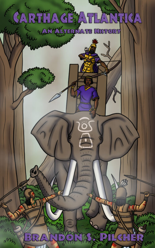
Carthage Atlantica

The author says:

It’s an alternate-history novella about ancient Carthaginians from North Africa settling on the shores of North America in 200 BC and getting embroiled in a conflict between the Native American nations. It should appeal to fans of ancient history as well as the “alternate history” genre in general (think the works of Harry Turtledove).

Nathan says:

I’m probably going to suggest more work than you think a novella is worth, but here goes:

I think the main problem with the artwork lies in the initial stages, with the layout.  What you’ve got here looks like a snapshot by tourist watching a staged spectacle: All the figures are in the middle distance, the perspective is roughly perpendicular to the action, and it’s just… there.

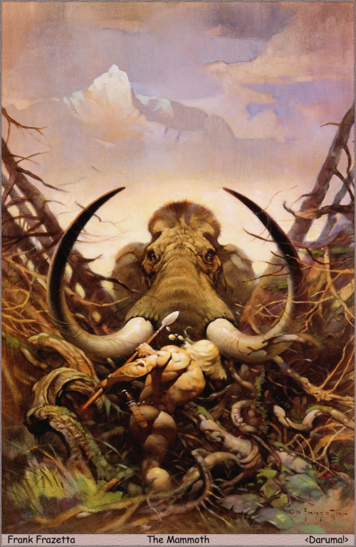
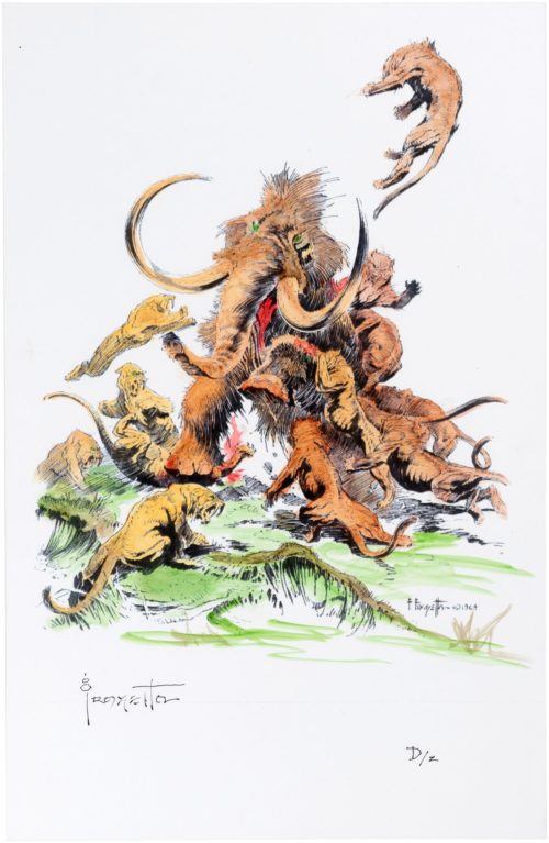
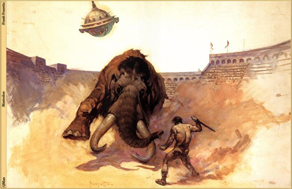
For contrast, here are three Frank Frazetta paintings featuring elephantine beasts, and sure, it’s unfair for me to compare anyone to the master, but just look at the dynamic layout, independent of paint on canvas:

S-curves. Foreshortening. Focal points. The mammoths are a menace not only to other figures in the scene, but to the viewer. And nobody cares about the feet that aren’t attacking or inflicting violence.

Plus, there’s intentional space for the title. Not just “Oh, by the way, here’s the title, hope it doesn’t distract anybody, carry on.” Remember, the text on the cover is as much a part of the design as the artwork — it needs to contribute to the whole.

(And all of this is independent of whether this cover signals to the readers of Harry Turtledove that this is a book they’ll enjoy.)

Other comments?

The Precocity Virus

The author says:

In the near future, an asymptomatic and universally contagious depopulation virus engineered to accelerate the aging of human female reproductive organs soon precipitates a worldwide baby bust, leaving civilization and humanity itself in danger of extinction if people in general can’t find some way to start having more children. While various individuals and institutions all over the world bicker endlessly about this crisis, the mothers from a pair of fairly ordinary neighboring families somewhere in rural Alabama come up with a working—albeit extremely illegal—solution: since they can’t have any more babies themselves, they’ll get the children they already have to do it for them. Thanks to several rather fortuitous circumstances (e.g. an illegal teachers’ strike shutting down Alabama’s schools for months on end), their plan succeeds, but what will happen when what they’ve done is inevitably exposed to public scrutiny?

While premised on a sterility plague something like the ones in Greybeard by Brian Aldiss, Children of Men by P.D. James, and Bumped by Megan McCafferty, this is mostly just erotic fiction with a light dusting of science fiction (i.e. the titular virus) taking place in a time no more apocalyptic or dystopian or violent than our present. In other words, the vast majority of the “action” takes place between the sheets; no car chases or firefights here. Since a lot of the main characters participating in this “action” are necessarily rather underage, I also thought it best not to show any of the main characters directly on the cover, other than symbolically using that chart showing the intertwining of their family trees.

(P.S. That Impact typeface is only a placeholder. While I know some of the posters for that Jodie Foster movie The Little Girl Who Lives Down The Lane used it, that’s getting to be half a century ago and it’s probably rather overused these days. If you critics can suggest a better one, I’m all ears.)

Nathan says:

I assume by “underage” we’re talking about teenagers, right?  Because portraying teenagers as sexy isn’t as uncommon as you think — look at all of the posters from ’80s movies about teens getting it on, or at least attempting to.

But here’s the other question: Is this comedic? Dead serious? All just sweaty humping?  Whatever it is, a “sexy” novel without a sexy cover is simply a mistake. Sex sells.  You’re completely burying the main attraction.

Toobs

The author says:

“Toobs” is a character-driven literary novel, set in the present day. Takes readers on a wild ride through the dark funhouse mirror world of “Munchausen by Internet syndrome”. Single-line description: “A website dedicated to exposing medical frauds causes a chronic illness influencer to question her own reality.”

Target audience is women 25-45 or so, comp books are “Self Care” by Leigh Stein, “Fitness Junkie” by Lucy Sykes, “Cover Story” by Susan Rigetti. It’s the type of book I’d like to see featured in Cosmopolitan Magazine summer beach read round ups.

Cover should convey “this is a dark, intriguing book about medical stuff”. Want to stand out among bright pink swirly and girly cut-paper or watercolor blob covers.

Nathan says:

I think the first problem is that you’ve set two targets — “character-driven literary novel” vs. “shocking, visceral and riveting” medical thriller.  I’m not saying that a medical thriller can’t be character-driven or have literary value, but those are two different shelves in the bookstore with different visual tropes to attract readers. (And neither of them are “bright pink swirly and girly.”)

The first step to making something look “dark” is… well, make it literally look dark.  (Or at least stark and contrasting.) It also helps distinct elements of the cover stand out, as opposed to the midlevel warm gray that the thumbnail becomes.

See what I mean?

And for heaven’s sake, ditch that title font. I get that it’s trying to convey “viruses” or whatnot, but it’s just goofy.

Other comments?