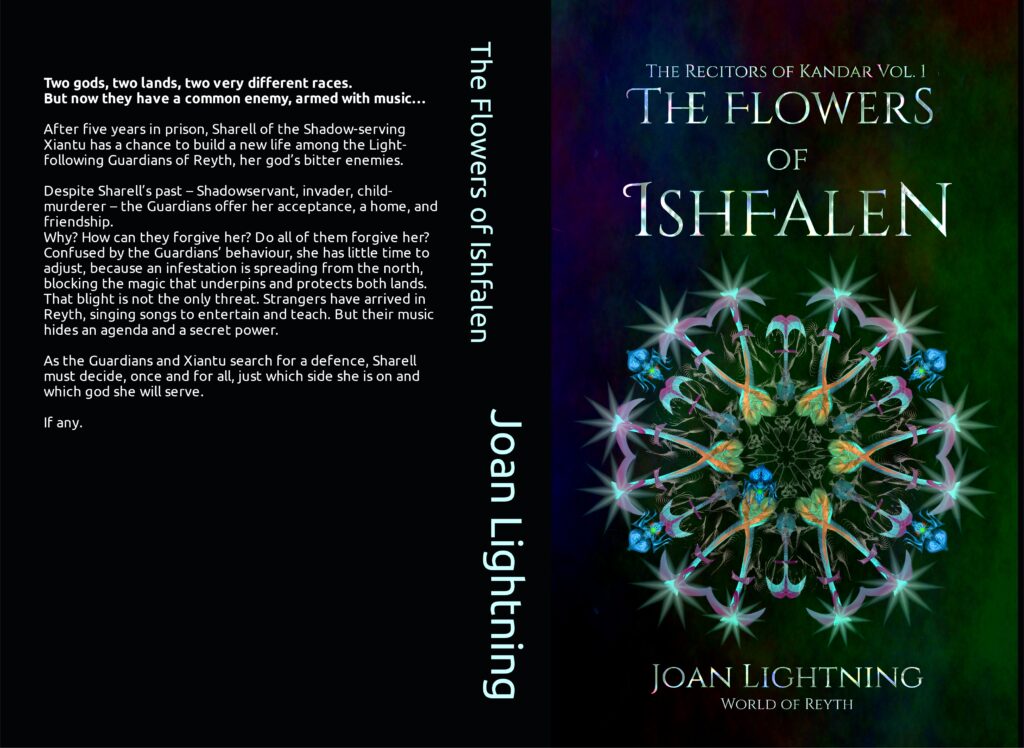
Clean Epic Fantasy/ Christian fantasy. Two gods, two lands, two very different races. But now they have a common enemy, armed with music… An infestation of strange ants is spreading from the north of the continent of Reyth, blocking the magic that underpins and protects two warring lands. That blight is not the only threat. Strangers have arrived, singing songs to entertain and teach. But their music hides an agenda and a secret power. Enemies who fought against each other in the war five years ago must now work together to search for a defence against this double invasion.
Target audience probably also reads David Eddings and Anne McCaffrey. It’s set on another world. The full blurb is on the image.
Nathan says:
You’re trying to avoid the obvious but expensive issue: Most epic fantasy — certainly the books of the two authors you mention — features full custom figurative art on the covers. It’s hard to convincingly say, “My book is like those!” when your book doesn’t look like those.
(On top of that, the font used for the spine and back cover is utterly wrong, but I’m assuming that’s just a placeholder. Right?)
My advice would be to browse ArtStation.com and similar portfolio sites to find a suitable piece of art already created. (By “suitable,” remember that it doesn’t have to have the right hair color for the protagonists and the correct heraldry on the shields — it needs to say, as you said before, that a reader of Eddings and McCaffrey would like this book.) You’d be surprised at how cheaply an artist will license you the use of his artwork if they’ve already made it for a different project or for personal enjoyment.
Good luck!


I agree with Nathan, you should look for a better image. It’s a nice enough cover and illustration, but it says nothing about the novel. The font is OK, but watch the ligature between the H and the E in THE (and fix the kerning between the T and the H).
As Nathan mentioned, don’t forget to fix the font on the spine, and show us the back cover when that’s done too!
Okay, a couple of comments.
First, the Dandelions are not working for me. I know, they’re not dandelions but they kinda look like dandelions. They are making it tricky to see what the cover is meant to convey: genre, area of interest, etc. Right now, it mostly says “LitFic, but not sure where.”
As Nathan rightly states, Fantasy has its own rules, and one of them is, it needs to be visibly and obviously fantastical and preferably, with its own custom art, or at least, art that looks/feels custom and more importantly, conveys the idea that “this is High/Low/whatever Fantasy,” to immediately draw in the prospective buyer. When I see this, I am not at all told fantasy, or anything else, really. That’s the biggie, here, to me, regarding what needs redoing the most.
The title font: while I appreciate what your designer put into the ‘backlighting” on the title font–I genuinely do–I keep reading “Ishfalen” as “Tishfalen.” It’s one of those swashes that is defeating the purpose and obscuring the title rather than clarifying it. Sorry.
The spine font: God no. Ditto the rear cover text–find a friendly, highly-readable, plain old serif like AGaramondPro and use that for the rear text. The spine should echo/reflect the titling font. Also, why are the title and the blyine, on the spine, offset? It’s…vertigo-inducing-ish.
The solid black of that same spine and rear–something about this is really putting me off and I’m not sure if it’s the Bahnschrift or Lota-ish font that’s distracting my eye, or…something.
That flat black feels dense and unforgiving. The front cover artwork, which was clearly separately made, has that deep navy blue/midnight blue that relieves that flatness, on the front, but the spine and the rear are just…there. Kind of like a large black hole, waiting to eat the unwary reader and without any sort of visual relief. It needs something to alleviate the ebony. Some sort of..ombre, or lightly-hidden pattern, something. It’s just…unfriendly-looking now, a bit repellent, and I can’t say better than that. Maybe Shel or one of the designers will pipe up.
(Cough cough assuming that they can remember how to find the place…)
Offered FWIW.
Can you comp your book to any current fantasy for a cover compare?
It feels like you looked at current fantasy covers, and didn’t see what makes them work. I don’t think this art works at all (it’s too abstract/fractal, compared to say The Bone Orchard or really any other fantasy cover that doesn’t have people.)
I would suggest something that is both more obviously fantasy, and relevant to your story specifically. Supposing the flowers of Ishfalen are literal flowers that end up being the Key to Saving the World, I would recommend a field of said flowers, or at least a bunch twined around your title.
see: https://i.gr-assets.com/images/S/compressed.photo.goodreads.com/books/1636669886l/58724793.jpg
or: https://m.media-amazon.com/images/I/91LvTKqG3iL.jpg
I recommend when you try again, you design your background for the full print cover, then concentrate on your front cover image. Also there are other, better (in my opinion) fonts for fantasy novels than Cinzel Decorative, but if your heart is set on it, use all caps for the THE to avoid the unsightly ligature (just adjust the point size) and keep an eye on the kerning.