The author says:
It’s an alternate-history novella about ancient Carthaginians from North Africa settling on the shores of North America in 200 BC and getting embroiled in a conflict between the Native American nations. It should appeal to fans of ancient history as well as the “alternate history” genre in general (think the works of Harry Turtledove).
Nathan says:
I’m probably going to suggest more work than you think a novella is worth, but here goes:
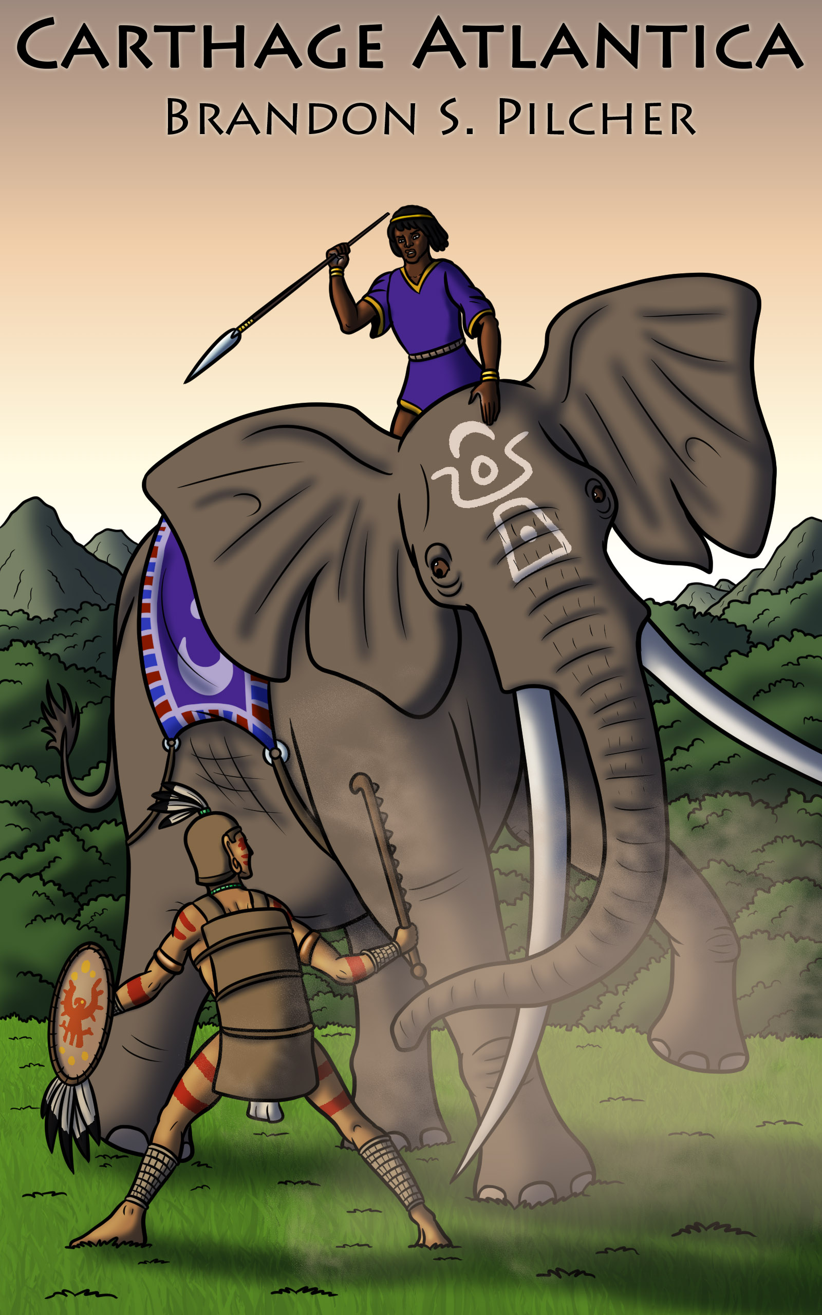
I think the main problem with the artwork lies in the initial stages, with the layout. What you’ve got here looks like a snapshot by tourist watching a staged spectacle: All the figures are in the middle distance, the perspective is roughly perpendicular to the action, and it’s just… there.
For contrast, here are three Frank Frazetta paintings featuring elephantine beasts, and sure, it’s unfair for me to compare anyone to the master, but just look at the dynamic layout, independent of paint on canvas:
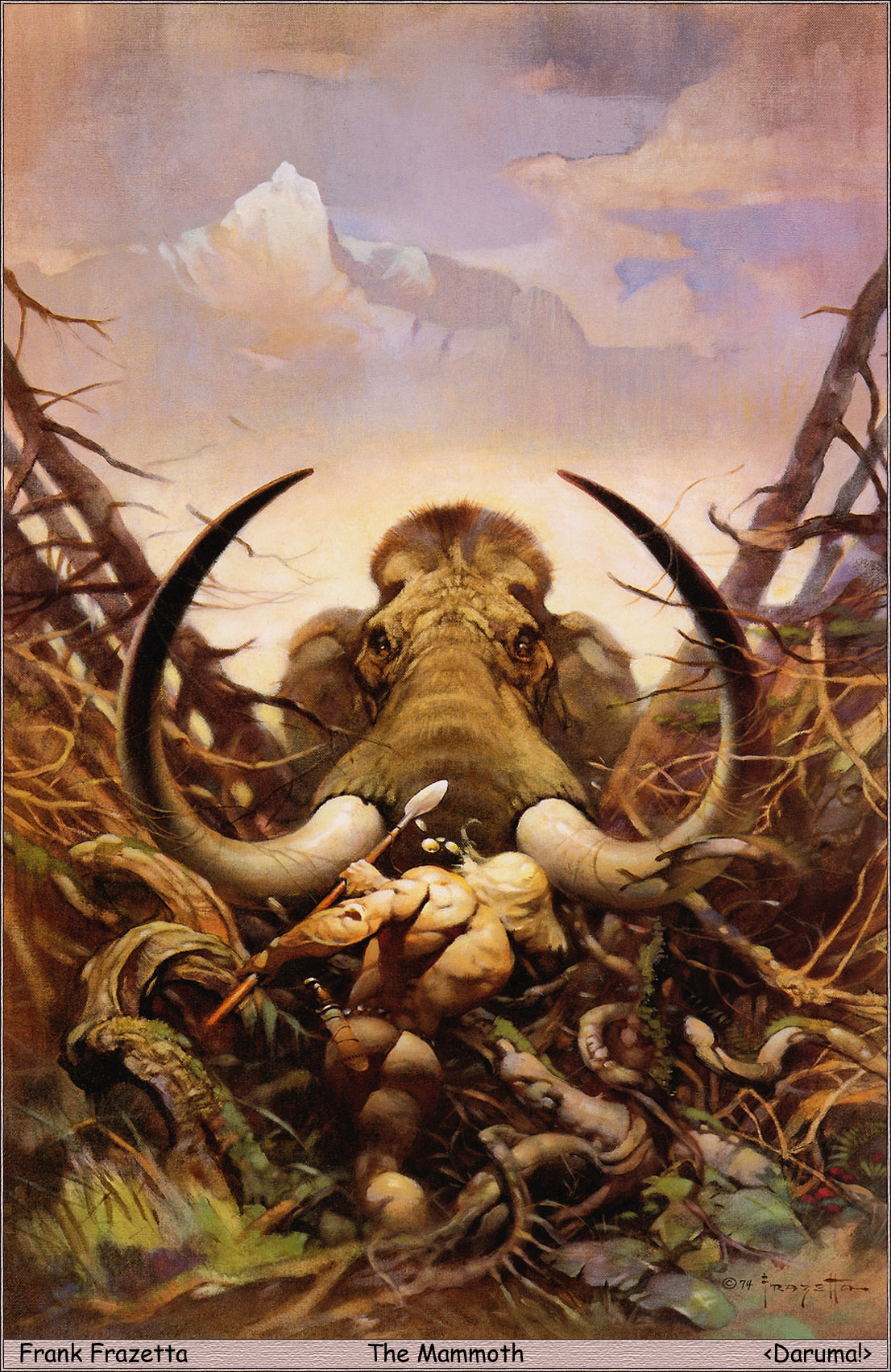
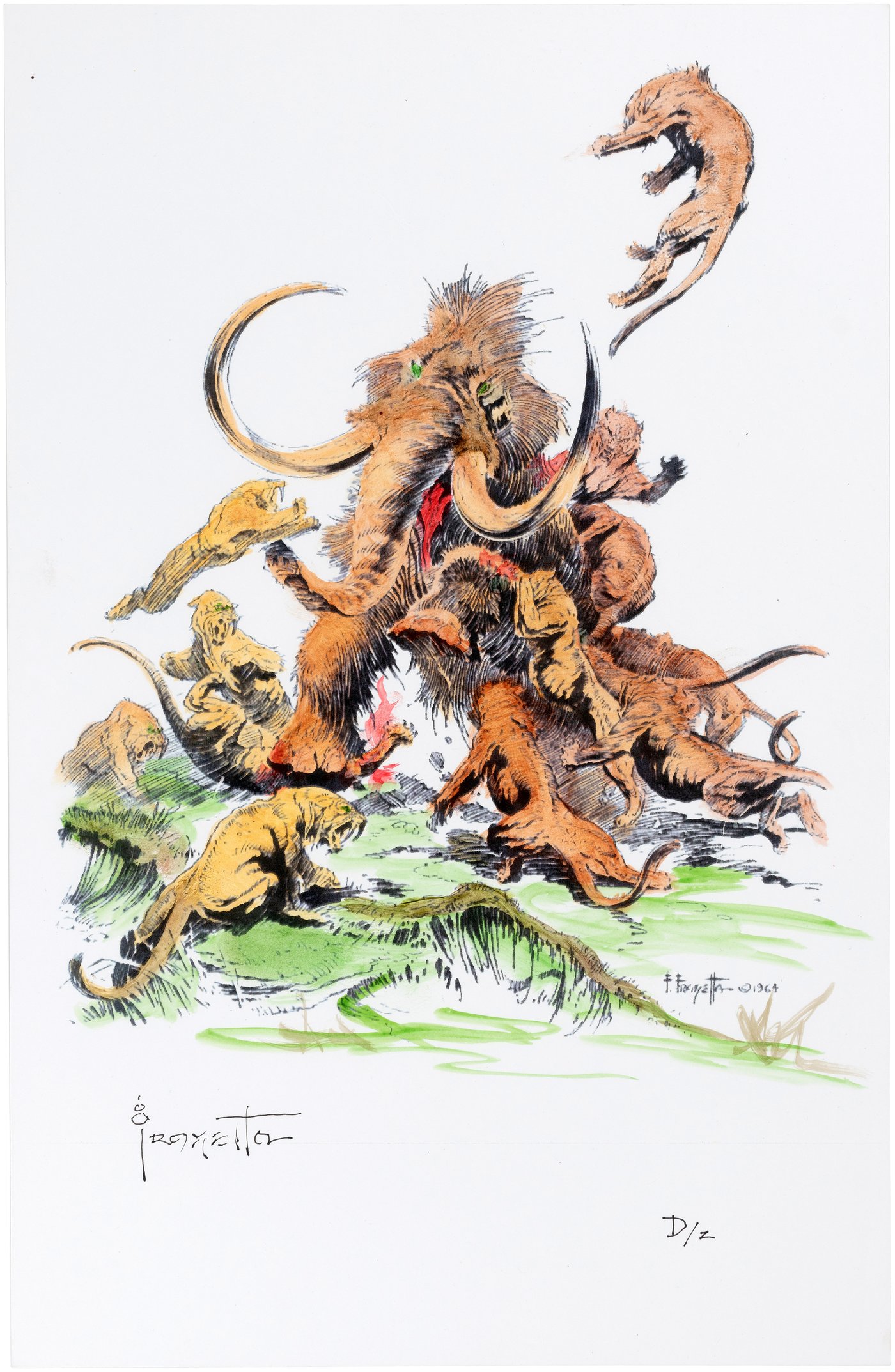
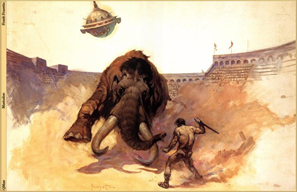
S-curves. Foreshortening. Focal points. The mammoths are a menace not only to other figures in the scene, but to the viewer. And nobody cares about the feet that aren’t attacking or inflicting violence.
Plus, there’s intentional space for the title. Not just “Oh, by the way, here’s the title, hope it doesn’t distract anybody, carry on.” Remember, the text on the cover is as much a part of the design as the artwork — it needs to contribute to the whole.
(And all of this is independent of whether this cover signals to the readers of Harry Turtledove that this is a book they’ll enjoy.)
Other comments?
At first glance, it looks like a middle-school / children’s book.
Identify your target audience and look at other comp titles in that genre.
Yes, I’d say our esteemed host is right: you’ve got the right general idea, but your imagery lacks dynamic punch. That native tribal foot soldier’s wide-legged stance with his face turned sideways so we can see it isn’t really how a guy would stand when facing down an elephant in a real life-and-death battle, and he doesn’t look like he’s swinging that saw-toothed mace so much as he’s just kinda holding it out in front of him. That shield is also pretty obviously being held out so we can see the painted crest on it; in a real fight, he’d be holding that over his chest to try to block the javelin that elephant rider clearly intends to throw at him.
Basically, you need everything to be at more of a skewed angle. The elephant swinging its head to one side with the intent of pitching the foot soldier aside with its tusks makes sense, but if that’s what it’s doing, its trunk should be swinging in the same direction to show its intent to whip it back at him (thereby doubling the impact of the blow) with the same head movement. The rider should either be aiming that javelin better (if he plans to throw it) or simply be carrying it by his side (if he doesn’t plan to throw it until the elephant has made its attack). As for the foot soldier, he should be backing up on his heels, bracing for impact, or both; and if he’s going to try to hit anyone with that mace (feeble as it would probably be against that elephant’s muscle mass), he should be holding it over his head and looking directly at wherever he intends to strike, not back over his shoulder at the fourth wall.
Also, yes, your title and byline are rather timidly placed. Put the one at the top and the other at the bottom, get them further away from the edges (at least a quarter of an inch, and preferably more), and make them both bigger. Don’t cram them all into one space in such tiny print and act like you’re too ashamed of having written this book to make them both visible and legible in the thumbnail.
Thanks for your thoughts!
And now for something completely different:
https://i.imgur.com/GKAZvMl.png
More for tone and layout than specific imagery.
Yeah, I think it’s still too peaceful–not enough action/adventure. But I do like the tone and layout for a cover for a different book.
That was the intent of the mock-up, not the image itself. Illustrations of alternate history early North America battles between natives and migrating North Africans are surprisingly difficult to come by. I also uploaded the wrong one. Here it is after a minor tweak and color correction:
https://i.imgur.com/BXpEotc.png
Incidentally, though the Carthaginian Empire was in North Africa, its people were not originally from there. They were colonists from the Middle East, probably of Phoenician and/or Amorite extraction, and their nation’s name as it comes to us is a Latin mispronunciation of something like Kiryat Thiago which meant “New Town” or “New City” in their language. In other words, while they likely did have a dusky-to-dark complexion on the whole (and probably did interbreed fairly freely with the locals), Carthaginians weren’t jet black like some of their native neighbors; the elephant rider on the author’s submitted cover is probably a fairly accurate depiction of a Carthaginian with several common Middle Eastern features and a skin color about as dark as any of theirs got.
Y’know, I almost always learn something interesting from you, RK. 🙂 Thanks for that.
I think that one problem with this is that it looks contemporary: there is no real hint that the book is an alternate history. let alone one taking place in 200 BC.
Something a bit more dynamic:
https://i.imgur.com/QX3alR3.png
I like that! Personally (Savoy will laugh reading this), I’d like the contrast skooshed up a bit, but overall, yes, I like that a lot.
I had to add the merlon on the right as well as the sky above the wall, but should have softened the cloud detail and color, left more at the bottom for the byline, and adjusted the contrast. Even so, as an example I think it works.
Yes, I agree, it does. 🙂
I agree with Hitch. This comes infinitely closer to hitting the mark.
Regarding the original art, with that kind of talent I’d suggest exploring the possibility of creating an illustrated children’s book for your next project.
Do we think that the author did the art, CC Participant?
This same cover with text has been posted on a number of sites, with the same user name claiming it’s the cover for a new book. I also saw other art posted by that same person done in the exact same style.
I can’t discount the possibility entirely, but I doubt someone would steal the art and then post it all over the internet while claiming they created it, or steal Brandon’s cover and claim it as their own.
LOL, that’s not what I meant. I only meant, do we think that the person who posted it is the artist, or do we think it’s the author? Or that those are one and the same? I didn’t mean to imply that old Brandon there had absconded with someone else’s art. 🙂
???
The postings indicate the author and artist are one and the same.
Ah. Thank you for the elucidation.
Lucidity is my middle name.
Hey everyone,
I’ve decided that I will redraw this cover, but I am having a bit of trouble figuring out how to cram all the major elements (i.e. the Native warrior, the elephant, and the rider with javelin) together into one cover with a more “intimate” perspective. By “intimate”, I mean having the warrior positioned closer to the viewer’s point of view so that it doesn’t look so much like “a snapshot by a tourist watching a staged spectacle”. The problem is that if everything is closer to the viewer, more of the elephant and its rider get cropped out in the cover. Anyone got suggestions for a better composition?
Don’t show the whole elephant.
Don’t show the whole warrior.
(You’re already not showing the whole rider.)
One of my rules of thumb: “Nobody feels bad if they can’t see feet.”
One way I could imagine it going: show the native tribal guy clambering up there on the elephant’s head and furiously trying to crush the Carthaginian rider guy’s skull with that saw-toothed mace of his while the rider in turn tries to skewer him with his javelin. That would be kind of a retro-historical version of a “two guys fighting over the steering wheel” scene, which would be a much more realistic scenario than any warrior—however fierce—trying to face down such a charging mountainous mass of muscle as an elephant all by himself. For bonus points, have both combatants’ teeth bared at each other and try to make the elephant look seriously ticked off as well.
Thanks for the suggestion!
And leave room for your title and byline. They are just as important and should not be an afterthought wedged into accidental blank areas.
Show potential readers you’re proud of the book, and being the author.