The author says:
A psycho sexual first person narrative set in San Francisco, exploring the gritty underbelly of sexual desire, substance abuse and financial instability in the ever changing metropolis.
Nathan says:
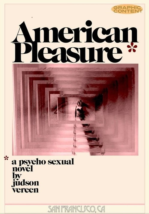
This a very cunning impersonation of the “edgy” covers from the early seventies, and I applaud the designer. The only question is if there’s enough of a market of people who would be attracted by such covers, and I don’t feel qualified to answer. Anyone?


I like it a lot. My only comments come under fine tuning.
The placement of the lower asterisk could be better. Bring it down more even with “a psycho.” Lower the upper asterisk so it is a little closer to the “e” in “pleasure” and is not touching the “n” in “American.”
I have no idea what the “San Francisco, Ca” is doing there or why it is in such a contrasting typeface. Otherwise, first-rate.
I agree with the asterisk suggestions. I’d also lose the warning and the thing at the bottom.
Additionally, I’d like to see the asterisk and “a psychosexual novel” (one word or hyphenated) on a single line spanning the graphic, with “by” left aligned below, and the byline larger below that.
https://i.imgur.com/EwfcaEX.jpg
I think that if you’re a connoisseur of the artform–covers–and you were born around 1950 or earlier, or again, you’ve studied cover design over time–this cover will catch your eye and appeal to you. It’s incredibly well done, other than the small bits and orts that Ron and Nathan have already mentioned.
I am extremely hesitant to disagree with our Fearless Leader (Nathan) and Ron, but I think for today’s readers, it’s going to look like a reprint from the 70s. That’s what I think. I’m not sure it would even get curiosity clicks. I’m well and truly sorry to be Debbie Downer, but if our job(s) here are to give commentary for selling covers, I’m not sure that this is it. I could be absolutely, positively, dead wrong and it’s even likely but…that’s what I think.
Also, yes on “psychosexual.” That’s one word, so at the very least, it needs to be hyphenated if crossing lines; unhyphenated if not. It’s not two words.
I’m not wild on the pseudo-Art Deco font on the location. I’d nuke that and find something more apropos.
Huh, this is an interesting one. As Nathan says, it’s a great pastiche of those 70s covers. The question would be whether that’s an effective approach for the publishing context.
If this was for print publication and bookshop sales I would say yes, but I’m not so sure in the context of digital sales.
I think the pastiche is very convincing, but it’s taking precedence over this really working as a really persuasive cover; your target audience might easily scroll past this. When someone is just browsing on Amazon or similar, there’s no clues that this isn’t just an old book which will be of no interest to them, but is in fact modern.
If a designer is opting for a throwback look, they usually make sure there’s enough modern design sensibility to make it clear that the work is in fact new.
Often there might be a bit of overt irony used, such as in Janette McCurdy’s ‘I’m Glad My Mom Died’ which is styled after 80s ‘women’s fiction’ bestsellers to bring out the harshness of the title and photo all the more.
Apart from those broad questions I also have a couple of specific design tips.
Get rid of the font Desdemona! It’s like having Papyrus on an otherwise professional looking piece.
Apart from the font, I also think the text ‘San Franciso’ is confusing and needs to go, or have a clearer placement/treatment. Is ‘San Franciso’ a subtitle? Is ‘American Pleasure’ a series name and ‘San Francisco’ labelling this particular edition? Or is the full title perhaps called in full ‘American Pleasure: San Franciso’? In either of those scenarios these words need a different placement and graphic approach. If it’s not some kind of title, it doesn’t belong on the cover.
I would also get rid of the inner lines/frames. They doesn’t read as part of the ‘70s’ look in any case to me, and are needless clutter on a cover that would look cleaner and more attractive without them.
I’m not quite convinced by what’s going on with the asterisks. It might be an intentional period/edgy move to place them oddly (butting up against the letters/being quite detached from the text block) but it’s just doesn’t quite convince as a deliberate design choice.
I agree — it’s striking and eye-catching, but it looks way too ’70s. If I saw this on a shop shelf or website, I would be convinced that it’s a reprint of a novel from 1970-ish, not a new work.
In fact, depending on the website, I might even think it was a 50-year-old secondhand book. (The colours don’t help, either, since it looks yellowed and bleached, exactly like a 1970 paperback that was originally white.)
I also agree that the bottom “San Francisco” text is confusing. It’s so separate from the rest of the text, and in such a different style, that it looks like a publisher’s logo, if anything. Kata has it right: If it’s a subtitle, link it up with the title; if it’s not, chuck it out.
You say the story is set in San Francisco, but is it set in the 1970s? If so, we’re talking about practically the world hub of counterculture. San Francisco in the ’70s gives fertile ground for ideas that can be expressed in a modern style but convey the sense of the hippie/radical culture of the time and place.
Also, the “Graphic Content” label is distracting and unnecessary — the subtitle’s description as a psychosexual novel clearly indicates that the reader should expect plenty of sex as well as potentially disturbing psychological themes. If the label is intended as a sales come-on, then again the word “psychosexual” (and yes, one word) is strong enough for that. The label isn’t legible at thumbnail size, anyway, so it can’t attract a casual browser.