 The author says:
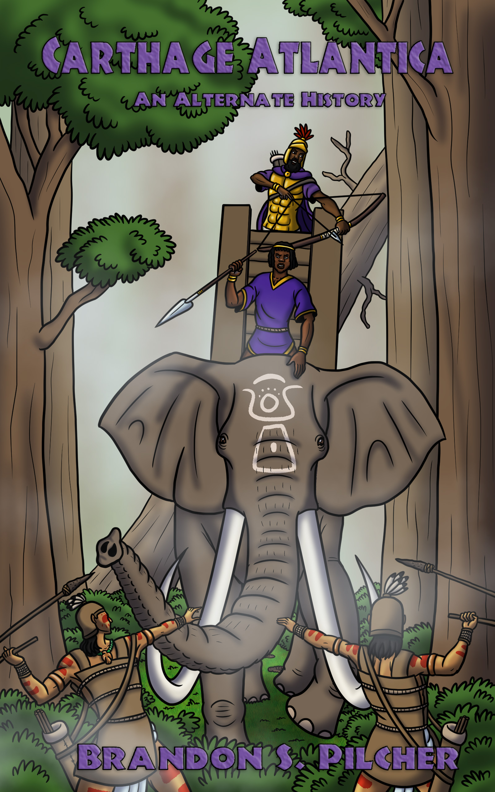
This is my second cover design for my novella “Carthage Atlantica”, an alternate-history tale about ancient Carthaginians from North Africa discovering the Americas in 200 BC. This time, I did a composition that made it look as if the war elephant was heading in the viewer’s direction, in response to your criticism of the previous cover design.
[original submission and comments here]
Nathan says:
Yes, you’ve taken some comments to heart, but it seems like you don’t know why those comments were made. I’m again going to be extremely unfair by using those same Frank Frazetta comparisons:
Look at the strong use of contrasts to draw your eye to the important central figures. Backgrounds, when they exist, are atmospherized for much less contrast. There are no straight vertical lines; vertical lines are static. Instead, everything is focused around dynamic diagonals. And the illustrations that were meant for book covers have areas in which the title can be inserted for maximum visibility.
Now compare that to yours. The trees and foliage are rendered with as much detail and contrast as the elephant; the “misting” effect only helps to flatten the perspective, making the central figures no more important to the eye than the background. You’ve even taken a step backwards as far as the type is concerned; while the title and byline in the original cover were too small and inobtrusive, they were at least readable against the background. In the new version, both are scrunched into spaces where they compete with — and lose to — the busy image (in the case of the byline, losing the battle entirely).
Here’s an exercise:
- Find a bunch of dynamic, adventurous old covers by Frank Frazetta, Boris Vallejo, etc. (The covers, not just the artwork. We don’t want to ignore the type placement here.)
- Do fifteen-second thumbnail sketches of each: Block in the title and byline, and indicate where the lights and darks are, where the lines and curves are. Heck, pull them into your graphics program and look at them in black and white to see where the impact is.
- Then start your cover from similar thumbnails. Block in big, readable areas for your title and byline, and where you want the viewer’s eye to concentrate.
- THEN start sketching out your artwork.
Other suggestions?
you want to integrate title with art, and you want some contrast, specifically you want that elephant to pop
https://imgur.com/a/zknC8Km
I don’t mean use that. It’s just a quick crappy example of what I mean. it would work better if the elephant was clearly a different color than everything else (I’d make him grayer) and if the guy in the yellow shirt was the guy in the purple shirt to lead your eye down with the yellow color. I’d definitely use the yellow for the title in this instance because of the contrast.
avoid adding effects to the title unless they match the rest of the art.
you might want to start with the title and author name and draw the art around that. I’m picturing a rearing elephant over the title, then the men, then name, and you want an angry looking elephant.
I actually did a second version of this cover with gold text, because I felt it stood out more than the purple:
https://i0.wp.com/brandonpilchersart.com/wp-content/uploads/2022/10/Carthage-Atlantica-Book-Cover.jpg
As for Nathan’s critique, I’ll admit that I don’t know how to respond to it right now. I want to be gracious and thank him for the constructive criticism, but I must admit that I put a lot of effort into this artwork (and the one for the previous cover design) and don’t feel like redrawing it all over again. Adjusting the text wouldn’t be too big an issue though.
I obviously can’t FORCE you to redo the cover, or demand it. It’s your book. You submitted it for criticism; what you do with that criticism is up to you.
Understood. Thanks for the constructive criticism regardless.
Hi, Brandon:
I’m sure it’s bloody difficult to hear this, especially after all the (clearly) hard work. IF you determine to take another whack at it–which I would strongly encourage–I would suggest that you think about:
* Creating a draft/rough/storyboard of the cover action, first;
* Do what Nathan suggested, about using extant Frazetta, Vallejo, covers and getting their rhythm, their feel.
*As Nathan said–it’s clear that your heart is in this and you did try to implement some of what we said. However, it’s equally clear that you didn’t understand some of the why when we said it.
* I’m not really sure how to address that, to be honest. This gets into fundamental concepts of design, targeting commercial markets and things.
* I’m hoping that maybe Ron or some of the others–including Shelley (Savoy) can give you some inside tips around coming to grips with the differences between creating for yourself and creating to SELL. They are very damned different things.
* And reluctantly, I confess, yes, I’m a bit onside with CC participant–I’m not really sure that this particular style of art, as you’ve drawn it, is ideally suited for the purpose. That though…can’t really change that, I mean, your style of artwork so that may have been best left unsaid. Honestly…unsure here.
(Nathan, wasn’t sure an HTML “list” or ol/ul would work here, so I faked one using asterisms. If it comes out looking crappy, can you please fix it? Tx.)
Good luck to you, Brandon.
Hitch
I agree with Shelley’s comments. The text definitely needs to be more dynamic. The contrast can be played with to darken the trees and make the front action pop more. Also, either make the sky blueish or add more dark trees/jungle in the background, which would also make the new text design and elephant pop more.
It’s a hard pill to swallow, but you might not have the right skills for this particular project. Try coming at it from a completely different angle, and in the future, this type of artwork may be the perfect thing.
I don’t think the art style fits. It’s fantastic art for something else, but not this. Also, the text is far too timid.
I’m sticking with my original suggestion from round 1.
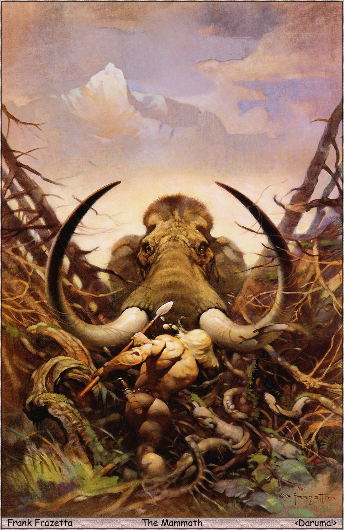
Brandon, bear with me, I’m going to try to explain why the Frazetta mammoth works for a cover and your art isn’t quite hitting the mark. I don’t think I can post a photo in the comment, so here’s a link to the image with some marks on it: https://imgur.com/a/idzIHpo
1. lots of space is left for the title. You’re designing the art, you have 100% control over this!
2. angles–the angles of the trees not only break up the straight up and down of the book’s sides, but that beast is BUSTING THROUGH those trees! whereas yours, in spite of a singled downed tree behind it, looks much less active/forceful
3. perspective–your perspective puts the beast at eye level with the viewer, which creates the subconscious impression that it isn’t that big, maybe the size of a horse. Frazetta’s perspective puts the viewer’s eye level with the warrior’s which mean that beast is towering over us. Both are facing the viewer/reader, but the perspective of that face make a huge difference.
I hope that makes sense?
Ah, screw it. I’m just going to say it, since everybody else has tried every possible uber-nice and kind way, to convey it:
Zanetti’s elephants look like raging Oliphaunts (LOTR). The elephants on these covers, here in CC.com look like the sort of jolly elephants you meet (or used to meet–giving away my age here!) at Ringling Brothers, Barnum and Bailey–more likely to take a lovely banana bunch or melons from you and squirt you happily with water, or paint you a picture, than crush your skull beneath their big-ass feet and squish you.
That’s the real issue. The style of the imagery is just not suited to the subject matter and the conveyance of menace. Those are some cute-ass elephants, who look like your buddies, and, welp, there it is. Between that and the lack of horror/menacing/etc. with the warriors…it’s just not getting there from here.
I’m sorry. I know, I can SEE that you spent a lotta time on this, but…it’s like night and day. It’s like thinking you’re gonna be chased by Frankenstein’s Monster across the tundra and finding out you’re on a date with Herman Munster.
Sorry.
Something like this but with original artwork designed to fit the format and text:
https://i.imgur.com/hG0bBHl.png
Yes, I’d say the cheerfully cartoon-ish style of the artwork is what’s mixing the messages here. On the one hand, I’m seeing a fair bit more of the kind of violence on the cover that I recommended last time; on the other hand, the cartoon-ish brightly colored line drawings make the violence look more like slapstick than a truly grim-‘n’-gritty kind of artwork one might see in e.g. the Punisher or Batman comic books and animated movies and television series. While the elephant does look a little more like it’s charging at the viewer (and those two guys in front of it), the picture in general reminds me more of an old wordless Gahan Wilson comic showing a guy driving a street washer gleefully trying to run down a late-night jogger (for some reason) who’s fleeing for his life; a mixture of the bizarre and macabre that was Gahan Wilson’s typical style of humor.
If you want your Harry Turtledove-style alternate history novel to be taken seriously, I’d recommend artwork similar to that shown on the cover of his book The Golden Shrine: not exactly photo-realistic, but drawn and painted something like the comic book artwork of Alex Ross, with all surfaces textured and no cartoon lines around those surfaces. Another good example: The Breath of God; even if that war elephant does look like it’s enjoying its job a little too much, you can see the menace it presents to the guy in the foreground who’s (probably) about to get trampled by it.
Yes. ^^ I think that’s pretty much it. I’m sure it’s not happy-making news but there’s a reason that there are different artists in the world.
¯\_(ಠ人ಠ)_/¯
Hitch