Category: Covers

Time Winders [resubmit]

The author says:

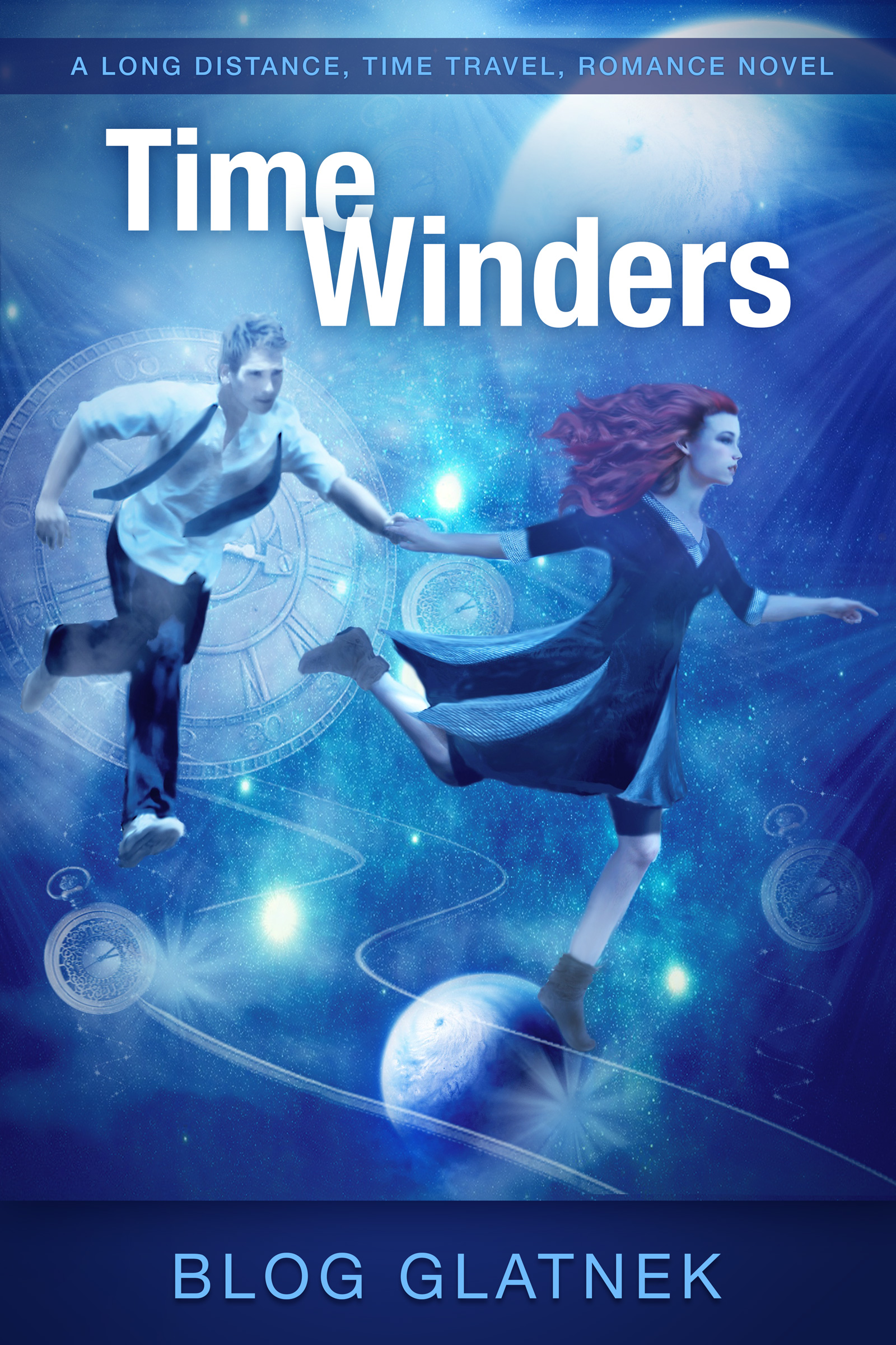
A time travel adventure novel about a top Temporal-agent (female) forced to drag a hapless man through time. Much danger ensues. Written by her boss, the head of the Temporal Agency, Blog Glatnek.

TimeWindersEbook copy

TimeWindersEbook copy


[original submission and comments here]

Nathan says:

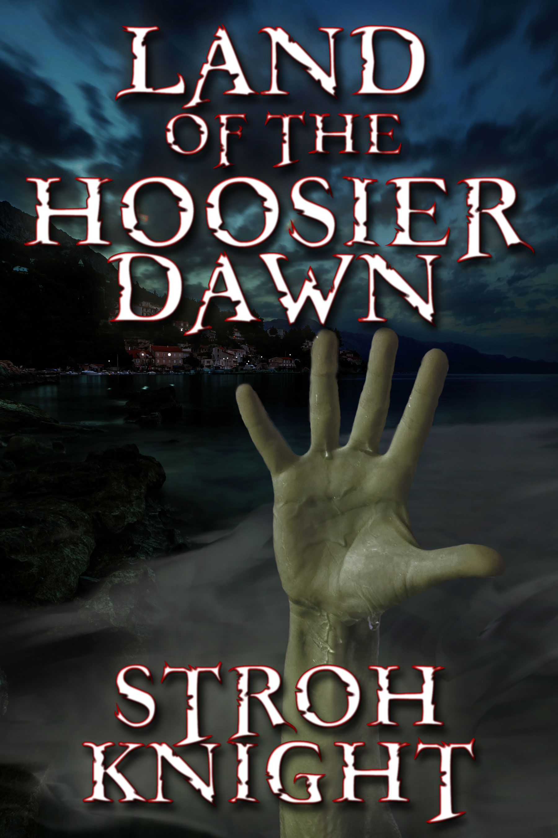
Definite improvement!  You managed to be a lot more confident in your font use, while still maintaining the feel of the original (as opposed to my more “novelty”-style fonts in my mock-up). Here are a couple of things I would still look at:

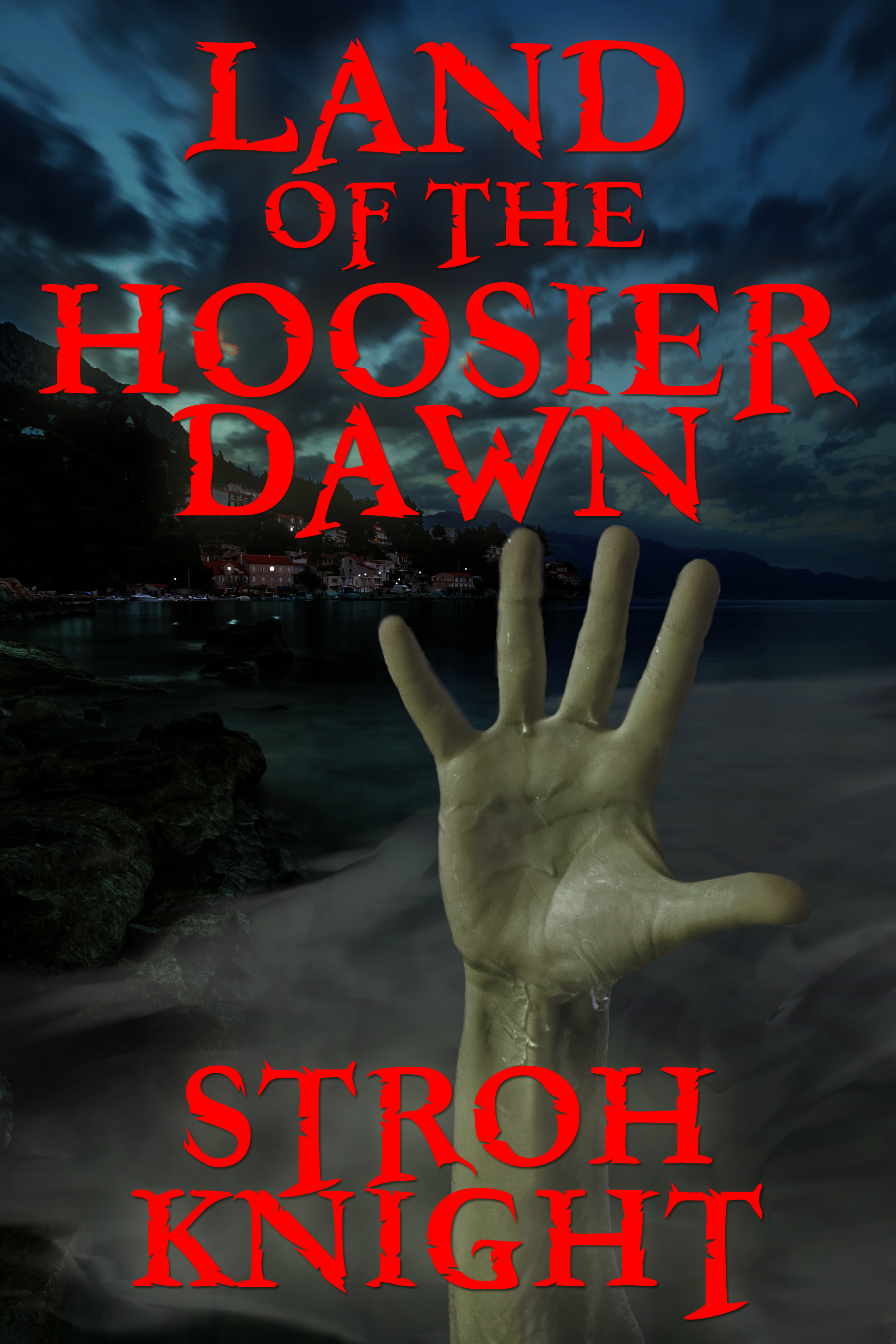
1) I think there’s still a lot of wasted space at the bottom — I mean, it’s not like you need to make sure that the reader has an unobstructed view of her left sock, right?  I would tighten it up by cropping it a bit, making the top of that solid area behind the byline the bottom edge of the cover, and in compensation cropping a little from the left side.

2) While it’s good artwork, it tends to blur into a blue murk in thumbnail, or when glanced at (and remember, every book cover is first glanced at — it’s only after that first glance that a browser comes back for a second, longer look.) How can you make it “pop” more? I’d place with the contrast and/or the saturation — it doesn’t need to be garish, but a more dynamic contrast of light/dark or blue/red would make it more arresting.  Remember, your book cover’s first function is to work like a highway billboard, grabbing the attention of someone who could just as easily concentrate on something else. (Like the car in front of him.  Maybe you shouldn’t follow this comparison too far.)

3) The byline.  As you said in comments to the original submission,

I (Tanya Park, female) am the author. Blog (male) is the futuristic narrator of the book.

So where’s your name?  Because as it stands, there’s no reason for anyone to think anything except that Blog Glatnek is the honest-to-Elvis author.  This book will get filed under “G.”  If you’re trying to establish a pen name, that’s one thing; but if you’re instead trying to establish the identity of the narrator on the cover, I’d suggest something like:

From the Official Reports of

BLOG GLATNEK

Director General of the Temporal Agency
as told to

TANYA PARK

4) Commas. I’d take as many as possible out of your tagline (i.e., all of them). “A Long-Distance Time Travel Romance Novel.”  If you feel really naked without some more punctuation, you could hyphenate “time-travel.”

Anybody else?

Land of the Hoosier Dawn

The designer says:

This is the description I received from the author:


“An unforgiving fog from the nation’s most polluted river rolls over a small Indiana town one Friday night in October of 1993. For those who were caught in its path, a new day has dawned onto who, or what they have become. Their bodies have changed and their diet has become “inconclusive,” until dead bodies surfaced at their docks on the inland river channel. For police chief Linton Derr, living in Fogstow, Indiana was a real dream. There was little to no crime. Everybody knew everyone else’s name. It made his job just a little bit easier and helped make the community one of the most desired places to live in the small riverside county that was once desolated by coal mines. But all it took was one big tragedy to put things into perspective. To bring all the skeletons out of the closet and force him to see that even in small towns, evil can walk amongst them. It could hide its deeds in the shadows and when the time was right . . .”


The author received some feedback saying the text was too bright and that the red needed to be toned down, but I think that makes it too murky and impossible to read at thumbnail size. I’ve also tried using white text, but that makes the cover look bland and colorless. It was also suggested that the hand be centered, but that didn’t look good at all. I was pretty confident with the cover until the feedback from other writers started coming in. But they’re not designers, and I put more stock into what you guys say.

Land of the Hoosier Dawn12


Land of the Hoosier Dawn12

Nathan says:

Thanks for making my job easy! This is 90% of a good cover, and it’s a lot easier to pile on that last 10% when the majority of the heavy living has been done.

First, regarding the type color: Remember that you’re not limited to all-or-nothing on either red or white.  I pulled your picture into Photoshop to try something, and:

Land-of-the-Hoosier-Dawn12

I’d play with the width of the red border (which I made darker so it wouldn’t be so garish), and with using an off-white instead of pure white for the centers.  I also added a bit of a drop shadow, which is always a quick fix if you’re worried the type still isn’t distinct enough.

Second: The hand. I think an easy fix there would be to tip the hand on the diagonal — say, maybe 20 or 25 degrees counterclockwise. You could thus center its main visual mass while avoiding the “wine glass” appearance of having every cover element centered on the same axis.

Third: You didn’t ask, but I have some issues with the font (Freebooter, yes?). It looks fine for the title — the matching over-extending descenders of “OF THE” is a bonus — but it looks awkward in the byline, where the Ts just seem out of place.  Maybe using upper-and-lowercase instead of all caps would solve that problem.

Anybody else?

New Darwinian Laws For Every Business [resubmit]

The author says:

This is a resubmit, taking into account many of your suggestions. I also received some additional thoughts from Derek. Am I getting closer? Thanks again for your help and comments.

FrontcoverV15

FrontcoverV15

[original submission (as Survival of the Fittest) and comments here]

Nathan says:

Hmm.  The artwork is certainly less crude, though I don’t know that it’s still uncrude enough. And for what it’s worth, I disagree at least halfway with Derek, in his comment on the original post, regarding the need for a different title: I think that the wholesale replacement of the original title with “New Darwinian Laws For Every Business” is a mistake because, while it’s more accurately descriptive, it’s also more clinical and less evocative; not only is that less immediately appealling, it runs counter to the comment you made on that same post that you were indeed going for a “whimsical” approach.  Perhaps a longer, colon-divided title/subtitle — “Survival of the Fittest: What Your Business Can Learn From Darwin,” or somesuch — in which the subtitle is only slightly smaller than the title, and thus both are readable at thumbnail size.

Of the visual examples contributed, I really think that Viergacht’s mock-up is definitely the direction to go: it’s got that element of whimsy, it’s clean and clear, the text dominates and the image supports the title and effectively communicates the voice in which the book is (reportedly) written. Heck, I’ll reproduce it here because I think it’s that good.

Cux7rxs[1]


You can really see the appeal if you place your revised version beside his in thumbnail.  The cartoony vibe from his big fish really makes it for me:

FrontcoverV15 Cux7rxs[1]

I think that with a slight wording tweak so that the business aspect of the book is visible from the thumbnail, that’s really the way to go.

Other comments?

Invivo

The author says:

Invivo is a love story of honor, remorse and revenge, and one man who sacrifices everything to fulfill a promise. The story opens in a small university town in Scotland. Dr. Harold Spencer is arguing with his wife Shelly. She wants a child. He does not. Harold’s father and then his brother died of Cystic Fibrosis. He did not want an abbreviated, unhappy life for his child. He would not have children unless they could be healthy. His research was progressing. He promised they would not wait too long. Harold was deep into a bold experiment, injecting foreign DNA into a host animal, doubling the viable DNA. His approach promised miracles. So far, however, he had managed only to kill hundreds of rats, until one survived. A brutal murder ends all possibilities and results in one lost life, one given away, and one life allowed to blossom and quickly die. Harold found the one way he could keep his promise. Aimed at adult fiction readers.

Frontcoverlarge

Frontcoverlarge

Nathan says:

Minimalism is a tough gig. More than any other style of design, I have only by gut reactions to go by when saying whether something works or it doesn’t. I don’t think this works, and what follows is my attempt to reverse-engineer my gut reaction in intellectual terms.

1) I think most minimal designs work best when the lack of extraneous information lets a strong focus be put on one, and only one, detail.  In this case, I think that seeing the curve of the back distracts from the navel, which would otherwise be the obvious focus.

2) With very little to take away the focus from the type, it becomes imperative that the type be presented confidently.  That doesn’t mean that it needs to be gaudy or even ornamented with serifs, but I think the font you chose here gives more of a “chosen at random” feel than “chosen for strength.”  I hope that makes sense.

3) I’m nor sure from the description what the real focus of the story is, but I’m pretty sure that the cover doesn’t convey it.  Looking at the cover without the description, I may think that it has to to with the pursuit of physical beauty, and the title gives at least an indication that procreation is involved, but I don’t get anything remotely science-y or science-fiction-y, or murder-y.  Again, I don’t really know how central those themes are to the book, but they seem central to the description and yet absent from the cover.

Given that there’s a lot of image to work with here, I was to do one of my Five-Minute Makeovers to see what I could come up with.  But when I tried cropping the curve of the back and the text out of the photo, the navel over to the side wasn’t enough of a visual clue of what we’re seeing. I think you might want to find a different photo (it could even be something from the same modeling session) with the navel more toward the middle so that you can include the muscle and bone structure around it and have it be more recognizable.  An added bonus there is that you can play with the color more to indicate either the suspense-thriller or medical-science mood of the story, while not impinging on recognition of the navel.

I have now talked about navels more in the past twenty minutes than I have done in the last five years.

Anyone else?

Time Winders

The author says:

A time travel novel with a strong, female protagonist.

TW cover Critique

TW cover Critique

Nathan says:

Hmm. You didn’t give us a very big image to examine, so we can really only critique it as a thumbnail.  There’s only a very short description to compare it to, so forgive us/me if the advice we give doesn’t match the novel well.

First: Fonts. My rule of thumb is that, unless you have a compelling reason, try to limit yourself to two typefaces.  I don’t think you’ve got a compelling reason; what’s more, the most difficult-to-read font is used for your smallest text. (Another rule-of-thumb: The smaller the text is, the easier you should make it for the reader to read.)  And your largest type, your title, is in your most boring font.  I understand that big, bold sans-serif typefaces can appear strong, but I think this one misses the mark.

Second: Cover vs. description. All that we know about this time-travel novel, really, is that it has “a strong, female protagonist.” If that’s the most important thing you want the reader to get from your cover as well, then the image should concentrate on the female character more than the male; as it is, they have pretty much equal visual weight.  I don’t know if the original artwork has cropped-off portions; if it does, you might want to crop it differently so that the female is central and the male is off to the side and partially cropped.

Third: Layout.  The pattern you use — am image in the middle, completely separate from text above and below — is more often used for non-fiction than fiction books.  Again, if the original art allows it, I’d recommend the text go on top of the image.

Fourth: The words.  Maybe it’s just me, but I really dislike subtitles which essentially tell us the (sub-sub) genre of the book.  Maybe it’s because you see it more in crank-em-out erotica ebooks: “A Polyamorous BBW Shifter Billionaire Romance,” etc.  I’d recommend something more like “A Romantic Adventure Across Time” or somesuch — something that tells the reader about the contents without seeming like a taxonomic classification.

Fifth: The words, part two. I understand why you have “by” in front of your name; it’s such an unusual name that readers likely wouldn’t immediately identify it as the byline.  However, the “by” just seems like it sticks out there uncomfortably.  You could solve the problem by combining it with the tagline and putting it just above the byline — “A Romantic Adventure Across Time by” — instead of under the title.

I really want to do a five-minute mock-up to show you how these fixes would fit together, but the small size of the image you’ve given us doesn’t lend itself well to that.

Eh. what the heck.  Here’s something.

timerunners-2

These aren’t the fonts I would go with for the final, but I think this gets across all the ideas I was trying to spell out.

Anyone see something different?