The author says:
A romantic suspense set in modern-day Portland, in which a stalker attacks the FMC and kidnaps her. Assault with a truck-shaped weapon is involved, thus the traffic. Author lookalikes would be a mix of J.D. Robb and Janet Evanovich in a perfect world.
Nathan says:
Leaving aside the question of whether J.D. Robb would even exist in a perfect world… (I jest, I jest.)
I like all the elements here. Simple, iconic, germane for the genre. So everything I have to say falls under “tweaks.”
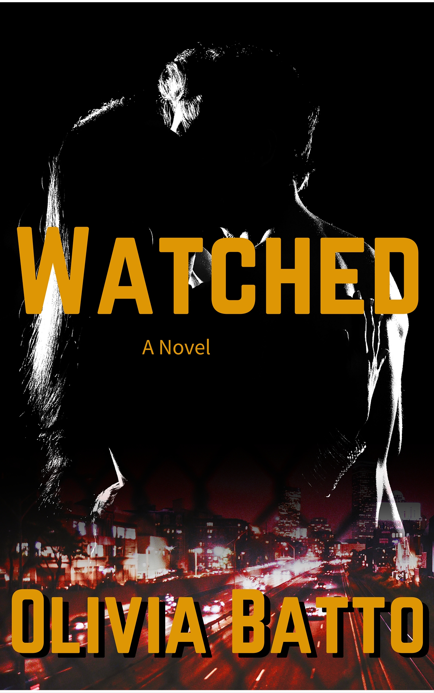
- The silhouettes are a little too black to be recognizable at thumbnail size; even at full size, it takes my brain an extra 3/4 of a second to identify what I’m seeing. Can you try adjusting the levels on the couple so that there’s a liiiittle more non-black to their shapes?
- I think there’s a bit of a clash between the monochrome top half and the full color/red-heavy bottom half. Maybe adding a subtle blue tint to the top would work.
- Sitting right over the two brightest areas of the couple image, the “W” and “D” of the title are hard to read in the thumbnail. It’s possible that adding the blue tint would solve this, but in case it doesn’t, consider adding a diffuse drop shadow (it doesn’t have to be nearly as strong as the one on the byline).
- There’s gotta be some other font you can use for “A Novel.”
- Watch your kerning. The “A” on your main font seems especially problematic — note the extra space to both sides of it in “Watched,” and the gap between the A and T in “Batto.”
Good work! Other ideas?