Category: Covers

Analog

The author says:

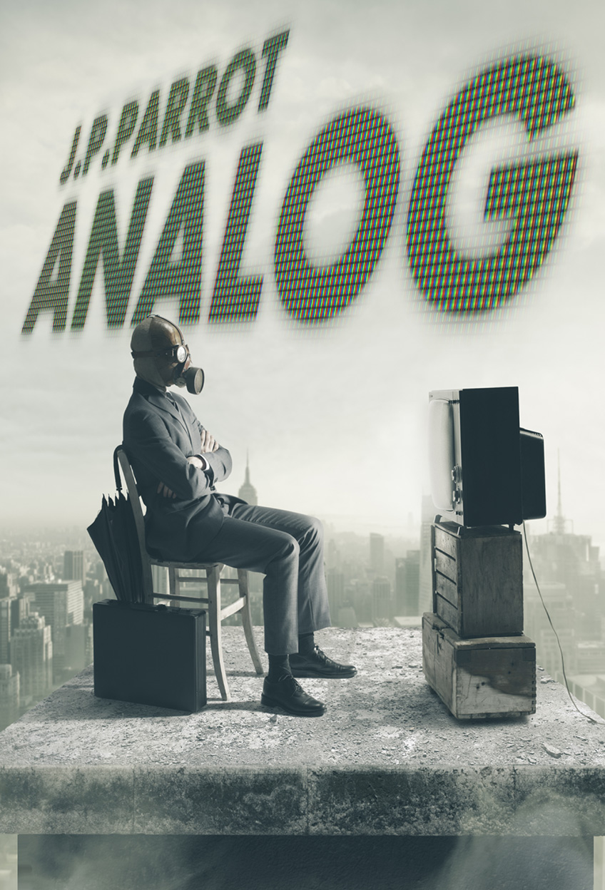
The Internet suddenly disappears. Now a systems analyst from a dying newspaper, a clueless gamer and two hipsters are all that stand in the way of anarchy in this comical adventure. Targeted to YOUNG ADULT/ADVENTURE genres.

cover

cover

Nathan says:

This’ll be short, because I love it.

My only concern is that there’s nothing about it that suggests “comic adventure” — and given how grim most post-apocalyptic dystopian YA yarns are (leavened only by some rebellious teen romance, naturally), I think that would be a great selling point.

I know that in DVD marketing, a big red title against a white/off-white background immediately means “comedy” to most people.  That trend doesn’t seem to be nearly as prevalent in book publishing, but it’s still worth a try; what if the CRT letters of the title (and I love that element, by the way) were red?  That would also help the cover “pop” at thumbnail size.

(Part of me also wants to see a bowl of popcorn on the man’s lap, but changing that photo composition is probably out of the question.)

So, specific suggestions sought: How to play up the comic elements of the novel?

Surrender: Innocent in Africa

The author says:

Contemporary romantic suspense set in Africa. Will appeal to readers of JA Huss and Alessandra Torre. Falling for my hot billionaire boss and his hunky Black lover should have been enough trouble, but the bad guys struck again. They took Kane and his fate was up to me. Unless I returned to my captors, our threesome might remain incomplete — permanently. The deeper I went into the mystery of West’s business in Africa, the more I feared the truth. Did he really care about me, or was he using me in his dangerous game? Did the two of them want me as much as I hoped, or would they send me home if I made another mistake? And could I remain untouched through a second abduction? This is the third and final episode of the Billionaire First Boss Menage Suspense serial.

Surrender luma 8

Surrender luma 8

Nathan says:

So even though this is the third of a series, I’m not going to take into account any branding continuity from the two preceding volumes.  If we come up with good design ideas here, you can reserve-engineer it for the earlier books in the series.

The thing with billionaire romance novels (and now we’re already deep into a sentence that I never thought I’d type) is that there are so many of them.  I can’t look at a “free books” or “books on special” bulletin without seeing at least one.  That means that, in a glut, your cover needs to stand out, or at least hold its own.  Here’s how I see them doing it:

  1. Color.  Not just a color, but vibrant technicolor — deep, rich hues.  I don’t think that the monochrome photo with red type you have here competes.  The only place on your cover where color comes to the forefront is where you have, confusingly, three faces overlapping for no discernible reason.  Confusion isn’t hawt.
  2. Romance.  Just about all of them have some incontrovertibly romantic imagery, and some of them eschew any subtlety altogether.  Compare that to yours; yes, there’s a shirtless hawt guy, but he’s just standing outside.  There are no dramatic shadows, no deep skin tones (except, again, in the confusing overlap of faces).
  3. Fonts.  I suppose that stencil fonts might work in a military-themed romance (if supported by the other elements above), nothing about your description suggests that stencil fonts might be appropriate to this story.  And the handdrawn font below it absolutely needs to go. (While we’re at it, dividing the title and subtitle with the byline is a really bad idea.)
  4. Sub-genres.  We’ve all seen them: romance novels which don’t just divide themselves into Regency or contemporary or paranormal or romantic suspense, but super-granulated sub-sub-genres: “Taken by the Alpha Billionaire Shifter, A BBW Polyamory Pregnancy Mindswap Romance.” I think the reason behind this (well, the most defensible reason) is that, in picturing sex, readers are very definite in who they want to imagine humping who.  Your description mentions a black lover, and the whole thing’s set in Africa; do you think you should maybe include a black person somewhere?

Sorry if this seems overly negative, but as I said, the subgenre you’ve chosen is one in which readers have no shortage of reading options.  Is your cover going to grab the attention of the appropriate reader, versus the five or six other covers that reader will see at the same time at the bottom of the Amazon page?

Other thoughts?

Spacelore

The author says:

Spacelore is a collection of sci-fi short stories, all with a common theme of space travel (in various ages, modes, etc.) It pays homage to the sci-fi paperbacks of the 1960s-70s (Ace, Pocket Books, etc.) The art is licensed, the layout is mine (author).

spacelore-cover-review-jpg

spacelore-cover-review-jpg

Nathan says:

I have no complaints about the artwork, obviously.  It’s good art, and a good choice.

You’ve also chosen a good typeface for your title — stylized, but readable.  I think having the publishing company logo up in the left corner, and nudging the title over because of that, calls to mind comic books more than paperbacks; I’d extend the title across the top, then place the logo either on the right under the title or in one of the bottom corners.

I think you miss a bet by not using the same font for the byline. Center it, enlarge it, and let the world know you wrote it.

I also think that a short description — “Stories of Space Travel” or something” — would not be amiss.  Most readers assume that a book sporting nothing but a title and a byline is a novel; you should correct that from the get-go.

Good work!  Any other comments?

Amongst Other Things

The author says:

A young servant spends her time tending house chores and garden maintenances. Amongst Other Things she’s done this her entire life. The big time business man who owns the house takes a sudden interest in the young woman and a new life begins there for them both.

Amongst Other Things

Amongst Other Things

Nathan says:

So… it’s a romance?  Household servant meets businessman?

I can understand that you’re trying to go classier here than the average “Pursued By the Billionaire” romance cover, but you may have gone overboard.  There’s absolutely nothing on this cover to let potential readers of your novel that this is the kind of book they would enjoy reading.  If I were to guess by looking at the cover, I would assume that it’s a volume of poetry, or a collection of literary stories that someone published via a small press in order to impress the tenure committee.

Your book cover is the movie poster for your book. Treat it as such.


See Through You

The author says:

See Through You is a book for people on a spiritual path, searching for who they truly are. It’s a book that provides a practical guide to spiritual awakening, or in other words, discovering who you truly are.

Book 1 cover.indd

Book 1 cover.indd

Nathan says:

This is another cover where I’m not really the target audience, so all I can say is that something clashes for me between the two typefaces used; perhaps a cursive or italic font for the subtitle would work better.

Anyone else got anything?