The author says:
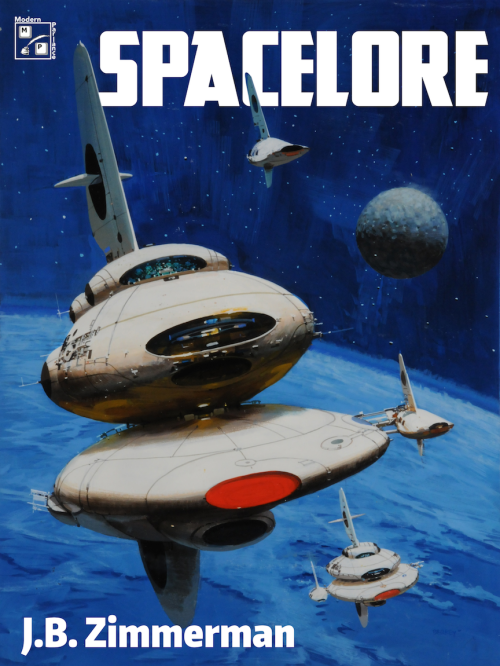
Spacelore is a collection of sci-fi short stories, all with a common theme of space travel (in various ages, modes, etc.) It pays homage to the sci-fi paperbacks of the 1960s-70s (Ace, Pocket Books, etc.) The art is licensed, the layout is mine (author).
Nathan says:
I have no complaints about the artwork, obviously. It’s good art, and a good choice.
You’ve also chosen a good typeface for your title — stylized, but readable. I think having the publishing company logo up in the left corner, and nudging the title over because of that, calls to mind comic books more than paperbacks; I’d extend the title across the top, then place the logo either on the right under the title or in one of the bottom corners.
I think you miss a bet by not using the same font for the byline. Center it, enlarge it, and let the world know you wrote it.
I also think that a short description — “Stories of Space Travel” or something” — would not be amiss. Most readers assume that a book sporting nothing but a title and a byline is a novel; you should correct that from the get-go.
Good work! Any other comments?


I disagree with Nathan about the byline font and size. I think it is readable at both scales so it’s no mystery who wrote the book and yet it is understated evoking the message that the book is the important thing and says something about the author. I find it attractive on a few levels.
Frankly, I wouldn’t change a thing other than perhaps following Nathan’s advice regarding the publisher’s insignia.
Nice job.
This feels a little dark to me. Can you change the levels on the ships to make it brighter and make them pop out more? It would increase the contrast and the effectiveness of the cover I believe.
I really like the artwork. As a sci-fi fan in his mid-40s, I know what it pays homage to.
The title font is good. It fits with the time period the artwork references. While Nathan makes a good point about moving the publisher’s icon so as to move over the title and enlarge it, I don’t think it’s a deal-breaker. But if you enlarge the title and center it, would you move the art so that the title doesn’t obscure the fin on the foremost (or is it the largest?) ship? I’d be curious about how the balance of the cover changes.
I’d have a look at that byline font. The size is good, but maybe if it matched the title font, it would be better.
Thanks all! Nathan: The pub logo in upper corner is part of what I’m aping, and more importantly, I couldn’t figure out how to center the title without breaking the shape of the large ship by overwriting the fin or blocking big chunks of the title word if I pushed it to the background. I tried it with the byline on the lower right to match, but it was too imbalanced. I also tried putting a neutral color block, matching as best I could, above the art for the title, but it was jarring and didn’t match.
I had a version with ‘A Short Story Collection by’ over the byline, maybe I’ll look at that again. The title page says that, and I plan to put it in the book description; I do take your point re: people expecting novel.
I used the different font because it felt too short/blocky in smaller size for the byline, but I’ll look at that again too. Waffles, many thanks, I hadn’t thought of that; I’ll see if my meager skills run to punching up the brightness on the ship hulls!
In any case, much appreciated, folks.
Or just ‘Short Stories.’ ‘Collection’ is a bit redundant.
Wow! It’s not often I see a cover needing only a few minor tweaks like this one. Indeed, it reminds me a lot of the covers of the science fiction books my father has in his lifetime collection (which runs from the late 1950s all the way up to the late 1990s). He probably would buy this too if he happened to come across a physical copy with this cover on it. (He’s not much into digital books.)
The minor tweaks:
1. Your title and byline are pretty effectively balanced, but in a Western market where we all read from left to right, it seems a little strange to have the title in the upper right corner and the byline in the lower left. The current layout should be fine for any translations you plan to sell in the Middle East (where written Arabic, Farsi, and Hebrew all run from right to left) or Asia (where the books are typically read from right to left), but I’d have the title and byline swap sides for all Western markets.
2. As Waffles notes, the picture’s a little dim. Some of the covers on my father’s novels look like that too, but only because they’ve had decades to fade since they were printed. Typically, as you’ll notice if you look at pictures from actual NASA expeditions, everything has a rather bright solar glare when viewed from space. Applying some gamma correction in a graphics editing program until the planet glows a vibrant sky blue and the space vessels glow a bright bleached white ought to up the contrast to appropriate levels without sacrificing the smooth color blending or the darkness of the space behind these objects.
3. By themselves, as Nathan notes, the title and byline suggest this to be a single story rather than a collection. A simple one-word description under the title such as “Collection” (if these stories are all yours) or “Anthology” (if these stories are collected from multiple authors and you’re the editor-as-author who brought them together in this volume) should be sufficient to clarify the contents to your readers.
Make those tweaks, and you’re good to go.
This rocks. I actually like the off-center title; I feel like I’ve seen that on old-school sci-fi before. I agree about adding a tagline, but other than that, I say don’t change a thing.