The author says:
I’m comfortable exposing yet another effort because the tone of this site is educational, not one where finding fault is the turn on. Much appreciated by all of us writers without funds and with minimal design sense. You make the world of writing a better place. Thanks.
[original submission and comments here and here]
Nathan says:
Aw, shucks. Thanks. We’re all happy to offer pre-publication advice and support — we save our snark for after a cover has been published to the world.
My first reaction — before any of the technical design stuff — is that, in looking at the three prospective covers, I really don’t know what to expect in your novel. I don’t know the tone, the mood. I know that it’s “literary,” whatever that means… but is it lighthearted? Leaden with awareness of the futility of existence? Postmortal existentialism? The three covers we’ve seen so far could each apply to one of those three, which would each appeal to different readers.
I’ve got several specific pointers about this cover (kerning, position of “A Novel,” etc.), but I feel like it would be rearranging deck chairs on… not the Titanic, but a boat that’s not going where you want it to go.
At this point, my advice would be to get a second pair of eyes. Find a reader with at least a cursory awareness of book marketing, have them read the book, and then ask, “What kind of cover would you expect to see on this?” If you want, show them each of the three covers you’ve shown us so far and find out which one best matches the mood or feel of the book. Then you’ll be able to dive into how best to design that cover to appeal to your prospective readers.
Best of luck.
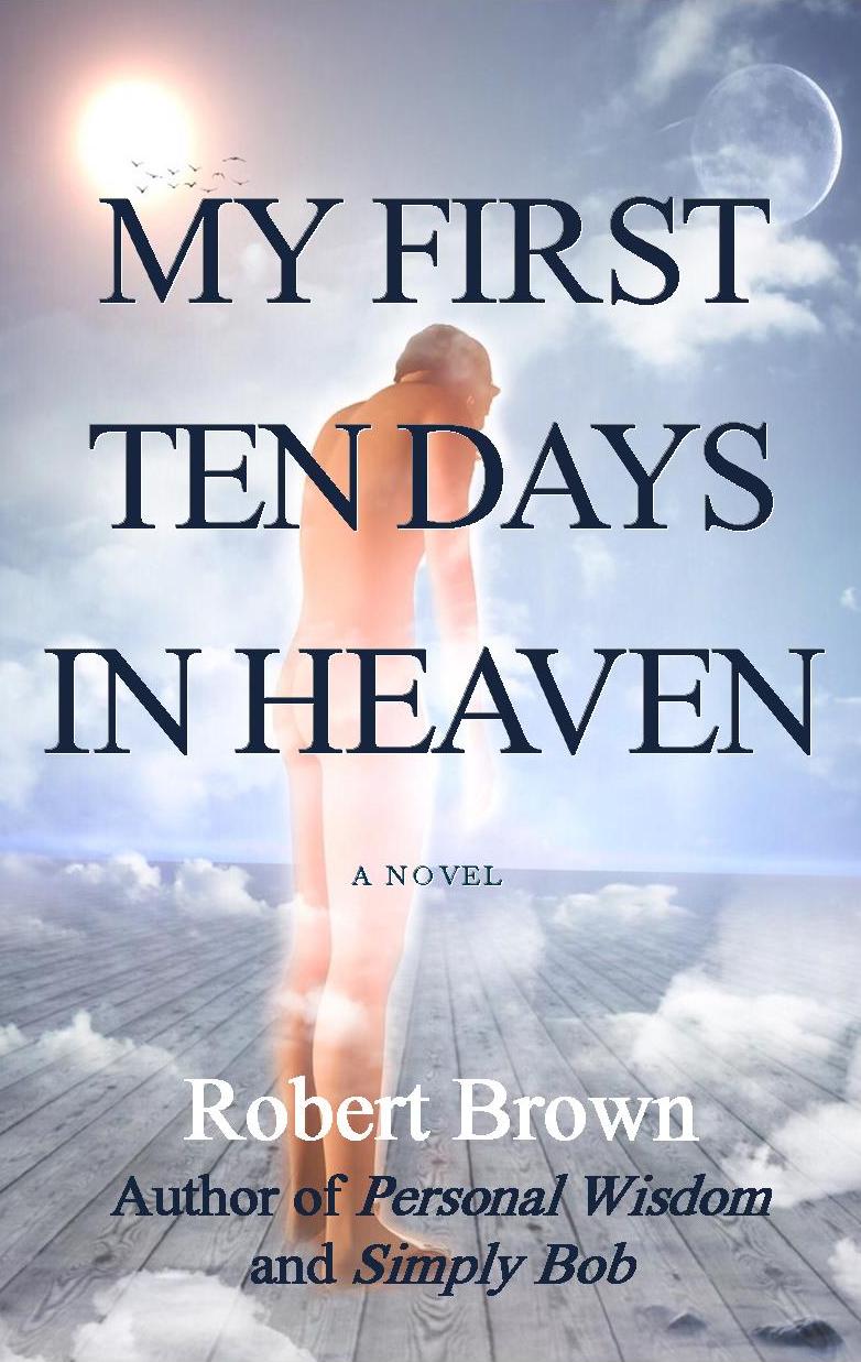
This cover at least is more attention-grabbing. It made me curious enough to linger.
Is the dude wearing a baseball cap? There’s a weird blip on the right of his head.
I think this is by far your best one, and it is much improved in terms of choice of image and color! I’m not sure it’s quite the ideal image to convey the feel of your book; looking at this my guess for the mood is… “weird, a little bit quirky and generally light-hearted”. You might be missing some of the melancholy that seemed important to the story.
I think maybe the title takes a bit too much space and makes it hard to see what’s going on beneath (…its placement is because nobody wants to see old man butt, right? haha). I just felt like there’s too much spacing between each line of the title – or it could be this font in particular, it feels a little bit slapped on. Author name is also hard to read since it’s small and pale. Re-reading Nathan’s comments, I realize I hadn’t even noticed the “A Novel” since it’s so tiny, sitting right on the horizon line.
So, good improvements, getting there (:
Definitely the best so far! I like the colors and overall mood. The figure looks a tad pseudohuman-y, but that’s less of a problem since the face isn’t shown, and it could probably be redone with more realistic textures. (I agree with the first comment that the head bump should be smoothed away.) The nudity might put off some people, but might also help distinguish this as a literary novel – i.e., readers who are looking for inspirational/Christian fiction frown and don’t pick this up, but literary readers aren’t as repelled.
Just a note: if you’re planning to sell on Amazon, the bare buttocks might cause Amazon to pull it down. (I know there are plenty of other books with violations of Amazon’s code, but they get pulled down if someone complains and then a human at Amazon looks at it. Although their review process is wildly inconsistent.)
If you go with this or a version of it for Amazon, I’d put heavy cloud cover under IN HEAVEN to obscure the buttocks.
Your moon is lit from the wrong side. the little bird things beneath the sun ‘feel’ like a mistake to me because it’s hard to see what they are. (adding a slight gradient as day darkens to night might be cool too)The plank beneath his feet feels very ‘off’ for Heaven. It’s to man-made. He should be standing on something natural or something supernatural. As others have said your font isn’t helping sell the book. I do like the colors, the glowing, the clouds but some type of hint as too type of book would be awesome too. Font can tell that by picking scary, funny, thriller, etc, types
I agree with others about the placement of “A Novel,” and other type. It’s distracting to see “Author of…” over the legs/feet. It could be smaller and try a condensed san serif. What if the figure was smaller, too?
I agree that this is definitely–by far–the best yet. I think that some of the suggested tweaks might help, (find a different substance for him to be standing upon; possibly make him smaller; increase the cloud cover over the butt, so you don’t have issues with Amazon) and the font really has to go.
So now, for the fonts: I and the others need to know more about the book. The feel that you want to go for, so that we can recommend fonts. I’m sorta thinking of a few angelic/heavenly fonts, but you might say that the feel is weighty–and then those fonts wouldn’t suit. So, can you throw us a bone? Give us a bit more to go on, for the fonts?
If nothing else: at the very least, use a tallish/narrow sans serif font for the title. Something like Steelfish–but with a bit more flair. Valentina might work. LHF Charlotte might–but it’s light. Might be too light for a cover. FontcalledCM might be a nice change-up. And let’s not forget TallDark and Handsome.
In serif, maybe LHF STETSON–that’s got some nice angles to it. Of course, because we’re talking heaven, Foglighten no3 would be something I’d definitely test. Good old Optimus Princeps. Good old Bauer Bodnieu. The last two are classics, so if you’re looking for a more-traditional literature look,those are both good, but I urge you to try out the others, too.
Can’t wait to see V4!!! 🙂
You’re still using Times New Roman. You don’t want your readers’ impression to be “the default on an old computer.”
Definitely the best so far. A vast improvement. With the font, I think you’re probably right to pick a classic serif font but like the others say TNR is too generic.
Additionally, I think you need a font that fills the space better – a taller font. It’s vital to manage that carefully as tall/thin fonts can easily become ‘creepy’ looking, more fit for a horror cover than a literary novel. And moreover you certainly don’t want to make the text less legible. But I’m thinking something like this:
http://www.dafont.com/sexsmith.font?text=FIRST+TEN+DAYS
http://www.dafont.com/ayres.font?text=FIRST+TEN+DAYS
Using a font like that, the top line of the title can be brought up to almost the top of the cover and the bottom of the text can sit a bit lower than where it is now (the horizon line should be lowered to accommodate as it does provide a nice divide in the cover.
I would move the ‘A NOVEL’ above or below the horizon line instead of sitting on it. Probably below it.
The figure is a little odd looking but it kinda works. Have you stretched the image upwards? He looks disproportionately tall and thin. His legs look too long for his torso. It could be a bit of an optical illusion in that he’ was drawn/photographed standing on a different plane from the one you have placed him on hereso the mismatch throws him off?
When re-placing the title text I would make sure the man’s head and neck fall fully into a gap between lines. Although this is a background image, and his back is turned so we intentionally don’t see much, it’s still important to be able to connect a bit with the figure and his mood (even if ambiguous) via a clear view of the head.
Finally, are you confident this cover is communicating the right tone? I don’t know, not having read the book. Maybe show it to a few people without telling them anything about the book and see what they guess to gauge whether you have pitched this right.
Oops didn’t mean that to be a reply to Katz’s comment!
I was just going to add that as food for thought re. imagery I” link tot two images similar to yours to highlight how they change the tone implicitly.
The man in your image has a weird stance that’s hard to place but that may be intentional. It certainly gives the cover a quirky/odd vibe. It’s hard to tell whether the man is swaying dizzily, looking at something on the floor/his feet or what. The oddness and awkwardness of the figure does play against the title and make it clear that this isn’t a po-faced spiritual book, so maybe that’s your aim.
But to make sure of your thinking it may help to look at these pics and think about what they communicate:
Using this image, for instance (probably cropping the doorway frame out) and pacing the man in the clouds, the book would feel more serious and epic,. The man’s stance is clearly strong and curious, if a bit wary: https://image.shutterstock.com/z/stock-photo-man-looking-into-white-light-about-to-start-a-journey-92396599.jpg
Meanwhile if you used this picture, the book would feel firmly surreal and funny: https://image.shutterstock.com/z/stock-photo-surreal-painting-naked-man-swims-in-the-sky-d-render-568231411.jpg
This has a pleasant mood. I think my suggestions would be to replace the wood floor with a solid cloud bank that fills the bottom portion of the image, and that the figure might look a little less solid at the extremities.
My font suggestion would be something humble like Adobe Caslon or maybe Mrs. Eaves, using upper and lower case. I agree that the “Author of” lines compete too much with the author’s name; they could be considerably smaller (and should use real italics instead of a slanted roman).
It is a good sketch to give to a designer, but it should be worked on in every detail.
Thank you for such a treasure chest of ideas and information. All of you are one step closer to Heaven. I will return to the drawing board fully armed. As a token of my appreciation, I’d be delighted to send a prepublication ebook to anyone who’d like one. On my website http://www.collwisdom.com, use the contact page to send your email address and what format you would like, note that you are a cover critic. Should be available in the fall. Thanks.
On the upside, this is getting closer to the kind of imagery that will attract your prospective readers. Like our host, I’m still not quite certain what exact mood you’re trying to convey here, but the genre and setting are a good deal more obvious with this draft than with your previous ones. At the very least, the stuff on this cover is looking a lot more like the Fluffy Cloud Heaven imagery I recommended to you back on your first draft.
Most of my gripes with this cover are in the details, and other critics here have already mentioned them. If a sun and moon could somehow be in the positions shown on this cover, the moon ought then to be lit on the other side; although frankly, they seem a bit of a distraction from the subject at hand, and you might just want to cut them out altogether. The planking underfoot is somewhat reminiscent of the serenity of being on a boardwalk at the beach on vacation, but not really what most people think of as Heavenly imagery; having clouds underfoot as some of my colleagues here have suggested might work, but if you can do the cutting and pasting and shadowing and anti-aliasing properly, you might also want to try for some bucolic grassy knolls like you might find in a rural setting or big flat rocks like the ones you might find at a lookout point on a mountainside.
Concerning the nudity… well, booksellers here in America (including even the rather finicky people of Smashwords) probably wouldn’t be too strict about censoring it in the case of some old guy’s rear end; standards do tend to vary from place to place, however. In the case of a television trailer for Waking Ned Devine, for instance, the censors rather preferred to black out the exposed backsides of a couple of wrinkly old fellows; not so much because it might arouse any unwholesome prurient interests in the audience, you understand, but because (undoubtedly like the vast majority of their viewers) they were probably asking themselves “Who’d want to see stuff like that on their televisions?” If you’re planning on marketing this worldwide on Amazon, therefore, I’d recommend clouding out the old man’s butt cheeks just a little more.
As for fonts, yes, you could do with something a bit flashier and more unique than Times New Roman. Others here have already made several recommendations, so try playing around with some of them and see if anything takes your fancy. Then bring it back here (we wouldn’t mind seeing a fourth draft) and see if it takes our fancy.
Bottom line: you’re getting where you’re trying to go, but you’re not quite there yet. Get a little “buy-in” (as corporate jargon puts it) on your cover and try showing your prospective cover to a friend or acquaintance who hasn’t read your story yet and see if he or she can guess what kind of story it is just from the picture (for best results, shown without the title and byline). The closer the guess is to the actual content, the closer you are to being ready to publish.