The author says:
A science fantasy series for children, The Plumseed Chronicles: Eternity’s Island takes place in a world of machines. Eternity’s Island focuses on a nameless girl who arrives on a drifting island with no memory of who she is. As she explores the island that is her home alongside her newly-adopted family and the sleepy village they live in, the girl soon discovers that something else far more dangerous and sinister followed her to this little island. Inspired by A Wrinkle in Time, Doctor Who, and The Golden Compass, The Plumseed Chronicles as a whole is intended for those who love stories that deal with scientific concepts played around with magic.
Nathan says:
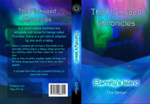
This is a competent (though not terribly exciting) cover markup, but it completely misses your target audience.
Let’s do some market research. I pulled up Amazon’s page for science fiction and fantasy, ages 9 – 12. These are the bestsellers:
Now, I’ll grant you that it’s very skewed toward name recognition; the only book on here that isn’t related to Harry Potter or Percy Jackson is Lois Lowry’s The Giver. But still, these are the books that your target audience already knows that they like. And how does that target audience expect books aimed at them to look?
- Big words, slightly ornate but still very readable
- Clear imagery, showing characters in adventurous situations (there are a couple that rely only on an iconic image, but they can do that because they’re Harry Potter books, and readers already recognize the owl or round-glasses-and-scar imagery; you don’t have that recognition)
Compare that to your cover: An unusual but sedate typeface (which is, by the way, completely wrong for your back-cover copy — that needs to be readable, readable, and readable), an abstracted pseudo-landscape in tones of blue, and — if you look really close — something that might be the main character:
This is not how the target audience for your book is accustomed to being marketed to. It will not snare the attention of the people whose attention you want to snare.
My advice, simply, is to start over.
(And semi-related: You want to give that back-cover copy another scrub. It’s ungainly, and some of the grammar is questionable at best.)
Other opinions?


I think the art is lovely. Possibly it could be salvaged with a larger title and some clearer delineation between which is the series and which is the book title, and a nice focal drawing of the protagonist.
Your colors are luscious. I might pick it up for a look just based on the colors. So I want to keep that palette while making the design more MG-friendly.
Unless this actually takes place in The Matrix, and it doesn’t seem to, replace that rendered-looking landscape with a more detailed, realistic-looking sci-fi island(I also detect some filtered-to-death layers in the background; lose those). Then put the girl in the foreground big enough for us to get a real look at her. It shouldn’t be hard to find stock images of a sci-fi landscape and a middle grade girl to work with.
A computery font is the right idea (for the title–not the back cover copy), but you can find a much jazzier one. Hitch has some good ideas, no doubt.
My first thought on seeing this cover was “Why, oh why couldn’t you have been the cover designer for this author’s book back in 2015?” Your cover is perfect… for that book, rather than this one. It’s a beautiful cover; just not a science fantasy for children cover.
If you want a good cover for your book, I particularly recommend looking to the covers for Madeleine L’Engle’s science fantasy for children A Wrinkle In Time (which you cited) for inspiration. This cover has a similarly colorful scheme, while offering a somewhat more detailed layout of the sort your book needs. As with the intriguing oddities of her cover (a rainbow-winged centaur and floating green head with red eyes?), your cover needs to have some intriguing oddities from your story on it too.
What do those machines and Divinities and that floating island (to name just a few possibilities) look like? Curious prospective readers would probably like to know. Unless they look exactly like auroras and an old Nintendo-64-generated landscape, this isn’t really the way to portray them on your cover. (Granted, if your story ends with the girl discovering she’s inside a huge video game/computer simulation, it might make sense to keep that landscape.) Children like pictures of what’s in the books they’re reading (or having read to them), so give them a few on the cover to help spark their imaginations.
Everything is very pretty…but at the same time very bland—in spite of the nice colors. I think this is largely due to the fact that the figure is simply lost: it is much too small to have anything like the impact it should have. (It’s difficult enough to see as is, and is invisible at thumbnail size.) The result is that there is really nothing at all interesting or important for the eye to go to—certainly not anything that tells the potential reader anything about the book or its themes. The first thing I would do would be to increase the size of the figure by at least 200%, if not more.
The typography is another real issue, but Nathan has already made some suggestions along those lines.
I don’t think it should be scrapped completely, but the figure is definitely too small. Make her bigger, and have her do something. There’s nothing exciting about someone just standing there.
I like the scenery. It could be perhaps improved with a few more details, but I like it. The font could be better, and yes, the series name should be smaller than the book title (only well-known series could really profit from the series name being bigger). And the glow under the title impacts the readability in the thumbnail, but even the series name is just slightly more visible. You might want to try a fuller font at a different color, maybe gold or copper. They might go well with blue, and they’re colors often used on MG books, as you can see from Nathan’s example.
I disagree – it should be scrapped completely. It is a very nice picture, but it does not fit – and it lacks the certain something that sets apart professionally finished work from amateur; even if the amateur work was artistically speaking better than one a pro hack has thrown together in an afternoon, there is that certain finished, sealed and lacquered look that comes with experience (I guess?) that looks good on graphic design. This still looks a bit unfinished. As earlier pointed out, this also lacks interest: it merely has pretty colours, but the tiny figure lacks any personality and the picture is otherwise very static.
As for the font, even if your book is scifi, something a bit more fantasy might be in order: this is more fitting hard scifi than something that your blurb describes. Fantasy is also the plat du jour of YA literature at the moment, so softening the sci- edge of scifi would likely be more appealing to readers.
I agree with this. I don’t know how to explain it, or what causes it, but I concur–there’s something “not professional” about it. I don’t mean it’s godawful–I don’t. But I, too, noted that there’s simply something…missing.
One of the pros here probably can point to exactly what that is. I think that the colors could be used, certainly, but..anyone have an idea what that “what” is?
AND, we need some fonty-goodness here, too.
I can’t tell, from your description, whether this is more fantasy or more sci-fi. That’s a pretty big gap, there. If it’s more sci-fi (more Doctor Who, less Golden Compass) then a font like STARCRAFT from Pixel Sagas might be just right. There’s a relatively new font from Iconian fonts called Domino Jack that might be nearly perfect, again, if it’s heavy on the sci-fi.
If it’s more GC/Harry Potter than sci-fi, that presents differently. The world is not short of fantasy-type fonts widely used–Calligraphic fonts, and others. The tendency is to use what you’d call “Elvish” fonts, or Medieval. That’s a bit tired. Then you have the script fonts, or brush fonts, which are absolutely everywhere, from MightyDeals to TheHungryJpeg, and so on and so on.
You need to look for some alternatives, like QUMPELLKANO12. It’s not the end-all, be-all, but at least it has some weight, so that you can get it to stand out on a cover. I also rather like some of the Kingthings fonts–and you can mix-match a number of them, to get a different look. Not Gothique; with that background, using that font would be a disaster. (I confess it–that’s another font I’m dying to find just the right book for…). Gondola is nice, IF you can make the lettering large enough to work. Yellow Magician is not often used–that’s one to take a hard look at, if your work is more fantasy than sci-fi.
Maybe Kirsty Bold–but I tend to think not. Trocchi, perhaps. Zantroke.
I’d need to know more about the book, but some combination of those ought to work.
The rear cover? Use a SIMPLE, readable font. I think it’s very hard to make that back cover work, the way it is. You should consider using a light-colored panel, to make it easier to read. I’d use either a very clean serif–that’s traditional–or a simple sans. Ditto–stick with traditional fonts.
I hope that helps. I know, all too well, the issue with trying to get text to work on a middling-dark cover. You might have more like with a very light yellow or even a pint, against those swirls of color. Remember–no spindly fonts, use a heavier font so that it can be READ before they go to the book page itself. That matters.
Good luck to you.