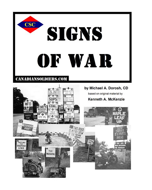
At Fault

The author says:

The United States is literally tearing apart. Advances in laser drilling technology have made drilling for oil much cheaper, and energy companies are pumping the life out of the earth in Colorado. Peter searches for the cause of the increasingly strong earthquakes. Will he be able to find out what–or who–is responsible before it’s too late?

Nathan says:

Nicely done, and a solid visual concept, except that the starscape dominating the cover may give the impression that it’s set in space (or, conversely, that it’s meant to appeal to readers of The Fault In Our Stars).

Other than that, I have no comments.  Anyone else?


Passion pleasure prejudice & pain.

The author says:

A guide to Chinese ladies, marriage, sex, culture, love, dating and living in China. The book reflects the opinions of the author and has been influenced by the opinions of some of his friends and trusted acquaintances. It is a genuine attempt to inform and help those people preparing for a serious relationship with a Chinese lady. Generalization has been necessary as no one example fits all. There are many underlying messages herein and the purpose of the book is to educate or inform as many people as possible.

Nathan says:

Um… Okay.

First up, whenever you put the words “pleasure” and “pain” in proximity, the inference drawn is overwhelmingly one of masochism.

Second, the dissociated facial features seems an awful lot like objectification — which is a bad thing.

Third, when you’re giving advice to men about saving money with foreign women… that sounds like prostitution.

Fourth, the way you’ve got the title fit in and around the photos makes it seem like an afterthought.

Fifth, having “Passion pleasure” right beside each other without any punctuation is just plain wrong.

Sixth, the two fonts chosen seem to have been whatever was on your computer at the time.

Seventh, half of the facial feature photos are of visibly poor resolution, and one (the nose) also has been stretched out of proportion.

I’m sorry, but there’s no part of this cover that doesn’t fail, and fail hard.  You would be much better off turning this over to a for-real cover designer.

Digital Tart [resubmit]

The author says:

Title: Digital Tart Resubmit – started again from scratch. I re-wrote the description as well.

Genre: Science Fiction/Adventure

Setting: Near future

Clare Farral is in a cushy job, out of her stinking subsistence apartment, coaching the fledgling artificial intelligence of the DigiTart chat service. When she gets a psycho-caller laying the groundwork for the next cyberwar, new opportunities arise – a promotion to troubleshooter, a dodgy employee to check out, the chance at the latest in digital implants, and more trouble than she could have imagined, with only her wits to keep her one step ahead of getting killed. Lianne Medway, an enhanced police officer, investigating the murder of her old partner, is gunned down in what should have been the safety of a police barracks. On light duties, bereft of her powered armour, she pursues a lead and comes up against the ruthless Digital Tart. She knows she’s on the right track – people keep trying to kill her with ever-heavier weapons. The two women converge on the same target, unaware that he is a brutal mercenary employed by the Digital Tart. Their only chance is to decipher the puzzle, avoid getting shot and outsmart a trained killer.

[original submissions and comments here]

Nathan says:

While the specifics of any critique of this cover are different from those on the previous iteration, your reach still exceeds your grasp by a significant degree.  There are things here that are so wrong that an experienced designer would have trouble explaining why they’re wrong, because he would have internalized it to the degree that it becomes unconscious instinct:  the busyness of the background, the way the silhouette becomes absorbed into the skyline at thumbnail size, the too-small font sizes and the type treatment (especially on the byline) that is an impediment to reading…

I think you need to realize that cover design is a specific skill beyond the ability to operate PhotoShop, and that your book will be better off if someone with that specific skill creates your cover.  This is not an admission of failure, but an awareness of the role of expertise.  Just as you would not expect a cover designer to be able to write a compelling novel because of his track record in cover design, you should not expect to be able to design a good cover for your novel just because you wrote the novel.

Sorry, but it’s the truth.

The Seed of Joy

The author says:

A naive young American named Paul Harkin would do just about anything to escape the tedium of his home town, Lafayette, Indiana — including signing up for a stint overseas in the United States Peace Corps. His assignment serves up more than he ever expected. South Korea in 1979 is a hotbed of political turmoil, with student protesters going head-to-head with government riot police. He tries to stay above the fray. But when he falls in love with Han Mi Jin, a troubled pro-democracy activist, all bets are off. He defies the Peace Corps, the US government, and the Korean martial law authorities to take up her cause. When they become embroiled in the bloody Kwangju Uprising of May, 1980, in which nearly 2,000 people were killed by government troops, they risk losing everything.

Nathan says:

I’m sure that this cover will seem fitting to anyone who has read the novel, but that’s attacking it from the wrong end.  What can we put on this cover that will draw in the target reader?  There’s plenty of drama and conflict in your description, so how can we indicate this on the cover?  The silhouette of a couple embracing over a sea of upraised fists, maybe?

I’ll let other commenters do the heavy lifting of providing more suggestions.

Zombieclypse Volume 1 [resubmit]

The author says:

I fiddled some more with the cover and hope I made some improvements using the critique given. 😉

[original submission and comments here]

Nathan says:

You did indeed, and the improvement definitely shows.  There’s still room for more, though.

I was uncertain last time if “Zombieclypse” could easily fit on one line; you’ve demonstrated that it doesn’t, not without compressing the letters to the point that you sacrifice readability. I think one of my suggestions last time just got stronger: put the title on an angle, high on the left and low on the right.  I would also put a slight dark glow or drop shadow around the title; with the font so textured against a background so textured, the text blends dangerously into the background.

Other notes: The spaces between the letters in the series description are so minimal that the words run together.  Especially in all-caps, you need to make sure the words are distinct — if you need to, double-space between them.

And there should be a space after the period in the byline.

I think we’re close to a winner here! Other comments?