The author says:
The United States is literally tearing apart. Advances in laser drilling technology have made drilling for oil much cheaper, and energy companies are pumping the life out of the earth in Colorado. Peter searches for the cause of the increasingly strong earthquakes. Will he be able to find out what–or who–is responsible before it’s too late?
Nathan says:
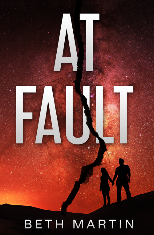
Nicely done, and a solid visual concept, except that the starscape dominating the cover may give the impression that it’s set in space (or, conversely, that it’s meant to appeal to readers of The Fault In Our Stars).
Other than that, I have no comments. Anyone else?


I’d try pulling the picture and text apart at the fault line and perhaps mis-aligning them vertically a little bit (not a vast amount), instead of just putting the fault line down on top. I think it’d give the cover a bit more of an unsettling feel.
I sort of also want a more dynamic font for the title, but that would depend on the feel of the book–is this an action-filled story, or more of a slow-build suspense, or a mystery?
Well, it’s a good cover for a book, but is it the right cover for this book? My first guess from seeing a crack across a picture of a romantic-looking couple holding hands under a starry sky is that this was some kind of legal drama about a couple having a messy divorce battle in court (due to the “breaking” of their romance leading to a broken marriage as well). If you’re doing a story about earthquakes, the crack is fine, but I’d recommend the picture under it be of an oil rig, or of Colorado, or of anything else directly related to the subject at hand in the story. At Fault sounds a bit like a divorce court term as well (as in “at-fault” divorce instead of “no-fault” divorce); maybe Faulty Premise or Faulty Foundation would help emphasize that this story is about a fault in the land specifically.
What RK said. My reaction to it was the same.
I’m thirding RK and Appledore’s comment–the handholding couple imply that it’s a divorce or romantic drama. Any chance you could change up the silhouettes, to divorce the cover from that connotation? (Yup, I said that and went there. Couldn’t resist.)
I kinda like Augusta’s suggestion, too. Because of the visual strength of the cover, I don’t feel that the font needs to be changed up, even though I, too, prefer stronger fonts, typically.
I would, though, see if you could remove the romance-story aspect, by swapping out the silhouettes for someone else. Peter doesn’t need a woman on the cover, given your description, so perhaps just a man’s silhouette. Although you may need more bodies, for balance..perhaps a group of people? Without playing with it, I can’t say for sure.
HOWEVER, I do want to emphasize–overall, it’s a good, strong cover. Nice work!
This looks amazing. I wouldn’t fault you if you wanted to keep it as-is.
But everyone is right that, as good as it looks, it might not be ideal for this book. I think you can do rather specific surgery. Keep the typography and the fault, but put it on some kind of distressed earth-textured background. That might be fine on its own. Then, if you want to add some people, put in a man and a woman running holding hands, or something else with some thriller action.
Nice idea nicely done. But I do have to agree with Nathan that the starry sky is misleading. A landscape of some sort would be much more appropriate—even more so if the image contained something relating to drilling. There would also be less danger of the black fracture being lost against a dark background, which occurs now, especially in the upper third of the cover. The figures, too, seem inappropriately calm for the kind of story you are describing. They look like a pair of lovers admiring a beautiful night sky.
Why not a satellite view of the United States, with that giant fracture down the middle? Too on-the-nose?