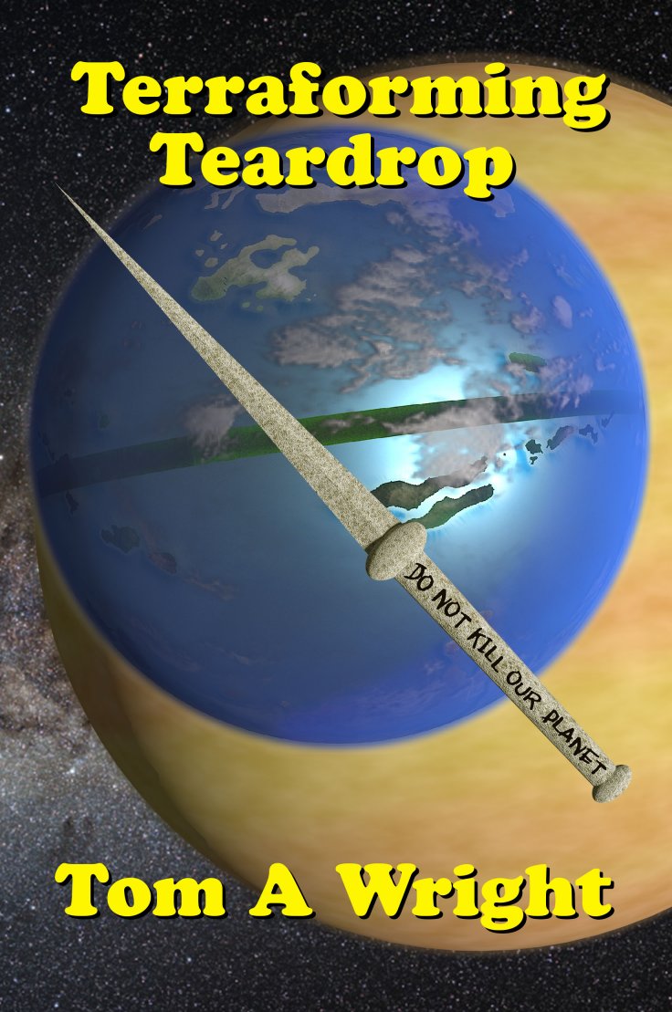
The Green Book

The author says:

This work book accompanies our Can Cubs sessions and is a great way to review some of the content from class. Alternatively, it can aid kindergartens and home learning too! This workbook covers 10 different topics/themes, they include:
On the farm
Autumn I’m a little teapot
Old King Cole
Pirates
Circus
Jungle
Manners
Five senses
Shapes
Read | Talk | Solve | Write | Colour Together!

Nathan says:

I know that Comic Sans is a very readable font for young readers, and teachers have an inordinate fondness of it. But isn’t there some other handdrawn font you can use that doesn’t give adults hives?  Especially when you use it for everything…  (Maybe using a handdrawn font for the words that you’d expect preschoolers to read, and a different for for other text, such as “Preshoolers workbook.”) (By the way, is there a reason that “workbook” isn’t capitalized?)

The placement of the type doesn’t seem to have any awareness of the picture it covers. I didn’t realize that there was a person in the foreground holding the map until waaay too long.  If you’re not going to make the person visible, just excise the person and map, and move the pirate ship up so the grays bands behind the text don’t do it violence.

Speaking of those gray bars: I understand they can make the text more readable for young readers by isolating the letters from the cover image. Hover, there’s not enough difference in luminosity between the gray and the green of the word “Green” — the word becomes unreadable.

Other comments?


Legend of the Dark Star: Year One

The author says:

Lord of the Rootshire Province comes into the possession of a powerful relic: A masterpiece runeblade, capable of taking down armies with ease. He embarks on a mission with an Archmage and a Royal Protector on his side, to disenchant the runeblade little by little until it is weakened enough to be destroyed. Along the way, he obtains the only thing capable of countering the weapon’s powers: an Armor specifically created to battle against the weapon. With both the target and the contingency in his possession, the Lord continues his journey, gathering a group of misfits who fit in quite well.

Nathan says:

Nice art. But every decision you made after that diminishes its impact.

  1. There’s no point to having the dark bar across the top — it just takes up space and gives nothing back.  You should use the space the artist left up there to present the title at a size that it’s readable. (Honestly, I saw the text at the top, thought it was just a series title, and searched the rest of the cover for the actual book title before realizing that that was it.) Emphasize it.
  2. Too many fonts, and of the three you have, only the one used for the byline is even close to right for the genre. The italic font especially is both too gentle and too unreadable for the use you put it to.
  3. The random distribution of unneeded text is a bad decision, too.
  4. And none of those chunks of text is needed, anyway.  The top two don’t do anything to entice the reader, and the pullquote is both counterproductive (“starts slow” is NEVER a good thing to put on the cover) and unimpressive, since even a Google search didn’t tell me immediately who Dr. M.Z. Miah is and why his/her opinion should be persuasive.

The point of a book cover is to catch the attention of the target audience and get them to read the description, either on the back cover or on the sales page. That’s all. As a frequent contributor summarizes it, your cover is clickbait. Ditch the extra text and let your cover be the artwork, the title, and the byline. Put the title in a large, bold, readable typeface appropriate to the genre and let the cover do its work.

Other comments?

The Nerd, the Baby, and the Toothbrush

The author says:

This cover is done and ready for publication.

Genre: Young Adult

Target Audience: Teens and young adults

Synopsis: Blake is the biggest — and most hated — nerd in Rosewood. Not only is his only friend his pet beagle, but there’s a holiday centered around his demise. Meanwhile, his older brother Phoenix is fighting to keep his cool after his lifelong rival steals away Keira, the mother of his would-be firstborn. Their only refuge is Mirallegra, a city where miracles are brought to fruition. Blake is eager to start fresh in a city where no one knows his name, but is horrified when he meets someone who knows his past. In the meantime, Phoenix resumes his previous work as a “piano tutor,” leaving debauchery and destruction in his wake.

Nathan says:

I… cannot figure out from your synopsis what the book is.  Is is some kind of magic realism/urban fantasy?  Humorous, maybe?  Or just plain weird? What “past” does a big nerd have to be horrified about?  How did “debauchery” get into this?

Given that I have absolutely no idea who this novel would really appeal to, I have no complaints about the cover, I guess.  Which is okay, because by saying, “This cover is done and ready for publication,” you’re pretty much saying that you’re not looking for constructive criticism for another draft.


Cultivating a Natural State of Mind

The author says:

Non-fiction – This book is about consciousness and happiness. It follows the trail from smiles, through peak experiences, entheogens, and cultivating a natural state of mind through a meditative, playful attitude.

Nathan says:

I have no problems with it as such, but I wonder if using a hand-drawn, cursive typeface — or even actual cursive writing, not generated by font — for at least part of the next might be an improvement.

Comments?

Business Writing Tips

The author says:

170 practical tips for how to do office writing jobs with ease, speed and style. For small businesses, less experienced writers, and non-native English speakers. Business/Reference book.

Nathan says:

I think it needs just a little more “punchy” — it could be as simple as reversing the font color and background for the “170 Punchy Tips” circle.

Other comments?