The author says:
What would it take for you to discard everything you believed in and give up your sacred honor? What would it take to make you rise up and fight when all the odds are against you?
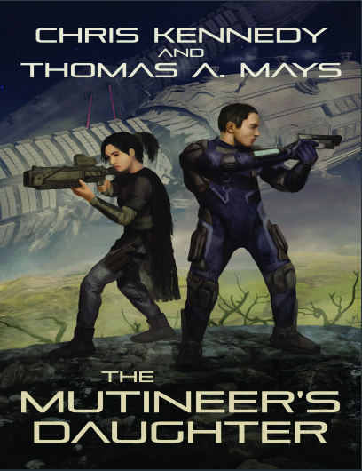
Chief Warrant Officer Benjamin “Benno” Sanchez has devoted over 20 years of his life to the Alliance of Liberated Systems’ Navy, defending his colony world from the continued encroachment of the Terran Union. His young daughter has been virtually orphaned for years, but his time away is coming to an end. His debts are paid, their lives and prospects have been secured, and he will soon achieve his dreams of freedom and a better life for his child.
On Adelaide, fourteen-year-old Mio Sanchez chafes at the limitations placed upon her. With her father away and her mother long since passed, she struggles with an indifferent foster family, too young, too poor, too female to be taken seriously. She yearns to leave her simple life and join her father in the Alliance Navy…or be anywhere but Adelaide.
Now, with all-out war underway, Benno’s devotion and sacrifice have been betrayed—Adelaide has been invaded, and his Mio is under threat by the implacable Terran forces. And the aristocrats of the Alliance plan to do…nothing. Benno must now make a choice: Honor his oath and leave his daughter’s fate to chance…Or do the unthinkable and rise up in mutiny against his own. And on Adelaide, Mio must also make a choice: Keep her head down and survive…Or fight against the invaders and endure hardships, horrors, and dangers far beyond what a “just a girl” is prepared for. Sacrifices must be made…but how far will a father and daughter go to be reunited?
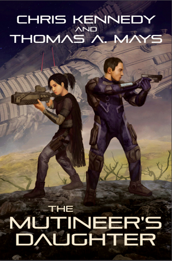
Nathan says:
This one just begs for a five-minute redo, because it’s sooo close.
The two problems:
- The art is visibly stretched horizontally.
- The colors and contrast are muted.
I also think that the type could be stronger and thicker, especially for the title.
So here’s the five-minute redo:
 (more like 90 seconds, because I didn’t try to modify the type.)
Other comments?