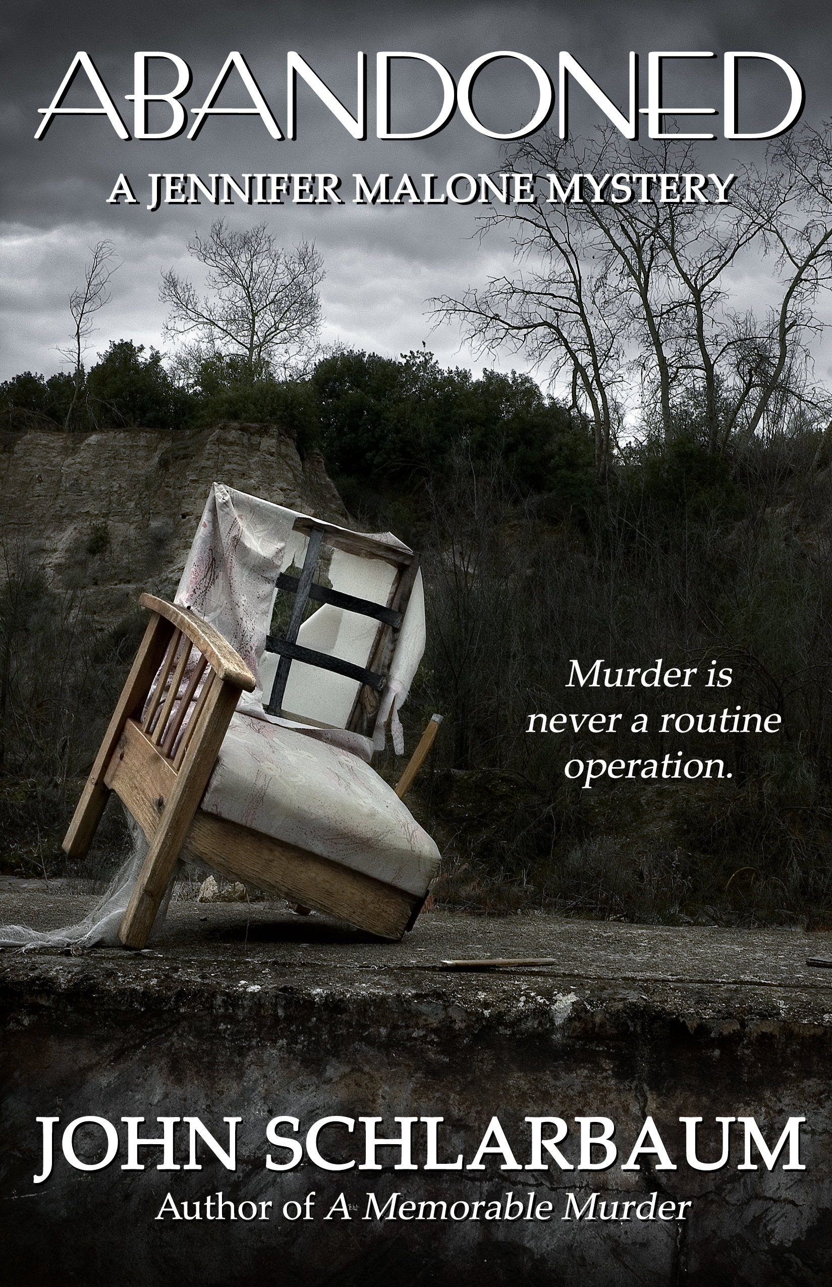
The author says:
This is the published cover for this Murder Mystery featuring investigative newspaper reporter Jennifer Malone.
“Don’t let them kill me.” These are the first words spoken by elderly patient Helga Klemens to the transporter arriving to take her down for a simple hip surgery. Luke assures the frightened woman no one is going to harm her, chalking the bizarre declaration up to nerves and medication issues. After safely delivering her to the O.R., Luke’s final words to Helga are, “Don’t worry. You’ll be fine,” unaware she will be dead within the hour. On the same Sunday afternoon, newspaper reporter Jennifer Malone is looking into the case of a John Doe residing in the hospital’s morgue. Once her interview with the coroner is complete, Jennifer is stopped by a distraught Luke and his security guard girlfriend, Maryanne, who are both shocked at the news of Helga’s untimely death. Over the following five fast-paced days, Jennifer will use all of her investigative skills to determine exactly what happened in the O.R. However, when a second unidentified body washes ashore, Jennifer’s attention is sidetracked wondering if there’s a serial killer on the loose. Could the three seemingly unrelated deaths be linked?
Nathan says:
It’s a striking image, but I’m not sure it’s conveying “mystery novel.” You’ve got at least part of the novel set in a hospital, and part of it is about a body that washes up — both would seem to me to be evocative visuals more conducive to “murder mystery” than a chair (even an ominous chair).
Also: If the title were in a taller font, the letters would be bigger and easier to read in thumbnail.
Other comments?
Hmmm… Yes, that’s a decent image for some kind of mystery novel, but not necessarily a murder mystery novel, or this murder mystery novel. An aged and abandoned chair (unless it has blood stains on it or something) suggests more of a “find the hidden and long-forgotten treasure” mystery or “discovering how a whole family very suddenly vanished without notice from a spooky old mansion decades ago” mystery. You want a cover for a murder mystery, you generally either have to show bloodstains, a corpse, or both on the cover.
Since it sounds like the serial killer (assuming there is one) isn’t the messy kind who’d go leaving bloodstains on things, your best bet would probably be some kind of “dead hand” shot either in the hospital where the “unfortunate” deaths occurred (in the morgue or on the operating table), or at the beach where that corpse washed up. Yes, showing somebody’s limp hand is getting a bit cliched at this point, but the reason people still use that kind of image on covers and posters to this day is because it works. Don’t be too concerned about originality to use an old tried-and-true trope like that, or like the common “toe tag on the recently deceased at the morgue” variation.
It’s a very nice, very evocative image, but…
I think it might behoove you to take better advantage of the novel’s hospital setting—especially since that sets it apart from the run-of-the-mill mystery. For instance, the present cover might have worked if the image had been of a wheelchair or gurney. The tagline would also then be more appropriate, too.
But you would still be only halfway there. I would make especially sure that the image includes some element that suggests murder or death.This does not necessarily have to be anything either obvious or blatant…but it does need to be something that pushes the cover fully into the realm of murder mystery.
Whatever you do, try not to repeat the one thing about the current cover that bothered me most: crowding the title into the top. Allow yourself plenty of space and take full advantage of it.
Maybe something more abstract like this
https://imgur.com/a/rrDoX
(excuse my crappy handprint…lol, this is just a quick mock up of an idea)
A pool of blood in a hospital, or just a pool of blood, would be eye catching. Looking at the thumbnail, (focusing on the title) I noticed that the whole of it is something of a monotone. It just doesn’t catch the attention. A splash of bright red in a similarly monotone coloring— whether beach or hospital— would be attention grabbing. Also, the title font feels delicate and not murderous. It’s thin. But if you make it thicker, it may have to be smaller to fit, so … is there a thicker, taller hard-edged font available?
Something like this perhaps?
https://i.imgur.com/v5ug4A2.png
That’s the kind of imagery I had in mind, though one generally shouldn’t layer in floating heads on book covers like that; either make the creepy guy in the medical mask part of the cadaver-in-the-morgue scene, or leave him out.
Oops
Maybe a splash of red or a different font could make a huge difference.
Something along these lines, perhaps.
https://i.imgur.com/3IKSFVd.png
My comment about the title font is that it has a definite Art Deco feel–that’s going to convey a sense–which will not be corrected by the cover image, as is–that this takes place in the 1930s. Is that the intended time frame? It’s also not contradicted by the slab serif byline font.
If it’s intended to be current day, then the font is misleading. And, even were it not, the font is realistically too fine, too thin for the purpose. It doesn’t show up well in the thumbnail, and you must never forget that most people will only ever see your cover in thumbnail. Not in full size. Every author envisions their cover full-size (actually–they all envision their covers on an IMAX screen), and forego the necessity of staring at their cover in a thumbnail.
I agree with the others, that you have not made best use of the hospital setting, and have not clearly conveyed the murder-mystery concept in the imagery. The image is striking, but…not necessarily the best image for this cover. In fact, it’s really all wrong. But the font really must change. And then, it needs to stand out more, color-wise. (AND, yes, your color sense is not working. Muted colors don’t really sell books–and that’s the job, right?)
Good luck.
It’s difficult to know exactly what ought to be done with the cover without knowing exactly what tne/audience you’re intending to strike.
Neither your blurb or your current cover convery much about exactly what kind of book we’re dealing with – I mean, it’s obviously a murder mystery, but where it falls on the cosy-to-grim scale is unclear. Is it more Jo Nesbo or Agatha Raisin? What authors do you strike a similar tone to?
That’ll ditate what way to go on the cover.
Your series name suggests something more towards the lighthearted end – ‘A Namey McName Mystery’.
So at the cosy end of the mystery thriller genre we have this kind of thing:
https://images-na.ssl-images-amazon.com/images/I/51JEWDYSAHL.jpg
https://images-na.ssl-images-amazon.com/images/I/61Nbo8KbrwL._SX316_BO1,204,203,200_.jpg
Sliding into more serious territory, you get this sort of thing:
https://i.pinimg.com/originals/37/20/b4/3720b48e627cac216405275f6135e0dd.jpg
https://i.pinimg.com/originals/37/20/b4/3720b48e627cac216405275f6135e0dd.jpg
https://images.gr-assets.com/books/1507626327l/36097619.jpg
Like, still often illustrated but less ‘quirky and more symbolic/atmospheric.
One thing you’ll notice about covers that fall anywhere outside ‘super serious and grim thriller’ territory (more on which below) is 99% of the time they make the SETTING of the novel very clear on the cover. That’s for good reason. There’s a million crime novels out there and you need to signal very immediately what is particular about yours. That almost always means, where its set. Thrillers sell on setting.
So if you think your book falls anywhere short of ‘gritty, scary, fairly graphic thriller a la Nesbo’ then you’ll need a cover image that conveys your specific setting.
But in contrast to your tagline your chosen image hints at this geritty thriller vibe, so maybe it’s that?
At the gritty thriller end of the genre, setting loses its importance and covers become all about conveying just how scary and serious this book is. Covers of gritty thrillers all have essentially the same cover:
https://images.gr-assets.com/books/1491412383l/34806691.jpg
https://images-eu.ssl-images-amazon.com/images/I/5151vUkhRWL.jpg
https://images-eu.ssl-images-amazon.com/images/I/61EHKtSVIDL.jpg
Big serif letters spelling out title over photo vaguely implying atmosphere or disquiet. Palette of muted, murky blues with yellow, white or red letters.
Now your cover would be going for that except for one problem – your title. It’s not very evocative in the way the linked titles are so it can’t be relied upon to do all the work like the latter.
Also, it’s a single long word of a title, meaning it can’t be blown up to occupy the cover.
So if you WERE going for the gritty thriller genre, a publisher would probably persuade you to change to the title to something more of the genre.
I know it sounds prescriptive but crime fiction is very conventional in its cover system like no other genre. People who read crime know what they like and expect to be able to recognise at a glance if this book is for them or not. So it’s a genre where you need to tick the right boxes to get the readers. It’s as simple as thinking which authors books yours resembles in tone and following the same template that they have.