One Slip [resubmit]

The author says:

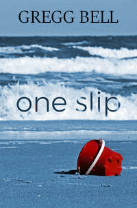
ONE SLIP is a literary fiction novel. Here’s the blurb:

It all happened so fast. Connie Silverstein got a call from a friend whose daughter had an accident and was in the hospital. Could Connie watch her four-year-old son? Despite it not being the best of circumstances, Connie races to the hospital and picks up the boy. Todd’s a sweet kid, a charmer, who calls her “Aunt Connie.” He asks if they can go to the beach. Connie hesitates—it’s windy and the waves are rough—but then takes him there. The unthinkable happens. Todd’s sucked out in a rip current and is rescued, but only after he’s suffered considerable cognitive impairment that may be permanent. Brain damage. Connie is desperate to help Todd, but his mother is bitter and shuts her out. Traumatized that Todd’s injury happened while he was in her care, Connie can’t forgive herself and is consumed by guilt. Friends and family assure her that accidents happen to everyone, and she shouldn’t be so hard on herself, but only Connie knows the terrible secret that what happened to Todd wasn’t an accident.

[original submission and comments here]

Nathan says:

You’ve posted a lot of process shots in the evolution of the cover in the original thread; I think you’re a lot closer to understanding how to market your book to your target audience.

More than the one you submitted above, I prefer this one:

I find the slightly warmer blue tint to be more inviting to the eye, and both the font and type treatment of the title are more deliberate and thoughtful.

On the other hand, given that the intent of so much literary fiction seems to be as uninviting as possible [he said snarkily], maybe the former is better.

Comments?

Zero Glyph

The author says:

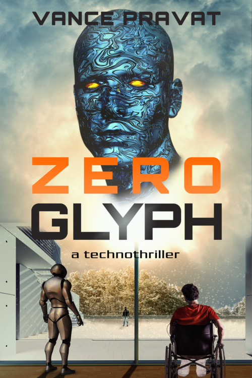
The book is a sci-fi technothriller set 10-15 years in the future. It involves AI, robots, a tech theft, and a home invasion. Think Ex Machina meets Rear Window meets trolley problems. I want it to appeal to scifi readers who like Michael Crichton-style technothrillers / Hard sci-fi / Asimov’s robot novels. The cover is not a mockup, but I want to get other opinions before I publish the book. Specifically: 1)Does it convey the genre expectations? 2)Does it stand out? 3)Does it make you want to click on it and find out more about the book?

Nathan says:

It definitely says “techno.” I’m not sure about the “thriller” part.

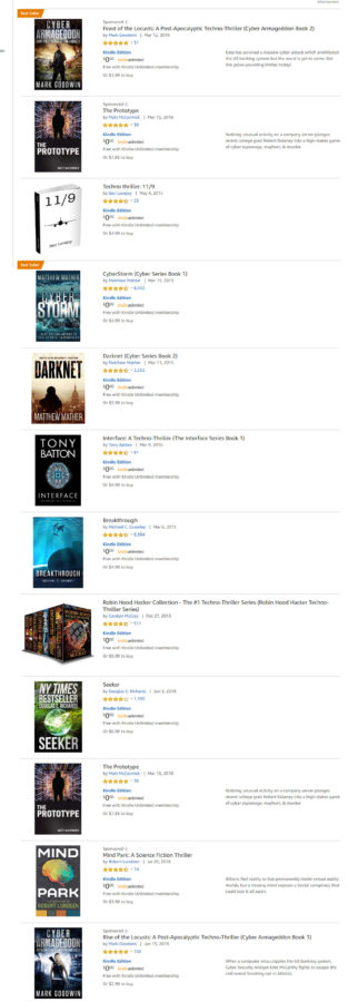
When I look at the “technothrillers” category, here’s what I see (click to see it large):

Here are some commonalities I see:

  • More often than not, a thin sans-serif font.
  • A lot of silhouettes.
  • High-contrast color schemes dominated by one color (a cold one, most likely).

I know you wanted the cover to “stand out,” but before it does that, it needs to draw the attention of your target audience, which means it needs to contain the instantly recognizable cues that that audience looks for to find books aimed at them.  I think if you tweaked your existing cover with those visual cues in mind, you’d have a winner.

Other comments?


The Spirit, The Scribe, The Journey

The author says:

The Spirit, The Scribe, The Journey is a collection of excerpts from personal spiritual journeys. The target reader is someone who resonates with wisdom other Christians received from God. The genre is christian spirituality.

Nathan says:

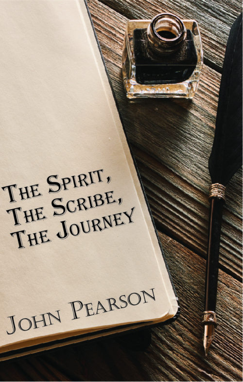
The problem here is that absolutely nothing on this cover conveys “Christian” — the only part with even a sideways connection to Christianity is the word “Spirit” in the title, which is scarcely an exclusively Christian word.

The type also has some problems. The title is in Algerian font, which is “the font resorted to by people who want an elegant or magical font but won’t look further than the fonts already on their computer.” It’s overused for all the wrong reasons. And while the byline font isn’t as bad, (a) it clashes with Algerian, and (b) its position against the bank page calls attention to the fact that it’s sorta supposed to look like it’s written on the paper, but it ain’t. (And neither font looks like it could have been produced by the quill pen on display.)

The blank space at the top of the journal page also looks oddly unused.

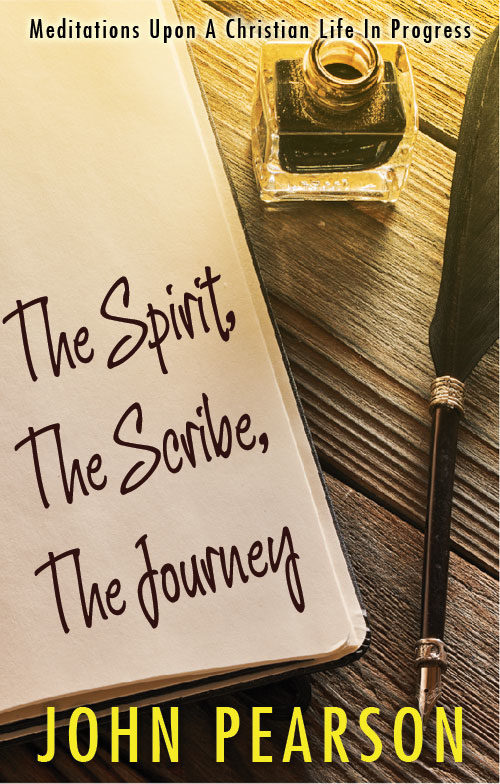
I’m assuming that we’re working with a stock image here, and if you’re determined to use it, here’s my ten-minute redo to correct some of the problems.

I added the slight sunrise-y glow because, well, Christianity is about hope, and it seemed right.

I’m not sold on the handwriting font I used (ten minutes, after all), but it at least indicates the direction I think you need to go.

Other comments?

What Will Be Made Plain

The author says:

Help me with my decision please!

Adult or YA suspense Amish: What Will Be Made Plain: Classic themes from Hamlet are played out when young Leah Mohn’s charismatic father moves a whole community two counties away to make a fresh start in a secluded survivalist community. At first, Leah finds much that is comforting and secure in the new locale. But her dead mother appears to her in dreams, urging her to some sort of action, and no one can help Leah figure out what her heritage says about such supernatural visits. Handsome visitor from another survivalist commune, Matthew Lescher, is Amish and should be “safe,” but his input about the undead —and his own involvement with the Goth culture—leave her with even more questions, and an inevitable head-on collision with her heritage and her sanity.

Nathan says:

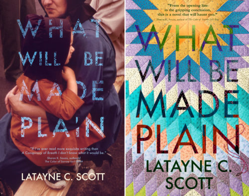
The problem with both of these covers is that they’re made to look good (a) at full size, (b) to someone who’s already read the description.  That’s a problem because 95% of potential readers will first encounter the book (a) at thumbnail size (b) without having any previous familiarity with it.

Just looking at the thumbnails above, nothing says “Amish” to me at first glance, or “supernatural-tinged thriller,” or “Hamlet,” or… In the first one, I can’t make out either the photograph OR the title — so I basically get no information from it. In the second one, I can see the starburst pattern, and while that makes reading the title difficult, it’s not completely illegible; however, the starburst pattern doesn’t look like a quilt unless I look at it larger, so it will miss the attention of those readers who would be attracted to Amish themes.

My suggestion: Start over with the thumbnail in mind. A cover which features a young Amish woman in a suspenseful color palette (lots of shadows, the rest dominated by a single strong color) and a readable title might not be as “artistic” a design as either of yours, but I bet it would attract the target audience a lot better… which is the point of the cover.

Other thoughts?

Web of Eyes

The author says:

Madness sits upon the throne. Rebellion rages in the South. Dark magic threatens all life. The kingdom is desperate for heroes. When the young king’s soul is stolen by a traitorous cultist desperate to resurrect the Buried Goddess, disgraced knight Torsten Unger makes it his sworn duty to get it back. He has one chance to restore his honor. But he can’t do it alone. He’ll need a thief. Whitney Fierstown planned the perfect heist, one that would have made him a legend among thieves, until he got caught. Now, a knight with a questionable reputation is offering a deal: rot and die in a dank cell or join him on a dangerous expedition to put his skills to good use and earn his freedom. Whitney and Torsten must put aside their differences and work together to battle unholy cults, demons, rebels, and worse to become the heroes their war-torn kingdom never expected…if they don’t kill each other first.

Nathan says:

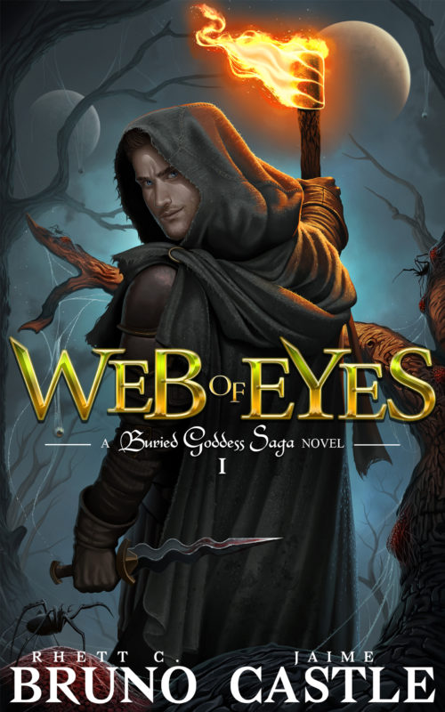
I have no complaints with most of it. The art is obviously of professional quality, and the title treatment is interesting without being distractingly ornate.

My only quibble is with the series title.  The typeface used there neither matches nor contrasts effectively with the title and byline fonts; it just clashes.  It also violates the good-sense guideline of “the smaller the type, the more readable the font.”

If the original artwork has enough unused margin, I’d be tempted to move everything down so that there’s more room above the torch’s flame, and see how the series title works there.

Other comments?