
The author says:
ONE SLIP is a literary fiction novel. Here’s the blurb:
It all happened so fast. Connie Silverstein got a call from a friend whose daughter had an accident and was in the hospital. Could Connie watch her four-year-old son? Despite it not being the best of circumstances, Connie races to the hospital and picks up the boy. Todd’s a sweet kid, a charmer, who calls her “Aunt Connie.” He asks if they can go to the beach. Connie hesitates—it’s windy and the waves are rough—but then takes him there. The unthinkable happens. Todd’s sucked out in a rip current and is rescued, but only after he’s suffered considerable cognitive impairment that may be permanent. Brain damage. Connie is desperate to help Todd, but his mother is bitter and shuts her out. Traumatized that Todd’s injury happened while he was in her care, Connie can’t forgive herself and is consumed by guilt. Friends and family assure her that accidents happen to everyone, and she shouldn’t be so hard on herself, but only Connie knows the terrible secret that what happened to Todd wasn’t an accident.
[original submission and comments here]
Nathan says:
You’ve posted a lot of process shots in the evolution of the cover in the original thread; I think you’re a lot closer to understanding how to market your book to your target audience.
More than the one you submitted above, I prefer this one:
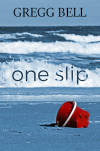
I find the slightly warmer blue tint to be more inviting to the eye, and both the font and type treatment of the title are more deliberate and thoughtful.
On the other hand, given that the intent of so much literary fiction seems to be as uninviting as possible [he said snarkily], maybe the former is better.
Comments?
I haven’t seen the previous post, so forgive me if you’ve considered this suggestion already.
When I look at the Amazon top 100 for literary fiction, the trend that jumps out to me is having the title really big. I’d suggest using the same font treatment as the second image in the post above, but putting it on two lines and enlarging it, like so (I just grabbed the title from the picture and enlarged it on the Depositphotos photo, so it’s pretty gnarly looking, but you get the idea):
The author name still feel amateur, for want of a better description. If you look on Amazon, you’ll see that a lot of shorter author names have larger kerning–the space between the letters–to make a bigger impact. I did that above. I’m not happy with the serif font; if I were designing this, I’d try a sans-serif, but the example is to just give you an inkling of what I’m talking about.
It works better if the image is included, huh? 🙂
https://i.imgur.com/HqqPzBr.jpg
I like what you did with the author’s name – much better.
Thank you Augusta Scarlett. I tried the bigger two-tier title and it seemed to throw the symmetry off. But I’m definitely going with a more sans-serif font for my name. I also made the waves splash over the entire title. The only other difference in the below links is the color of my name.
https://imgur.com/a/3sjq4wR
https://imgur.com/a/Lw48yuu
Augusta’s take on Nathan’s suggestion is a good one. I would only, in Augusta’s version, center the two words and reduce the space between them (in part to keep the bottom of the word ONE from aligning with the upper line of surf). In both, I like the how part of the title is being engulfed by the wave. That’s pretty nice.
Oh, and I would use the same typeface for both the title and author’s name.
Thanks Ron. I couldn’t make the two-tier title work, but I did try the same font for the title and my name, which is here: https://imgur.com/a/2pZH5mA
I think, I like this font better though (and I made the waves splash over the whole title. the only other difference between the below two links is the color of my name).
https://imgur.com/a/3sjq4wR
https://imgur.com/a/Lw48yuu
Very nicely done! I agree with our host, though, that the variant he selected is just a teensy bit better: specifically, the slight distressing of the title makes it look like the ocean waves are about to swallow it… sort of like how they almost swallowed the poor kid whose lingering death is driving the plot of this story, wouldn’t you agree? Nothing quite conveys the ocean’s menace like having it seemingly attacking the fourth wall this way.
Also, the overturned toy bucket is good and gets the point across, but don’t hesitate to try out some variants of this cover with other objects: a punctured flotation device lying deflated on the beach, for instance, or an abandoned pair of child-sized swim trunks floating in a shallow puddle might drive the point home even further.
Thanks RK. I made the waves splash on the “one” in the title and changed the font in my name. The only difference in the below links are the color of my name.
https://imgur.com/a/3sjq4wR
https://imgur.com/a/Lw48yuu
I think it looks good.
Should you go with the distressed-letters variant, I’d want to see the distressing larger just to make sure it looks good–it’s hard to tell at thumbnail. But it’s a good idea.
Thanks Gwen. You got me headed in the right direction with the better image.
https://imgur.com/a/bU9ybCF
Now I’ve made the “one” in the title with the waves splashing on it. I also went with a more sans-serif font for my name. The only other difference in the below links is the color of my name.
https://imgur.com/a/3sjq4wR
https://imgur.com/a/Lw48yuu
I also prefer the version that Nathan noted, and yes, I’d suggest making the title larger, and ensure that the distressing is quite obvious. Something about the purply-shade of the newly-submitted cover is off-putting to me.
Thanks Hitch. I definitely went with the more distressed title. I also made my name smaller and hopefully that helps with the proportion between that and the title. I also used a different font for my name. The only other difference between the below links is the color of my name.
https://imgur.com/a/3sjq4wR
https://imgur.com/a/Lw48yuu
Hmmm… I quite like the purply shade – looks more ominous to me. Definitel a better picture – says missing child at a glance.
Thanks Kirsty.
I do prefer Nathan’s selection for a few reasons. Like others say, the title treatment works better. I noted before that a super popular way to signal ‘classy/iterary fiction is to have the title typography interacting with / somewhat disappearing into the artwork. The example does that well, the treatment hinting ominously at the central plot point.
I think a sans-serif/capitalised treatment also works better.
However, I do think the blue used there is too warm and friendly. The other more lavender-skewing blue creates more of a sense of tension.
I also feel that the byline is too heavy on Nathan’s selection and there’s an awkard relationship between it and the title. One of the very basic tenets of design is ‘visual hierarchy’. You need to make sure you are directing your viewers’ eyes to the right things in the right order. On this cover ‘Gregg Bell’ and ‘One Slip’ are too equal in eight/eye-catchingness and it throws everything off. You have a better baance on the large image where ‘Gregg Bell’ is smaller.
Thanks Kata. Yeah, you got me started with the idea of the title interacting with the imagery. I think that really makes a huge difference (and does hint at “literary.”) I added a little more interaction in having the waves “splash” on the “one” in the title. I tried all caps for the title, and it didn’t work for me. But I did change my name to a sans-serif and I think that works a lot better. I also did make my name smaller and I believe that does keep the visual hierarchy in tact now. The only other difference in the two below links is the color of my name. (Ivory vs Black)
https://imgur.com/a/3sjq4wR
https://imgur.com/a/Lw48yuu
Many thanks to Nathan and CoverCritics.com for all the incredible help with this cover! And thank you, Nathan, for posting the new version and the later version I posted in the comments section. I really appreciate that. Some final tweaks. I made the waves splash over the entire title and went with a more sans font for my name. The only other difference in the two links is the color of my name. Ivory vs Black.
https://imgur.com/a/3sjq4wR
https://imgur.com/a/Lw48yuu