The author says:
The Spirit, The Scribe, The Journey is a collection of excerpts from personal spiritual journeys. The target reader is someone who resonates with wisdom other Christians received from God. The genre is christian spirituality.
Nathan says:
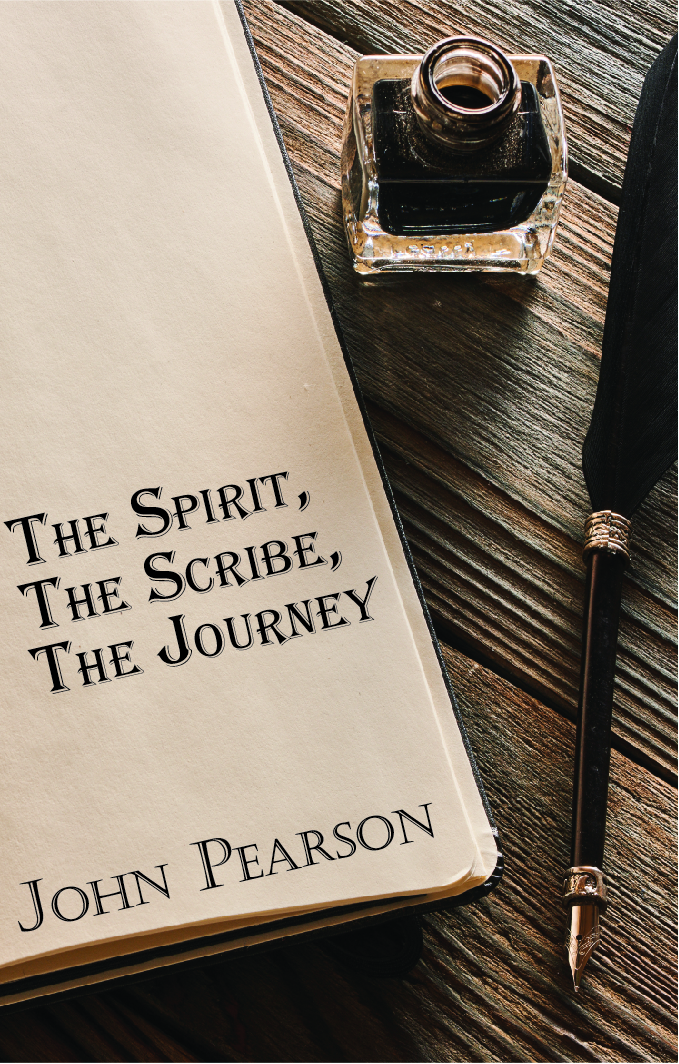
The problem here is that absolutely nothing on this cover conveys “Christian” — the only part with even a sideways connection to Christianity is the word “Spirit” in the title, which is scarcely an exclusively Christian word.
The type also has some problems. The title is in Algerian font, which is “the font resorted to by people who want an elegant or magical font but won’t look further than the fonts already on their computer.” It’s overused for all the wrong reasons. And while the byline font isn’t as bad, (a) it clashes with Algerian, and (b) its position against the bank page calls attention to the fact that it’s sorta supposed to look like it’s written on the paper, but it ain’t. (And neither font looks like it could have been produced by the quill pen on display.)
The blank space at the top of the journal page also looks oddly unused.
I’m assuming that we’re working with a stock image here, and if you’re determined to use it, here’s my ten-minute redo to correct some of the problems.
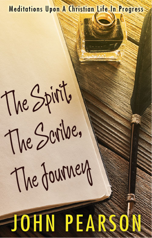
I added the slight sunrise-y glow because, well, Christianity is about hope, and it seemed right.
I’m not sold on the handwriting font I used (ten minutes, after all), but it at least indicates the direction I think you need to go.
Other comments?
I agree with Nathan. You have a good fundamental idea here, but it needs a little more work in order to be really effective.
As Nathan pointed out, the main problem is that there is nothing in the cover that suggests the theme of the book. That is the main thing you need to get across. The addition of a tagline helps, but I think that the image itself needs to also convey the idea of “Christian spirituality.” As I have often suggested in the past to other authors, imagine your cover with all the text in a foreign language…would you still be able to get an idea of what the book is about?
I presume that you are using a found image. But there are a couple of problems with the one you chose. One is the need to crowd the title into the space available (which Nathan has helped alleviate to a degree by changing the typeface to larger one and one more appropriate to a journal). The other is that there is a little too much focus on the ink bottle and pen…both of which suggest something old-fashioned and folksy. Why not consider creating your own image? Even a cell phone with a decent camera can do a great job. Then you could not only give the page in the journal a little more presence, you could include a writing instrument that is more modern and, perhaps, include something that helps convey the basic subject of the book. A small Bible, perhaps, or a crucifix. Or even both, for that matter.
Oh no, Algerian! Algerian is my personal #1 worst font of all time.
That said, I don’t really like Nathan’s redo either–the handwriting font clashes with the sans serif byline, the glow is filteriffic, and the tagline overlaps the inkpot (sorry, Nate).
I think the base problem is that while the picture is nice, it conveys nothing except “it’s a book.” Christian fiction often has pleasant nature imagery with a symbolic aspect–light shining through clouds, a plant sprouting, a tree, a mountain. For fonts, either script or simple light serifs. I’d suggest you go the same direction.
Hmmm… That’s not the kind of Christian fiction I read 🙂 (I prefer it to have a space ship or a sword or something)
I guess it depends WHO it’s aimed at. The gentle nature imagery etc suggests ‘inspirational’, but may not attract the target audience. Or it may – the author will know better than me.
I’m going by the covers in the Amazon “Christian inspirational” category.
I guess my point is that Christians have all kinds of personalities and tastes, so it has to appeal to the right kind of Christian. Who may be the kind of people that would like that kind of thing, or may not.
I agree with the font comments – it needs to look hand-written.
Whether or not the cover image looks Christian will depend on where you’re selling it. If you’re selling it only in Christian shops or websites, it’s not necessary (customers will assume it’s Christian). If it’s sold elsewhere, though, it might be necessary. Particularly since I’ve just looked on Amazon and discovered an author with the same name who writes crime biographies!
What era are these excerpts from? Is it historical Christians? If so, I think the olde worlde image is fine – in fact, I like it. But if it’s modern Christians, a modern notebook, pen etc. would seem better. And the suggested inclusion of a Bible couldn’t hurt. It can be encouraging to read the experiences of people in similar situations to ourselves, and a quill pen doesn’t suggest that at all.
Your description reminded me of Sarah Young’s Christian devotionals. They’re sold in places like Hallmark, and though the dimensions are very different than what I assume you’ll be using with print-on-demand, it may be worth visiting to get some extra visual inspiration.
https://www.amazon.com/Sarah-Young/e/B001K8ABK0?ref=sr_ntt_srch_lnk_4&qid=1553302330&sr=8-4
I like the hand drawn font a lot but I’d recommend changing the duplicated letters a bit so they aren’t identical. If there are no alternate glyphs in the font you pick try making some letters smaller or larger or tilting them a hair or distorting them just a bit so it looks really hand written.
It’d be cool to layer some of the objects, like having a pen lay across the paper, (I’m not totally sold on the inkwell idea as no one really writes with one of those. That space might be better used with a Christian icon like a bible or rosary or hymnal) and maybe put a really faded pattern on the paper like the type you see on journal pages. it’d be another great spot to reinforce the Christian theme.
Yeah, y’know…that’s always, always a problem. H/W (handwriting) fonts, generally, suck. Every time you buy a bundle of fonts, from the ubiquitous MightyDeals, Creative Wahtever, etc. you get a thousand (slight exaggeration) crappy h/w fonts, and two decent fonts. Honestly, my bundle wastebasket is always full of the ubiquitous “oh, making a font is EASY” fonts that are used to pack bundles to make them look more valuable. Even the ones that look great have s**t kerning.
So…No Time isn’t horrible. Kristi; Callgraffiti; Journal; of COURSE, Architect’s Daughter (although it’s in danger of being Papyrused to death), Wortsveld sling. Novita Nova.
Any of those would probably serve. I personally love the inkwell (Hey, Savoy, *I* use one of those!), but I’m not sure it’s doing your cover any favors.
Like everyone else, I’m just not getting a Christian vibe off of it, and for that matter, completely ignoring the Christian angle–what the hell is it about? Essays from other folks? That’s it? I don’t think that the cover conveys that, either, which to me is a bigger problem. You can use keywords and categories to convey “Christian,” but conveying “essays” to me is more difficult–and I don’t think I’ve seen any suggestions about how to do that.
In its defense, I will say the objects shown had me thinking this was some kind of “inspirational” literature, so the designer got that right. The problem? It’s a very generic kind of “inspirational” literature; as the others have noted, nothing really specifically says this is Christian inspirational literature. Without a cross or a fish symbol or the like somewhere on the cover, this could just as easily be a book of Buddhist or Confucian “inspirational” writings.
Others have already pointed out that Algerian font’s got to go, but as Hitch has pointed out, handwriting computer fonts almost always suck. Even when they don’t, people can just about always tell when “handwriting” isn’t really handwriting; the uniformity of the letters used gives it away every time, as does its two-dimensional nature however well your image editing program anti-aliases it. Just substituting a better font isn’t going to be quite enough, therefore.
My suggestion? You know, none of the props on this cover look all that difficult to find or expensive to buy in an arts and crafts store, and it’s not that difficult to photograph stuff on a flat wooden surface like a picnic table or the floor of an old hay loft or the like. Why not get yourself an old-fashioned-looking Bible, an inkwell, and an old quill pen like the ones shown here, set them all on a picnic table or old wooden floor or some such, and take the picture yourself?
While you’re at it, you can use that old pen to write your title and byline on a scrap of old paper that’s gotten yellow with age (which shouldn’t be that difficult to procure; check your church’s attic for old discarded hymnals and the like) and drop it into the middle of the object montage. If your calligraphy’s not so good, just ask somebody who is good at it to write the captions for you. Then you’ll have a cover with a completely genuine handwritten title and byline amid a bunch of genuine-looking old-time objects (including a distinctly Christian Bible); and you know, people who read inspirational literature appreciate cover designs that go the extra mile to add some authenticity to their appearance that way.
I like the genuinely hand written idea. This could even just be done by photoshopping it on. Taking a photo would depend on the skills of the author!
Going by the title, I’d say ‘The Spirit’ suggests Christian or Jewish. I don’t think any other religion would use that terminology?
Well, as Hitch says, “Spirit” by itself can mean a lot of things. “Holy Spirit” would be distinctly Christian (or at least Judeo-Christian; the Holy Spirit gets some mention in the Old Testament too), but that’s not what the title specifically says. Then too, even if it did say that, one of the tests we like to use here is: can you understand what kind of book this is from the imagery on its cover without understanding the title? If we ran this without the title, or wrote the title in e.g. Thai lettering… would you still immediately recognize this as a book of Christian writings?
With the current imagery, you could easily guess that this had something to do with older writings, but I don’t think you’d see them as specifically Christian writings. Hence the need for a Bible in the picture, preferably one that looks a bit more old-fashioned, like the kind I’ve seen laid on altars in front of pulpits in churches. When you see one of those in the shot, then you know you’re dealing with some brand of Christianity here.
Sorry to keep banging on about this – but I’m still puzzled why everyone thinks a Christian book has to have Christian imagery. That would be terribly limiting to designers.
I did a quick survey of books that came to hand, and out of 37, only two had anything explicitly Christian.
I took some photos – not sure how to link to them, but I’ve put them in a blog post here if you want to see.
https://kirstymcallister.blogspot.com/2019/03/christian-book-covers.html
What matters is not that it ‘looks Christian’, but that it looks like the KIND of Christian book the ideal reader likes to read (because all Christians do not like all Christian books, obviously). If, as someone guessed, it’s similar to the ‘Jesus Calling’ type book, it has to look like what people who read those books like. Which I think it does a bit – brown, ornate, taditional. Needs warmed up as Nathan said.
Well…I’m not a Christian Book reader, but..to me, most of the covers you have in that first image strongly suggest Christian reading or reading of Faith-based/related books in other ways. “The Reason for God,” or “Honest Evangelism” or “Revelation for You”, “Living the Holy Life,” and so on. Some make their faith-basis clear in other ways. Now, “Crazy Busy” would never have struck me as faith-related, but the rest mostly do. Timothy Keller’s “The Way of Wisdom” isn’t, particularly, but he’s a known quantity, for Christians; like Stephen King, you know what you’re getting when you buy a Keller book. “Women of the Word,” unless someone’s wholly ignorant, that’s eponymous.
This book has none of the above. No title that says faith or Christianity, and no imagery. You seem to think that “The Spirit” implies Christianity, and perhaps, to you, it does, but to me, it could mean anything from Ghosts to whatever. (We’ve done a book for Buddhists that talks about the spirit, so…) “The Spirit, The Scribe, The Journey” could mean nothing more than some battered person, down on their luck or their hope, who found a reason to live utterly unrelated to Christianity.
I think that what most of the designers here are trying to say is, if you, as a publisher, are attempting to primarily appeal to a Christian reading audience, then you should try to make it obvious that that’s who you are targeting. I don’t care if you’re trying to appeal to Christians, or SciFi fans, readers of Fantasy sagas, etc.–the point is, the cover should be immediately identifiable as being XXX, for that reader base. Hell, this cover doesn’t even necessarily say “non-fiction,” either. It could easily be a novel about some 18th-Century personal secretary to a Lord.
That’s my take on it. Others may have different viewpoints, naturally.
Good point. I was looking at imagery only, but you’re right – the titles of those books make it clear. So at least one of them should.
First off: The audience of this book isn’t “Christians,” as in “all 2 billion people on Earth who identify with that faith.” It’s “people who buy books about inspirational Christian spirituality.” So if you’re a Christian who really likes books about spaceships, then whether you like this cover is moot; there are no spaceships in this book. (For whatever relevance it has, I say this as someone who is both Christian and a fan of spaceships.)
Second: Your assortment of covers, by and large, proves the point. A lot of them are irrelevant to our case: The Christian fiction is an entirely different genre, some of the nonfiction is too (The Dawkins Letters, for instance, is Christian apologetics, not Christian spirituality), and many of the others are by big names like Kevin DeYoung or C.S. Lewis and thus don’t need distinctive imagery because the author’s name alone sells the book.
Of the ones that are on the Christian spirituality side of things and do feature imagery, the predominant imagery could be described as, dare I say, “pleasant nature imagery with a symbolic aspect–-light shining through clouds, a plant sprouting, a tree, a mountain.” In fact, I specifically see a tree and a mountain. (To look at it another way, the only cover that has imagery that’s not typical of the genre–either nature, Biblical/ancient-timey, or an author photo–is the planet. And that one helpfully has “Narnia” in the title.)
And it’s not all arbitrary “monkey see, monkey do” circular logic, either, because the imagery has meaning. “Your spiritual life will grow like a tree.” “Your spiritual life will be strong like a mountain.” Whereas if you have bold red lettering and an exploding spaceship, that’s very dramatic, but it doesn’t communicate that this is uplifting spiritual bedside reading.
TL;DR: In Christian spirituality, like all other genres, looking like other books in the same genre is a good idea.
(But because alternate approaches are always a possibility, I’m also curious to hear: What imagery would you put on the cover of this book? Why do you think that imagery would do a better job of attracting readers?)
I think I must have misunderstood – I thought people were saying that ‘Christian books’ SHOULD have a specific look – and that’s why I linked to all these other covers, to make the point there are many different genres… I basically agree with what you’re saying.
Therefore, apologies – ignore everything I’ve written 🙂
Since you asked what imagery I would suggest – I would prefer to know rather more about the book. “Wisdom other Christians received from God” could be anything from ‘don’t worry, God loves you’, to ‘get off your backside and fight for the truth’ – which would obviously need rather different approaches! If there is an overall theme, or a striking image used in the book, I’d focus on that.
In the absence of other info, I think the notebook and pen idea is good, but I’m not convinced by the historical look UNLESS it’s either wisdom from the past or aimed at a particular type of person who resonates with that kind of imagery. For some people ‘old fashioned’ is off-putting, but for others might be reassuring. A nice modern notebook and pen could work (e.g. a stock photo), with a hand-written title on the notebook, and perhaps a hand-drawn cross or similar. But not knowing the target audience, I’m not sure.