The author says:
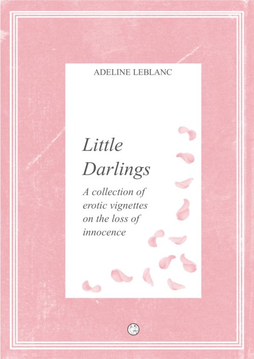
A collection of erotic vignettes about the loss of sexual innocence. Containing four short stories, I am aiming for the “fans of Anais Nin” type market – those who like their erotica with a bit of literary sophistication.
Nathan says:
I see three main problems with this:
- Nothing is large enough to be comprehended in thumbnail. There’s no hook to make the 95% of your potential audience who will initially encounter it at thumbnail size click to take a larger look.
- The type is nothing but variations on Times New Roman, the default font on literally almost all word-processed documents ever. That makes it look extremely lazy.
- The flower petals (which I originally took to be footprints) are way too subtle an indication of your content. Even the covers of the current editions of Anais Nin’s books have a clue to the subject matter, and the erotic ones are pretty clearly erotic:


The good news is that antique images such as these are easily found from public domain sources, so they won’t set you back.
Other comments?


“Frame” covers are always problematical. Effectively, your cover is really just what is contained within the white rectangle: the pink border adds nothing. Whatever you ultimately decide to do with a cover image, it should fill the entire available space.
And as far as the cover image is concerned, I have to agree with Nathan that the current one is inadequate for all the reasons he lists. I am afraid that the only thing for you to do is to look at some of the examples he has provided and start from scratch.
Agree with Nathan. If you want to use a photo, it shouldn’t be hard to come up with some high-resolution public domain image that suggests your subject matter… Then you could (respectfully) follow the first two Nin examples. If you need to use petals, get a bouquet of roses and photograph it a few days after peak while it’s decaying, rather than using drawings of petals. LOL. Also, that tiny round logo on the bottom is kind of nice, but at any ordinary screen resolution it turns into an icky little squiggle. Go big and proud with it, or leave it out.
The fact that you have to say “a collection of erotic vignettes on the loss of innocence” is evidence that the cover isn’t working. The artwork should be communicating all that, and it just isn’t.
Am I the only one who wants something like this?
That Tampa cover is brilliant.
“Am I the only one who wants something like this?”
Not now you’re not.
This speculative cover I did a while ago is probably as close as I have ever come to the sort of thing you are thinking of…
https://www.charliehills.com/gallery/picture.php?/419/category/3
Ooh, nice. Something like that.
I’ll put it this way: this cover might have sold well back when the notorious Olympia Press was selling its banned books with plain green covers containing the title and byline and little else, but that era was well over half a century ago now, and just about nobody automatically assumes plain binding means salacious content these days. Personally, when I first saw your cover in thumbnail, I thought it was going to be another generic book of flowery poetry and/or women’s literature. If not for reading the title and tagline and your summary, I might still think it to be one of those kinds of books.
Not only is the current imagery far too subtle, but it’s hardly even there: the circle with the drawing in it at the bottom just looks like a weird decoration at any zoom level, and the pale pink flower petals are all but invisible in the thumbnail due to being set against a white background surrounded by so much pale pink border. Sure, flower petals are popular visual metaphors for various forms of sexual “innocence” and the loss thereof in certain contexts, but the rest of the cover isn’t really providing any such contextual clues. As for the tiny drawing in the circle of a gal blowing a kiss, I thought for a moment there before getting it at maximum zoom that she was holding a cup of coffee with a bit of steam rising off of it.
Without knowing exactly what kind of sexual “innocence” is being lost here, I’m not sure exactly what kind of imagery to suggest. Are these hot-and-heavy “The Incredibly Immoral Way I Destroyed My V-Card” kinds of stories, or just lighthearted slice-of-life “My Horrific Discovery That Valentine’s Day Isn’t Really About Getting Free Candy Killed My Childhood” types of tales? Wherever the stories in your collection register on that spectrum, it remains that you need to have whatever imagery is suitable to accompany them front-and-center and looming large on your cover where all your prospective readers can see it.
If you’re approaching this “loss of innocence” from the lighter side of the spectrum, of course, you’ll want something with just enough visual innuendo to make clear that the situations in these stories aren’t entirely platonic. Interestingly, something I’ve seen on the covers of a number of romances for kids in middle school (age ranging from 11 to 14, so you know they can’t get too steamy) is a picture of a young couple’s feet with the girl standing on her tiptoes. Everything’s clean and wholesome, everybody’s fully clothed, but… yeah, that’s a pretty stimulating image when you’re old enough to understand its implications.
On the opposite end of the spectrum, well… I probably don’t need to tell you much about that. Just about any kind of imagery goes, including some truly hard-R-rated stuff. Even if what you’re writing is out-and-out pornography, though, you should never go beyond the hard R; for all that Amazon and Smashwords have eased off of their restrictions since tightening them greatly in 2011, they and the other sales sites still don’t accept any covers with X-rated stuff on them.
In between these extremes is pretty much everything else, from trashy romances to “soft” erotica. The cover of Alissa Nutting’s book Tampa at the link Gwen Katz provided above, by my reckoning, would rate a hard PG-13: despite nobody’s revealing any skin or naughty parts in that shot, the meaning of its blatant symbolism is almost impossible to miss if you know your facts of life. (Moreover, the contents of that book are just plain X-rated: it’s a story told in exquisite detail from the point of view of a voluptuous sociopathic nymphomaniac teacher who’s molesting her 14-year-old male students with the intent of giving them such an intense experience that no subsequent girlfriends they may have will ever be able to satisfy them.) Ron Miller’s sample cover I’d rate PG: aside from Nabokov’s descriptive prose being far more restrained than Nutting’s, the meaning of the symbolism of the three intersecting pink strips and the heart-shaped lollipop’s placement on them takes a little longer to process even for those of us who’ve already read the book.
Getting back to your cover, I recommend assessing how your stories would rate if they were movies and then making the imagery on your cover one rating softer. After you’ve got your cover’s imagery figured out, then we can consider what font to use for your captions instead of Times New Roman. (Hitch will doubtless help you with that part whenever she gets here.) In the meantime, however, you can dump the tagline altogether; as Katz notes, if the imagery is doing its job, you shouldn’t need words to describe the content.
Yes, what I’ve just recommended is basically throwing out the whole cover and starting over from scratch, but that’s honestly just about your only option at this point.
I’ll be delighted to kibitz on fonts, once AL has revamped the imagery. Depending upon the new layout, it could be something soft and sensual like Ron’s Lolita title font, or something stark like Tampa. Without seeing the new imagery, it’s hard to know.
Thank you so much to all of you for your extremely helpful feedback, it’s really appreciated – I take all of the points.
I’ve started with a blank canvas and designed a new cover for a different collection (which I’ve submitted), and in doing so tried to take on board all your feedback. I hope it’s not such a disaster second time round!
Side note: I notice that there are just 4 stories in this collection, which is a pretty small number, especially if they’re short. To make sure readers are clear on what they’re getting, I would say “four vignettes” instead of “a collection of vignettes”. But either way you probably want to reserve that for back-cover copy.