
The author says:
Meet Mr. Scratch, the nefarious villain. Scratch exists as drawings on paper, but he’s certain he’s better than you. He’s just succeeded in splitting apart the family of his greatest nemesis, but an interdimensional mix-up prevented him from enjoying a victory lap.
Meet Mark. He created Mr. Scratch. Never thought he’d meet him one day.
A supervillain travels to the real world and meets his creator in the dark comedy BLACK HAT BLUES.
Nathan says:
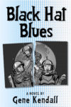
It’s a nice cover that completely misses. If I were to guess about the book from the cover, I’d think it’s about a nuclear family set in a winkingly-ironic version of what the Fifties thought the future would be like. I don’t get anything about villains from this cover, or about comic-book characters invading the real world.
(Also, waaay too much halftone filler.)
Other comments?
I agree with Nathan. There is really nothing about the cover that suggests anything at all of the book you describe. It certainly doesn’t suggest “dark comedy.” Everything works against this, from the color to the art to the choice of typeface.
I am afraid that the only realistic suggestion I can make is that you start over from scratch.
As our host points out, this is a well-made cover for… pretty much some other story entirely. If I had to guess the contents without your summary, my guess would be that this was one of those “seemingly idyllic future as shown in old fictional works from a more optimistic time turns out to be bad for the people who actually have to live in it” kind of stories. (You know: the kind of stories featured in much of the Fallout video game franchise, which was heavily based on both the promises and the perils of the future as depicted in 1950s comic books and pulp novels and the like.) Comparing that impression to your summary, I speculate that this cover properly belongs to the story-within-your-story from which your villainous protagonist originates, not to your story which is about his leaving that world and coming to his creator’s world which is more like ours.
In other words, instead of focusing on the main character and central plot of your story, you’ve let one of its peripheral secondary subjects take over your cover. What you’ve done here would be like making a movie poster for The Last Action Hero with nothing but a screen capture from the scene in which the protagonist discovers a promotional display at a video rental store for a Terminator movie starring Sylvester Stallone; a very entertaining scene and even somewhat relevant to the main plot, to be sure, but such would tell you almost nothing about The Last Action Hero‘s genre and story in general. For very obvious reasons, the posters for that film did not focus on such a secondary subject; and your cover likewise should focus on your villainous protagonist and his escape from the comic books page into his author’s live-action world, not on the secondary subject of what he did to the family of one of his victims while he was still in that comic book world.
My recommendation: the general layout of the cover’s not too bad, but the torn family portrait’s gotta go. In its place, what you should be showing is a nice shot of the villainous protagonist leaving a comic book panel and entering his creator’s live-action world in some manner. That way, you’ll immediately be showing your target audience the only two things they really need to know, both of which you managed to tell us in just one sentence (the last one) of your summary: that your story’s main character (Mr. Scratch) is some kind of comic book supervillain, and that during this story he’ll somehow be breaking out of his comic book and into his author’s world.
All else, such as what the protagonist was doing during his time in the comic book world (such as breaking up his enemy’s family just to be mean) and what he’ll be doing once he’s escaped (terrorizing his author?) is peripheral and secondary and therefore does not need to be on the cover. Remember, the cover itself is basically just the literary equivalent of a teaser trailer: you want to intrigue your target audience, not spoil the story by recounting the whole thing or confuse and distract people by focusing entirely on one interesting-but-peripheral scene. Stick to indicating the genre and the gist of the main plot (“Supervillain Escapes Comic Book: News At Eleven!”) and you’ll be good to go.
I also agree: Every single element of this cover communicates retrofuturism, but that’s not mentioned in your synopsis at all. (In the age of cheap full-color printing, halftone dots primarily communicate “retro” rather than “comics.”)
I agree with RK that we want some kind of cartoon-character-entering-the-real-world image; think of the marketing used for Disney’s Enchanted (although the tone is completely different, of course). Would I be a total cliche if I mentioned the Take On Me music video? Something like that.
If it’s a cliche, it was my first thought too!
Here’s a good tutorial on comic colouring – making it look like a cheap printed comic (if that’s what you’re going for). http://jonnycrossbones.com/tutorials/how-to-color-like-a-little-old-lady/
I hate to pile on, but I love this cover–just, not for the book that was described. 🙁
@Gwen Katz–nope, I thought of Take On Me’s video as well.