The author says:
I plan on hiring someone for a re-design, but I thought it was worth getting feedback on this draft.
The world is falling apart due to climate catastrophe, violent insurrections, and government corruption. Suburban father Howard Hall decides to take matters into his own hands against one of the men he views as responsible for the societal decay; the candy mogul Li Wen. After modifying his RV into a vehicle of war, he leads his family on a siege of the Wen Estate. However, the battle proves to be more complicated than expected when a group of teenage punks show up to terrorize both the Hall family and Wen’s personal army.
This short novel is a satirical action thriller set in the very near future of the United States. The target audience is adult fans of humorous speculative fiction and would likely appeal to fans of authors like Thomas Pynchon, Norman Spinrad, William S. Burroughs, Nick Mamatas, and Carlton Mellick III.
[original submission and comments here]
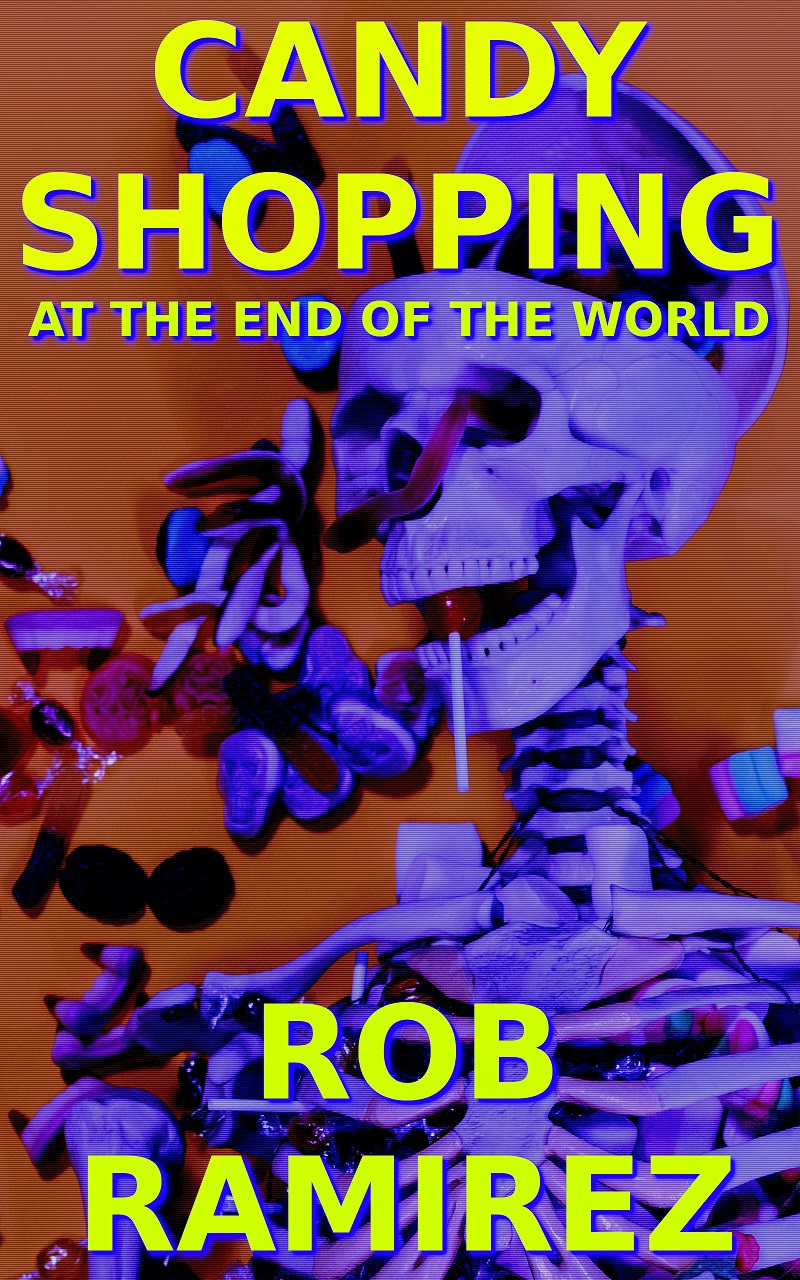
Nathan says:
It’s an improvement, but not much of one; the title overlapping on the skull pulls focus away from it, and the candy still isn’t recognizable as such thanks to the color filters. I think hiring someone is a good idea.
The candy does not come off as candy. There is much too little contrast between the skeleton and the background. Fixing that might also fix the overwhelming effect of the title and, especially, your name.
I can tell you’ve taken the advice given previously on board and you’ve definitely drastically improved the cover.
This is still a way off being a cover that’s going to help sell your book effectively but it shows you’re listening and improving your understanding of the design principles and trends at play, which will stand you in great stead for working with a designer to get a great cover.
Since you’re planning to do that – which is always the right move if one can afford it! – I don’t know how much further tips are useful but I’ll mention a couple of things anyway to help you get your eye in further.
Your title treatment emphasises the phrase ‘CANDY SHOPPING’ and minimises ‘AT THE END OF THE WORLD’. I think you want the whole title to be grab you. At thumbnail especially you only take in ‘CANDY SHOPPING” and imagine the rest of the rest must be a subtitle. Read this way one gets a skewed non-representative idea of your title’s/book’s vibe and intent.
I can see why you’ve made that choice – to leave space for the imagery. But titles should always take priority.
It’s probably the most universal mistake authors and novice designers make with covers to imagine imagery is what’s most important and to settle on that first. I guess we all grew up in an era of publishing where that was more true. Covers up till the late 2000s were more likely to be dominated by illustration or photography with a quite small, modest title treatment.
But we’ve undergone a complete paradigm shift here and you’ll see it if you walk into any bookshop or check out any Amazon book genre page – titles now dominate covers. That’s because sales are now mostly made online, thus a cover has to communicate at thumbnail size, thus the title needs to be really proportionally big – likely the single biggest/most dominating element. So achieving really clear, really attractive, really communicative typography has become THE most important thing, the point around which all other decisions are made.
So it’s not ‘how can my title fit around my chosen image’ but ‘what imagery can I find (or do I need any at all?) to fit in around a really big, bold title treatment’?
Yup, sorry, but no.
It’s just…now the contrast is more like glare on a window screen, when you haven’t washed the car in 3 months and it’s August, with dead bugs, bird crap and spooge all over it and the wipers don’t clean that off, so you’re staring through it, with your eyes squinched, desperate to see.
This is one cover that screams for a custom drawing.
I hate to say that, but it does. I don’t have any inspired ideas for how to do this one on the downlow, money-wise. (You can, BTW, find brilliant artists for super-affordable prices, but you GOTTA shop and shop and shop ’til you drop.)
About all I can say in favor of this cover is that the picture’s a lot clearer in both thumbnail and full size than on the previous one. That color scheme filtering everything through a shade of Cherenkov Radiation blue really isn’t floating my boat, however, and the vaguely comedic properties of showing Gummy Worms emerging from a skeleton’s eye will take too long for prospective readers browsing through the sales site to piece together in their minds. I still say—as with the previous cover—what would immediately get a prospective reader’s attention would be a picture of Death—the old Grim Reaper himself, or one of his stand-ins—pushing a shopping cart through a candy store aisle like a cheerful old 1950s housewife out shopping in a grocery store ad; it’s simple, it’s darkly comedic, and prospective readers would get the punchline of that kind of imagery at a glance.