The picture didn’t come through. Please contact me at nshumate at gmail dot com.
Yes, I’m working on getting a new means of submitting covers.
The picture didn’t come through. Please contact me at nshumate at gmail dot com.
Yes, I’m working on getting a new means of submitting covers.
Design 101 is an occasional series of design tips for non-professionals designing their own book covers.
We writers are used to saying what we want to say with the words we write. But when words are on the cover of your book — in the title, the byline, a tagline or blurb — what the words say is no more important than how they say it: the font in which the text is rendered is an important part of the design of the cover as a whole, at least as important as the artwork.
Now, learning exactly how to incorporate type into your designs is beyond the scope of this post. Mostly, I want to warn you away from some of the worst possible font choices when you start assembling your cover. Ready? Let’s go:

Seriously, this is the most common font in the world, thanks to it having been the default font in just about every word processor for the past thirty years. People recognize it, even if they don’t realize they do, and it implies to them that the book cover on which it appears is actually a term paper that was slapped together at the last minute.
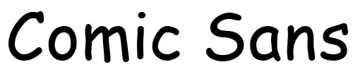
No. Just no. This began life as an ugly font (the lines are drawn at weird angle, and the letter spacing and the use of serifs is inconsistent), and its as a free font in most versions of Microsoft Word meant that it was the nearest thing to hand when people quickly wanted to make text a bit frivolous or childlike or “fun.” It has inspired a backlash of hatred (google “Comics Sans” to see what I mean), to the point that you can’t even use it ironically (whatever that means).
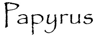
At one point, this would have been an acceptable font to use (although there are persistent kerning problems between uppercase and lowercase letters — see the gap between the uppercase “P” and the lowercase “a”?). Unfortunately, it has been so overused — and used poorly (see the kerning note above) — that only amateurs use it now.

Impact used to be a useful font. But again, overuse took it away from us — specifically, its use in thousands upon thousands of LOLcats and other captioned memes. That association has crippled its use in non-funny, non-internet-self-referential situations, especially in white with a black border.

Otherwise known as “that royal font.” This gets used a lot on fantasy novels by self-publishers who don’t realize that it’s (a) not as pretty as it looks at first glance — it’s kind of boring, really, especially because it’s all-caps — and (b) it’s terribly overused, especially on self-published fantasy novels.
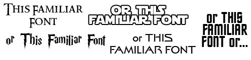
Here’s a tip: If a font is intimately associated with a media property with its own rabid fandom, the immediate recognition of that font will not help you. At best, your book will be assumed to be a parody of said property (and since all of those properties have plenty of lame-but-unintentionally-laughable self-published ripoffs, why would anyone want an intentionally laughable one?); more likely, yours will be assumed to be one of those lame-but-unintentionally-laughable ripoffs just mentioned.
And now, if you’ll excuse me, I have several fonts which I installed specifically to make these examples which I now want to wipe from my computer.
The author says:
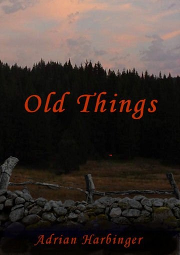
This is novel of the thriller/horror genre and centers around the life of a small town electrician who is in the process of breaking out and starting his own company. A early morning emergency call to his first customer starts him on a journey into the darkest corners of what we perceive as reality. He is to encounter impossible and horrifying things. Old things.
Nathan says:
1) THAT FONT MUST GO. A low-key photograph such as this one isn’t necessarily a problem, but it does shift more of the burden of communication onto the font, and this font simply isn’t up to it. It is a distinctly non-scary font. The replacement font doesn’t have to be out-and-out scary, because often those overboard fonts end up looking like a joke (for example, all of the “blood-dripping” fonts). But something slightly distressed will do just fine.
2) I’d say to curtail the color palette of the photo a bit; you don’t need a full range of pastels to show on a thriller/horror cover. If you overlay everything with a grunge texture, it can do double-duty of making the color more uniform, and adding that “gritty” connotation that works so well for this genre.
And since I had a few minutes to spare and it was easy to work on, I did this to illustrate what I’m talking about:
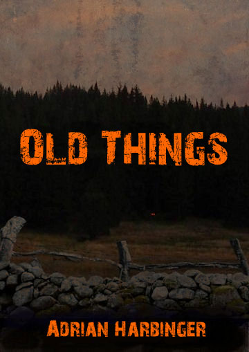
This is the five-minute version, and it shows; neither the font nor the texture is what I’d call my final choice. But it shows you what I’m talking about.
Any other comments?
March 23, 2014 Edit:
The author has made some revisions:
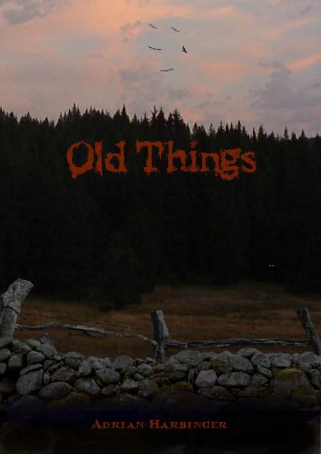
I like the addition of the birds in the sky; it’s an extra detail rewarding those who look at the full-sized cover.
I like the font for the title, but I’d still like to see it both bigger and brighter. The same for the byline; I don’t necessarily think the author’s name needs to be read from the thumbnail, but it really disappears here.
March 24, 2014 Edit:
Another revision:
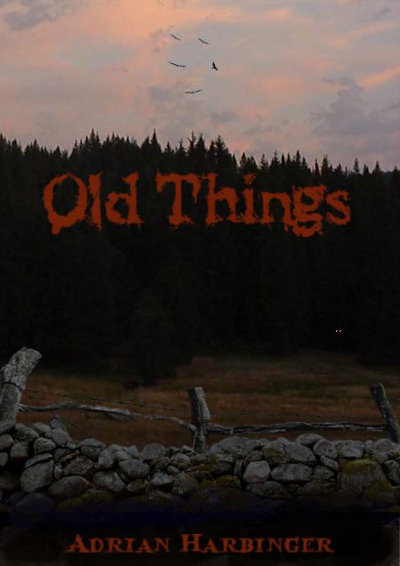
I would move the title down so that it’s centered in the darkness of the trees. And I still think the text would be served by a lighter/brighter color (not as much as in my five-minute rework, but some).
Other thoughts?
The author says:
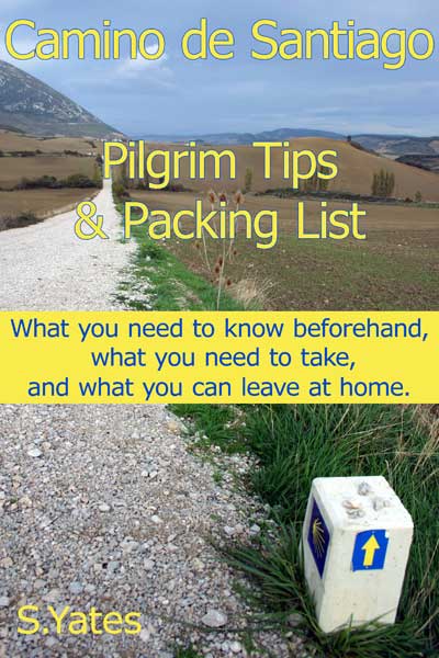
This book has already been published, but I would like to have some help to improve the cover.
Book Content
A non-fiction book about preparing for the Camino de Santiago covering things like:
– When to go and what to take (and what to leave behind!)
– What to expect during the walk
– Addressing lots of practical things like insurance, cultural shock, health, communication etc
– Pilgrims anecdotes to illustrate the points
– Links to other resources
Nathan says:
Now, I’m not a Camino de Santiago expert (in fact, I had to google it just so I’d know what we’re talking about here), but I would surmise that a guidebook such as this goes broadly under the category of “travel guidebooks,” for which it looks fairly appropriate; travel guides consistently have a no-nonsense vibe about them that says, “You can trust me.”
I think the design weaknesses here can be best seen in the thumbnail: The title merges into the background, and the subtitle wars with the title for importance. Here’s what I would do:
Anyone think anything different?
The commenters visible here have all been very helpful toward the covers already posted. However, there have been some that I haven’t let out of moderation. For anyone wondering why:
This is a site for CONSTRUCTIVE criticism: Point out why something doesn’t work and how to make it better. That purpose is not served by comments which do nothing but use such words as “awful,” “dull as dishwater,” “boring,” “zero appeal,” and offer no specific advice for how to improve it. The authors and designers who submit their covers here already know (or strongly suspect) that their covers could be improved; it’s pointless to further drive that point home without telling how to do it better.
And lobbing insults at other commenters’ judgment and skill doesn’t help either.