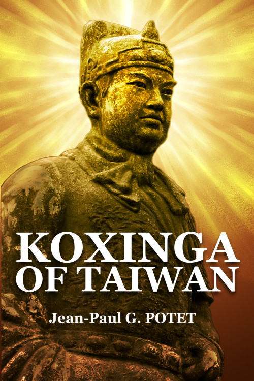
The author says:
This is a modest digest of what should be known about the life and deeds of Koxinga (Zhèng Chénggōng), the Ming military mandarin who founded Chinese Taiwan, and belonged to a family of international traders commanding a vast fortune and a fleet of merchantmen. Sometimes, instead of smoothly following its predictable course, history swerves to another direction because of an unexpected event. When Ming China was invaded by the Manchus, instead of collaborating to make even more profits, Koxinga launched a resistance movement. Yet, his fate was apparently sealed for hadn’t he been compelled by tradition to celebrate his birthday during the siege of Nanking, he would not have been defeated by the Manchus the morning after. If he had not died suddenly the year he ordered the Spaniards of Manila to pay him a tribute as to their sovereign, the Philippines would now be an overseas Chinese territory like Taiwan.
Nathan says:
I don’t really see anything wrong here. The only things I would do differently is (a) put the author’s last name in normal upper-and-lowercase, like the rest of the name, and (b) maybe add a tagline or short description: “A Biography of the Founder of Chinese Taiwan” or somesuch. You could drop the byline and put it under the title, or put it at the top of the cover (if you do this, I’d pull down everything on the cover — image and print — and put it in the empty space over the statue’s head).
But still, well done! Anyone else have comments?


Excellent work in my opinion. I do agree with Nathan regarding the all uppercase last name. I think the whole name needs the same font and case treatment. Again, impressive work.
This works, except for that last name. Personally, I wouldn’t add any byline. I think it’s clear as it is; I’d let the simple design stay simple, as it appears effective right now. When the cover is good and the subject is clear, they will click (or open) to learn more, and that’s the goal.
Looks good even at thumbnail. Definitely fix the last name. Not sure the byline is necessary. Might make the cover cluttered. I’d have to see it on there to know for sure.
I agree about the last name. I’m not mad keen on the serify font, but otherwise I agree that it works well.
Thanks a lot for your opinions.
I agree. This is a great cover. And while I also agree about the author name, I only say that as an English person. This type treatment (upper case last name) is typically a French thing. And so Jean-Paul may be showing his Frenchness. (But it’s generally not done in the UK or US) I too would recommend you make it at least as large (wide) as the title
@GP and DED – A “byline” is the authors name. As in, who it’s by. Pretty necessary.
Other than some kerning issues with the title (the spaces between the K O and X are a bit wide) it’s really nice. Well done Jean-Paul.
OOoop, the space between the W and A in Taiwan could use a nudge as well.