The author says:
Again is a dark-academia-adjacent mystery novel. Heartsick over a broken engagement, Professor Thea Vance finds refuge while on sabbatical in a tiny college town full of both charm and history. When a former lover, Roman, reappears in her life with a job offer to partner with him in building an immersive video game, she’s tempted in more ways than one. But just as she starts to suspect that something more than meets the eye is going on with Roman, she’s thrust into the center of a disturbing, mysterious death—a death that seems to have Roman at its center. Terrified and confused, Thea works against time to solve the puzzle when Roman disappears.
The mystery only deepens as she tries to unravel the tangled threads that lead to a powerful corporation, a mysterious white-elephant mansion brooding over hidden artifacts, a decades-old friendship and love affair gone bad, a scandal that rocked the gaming industry, and ultimately, a buried secret so shocking, it could change all of history…forever. Will she be able to fit the pieces of the past together in time to heal her heart and absolve her returned love or will she lose everything…again?
Nathan says:
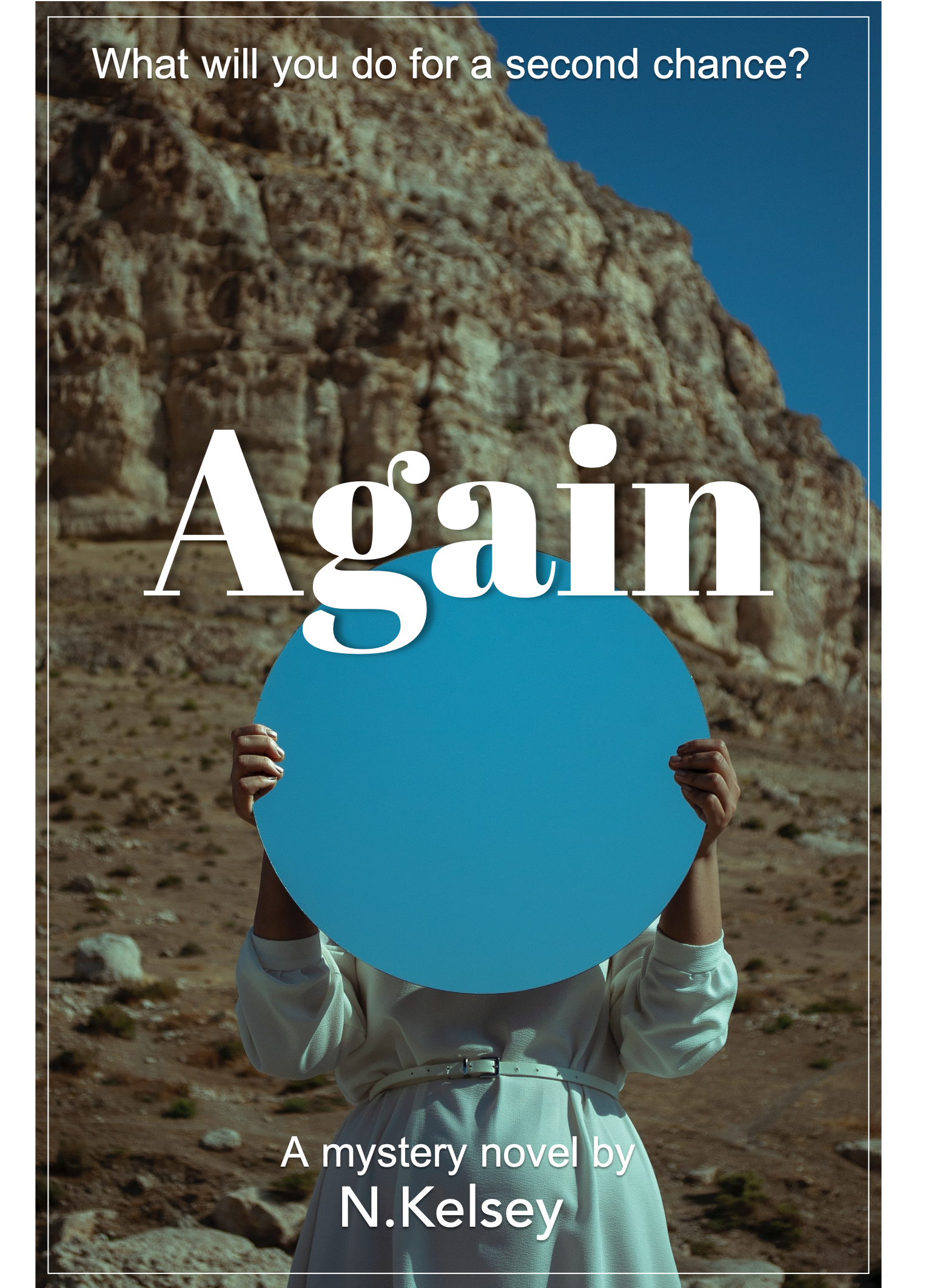
The cover might be good for a dramatic memoir or a lit-fic novel, but there’s absolutely nothing about it that says “dark-academia-adjacent mystery” — so you wouldn’t be attracting your target audience, and the audience who WOULD be interested in your cover would feel put off when they read the description.
I think you need to do what we frequently recommend around here: Imagine your target reader going on a book-buying binge. What other books would you expect in that reader’s shopping cart along with yours? Look at the covers to those books and see how your target audience is used to being marketed to, and let what you learn influence you as you come up with a cover concept.
Other comments?
It is a striking cover, indeed, but it conveys no idea at all about the nature of the book, what it might be about, its themes or ideas.
This book cover concept requires…
the MILLER TEST! (Yes, it’s named in honor of the esteemed Ron Miller.)
Pretend, submitter, that this is not your book. Pretend, for a moment, that the text on the cover says:
Athuair
úrscéal rúndiamhair
N. Kelsey
Quick–tell me, what genre is this and what niche in that genre? What’s it about? And if you’re thinking “how the hell would I know that,” ?that’s what your prospective reader is going to think.
Without the tagline, I’d never have thought it was a mystery. I’d have thought LitFic, maybe Women’s Fiction. Not a mystery. And the “dot” thing…I suspect that this is another cover in which the dot, the circular thing that she’s holding, has some meaning in the plot, that the reader “will understand” when s/he’s finished with the book–but that’s too late.
Covers are not the spot for Easter Eggs, not until you’re the next Stephen King or Dan Brown, or the like. Trust us, your reader won’t remember the blue dot, or whatever that is, that she’s holding. And even if they were going to, you need to get them into the book, first and I just don’t see that happening with this cover. I’m a dedicated, voracious reader of mysteries and I’d have blown right past this, never considering that it fell into that genre. If the graphic doesn’t grab my eye, I’m not going to even get to the tagline, to see that it is, or might be, a mystery.
I’m sorry, but I believe this needs a major rethinking. I would do what “everybody else” does and consider an academic setting, if academia is a strong element/component of the book. Yes, it’s a trope; yes, everybody else does it–but unless you have an established name, this is not the time to try to establish a new approach to covers for academic-based (or adjacent) mysteries. You want that reader of academia-based mysteries to click your cover–not blow past it. Your cover is clickbait–and this cover is not inciting clickage, IMHO.
I’d look at trade- and self-published books in the same niche and I would take notes about what the best-selling books are doing, cover-wise. Don’t just look at authors already known–look at authors with whom you are not familiar, new in the genre, that are selling. Pay attention to what they’re doing on their covers.
Good luck. I’d love to see what it looks like after a redo.
I totally agree with the blue dot issue. I’d be thinking that it was a ‘blue dot sale’ tag someone had stuck on the cover.
Me, too. I don’t understand it and that was my point.
You could probably reuse some of this. Change out the background for a library study or classroom but pick one with dramatic lighting. Something really pretty and eye catching. Pick an image that catches your eye without any work and it will likely catch others once that work is done. Starting with bland uninteresting images will make your job much harder. Even a plain black would be a stronger background than what you have now. It might be cool to try that and put a ‘spotlight’ on the circle thing. Add some scary shadow and that might work…lol
I’d recommend either centering that circle or making it noticeably/purposefully off center. I’d further recommend making it useful to the tone by adding/using it as part of the entire. For instance, making it a portal into the image either showing something relevant to the story or maybe a negative photo effect. Changing the circle to a swirly black mystery icon would better set tone than blue would. Changing it to red would better set tone than blue.
Blue is a ‘calm’ tone and the cover here needs to say excitement and mystery not calm.
I like the font but not really for this story. It’s a nice pretty font but it has the wrong tone for this book. I’d try a typeface font, maybe a distressed one but that would depend on the art.
I concur that Abril Fatface (typeface) doesn’t convey “mystery” to the typical mystery buyer.
Like Nathan says. This is a great photo, with loads of book cover potential – but unfortunately not remotely right for THIS book.
If your book was a kind of folk-horror/thriller concerning a small coastal community where there are hints of strange ritual and ancient belief, I’d be congratulating you on the image choice and advising on how to polish the. The image has vibes that remind me of The Wicker Man, Picnic at Hanging Rock and, from the book world, things like Water Shall Refuse Them (https://images-na.ssl-images-amazon.com/images/I/41PZRvztFgL.jpg).
However, that is totally different from the book described in your synopsis, across the board – setting, atmosphere and subject. Basically the wrong genre altogether.
Your cover’s most important job is to communicate what your book is to the browsing public, and do so in a way that makes them interested to know more.
That doesn’t mean your imagery necessarily has to be obvious and literal. But it does have to relate to the content strongly.
The relationship between content and imagery is one with lots of nuance and different ‘rules’ across different genres.
Mysteries and thrillers are areas where the cover imagery tends to be somewhat vague or symbolic in what it depicts because, of course, you don’t want to give away too much. And also because if you can create an air of mystery on the front you’re already getting your reader hooked!
The tricky thing is there’s a fine line between ‘intriguingly mysterious’ and ‘offputtingly impenetrable’ or ‘irrelevant’.
Your cover suggests mystery but NOT the mystery described in your synopsis. The people who click on this cover to find out more are going to be people expecting a different kind of book. And wrongfooting and disappointing someone expecting something else is not a good start towards making a sale. You need to have a cover that makes sure that what it is promising is what people will find when they read the blurb.
There’s a lot of different kinds of mystery. It sounds like yours is amongst the more ‘literary’ end of things. In this area, covers often do their job by using a lot of allusive and symbolic imagery, which hints at themes and provides atmosphere.
For example, let’s take another literary mystery/thriller set in an academic community, Alex Michaelides’ The Maidens:
https://images-na.ssl-images-amazon.com/images/I/81K05pTbJUL.jpg
The use of a Greek statue signals main subject of the book, which revolves around a Cambridge professor of Greek tragedy. The treatment of that image is what gives you the edgy, unsettling mystery vibes: the broken and bloodied neck, the image’s isolation on a black background, the pottery-like cracks overlayed and the elimination of the eyes.
The book keeps its secrets while also clearly signalling basics about its subject. A browser might not guess specifics when they glance at the cover but it does communicate enough to attract the right eyes.
With those guidelines in mind, I’m going to link the previous book by the same author:
https://images-na.ssl-images-amazon.com/images/I/91lslnZ-btL.jpg
I link this for comparison because the two covers provide good examples of how covers are led by title.
‘The Silent Patient’ is a title that gives us quite a lot of information. The word ‘patient’ tells us we’re dealing with the world of sickness and medicine. ‘Silent patient’ suggests specifically the world of psychiatric illness since that is where talking is most relevant. In addition, the very premise of the book is suggested in the phrase – ‘there’s something wrong with this person but they won’t talk’.
Because the title itself tells the browser such a lot the imagery doesn’t need to be that telling. The cover image here doesn’t feel the need to reiterate the medical theme, its imagery isn’t that specific to the content or theme, it just focuses on adding atmosphere and unsettling-ness to the idea of ‘silence’ suggested by the title. The designer makes sure the title is as big as possible and eases back on the imagery.
Now imagine is this book by Alex Michaelides, with the exact text and premise the same inside, was instead called ‘Again’ – do you think the cover designer would have made the same choices? Without the title clearly communicating the ideas of ‘patient, medicine, illness’ it would fall to the cover designer to instead communicate those themes via their chosen imagery. Without the title communicating ‘silence’, the designer wouldn’t be able to bounce off that to add a particular flavour of ‘secrets, pain’ to that word.
And we can see that because the other book I’ve linked by Michaelides has a far more opaque title. As a title ‘The Maidens’ gives us some immediate associations but nothing so leading. That’s OK too, it just requires a different approach from the cover designer to support. I.e. the title doesn’t say anything about the setting, subject or genre to the browser, so the imagery must instead.
Your title is ‘Again’. That is a title which communicates nothing to the browser. Again, that’s fine, I’m not saying it’s a bad title! But it means your cover has to work extra hard. It can’t all be secrets. You need to tell your reader enough to be interested in the mystery that is this book.
Your synopsis has a couple of distinct aspects and it’s up to you to decide which of these is the more definitive aspect of the book that would lead the cover. Is it the world of small-college-town charm, or the world of software development? Is it the tension between these two disparate ideas?
I have gone through the process of finding and trying out imagery for this book here: https://www.kathrynrosamiller.com/post/cover-advice-again.
You can find great imagery that is equally striking but also apt to the text and able to communicate the right stuff to browsers, you just need to know the steps!
I wish we had ways to “like” contributions here, Kata. I invariably find your workups and processes invaluable and I learn something each time. Thank you for them.
Aw thank you very much Hitch! Your comments are always very insightful too. And I always learn something myself from talking through the process, it’s really useful for noticing things one does unconsciously!
Wow I read your notes and your post and tons of helpful advice there, thanks! I’ll consider that when making the new cover. I like all your ideas and the careful consideration you gave them.
No problem! I’ve chucked a lot of stuff at you there, but the main thing to bear in mind, I think, is that the more options you give yourself at the start, the better the cover you’ll end up with will be.
And the ‘chuck a load of stuff at the wall and see what sticks’ is a really fun part of the process too!
Good luck with the next stage!
I’m going to say this not only for this cover, but for all of the last three submissions we’ve had on here: aloof covers are a horrible idea, and whoever first decided to design covers for books that would deliberately avoid offering so much as a hint to the prospective reader as to those books’ contents deserves to be stripped and shorn and soundly beaten and eternally expelled from our culture for being such an artistic blight on humanity. Authors and designers, if you actually want anybody to read the book (let alone purchase it), do not make aloof covers; they are the very antithesis of the whole point of designing book covers in the first place, let alone the purpose of this site.
Be it ever so surreal or symbolic, please at least put something relating to the actual contents of your book on your cover draft. If the symbolism is too obscure or the information the imagery imparts is inadequately intriguing, we’ll tell you as much, but at least give us a foundation on which to improve. When you tell us in your synopsis that a book is on a certain subject in a certain genre and involves certain significant elements, and then throw a bunch of random and completely unrelated imagery onto your cover draft for it, the only honest advice we can give you is to throw the whole draft away and start over from scratch.
For this cover specifically? First, as I just said, throw this whole draft away and start over. Second, when starting over, put something on your cover that actually might point to one or more of the following significant parts of your story: academia, a broken engagement, a rebound romance, the video game industry, a death under suspicious circumstances, and resolving a crisis situation by digging up (and presumably sorting through) someone’s sins of the past; surely you can think of some kind of imagery that points to any of these weighty concerns from the story?