The author says:
Rogue 13 is a contemporary fiction novel set in Las Vegas Nevada. It is targeted for adult readers with an affinity for action romance thrillers.
An FBI agent on an undercover operation is sold out exposing her op, blowing her cover, and leaving her at the mercy of the dangerous individuals she has been investigating. A former black-ops agent the intelligence world believes was neutralized long ago immerges from the safety of his obscurity to aid her escape. Labeled as a rogue agent with her own agenda by her superiors, and falling into the crosshairs of the intelligence underworld, the two unite their unique skillsets in a fight to clear their names amongst a world intent on silencing them.
[original submission and comments here]
Nathan says:
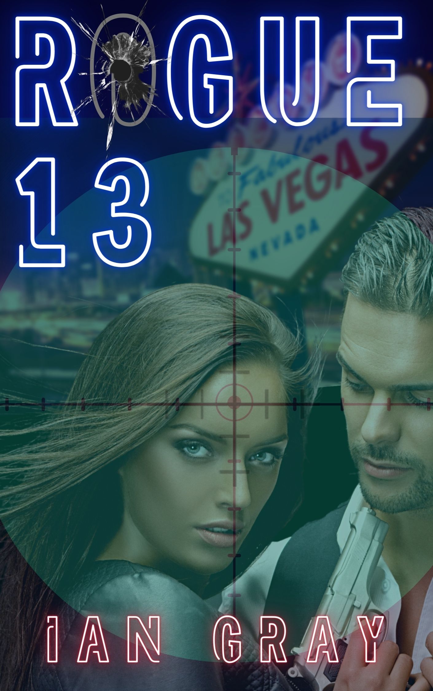
Some steps forward here, some steps back. The Vegas setting is more clearly indicated; however, the reticule over everything makes it all murky. The title/byline font is still more distracting than it needs to be — thrillers do well with clear, thick solid type. And the stock photo has the same problem it had the last time: She looks like she’s about to blow her boyfriend’s brains out.
Other comments?
Well, as it’s obvious that the artist/author is heavily enamored with that particular image…lose the reticule. The whole “he’s a hostage with Stockholm Syndrome and she’s going to blow his head off” imagery is even more pronounced now, as the problematic area is zoomed, but…without losing that particular image, I don’t see any way around that. I also think that the bullethole in the glass obscures part of the title, and at thumbnail, it’s incredibly difficult to read the byline with that font. I get it, conceptually–neon lighting–but in practice, it’s not helping, IMHO.
Maybe Savoy or Ron will have specific ideas or suggestions that can help.
My only specific suggestion would be to start over entirely from scratch.
The thumbnail kind of says it all: it is impossible to make out anything among all the murkiness.
The cover is in desperate need of both value and color contrast. Take my advice and make a gray scale version of the cover and I think you will see what I mean.
The type is fine…but when you are using a highly decorative typeface you do not want to mess around with it any further. Adding whatever that is to the O in Rogue just makes the word harder to read…aside from being an utterly gratuitous gesture. (Oh…it’s a bullet hole with a burnt-out neon tube. Nope. Aside from the fact that I had to scrutinize the cover to figure that out—which no potential reader is going to bother to do—it is just cleverness for the sake of cleverness.)
My only specific suggestion would be to start over entirely from scratch.
https://imgur.com/a/bIKLIU8
I recommend moving the girl’s gun hand (and probably the man’s too)(excuse my quick crappy blends on that)
Integrating the separate parts of the title so it looks purposeful. I didn’t hate your font in either version just the placement. Big bold font is common for thriller so I used it. You could make your name much bigger as half the thriller books have huge author names on them, and yes, I understand that it’s because names like David Baldacci sell books but it’s an expected and accepted design feature now and having your name bold and big can make a book browser assume you must be important too. Adding a few small lines of text can also help match the other books that are selling in that category. You want your book to fit in style wise with contrast to catch the eye. don’t be afraid of covering parts of the characters.
Using texture or effects to give the cover motion and action as the couple is very static. (I’m not in love with the couple as he’s looking down her shirt, not at her and his hand is on his own vest. I think having it go off screen might be a better pose but there’s still the eye issue even after the hands are fixed)
A color wash to keep all color tones in the same family.
Don’t worry about background detail. No one will notice or care. Use the background to make the main figure pop. Simple texture would be totally fine as long as that texture is genre appropriate. In other words you don’t want cloth texture. A texture like fire would work (if it were appropriate to the story) as fire screams danger and adventure. You want something that says action. I used a Vegas building but honestly it would work better with a few lit windows or lighting on the tower bits to imply there is action going on there. Plus contrast catches the eye so that’s what you want.
I played with the color and added another image. IMO the yellow pops more.
LOL, I was just coming here, after looking at your quick-n-dirty mockups, to say “I really, really like the one with the gold tones.” Strong contrast, eye-catching. Nicely done. I hope the author/cover-maker goes with it. And the font deployment, also niiiice.
Shelley, WOW! The covers look amazing! I agree the gold makes the cover pop. Thank you so much for your feedback, and taking the time to show me what is possible! May I use the cover you’ve created?
I “see” Shelley multiple times daily. I’ll let her know you’ve asked.
You could but’s it’s crappy. To do a proper job I need the original picture of the man and woman. I’m unsure if I can post an email address here though for you to send too. It might be against site rules. Maybe post the original picture on Imagur (or some other picture host) and the link to it here?
I’ll allow it.
Shel,
The original photo is from canva: https://www.canva.com/design/DAEYF6RoboI/q4N3oLV9xto7KaDLJDbZhg/edit
In the interest of your privacy, if permissible by site administration, my email is stitches13i@yahoo.com. You are welcome to contact me at your convenience without posting your info.
Canva would be the owner of the image and I have no idea if they allow third person manipulation to their art.
You’d need to purchase the image from them.
I can’t legally use the image without their express permission. Any image I work with needs to be legally procured with a signed model release. If you can’t purchase that image maybe one of these images would work?
https://depositphotos.com/236835408/stock-photo-couple-secret-agents-posing-guns.html
I also didn’t realize how many times this image has been used for books! Steamy romances, this romance, that romance. Hell, that image is practically a trope unto itself, but the submitter already has this image published, for his book. I did a Google Search for the image, and ran into book after book. Thus, I suspect that fixing it is the only path forward.
You can, however, license this image from iStock or Getty. The former has it for only $33.00.
H
I think the original was better because the figures stood out. In this one, the color wash and background are making the figures hard to see and the title hard to read, especially in thumbnail. So you still have the issues in the original photo, but rather than covering them up with fancy font and background, use the background to make them jump out at the viewer. I don’t like the photo, but if you’re set on it, make it clearer
My advice is to create or get characters that work, and use the background and font to make them, and the title/author, stand out as much as possible. Shelley has some good advice for making it work.