The author says:
The Trevor Family – filthy rich, dysfunctional. In an attempt to reconnect with his family, Henry decides to take an unusual vacation to the Democratic Republic of Congo. Fate takes a turn and leads them to an idyllic neighborhood, where everything is more than perfect. The hospitable people, their lively parties, and picturesque homes make them never want to leave again. Almost. Until they meet the weird twins, Mary and Joe. “You can never leave,” said Mary-Joe synchronously. “They have plans for you.”
Nathan says:
There are two issues here: (a) this is not a good cover technically, and (b) this is not a good cover for your book.
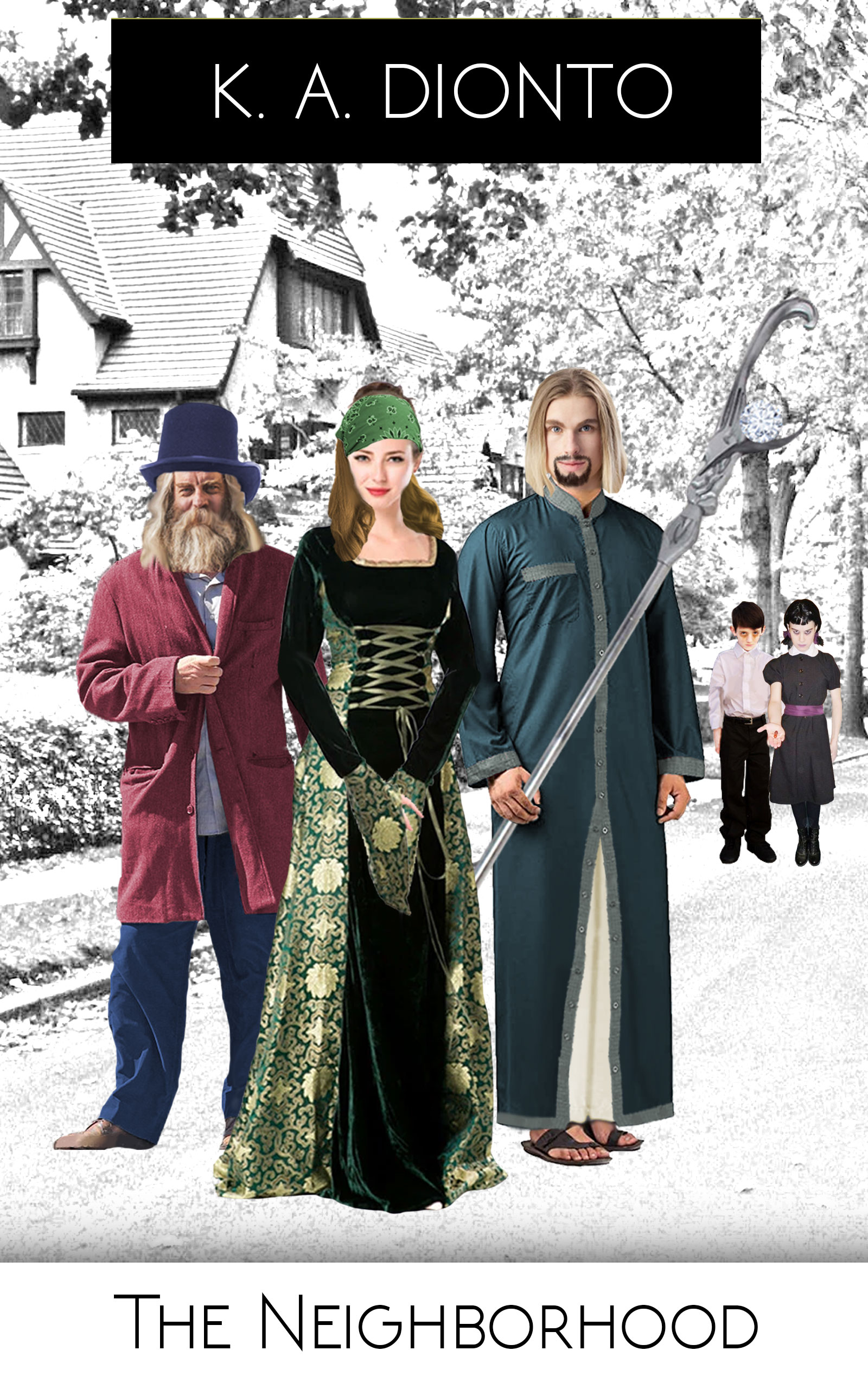
(a) The three main figures are obviously spliced together (the light source on the man on the left is the biggest giveaway), and their bizarre assortments of costumes tell us nothing about the milieu of the story. At least two of the three look like their images were taken from Halloween costume sites. The creepy kids look like they were inserted as an afterthought.
(b) So this story takes place in the Congo? I can see absolutely nothing of that in the cover. If I were forced to guess, I would say that this is the cover of a book trying to be Addams Family-esque, with a household of magicians (or psychotic Ren Faire groupies) living in suburbia.
The first step you need to take is to ask yourself, “What is the biggest ‘hook’ in this movie? If I had to blurt out to someone in an elevator why they should read it, what would I say? And then, how do I indicate that same ‘hook’ visually?”
Other comments?
The idea is a decent one—color figures against a B&W background—but not for this book. Nathan is right when he says that the cover simply does not convey any real sense of what this book about. I see where the Congo location is probably not as important as the fact that the story seems to be taking place in a kind of pseudo-world, “…an idyllic neighborhood, where everything is more than perfect” and where “The hospitable people, their lively parties, and picturesque homes make them never want to leave again.” But the cover does not suggest anything about this at all. It is just a bunch of people standing in the middle of the street in a middle-class neighborhood—looking as though they are ready for a cosplay competition.
I presume the two kids in the back are the “weird twins.”
I think that the main problem with the cover is the old bugabook of subjectivity: everything is meaningful to you…but you already know what the book is about. Anyone who has not already read it would be completely mystified if not thoroughly confused.
You need to step back and rethink this cover. What it needs to do is convey, in a glance, a significant idea about this book: what it is about, its themes or nature. In other words, it needs a lot more focus than it has now.
One thing a cover should not do is try to include everything that might be important (or seem to be important). Another thing it should not do is be a kind of puzzle for the reader to try to figure out.
Your description of the story reminds me a little of Bradbury’s “Mars is Heaven” or even “The Stepford Wives,” where a seemingly idyllic environment is more than it seems—and more sinister. Perhaps this is the idea you might want to try to get across. In short, as I have already suggested, focus on just one important aspect or theme of your story.
(Since I think that this cover needs to be rethought from scratch, these comments are pretty much moot, but there is probably no harm in pointing out that while the idea is nice—as I said—it suffers from execution. As Nathan said, there is no consistency in lighting and, without cast shadows, the figures are all floating. All to say nothing of too-obvious cut-and-paste and colorization.)
One more thought: consider where the title and your name will go as you design the art. That is, don’t come up with a great idea for an image and then just tack on the text as an afterthought. Make it part and parcel of the cover from the very outset.
Hi:
Lord, I don’t wish to pile on, but…I don’t love the idea and the execution is not great.
I don’t understand what the Halloween Costumes mean. Or why they would matter to me as a buyer (and I am the buying demographic for this type of book). Even ignoring this cover, and viewing the synopsis, I still don’t get it. Why are they dressed like that and what is it saying to me? Let’s say you hired a Deviant, (DeviantArt site, not a perv) to draw the artwork for that cover–what would it do for me? What’s it mean, in the context of this mystically-perfect-but-not, neighborhood?
The Twins aren’t doing anything for me. They might work, if they were front and center. Perhaps doing something ???, in front of an idyllic suburb behind them?
This is the type of cover that either needs something primarily symbolic, or needs custom art, in my humble opinion. Perhaps the Twins in front of something relatively simple but colorful, like this? https://depositphotos.com/46914787/stock-illustration-african-savanna-an-evening-landscape.html . It’s not perfect, of course; it’s primarily landscape oriented, but you get my drift. Something that at least says “Africa,” if that’s relevant to the story.
Is it? I can’t tell if it is, or isn’t. If the location is moot, other than “far away from what the reader is typically going to be used to,” then perhaps displaying “Africa” prominently doesn’t serve a good purpose.
Natch, it’s hard to not hear “[y]ou can check-out any time you like, but you can never leave” in your head, after reading your synopsis. There’s not much you can do with the Hotel California thing, though. You can’t even recycle that line, as the Eagles would sue your ass, but you could…homage it in a tagline. (“In the Congo, nobody can let you leave.” Or you could use “you can never leave.” I mean, those are twofers.)
So, sorry. I don’t know what can be done here, other than starting over. I would absolutely not use any of those images. The guy on the right looks like he’s prancing around in a faux-bathrobe; the woman looks like she went to a RenFaire, as Nathan stated and got whacked on the head and is wearing a bandage, and the guy on the left, sweet Jesus, looks bloody homeless. Or deranged…or both. There’s nothing that says “idyllic” here or suspenseful or even supernatural.
Again, not trying to pile on. It’s hard, I know, to put your work out there and have it critiqued. But I don’t think this cover is going to help your book and I don’t think it will lead to sales. And after all, that’s its job–to lure in the reader, get them interested, make them click through to your sales page. Then it’s done its job–then it’s up to your description and look-inside hooks.
I’d love to see this again.
I recommend focusing one character. You have a bit too much going on. Find an image of 1 character doing anything besides standing in a static pose. The more active the pose, the better. The only time you can get away with static images is if the expressions are really great. I can’t see the kids enough to tell if their expressions are good or not. If you’re set on using all of the characters, make them interact or the eye wanders all over the cover. You need some visual element to tie them together.
Changing out your background house for something with way less tree and more identical sameness would likely help like a row of the exact same houses with the focus on the weird kids in the driveway just make sure everything is to scale
An idea might be to scratch the people entirely and show the edge of the town with a sign saying leaving wherever (or the title of the book on a road sign) and then a mirror image of the town beyond that. You might be able to do it in one side white with black and the other opposite but that might not translate well
Hmmm…I like that, Shelley. what about a mirror-image (above/below) thing? With a pretty gorgeous neighborhood above and a tattered, blackened, horror-y look below? Maybe the kids could be standing somewhere, doing something (pouring?) down into the “bad” neighborhood? Something like that?