The author says:
The genre is historical romance.
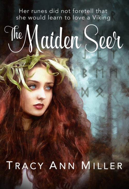
Konnar doesn’t believe in the power to tell the future or to see into the unknown. But that changes when Amber comes into his life. Amber, known in her homeland of Wessex, as the Maiden Seer, seeks refuge from her dark foretelling dreams of war. The rune readings she gives to her followers have also become too much to bear. But this can only happen after she fulfills her blackest dream … one in which she foresees herself killing a man. Konnar hopes the violent memories of his life as a Viking raider and tragic losses will be quieted when he leaves England forever. This upcoming task will pay for his future and provide for the village that depends on him. But, abducting the Maiden Seer and delivering her to the wealthy client goes wildly awry. Amber seems to know Konnar’s painful secret and claims to foresee a solution. While it enrages him that she negotiates her freedom with this knowledge, should Konnar dare believe the prophetess can help him? He is her captor, but hiding behind his might and violent history, is a man in need of forgiveness. It is that vulnerable side of him that she learns to love, as she enlists him on her dangerous mission to help the king of England. The Viking and the Maiden Seer journey throughout England to carry out her prophetic vision. Yet, they struggle with their mutual passion for each other, each unsure of the others true intentions. But what could it mean, Amber’s dark dream that began it all?
Nathan says:
Really, my only complaint here is the awkward edge of her wispy hair against the background. Hair is hard to photoshop around, and it might be best simply to erase the hair down to where it becomes a solid mass.
Other than that, well done! Any other comments?


Great job! Excellent!
I wouldn’t change a thing, either…other than the edge of the hair as Nathan mentions. If your drawing skills are up to it, you might try feathering the edge a little and/or adding just a few wisps of hair to break up the edge. That would look much better than a hard edge and would also make the figure not look as though it were pasted onto the background.
there are paintbrushes made specifically for hair to add wisps and curls. Just google hair brushes for whatever photo manipulation tool you are using. I recommend using the color pick tool and layering 2-3 strands together to get the same rich look as her curls. Make a few wisps on separate layers for ease of positioning of them. Then, to ‘blend them into the girl’s hair and the background try using MULTIPLY for the setting of the layer.
I love it too. If I were being nit-picky I’d recommend the following:
you have a hard straight edge that could be blurred/faded a bit on the girl’s shirt right on the letter M in Miller. Your tree has some weird black brush strokes on it. And the brown bush is bleeding into her hair. If you’re going for highlighting, I’d try a softer brush or a much harder one and set the layer to overlay. Or duplicate the back layer and use the burn tool to trace the areas you want to pop.
It’s nice! The girl is great and I love the runes in the background. At full resolution, it looks like there are some filters that I’m not in love with–a raster dot filter and an oil paint filter, maybe? They’re not obtrusive, but the cover would be stronger without them.
This is all very good advice so far. In addition to the others’ tips, I notice you’ve got just a little bit of some kind of “parchment” texture or something like that overlaid on the picture. For best results, when doing whatever you decide to do to blend the hair in with the rest of the picture, do the softening or blurring or feathering or whatever else first, and then lay the texture down on top of that to make it look that much more like it’s always been a part of the picture.
Thank you for all your comments! The way I constructed this was to compose and layer all my elements (minus the text parts) in a pleasing way, and then run it through one of the styles in the Dynamic Auto Painter. http://www.mediachance.com/dap/index.html
This paint program thingy is great for hours of fun! In my cover’s case, I like the way it unified my elements.
The hair problem actually happened in the process, but the more I monkeyed with it afterward the worse it got. So I left it as was.
🙂
Yeah, that’s the part I’m not going for. The composition and the elements are so nice that slapping a filter on it is unnecessary–it just gives me the sneaking suspicion that there was a mistake somewhere that you’re trying to cover up. Plus apparently it caused your hair problem, so there you have it.
I liked it pretty well before running it through the painter. Here’s that version:
https://www.dropbox.com/s/sej572gzje5wgvs/TheMaidenSeer_before.png?dl=0
I can’t find the PSD where I layered the background and runes, and apparently ramped up the color saturation.
Ooh yes, I like that much better!
I agree: it looks very nice except for the previously noted issue with the edge of her hair. But I can’t help thinking that her face is a bit small in relation to the overall size of the cover. I get that it’s not going for an extreme closeup where the face dominates completely, but would it help to increase the relative size of her head by about 50% (or push/zoom in on the whole image and recrop) so that the top half of her laurels pushes up under the title, and the bottom edge ends with only her hair instead of including those vague white areas?
I like the unfiltered better. The hair looks much nicer. The top of her head could use some touching up with a whisp or two so it doesn’t look pasted but your text might hide it enough anyway so it isn’t a problem. your runes are a tiny bit too prominent though (when I first glimpsed this cover I thought the runes hung from the trees, which was a cool effect. Here they sort of just hang there, but fading them a bit would set them more into the background picture. so maybe lower the opacity of just that layer just a smidge so they blend into the background more.) set the brush to the softest one you have and lower the opacity on the eraser tool and lightly go over the edge of her shirt to blur that straight edge.
https://imgur.com/a/2rDOM
the different tones were achieved with the simple process of filling a layer with red in the first pic (and green for the second) then setting that layer to overlay and then lowering the opacity of the layer. you could pick any color you like, redder, pinker, yellow, whatever, and easily mess around with it to get the look you like. that last picture had a black overlay on her hair only.to make it pop more. the overlays give the picture a cohesive look and fade your runes into the background a bit. you could easily use different overlays on the background and girl, make her redder and the background greener.
in the fourth pic, I added some quick wisps of hair with a hair paintbrush. the blend job was crap because I did it so quick, without using all the hair colors she has but you get the idea…lol
Thank you for the great mock ups!
This is really pretty! The thing that struck me most, though – which I’m sorry if it’s off-topic – is that the girl depicted on the cover does not look like an Amber. “Amber” makes me picture a modern-day basic bleached blonde, not a Maiden Seer with “dark foretelling dreams of war” in medieval England. Especially one with red-brown, as opposed to golden, hair. I might consider changing the character’s name to something deeper-sounding and more period-likely.
In terms of “Amber” seems a perfectly reasonable name to me for someone with auburn hair. It is also the classic Celtic or magic look. (If you read fantasy, it is one of the common tropes that ooh, red hair, magic user….). In fantasy terms (I know this is a romance not a fantasy) but in fantasy terms, you “translate” names – so Amber seems fine to me. The Vikings had amber jewelery, so calling someone with auburn hair Amber, or the equivalent seems logical.
However, that said, I am not a romance reader – and if it makes your audience react as Monica does…..
Incidentally – Monica – are you a reader of this genre? (Just wondering how representative of target audience your reaction is…..even though it is one data point…:) )
Your welcome 🙂 I recognized your tree background as I used it too in a cover… LOL different portion but the same forest. Its a great picture with really nice colors even without any filters/overlays at all. (The Book hasn’t been released yet)
🙂
I’ve seen “our” forest photo other times, too. It really is an evocative image.
I’m bugged by the willow wreath on her head – the leaf that curls down round her right eye draws my attention not in a good way. Also, the filter version, her eyes are very bright blue.
I wish I could have found a version of this photo with this model without the wreath. It was so much a part of the image though, I knew well enough not to do anything to it.
I actually doctored the eyes to that color AFTER the filter.
Mmm.
1. Well doctored on those eyes, looks a part of the picture
2. Really not for me – makes me think of folks with coloured contact lenses and movie camera men tweaking the lighting for that extra glow…
But again, I am not your target audience. 🙂
In the book, she has silver eyes, but that looked REALLY odd on the cover. The pale blue reads better and still gives the same effect.
I wouldn’t call her eyes pale blue at all – looks like a sky blue to me, so the darker end of blue eyes. In fact an intense enough shade to make me think “contact lenses”. Perhaps a little paler/greyer?
I do like the wreath personally.
I’m fine with the wreath as a whole, it is just the leaf curving across her face I don’t like.
It looks like something that should be in barns and nobles 👍
It is a good cover – I do think just that the face could be larger, or moved down, as there is a space now at the bottom which is mostly just hair, like others have already pointed out. The font on the top, for the motto or what should we call it, looks a little too plain. Not that it should be curly like the title, but something a tad more old-fashioned might work better, or just italics?
And these are more just nitpicks, the cover looks attractive as it is.
RE: silver eyes — remember the actress Meg Foster? When she was a pretty young thing. Eyes so pale they did look silver. Google for pics, see what you think.
I don’t have much input about the cover but the text on top just made me want to desperately read your book. It was amazing.