The author says:
Get That Job! The Quick and Complete Guide to a Winning Interview is packed with all you need to get ready for the best interview of your life. Through proven interview tips and step-by-step instructions, you will learn to:
✔ Identify and communicate the unique strengths that make you the right person for the job.
✔ Understand why employers ask many of the most common interview questions – and how to answer with confidence.
✔ Succeed with video interviews, behavioral interviews and panels.
✔ Build an arsenal of success stories – more than you think you have!
✔ Ace every step – from the first screening to accepting the offer.“A practical guide to authentic, well prepared interviewing, Get That Job! offers an abundant tool kit of resources – including great answers to challenging questions every job seeker is sure to encounter. Kudos!” –Marie Zimenoff, Director of Career Thought Leaders and the Resume Writing Academy
Nathan says:
Honestly, I’ve got no suggestions. It looks fine to me as-is. Over to you, hive-brain!


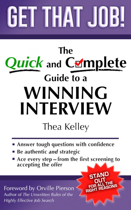
The only suggestion I have is to put a thin, black border around the entire cover to keep the white band from blending into white backgrounds on sales pages. One pixel wide could be enough. The cover overall is a touch bland, but getting too flashy could actually be a detriment as it would make you look off-point. The black border might help with that by defining the edges of the page more clearly.
The check mark for ‘o’ in complete is cute. It helps keep the cover from being entirely bland. It may even be enough on its own.
Funnily enough I was in two minds about the check box “o” – one one hand clever, on other slightly less readable – but I thought it balanced the italic green “Quick” you need a gimmick on both sides or it is unbalanced.
So to me, looks like a representative cover for the book. Eye catching. Says what is in the “tin”.
It does need something on both sides, and the green is good. I singled out the check box because it seemed the riskier of the two, since it does impact readability slightly. I think it works though. In the thumbnail “Get That Job!” is the only part where immediate readability is vital, and at full size the readability issue largely vanishes for “Complete”.
A definite YES on the border–not only is it a wise idea, but if you don’t, Amazon will send you a nastygram, at some point, because the cover will blend into the background of their web page. If it were mine, I’d play with a very, very pale but slightly tinted background color (super-pale yellow, or pink, or my fave when all else fails, super-pale creamsicle), to see if it sparks it up just a skosh, but if nothing like that works, then stick with the white and the 1-2 pixel border. I prefer a charcoal, for those types of borders, FYI. The black to my eye is always a teeny bit too-too.
Secondly–ye Gods!–I don’t even have a comment to make about the fonts. They’re great as they are.
Damned well done.
I’m on team anti-checkbox, actually. In the first place, O’s are not square. In the second place, the big red check is more visible than the box, so it looks more like a V to me.
Aside from that, everything is lovely! I like the fine gradient adding visual interest to the purple bars.