The author says:
This book chronicles the steps the five terrorists of Flight 77 (that hit the Pentagon) took in suburban Maryland in the two weeks prior to 9/11.
Nathan says:
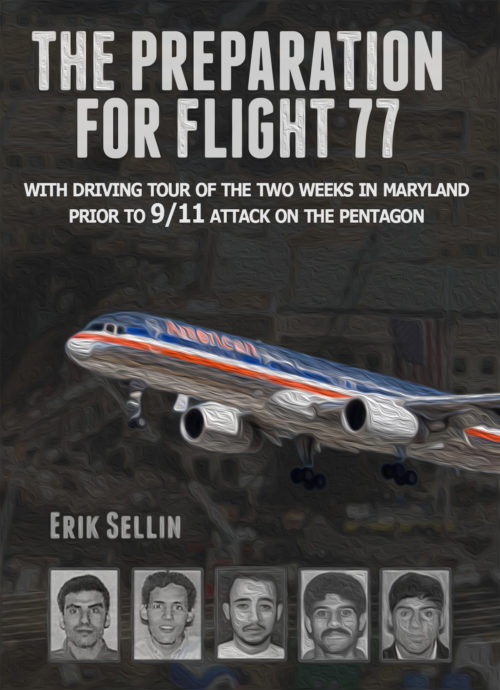
The subject matter of this one practically demands that the cover content be (1) an airplane, and (2) pictures of the five hijackers. You’ve got that part. Now, what should you do with it?
- Lose the swirly filter. Seriously, I don’t even know why they include that with PhotoShop, because it’s impossible to do anything good with it. The look you want here is “stark” — deep blacks, bold contrasts.
- Those cover elements, being obligatory, don’t need to be the dominant elements in your cover. That should be your title. Nonfiction covers have an advantage over fiction covers in that regard; readers don’t mind if your cover tells them with words what the book is about. If it were me, I’d have the title take up fully half of the real estate here.
- While your title font choice isn’t necessarily bad, you’ll notice in other covers that as the subject of the book becomes more serious and worthy to be remembered, the title fonts tend more toward serifed fonts in capital letters. Why? because a font that connotes two thousand years of history says, “This is important. This is permanent. This is worth being remembered.” Trajan Pro (aka “The Movie Poster Font”) is becoming too overused to clearly give that connotation, but there are other serif fonts that can give that same impression.
- Your subtitle font clashes with the title font — and I suspect, would clash with a serifed Roman font. Try using the same font that the book text uses. (Also, “driving tour” sounds waaay to idyllic for this subject. You’re not sending people on a terror-tourism family vacation here.)
- The title is centered, the subtitle is centered, the airplane is smack-dab in the middle, the five headshots are center-aligned… Why isn’t your byline centered? I understand the impulse to add some variety, but it just ends up being the odd element out.
Other comments?


I’m with Nathan, the swirly thing is not working. I would also flip this cover, have your name on the top, then the pictures, the airplane in the middle and the bottom half your title and subtitle.
On a side note, (a more personal one) I might consider leaving their pictures out all together. I realize that is what your story is about, but giving notorious criminals any kind of lasting publicity, (intentional or not) doesn’t seem like a wise use of your valuable real estate (your book cover). Perhaps, you could use pictures of some victims instead. Just a thought. Feel free to completely ignore it. LOL
I agree with Nathan (especially with his suggestion that you lose all of the texture filters: they are absolutely unnecessary)…with an added comment about the background. I had to look hard to realize just what that murky dark mass was. In fact, the overall impression I get of the book (especially in thumbnail form) is greyness.
Hmmmm. a couple of comments.
1. I’d strengthen the RED of the plane’s body. Lose the swirly (so appropriately named!), and vividly strengthen the colors, to build contrast. The plane comes with them; use it to your advantage. Make the white neon blue-white, the red bloody and the blue BLUE. The silver is hard to pull off, but do what you can.
2. Try Sorts Mill Goudy, instead of Trajan Pro. It’s a nice looking, strong font. CINZEL is also VERY nice. Classic Roman conveys what Nathan mentioned–history. Imperator Small Caps is tasty, too. If you need space, Industrial 736 has a nice compressed face, that doesn’t look mooshed.
2.a. I’d need to see a mockup of the title font, to know what to suggest for the subtitle font, but…play with it a bit. You’ll feel it when you see it.
3. I want to take a moment to concur that “driving tour” is bad phrasing. Um…map of? Detailed map of? Something that doesn’t imply something like the “Jack the Ripper walking tour.” (I guess, with due consideration, that’s not much better, but at least it’s more than a century in the past, and not so raw.) It just feels a bit…tasteless to call it a driving tour. I know that is certainly not what you meant.
4. Ron mentions that it’s “greyness,” and I second that. I’d think about a stronger black background, amping up the airplane, and I’d play with the coloring on the lettering. You may be surprised at what you can do just by trying different colors. Or mixes of colors, by which I don’t mean mixing the letter colors, but try different color mixes like adding a bit of white to yellow, or a pale blue, etc., for your lettering.
I’m ambivalent about Renee’s comment about not giving the terrorists any free publicity, fame, etc. I tend to agree with her, but I realize that they are, after all, the subjects of your book. I wonder if there’s something else that could be done with the images? There are some really talented cover designers that hang out here, and maybe one of them will have a brill idea about what you could do to feature them, but not emphasize them.
Good luck with this one. I know I’d love to see the revamped cover, when you are done with it. 🙂
From a distance (i.e. in thumbnail), this cover looked just fine. Up close, that “swirly” filter really kills the intended effect. Really, though, any filter would be inappropriate: this is real-life documented non-fiction, yes? Serve the pictures up straight, not like a cartoon or a pulp novel.
As to “free publicity” to terrorists, I think Renee and Hitch overestimate the likelihood that any books are going to increase their notoriety at this point. Fifteen years out, all the publicity seekers chasing 9/11 have pretty much gotten everything they’re going to get, and the news from last week is already considered ancient in our fast-paced contemporary world of internet media. Go ahead and keep the pictures, therefore; just keep them in stark gray-scale like the mug shots they are to emphasize that this is a hard-edged documentary and not an action-thriller fictional novel.
I do agree with Hitch that your sub-title needs a slightly different tone, however: “Driving Tour” does sound too much like something done on a lark, like those tours I’ve heard about a CIA and KGB agent giving of Washington D.C. where they amuse tourists by telling them about the various bits of skulduggery going on in various places there during the Cold War. We’re not that far removed from the political implications of 9/11 yet. Something that sounds more harrowing and condemnatory like “Legacy of Shame” or “Embedded Evil” or “Terrorism’s Trail” would help to emphasize that this is a serious documentary about the bad guys.
As to the rest of your layout, well… as the others say, either center everything, or else don’t. You need not be shy about your byline, but make sure that it’s either centered with everything else, or else serves to balance other things (like the title) by offsetting their offset (e.g. if the title is justified to the left, your byline gets justified to the right, or vice-versa). Your title’s not bad, but you might be able to do even better with something a little more concise, descriptive, and/or dramatic: Two Weeks To 9/11: Five For Flight 77, anyone?
One last consideration: you might want to fuss around with the color layout as well. The emphasis on the jet in the middle with everything else de-saturated into gray-scale does grab attention, but did it occur to you that a full-color shot of the burning Pentagon in the background with the jet grayed out instead might be rather gripping too? As with everything else you’re doing right, don’t overlook alternatives just because you’ve got a fairly good working design so far.
If you want to use the terrorists’ photos, you can try what was done with the photos of the killers in Capote’s In Cold Blood. The only photos of the men in the book were cropped close-up photos of their eyes. It was perfectly chilling, looking into those blank expressions. I agree with Nathan that you want to make those photos dark. Crank up the contrast.
I would emphasize the photo of the Pentagon destruction rather than a random image of a plane, particularly if American Airlines doesn’t want you to use their logo.
I also like the idea of only showing the terrorists’ eyes, especially since #2 looks like he smiling.
The tag is too long and poorly worded. Shorten and add drama.
BL? Did you sorta step into a time portal? This submission is from 3 years ago….???