The author says:
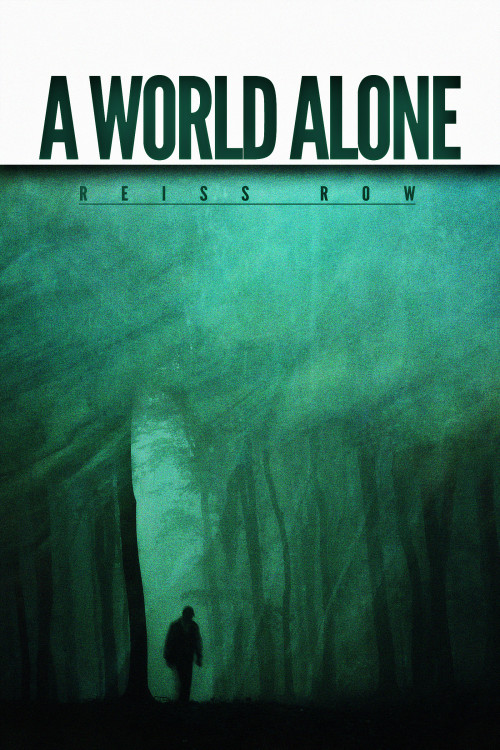
A young adult, zombie, horror novel that focuses more on their internal struggles while surviving in a post-apocalyptic wasteland.
Synopsis: Stella Carlisle is a thousand miles from her destination, and she’s willing to do anything to get there. Whether that means manipulating fellow survivors, or killing them, nothing is going to deter her. While infected lurk around every corner and bandits hide in every shadow, starvation and illness follow closely in their wake. In a world of personal demons, void of connection, Stella truly is living in a world alone.
Thank you so much for any criticism you can give me!
Nathan says:
First, a niggling little ebook design tip: When you’ve got white background to the edge of the page, add a very thin border to separate your cover from the (likely white) background of the page on which it’s sold. (Yes, I know that it’s off-white, but so subtly so that it’s still a problem.)
Now on to the cover itself: It’s a very solid design, and you’ve done well with separating it from the blood/guts/etc. of most of the zombie genre… perhaps too well. Nothing on this cover looks dangerous. Nothing looks like the world is out of whack. It looks almost completely introspective.
Also, the only person you mention in your synopsis is a woman who’s completely alone — but that’s a man’s silhouette.
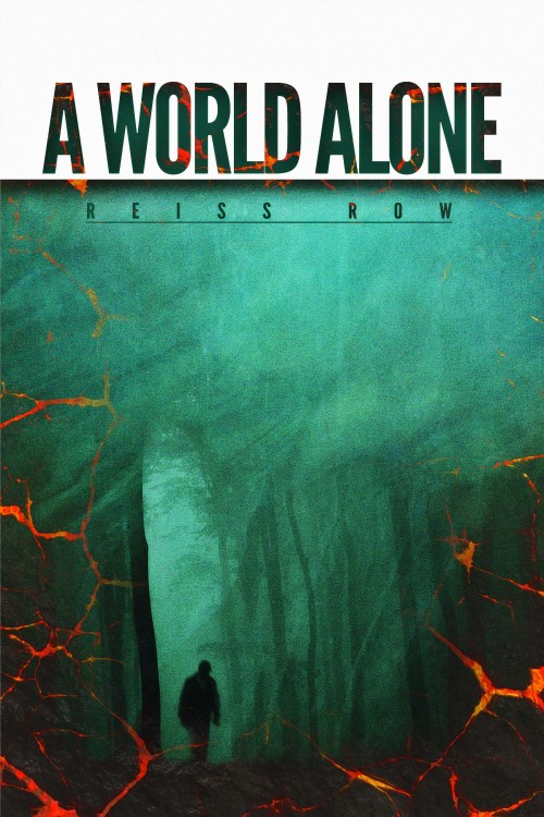
I would add some “noise” to the picture — cracks, probably, not only showing that something is “crumbling,” but also giving me the opportunity to add hints of a contrasting color.
Heck, the file you sent me is large enough; I’ll show you what I mean.
Not the best possible design solution, obviously; I just grabbed a lava texture out of my textures folder to show what I mean. (Doesn’t everybody have a textures folders?) The point is that distressing the image can add some of the apocalyptic vibe that the current image doesn’t hold.
And fix that man.
Other comments?


All I can really do is underscore Nathan’s comments and suggestions. It’s a strong design that only needs to be made a little more specifically relevant.
Hmmm… All right, your story synopsis sounds a bit like John Christopher’s No Blade of Grass with zombies, and your cover design definitely bears a strong resemblance to that of George R. Stewart’s Earth Abides. These resemblances are not a problem; the new must be born out of the old and the picture itself doesn’t appear to have been swiped from anywhere else. In Hollywood terms, you can honestly say your work is “inspired by” rather than “plagiarized from” its various sources of influence.
That said, the silhouette on your cover doesn’t necessarily look like a man’s, but that’s because it doesn’t have any features to distinguish its sex. The misty forest setting in the background also doesn’t distinguish this as a post-apocalyptic tale; someone might mistake this for a fantasy rather than a science fiction setting. If your character is endangered by bandits “around every corner” in the ruins of civilization, doesn’t it make some sense to show us some of those urban ruins?
My philosophy of inspiration is that one should always plunder the best sources. Your cover does a good job at evoking a feeling of total isolation with its lone silhouette, something like the poster for The Quiet Earth, but your synopsis suggests that while your protagonist may be lonely, she’s nowhere near so isolated as she’d like to be. If anything, I think you should take your inspiration from David R. Palmer’s Emergence instead; that story’s synopsis is much closer to your own (albeit with the danger being exclusively from other survivors, not zombies) just as the cover comes much closer to evoking both the loneliness and the danger of an isolated girl (fully indicated to be female, though seen only from the back) wandering around a post-apocalyptic setting than any of these others.
Here’s a bigger capture of that cover’s artwork without the titles. As with everything else, you should take inspiration, not plagiarize; if you swipe this outright, the author and publisher’s lawyers will easily nail you to the wall in court, and it’ll serve you right. On the whole, though, I think the direction this artwork takes is much more the direction you want to take with your own novel’s cover.
I don’t like Nathan’s cracks at all. I like that it’s monochrome and adding a loud contrasting color just makes it look like layers upon layers.
However. I do notice this is classified as young adult. So once again here’s yet another YA novel that’s got the cover of a sober mid-20th-century novel for adults. Once again, nothing on this cover would make a teenager pick it up.
So you get my usual recommendation: Ditch the somber, subtle approach and give us something big, striking, and high-contrast, like this.
While I don’t mind what Nathan did, I’m more inclined to agree with Katz’s comments, particularly the recommended cover link. It strikes me as too mysterious for a zombie book. I do like this cover though, but I’m a mid-40’s guy who doesn’t read YA.
I’d agree. At the moment it’s a nice design but, sorry to say, too dull for a YA book cover.
It;s a great image. With the right design to dress it up it could becoem a great cover for this book. You have a lot of nice empty space within it. I’d suggest losing the separate white framing for the title and having that text against the green background. Like RK was saying, looking at exisitng covers in this genre/ag range is a really good idea and will suggest directions. My feeling is you’ll want to choose a bold font and colour – your image is so somblre and atmospheric you need other elements of the design to work hard to say what ELSE the books is (YA, exciting, fresh etc).
If the figure is meant to be your lead, it definitely looks too male. But perhaps it’s meant to be a zombie?
Kat’s link is a good example of getting the balance right. It still embodies the sombre, atmospheric nature of a post-apocalyptic world, but also looks young and exciting. You can see at a glance was the audience is. The splash of muted red is enough to bring colour and horror to the vibe.
I think Nathan’s adjustements improve the design, but the fendamental layout is still wrong for genre and audience. with our without the red texture, what it reminds me most of at the moment is a certain kind of graphic novel cover. Great for that genre but not going to grab the people you need to take interest!
Love the art. Except for the figure, which stuck out for me right away. It definitely !ooks like a man, and unless his name is Stella, I assumed the protagonist was female. Also, I didn’t get any kind of grim, desperate, post-apocalyptic vibe from this at all. It could almost be a book of poetry. Very pretty but no clue as to genre.
Thanks so much for all the great responses! Sorry for not replying sooner, circumstances have left me without internet for quite some time. I’ll definitely take what everyone has said on board. The silhouette is meant to be a zombie, and I understand fully what you all be mean by being “too somber.” However, rethinking some things, I think maybe the novel isn’t suited for YA and should maybe be an adult novel because of some of its contents, hmmm… Lots to think about, thanks so much again!