The author says:
A trio of short Stories inspired by my nightmares (hence the 3 AM nightmares). Nothin’ more complicated than that really.
Nathan says:
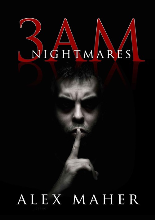
Well done. If I saw this in passing on Amazon, I’d have no criticisms. Since I’m supposed to offer suggestions, I might throw out things like widening and moving “Nightmares” down so it doesn’t overlap “3AM” and seeing how that looks, but that’s only idle tweaks.
Anyone got a more substantive suggestion? I think it’s fine as it is.


Red and black are hard to make work together – but you did. That white line makes all the difference in the world. *Claps!* It is a bit harder to see in thumbnail version, but still very legible.
Honestly, good job.
Generally I like this, but I have a few tweaks:
-I’d put a gap between 3 and AM. As is, it looks like “ZAM” (possibly only to Russian speakers, but still).
-I’m not in love with the reflection of the title and how it overlaps with the guy’s face. The relationship between the two is not clear.
I’ll second Katz’s first recommendation. But I’m fine with the reflection.
Great job!
I’d go with Nathan; print it. You can try putting a gap as katz said – because of kerning it is little like “3A M” – however, from an abstract point of view the layout looks good, especially in thumbnail, so maybe see what it looks like and revert back if it does seem to break the symmetry of the cover. And the face has space to be a little bigger. But these are in no way essential fixes.
Awesome job. I have zero criticisms on this cover. Print it. I disagree with Nathan regarding the overlapping text. That’s perhaps what grabbed me most in the design.
Most of the time I agree with Nathan. I would post more otherwise, but what’s the point if Nathan is saying what I would say. However, in this case, you must ignore Nathan’s track record and obvious expertise on this subject because he’s wrong and you must not take his opinion to heart lest you risk having your book show up in one of those big bins a Walmart with a huge orange discount sticker obscuring the cover with its non-overlapping text. Next you’ll lose your drive and start drinking a lot as the downward spiral begins to…sorry, I digress.
In short, great job and this is a rare instance where I completely disagree with Nathan.
Go with it as is. It’s a winner.
heh Thanks guys. I was pretty happy with this one, but then the ol’ self doubt creeps in. Now I’m doubting the strength of the writing that’s inside the book, but I’m still working on that part.
Adrian. You made me LOL and dribble lemonade through my nose (fortunately nothing stronger)
Once again – thanks – i ‘predicate the input.
I think it’s an excellent cover. I might make one or two suggestions, though…
Red on black is always hard to read, but I think you have set it apart from the background successfully. However, you may want to think how the cover looks in greyscale.
“3AM” at first glance looks like “BAM” One reason may be that most people are accustomed to seeing “am” either in lower case or in small caps…in either instance “am” is smaller than the numeral.
Otherwise a first-rate job! Congratulations!
I don’t have a whole lot to add to any of these other comments except for one point: the fellow’s face being lit from above such that his eyes are overshadowed is known to have a somewhat dehumanizing effect. This effect can be appropriate to horror novels, particularly about nightmares in which the perception that one’s humanity is slipping away might be what’s so horrifying; if this kind of philosophical horror is the effect you’re seeking, then you’re all set. If you’re going for a more visceral and immediate kind of terror (the fight-or-flight-inducing “I’m about to die!” kind), however, the cliched lighting of the guy’s face from below is the way to go.
I think it’s awesome! Great job!
The only thing that I cay say is that Nightmares is barely legible in thumbnail, but otherwise, it’s an awesome cover.