The designer says:
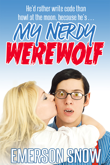
Usually I do horror pieces, so this is a bit outside my experience. This is for a humorous paranormal romance aimed at the YA market (think the “Teen Wolf” tv series) and also have appeal for older paranormal romance readers with nostalgia for 80’s comedies. The directions were to make it look like a retro-80’s movie poster, and to keep the werewolf character appealing. The tag line probably isn’t the final choice.
Nathan says:
Boy, this seems like fun. I think most of my suggestions stem from the fact that, aside from the big word “WEREWOLF” in the title, most of the rest doesn’t suggest there’s a werewolf in this book, especially at thumbnail size.
For one thing, the background looks like a clear mid-afternoon sky. Unless he’s a werewolf who transforms in daylight (and even if he is), I think the background should say “night.” It doesn’t have to be much — just darken the gradient a lot, especially at the top, and maybe stick a part of the full moon into the upper right.
For another, the nerd could as easily be taken for a vampire as a werewolf. (Yes, I know, yellow wolf eyes, but that’s still kind of subtle.) Maybe some hair growing up his neck, and sticky-out tufts from the points of his ears?
The font treatment is fun. I’d pull the slant off “WEREWOLF” so it stands up straight. I also think that using upper and lowercase for “My Nerdy” would look better than “MY NERDY.” Maybe even add a slight (slight!) arch to it. (If the gradient behind it ends up dark enough, you may need to reverse the blue and white on “My Nerdy” to make it pop.)
Those are my thoughts. Others?


I agree with your points, Nathan (text and hint of full moon in background). Maybe instead of hair on his neck and ears there can be his hairy hand on her back. I’m also not crazy about the author’s name, especially in thumbnail size. Maybe try it just in black?
I rather like it. It’s clean and crisp, and very cheerful, very 80’s comedy-ish. Even the fonts fit together in spite of them being so particular. I’d leave the title just as it is, but Don is right, the author’s name is barely visible in the thumbnail, and personally, I’m not too crazy about that font either. But you can’t put it in black, that would just throw the whole image out of balance. Red outline instead of blue maybe?
The only way (that I see) in which you can make the nerd more werewolfish and still keep it subtle is to make his ears more hairy.
The moon in the background sounded like a good idea at first thought, but to do that, you’d have to lose the whole 80’s cheerful look, and I don’t think that’s a good trade-off. Besides, full moons are terribly cliche, and from what I understand, this isn’t your average werewolf novel.
From a quick reverse image search on Google, it looks like you commissioned Viergacht on DeviantArt to do a cover image for you. It’s not bad as they go, but as Nathan says, it does need a different background and something to mark the guy as a bit more obviously a werewolf.
As long as we’re on the subject of 1980s comedies and 1980s movie posters, you do realize, don’t you, that the Teen Wolf TV series is itself a bit of a callback to Teen Wolf (1985) starring Michael J. Fox? Behold the totally 1980s poster for that movie, and take notes. If you want to identify the nerdy guy as a werewolf, I’d specifically suggest some visible wolf hair, as was done with Michael J. Fox on that poster; even some wolf-fur eyebrows on this nerdy guy could really tip the scales in your favor.
As for the background, wipe out the white isolation and replace it with something darker. It doesn’t have to be a night sky or anything like that, just darker than this. If part of the comedy is that the nerdy werewolf’s being a computer geek means he doesn’t get out much (making him a “Glass Walker” in Werewolf: The Apocalypse fan boy terms), I’d say a brightly lit corporate cubicle farm or high school computer lab in the background would do just fine. Just… not white. This is Teen Wolf material here, not THX-1138.
I could tell from the thumbnail that this was a comedy, so you’re half the way home. Now, if you can just make it more obvious that it’s a werewolf comedy, you’re there.
I’ll show you an example of what I mean. Here‘s a mock-up of the cover art I did using another stock photo and some further alterations to the nerd, and Here‘s that cover with your titles (less the unnecessary tagline). Don’t you think that looks a bit better? (The byline still needs improvement, but I’m not quite sure what to do with that, so I’ve mostly left it as it is.)
The title has my interest. But I might not have seen the title while shopping. Seems like a different color scheme could attract your audience better. And the effect seems to subtle for the thumbnail to grab your audience. It seems like the kind of book where the thumbnail’s ability to attract attention could really pay off. So I’d want a werewolf that looks nerdy, not a nerd that looks slightly like a werewolf.
You can kill the top line of text. Once anyone gives this cover any attention, that statement seems like it would be obvious. Put that in the description or inside of the book, maybe, but it may not be needed on the front cover. But if you keep it, that comma seems out of place to me. I don’t think the cover needs a tag.
Returning to my first point and your instructions… I think a more distinct werewolf would actually be more appealing. I’m not sure if this would be the popular opinion… but look at Beast (in Beauty) and Fiona (in Shrek). In both cases, I thought the beast or ogress was actually the more appealing figure. I feel that it would be easier to make an appealing full werewolf than an appealing nerd looking slightly like a werewolf.
This is a rare occasion when I disagree with Nathan’s take. I like it. I don’t know if it’s because I get it or because I don’t get it, but I totally get the nerd and werewolf vibe. I disagree with Nathan about the blue. Unless I’m off (totally possible) I get the office feel, possibly office romance even. Given it IS a romance, I think it’s perfect. There is the comedy feel, plenty of werewolf in the title and the fangs. I literally wouldn’t change a thing. Seriously. And for me to say that is very unusual.
Nice job!
I’m afraid this one doesn’t work for me. The image looks like exactly what it is — a lightly manipulated stock photo — and stock photos look dull and artificial.
Probably one too many fonts…and one that is pretty hard to read at thumbnail size.
Overall, it’s a very nice job….or, perhaps I should say, a pretty nice concept. It needs a little more, as Nathan suggests, to really pull it off. There is just too little that says “werewolf,” let alone “nerdy werewolf.” As Katz points out, the effect is really just that of a slightly manipulated stock image. You might want to consider taking the “nerd werewolf” idea a little more literally and replace the boy’s head with that of a werewolf…with all of the appurtenances associated with a nerd: horn-rimmed glasses with tape, pocket protector, bow tie, a pen behind an ear, etc. That would get the idea across much more immediately and also make the girl’s embrace and kiss funnier.
You might want to consider taking the “nerd werewolf” idea a little more literally and replace the boy’s head with that of a werewolf…with all of the appurtenances associated with a nerd: horn-rimmed glasses with tape, pocket protector, bow tie, a pen behind an ear, etc. That would get the idea across much more immediately and also make the girl’s embrace and kiss funnier.
I was thinking that, too. It would be really funny!
This is the submitter! I want to thank everyone for their helpful comments. 🙂
Several points were ones I was unsure of myself, like how “wolfy” to make the werewolf. Reviewing the suggestions, I think adding some sideburns and maybe more animal-like ears would sell him more as a werewolf. The specific direction I was given was a look similar to the Teen Wolf tv series, and they’re pretty light on the special effects. RK linked to my DA page; you can see I usually do much more lupine werewolves.
I was trying to avoid too many cliches of the photobombing wolf variety but something suggesting a full moon would work. I’m going to try some of the color and background variations you folks came up with and see how the client likes it.
I’m sorry about it being a stock image, but the author is self-publishing and couldn’t afford a photo shoot, so I did what I could within the budget. Also, I don’t have any control over the tag line, but the author is still making up her mind what exactly she wants it to say so I can pass the crit on, as well as on the other elements.
By the by, what is the standard size for a thumbnail? It would be helpful to know for future covers.
I’ve set my WordPress defaults to make the thumbnail 150 pixels in the longest direction; different ebook vendors will have different sizes; Amazon’s are 100px in the “Customers Who Bought This Item Also Bought” area and 300px on product pages, 150px width on index pages and 200px length on product pages…
Thanks!
As I say, you’re about halfway to your goal already. Your color scheme in particular is exactly as it should be for your stated intentions: the “visually similar results” for Google reverse image search is almost wall-to-wall with various movie posters for comedies, especially romantic comedies.
All you have to do is get the werewolf theme more firmly established in there. The ears and sideburns (and maybe bushy eyebrows?) ought to do it. A full moon somewhere in the frame might help, but is not absolutely necessary. If you do add anything to the background, however, be sure to give that background the same light bluish tinge you’ve got now: the yellowish background on my examples is throwing off the reverse image search, making it show fewer of those comedy movie posters. While a book cover and movie poster work slightly differently, the color scheme works the same on both.
Again, the Teen Wolf TV series is a kind of spiritual successor to the original 1980s Teen Wolf movie starring Michael J. Fox, so if you want an example of how a 1980s werewolf comedy movie poster looks, there you go. The nerdy guy on this poster also reminds me a bit of the werewolf Jason Bateman played in the sequel movie Teen Wolf Too (1987), so you’re on the right track here.
Oh yes, I am a big fan of the original Teen Wolf – I think it was the first werewolf movie I saw in theaters 🙂