Month: October 2019

Call Numbers

The author says:

“The not so quiet life of librarians…” Life is a book… and every person is a chapter. Everything’s looking up for Robin Walker. It’s 1994 in New York City, and he’s been transferred downtown to the 58th Street Branch Library. Ready to move up the ladder, Robin is excited about the opportunities that await him. But success, personal or professional, is as elusive as a first-edition rare book. Robin struggles with his strange new work environment as this motley crew of employees generates more drama than a runaway bestseller. He doesn’t know who to believe – or who to let in. And as potential romance mingles with devious machinations, there’s no telling where Robin’s story will go. All he knows is that he must see it through to the very last page.

Call Numbers is a captivating and multilayered adult drama. Through realistic dialogue and situations, author Syntell Smith has crafted a modern-day classic about the trials and tribulations of adulthood. Because a library is usually the last place you’d expect high drama, but for these characters…it’s long overdue.

Nathan says:

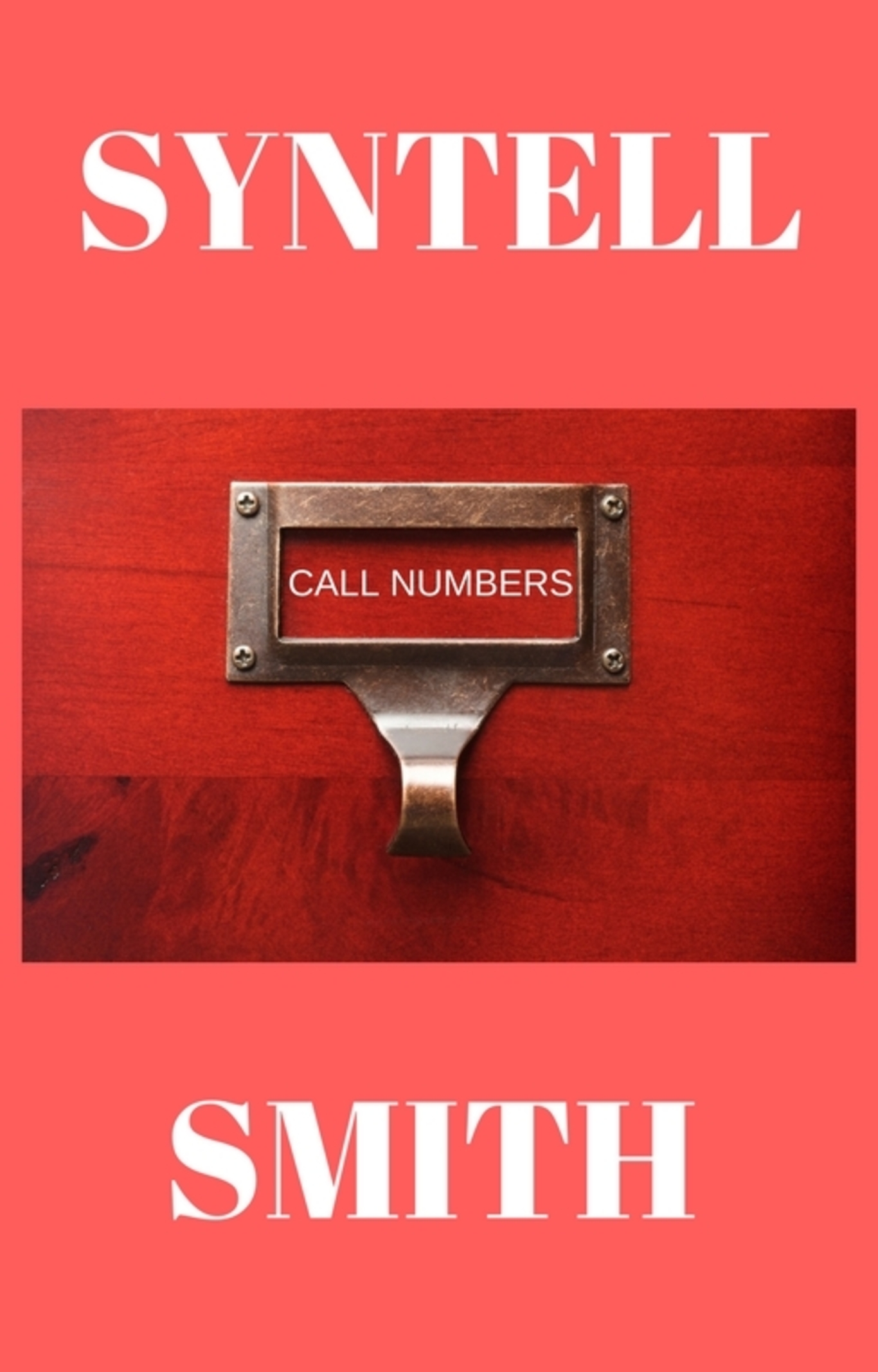
I love the use of the card catalog drawer as the main image, but dividing your name between top and bottom is a weighty demerit.  The title, wedged as it is in the window, also becomes almost unnoticeable.

So here’s what I’d do:

  • Put the card catalog image at the top, and zoom in — you can crop off that unnecessary margin, and maybe a little more.
  • Stack the title in two lines so that the type can be larger in the window.
  • Add a gradient taking the lower part of the cover to almost black at the bottom, and put your name there, along with a tagline (eg., “A Novel of Love, Lechery and Librarians”).

In fact, if you can find a usable image containing multiple card drawers, you can have the focal one at the top and then put the gradient over the lower one(s) to put the focus where it needs to be.  (Sorry, I’m not at my home computer where I could photoshop a quick mockup.)

Other thoughts?

To Catch a Bride [resubmit]

The author says:

I’m resubmitting this! 2 different colors because one of the commenters suggested pink instead of blue, and then when I tried it, I liked it. So, you can put up the one you prefer or both if you want to. I really appreciate all the feedback I received before. I also changed the byline on the cover (this is a different sub-genre for me). I bought the photo from a good stock photo place—I hope the resolution is better. The other photo was just a screenshot while I was choosing what pic to use. I made the cover on Adobe Spark.

TO CATCH A BRIDE is a contemporary romance set in the high-society world of Santa Barbara. The series is called Santa Barbara Billionaire Bachelors, and the target audience is women of all ages who read contemporary romance. It would appeal to the readers of Bella Andre.

[original submission and comments here]

Nathan says:

For reasons that I can’t articulate, I like the current flipped direction of the photo better.

I’m divided on whether the blue or the pink works better.  The blue “Bride” is certainly easier to read than its pink counterpart.  But I think my substantive comments apply equally to both:

  • The ever-so-slight lighter bar behind “Bride” serves no purpose. Lose it.
  • The same with the “…it’s now or never” tagline.
  • While all of the non-cursive type elements appear to be variations on a single font family, in “Santa Barbara Billionaire Bachelors” it seems particularly banal. Is there maybe a “narrow” variation of that font that you could use instead?

I’ll let the factions on the blue/pink question form… NOW.

Beyond Pink: A Christian Woman’s Guide to Biblical Femininity

The author says:

This is a nonfiction religious instructional book. The target audience is Christian women. The idea is to use 7 Principles to get past cultural stereotypes for women and find out what it really means to be feminine, as well as to explore who God has created women to be, and what He wants them to do. It is designed to create a framework for any Christian woman to know how to please God with her womanhood – even if she doesn’t fit the stereotypes. Similar books include “Recovering Biblical Manhood and Womanhood” “Eve in Exile” “Set Apart Femininity” “Radical Womanhood” “Biblical Portrait of Womanhood” “Girl Defined” and “Redeeming the Feminine Soul”

Nathan says:

I think you could learn more from the covers for the books you cite.  On your cover, the woman shown is more than a little goofy-looking, giving an impression of humor, and the type treatment is bland.  (Type should do more than just render the text readably, although it should definitely do that; it should also add to the information presented by the cover. Unfortunately, yours only conveys, “I didn’t really know what to do with the text, so…”)

Let’s look at the books you reference:

With the exception of Recovering Biblical Manhood & Womanhood, which has a fairly academic vibe to it (and a little bit of the same with Biblical Portrait of Womanhood), the rest have a feel of “light but not humorous” and “gently feminine.”

The lesson I’d take from the examples, then, is to find an image which conveys “femininity,” and use a type treatment which is neither overbearing nor humorous — most of the fonts used above are quite literally light, not bold.

Other comments?