The author says:
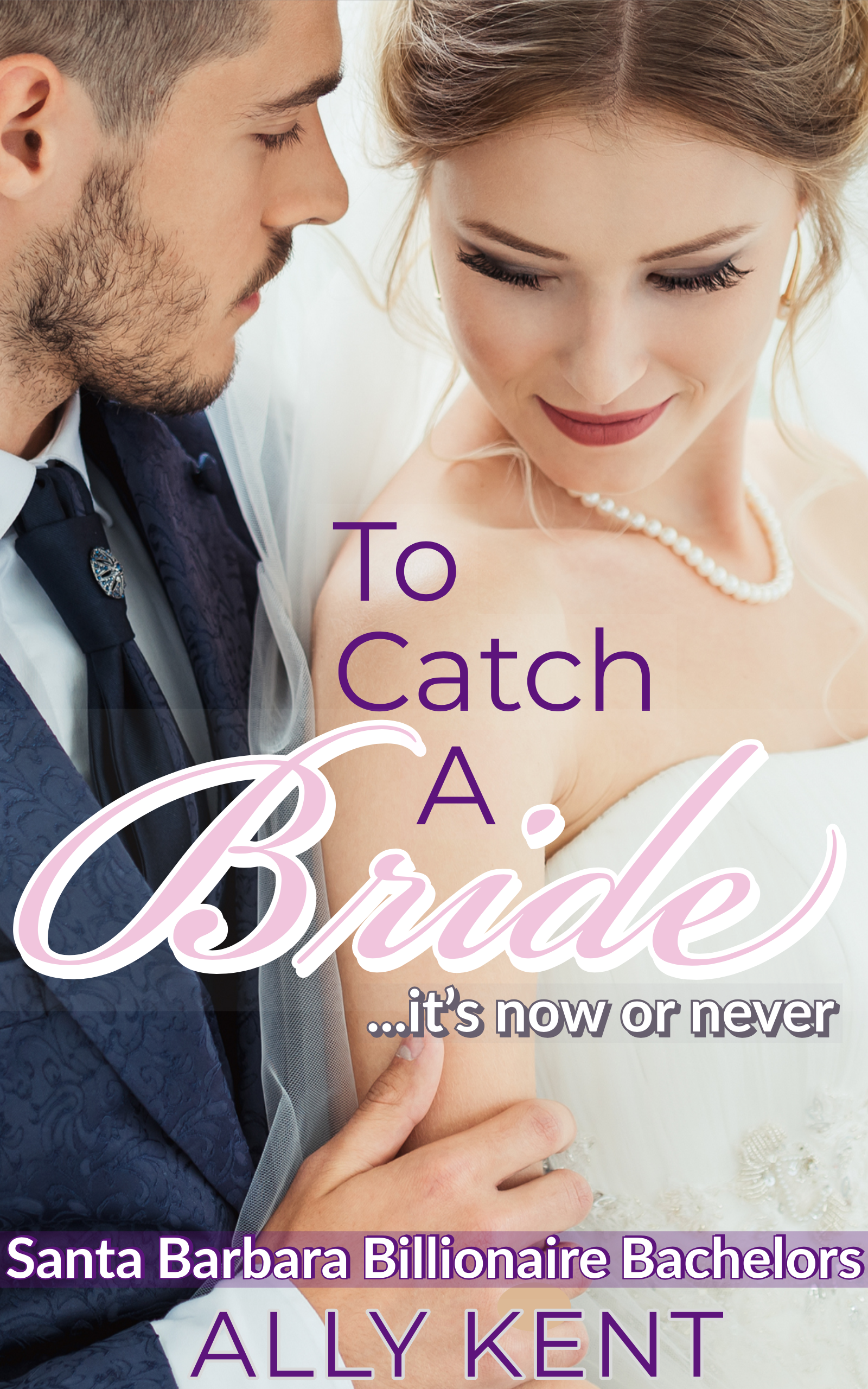
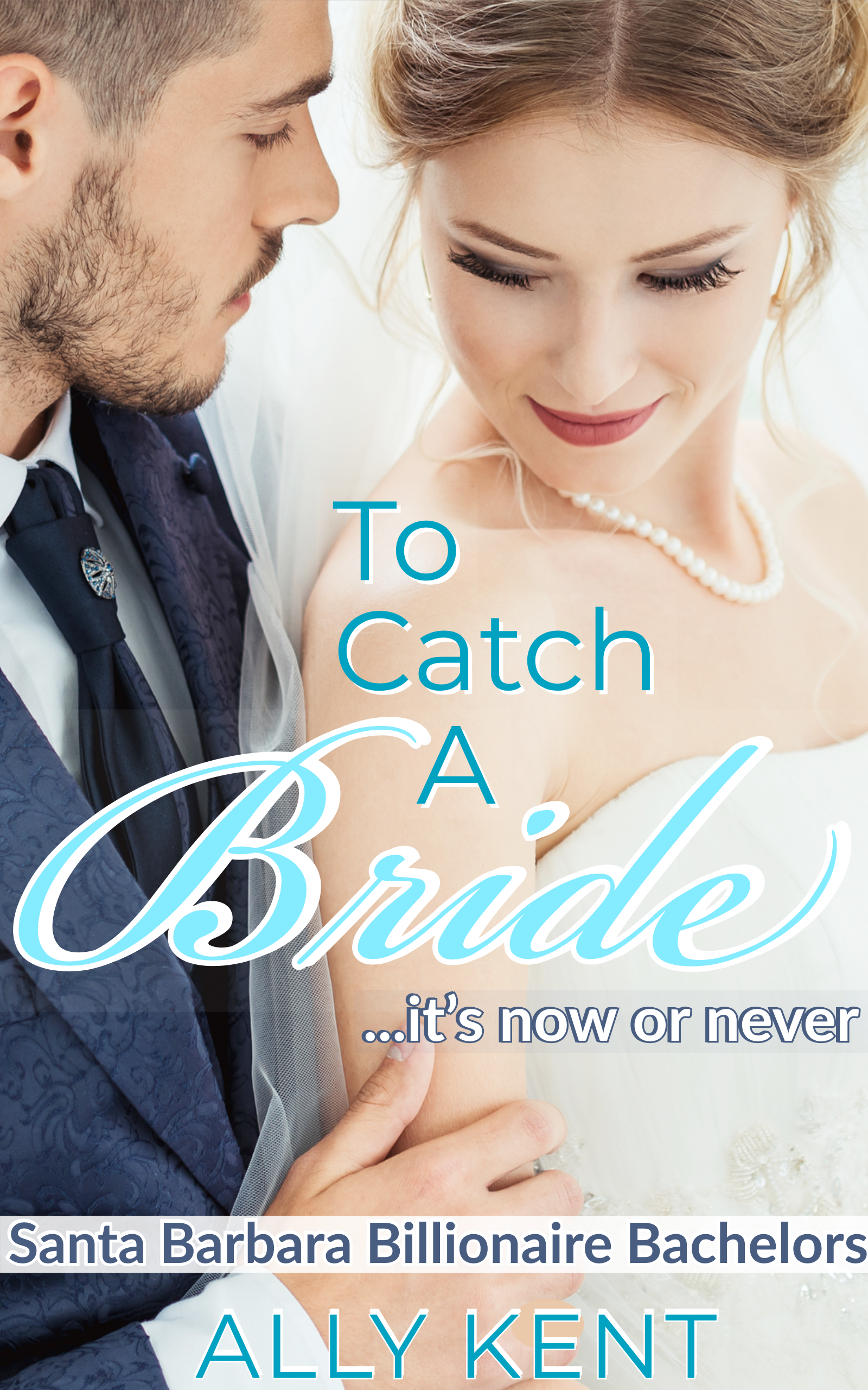
I’m resubmitting this! 2 different colors because one of the commenters suggested pink instead of blue, and then when I tried it, I liked it. So, you can put up the one you prefer or both if you want to. I really appreciate all the feedback I received before. I also changed the byline on the cover (this is a different sub-genre for me). I bought the photo from a good stock photo place—I hope the resolution is better. The other photo was just a screenshot while I was choosing what pic to use. I made the cover on Adobe Spark.
TO CATCH A BRIDE is a contemporary romance set in the high-society world of Santa Barbara. The series is called Santa Barbara Billionaire Bachelors, and the target audience is women of all ages who read contemporary romance. It would appeal to the readers of Bella Andre.
[original submission and comments here]
Nathan says:
For reasons that I can’t articulate, I like the current flipped direction of the photo better.
I’m divided on whether the blue or the pink works better. The blue “Bride” is certainly easier to read than its pink counterpart. But I think my substantive comments apply equally to both:
- The ever-so-slight lighter bar behind “Bride” serves no purpose. Lose it.
- The same with the “…it’s now or never” tagline.
- While all of the non-cursive type elements appear to be variations on a single font family, in “Santa Barbara Billionaire Bachelors” it seems particularly banal. Is there maybe a “narrow” variation of that font that you could use instead?
I’ll let the factions on the blue/pink question form… NOW.
I agree with Nathan’s comments, especially the suggestion that you work on the series title. A slightly smaller condensed typeface would work much better (and definitely without the background bar).
I would also suggest getting your name a little further away from the bottom edge.
1. You need to heed the bleed and trim variances if you’re offering this in print.
2. Too much text. Lose the tag, especially since it adds nothing and is illogical unless one of them is terminal.
3. Oddly, I find the blue version too feminine. The ‘purple’ cover looks better overall with richer color, and the series banner looks better colored and translucent. Since there is a dude on the cover (and pink is a stereotype), use the purple of the text for the word “Bride” (or a slightly lighter shade).
4. As I indicated I don’t mind the purple series banner, but if there is more to the image at the top I’d suggest placing it up there to ensure it can be placed the same for subsequent books for better branding. Having it anywhere in the middle might be problematic when using other images.
5. Your drop shadows should match. I prefer the subtle surround on the purple byline. The blue drop shadow is odd with the 4 right, 4 down configuration for the title but 4 up, 2 right for the byline.
I definitely want to lose all the text bars. Other than that, I think it looks good.
I like the pink/purple version better.
I agree with Gwen and Ron. My vote goes to the pink-and-purple color scheme, and you should definitely lose the text bars. I also recommend horizontally centering the series title and vertically centering your byline between the bottom margin and the series title to ensure neither will get accidentally cut off when the physical cover is cropped.
The flipped orientation works because of the natural diagonal line made between his suit and her arm. That moves the eye of (at least western readers) naturally from upper left to lower right.
As others have said, it doesn’t need the bars. Those are rarely seen in romance and lessen the professionalism of the cover.
They typography is pretty rough. Try to being everything in from the edges. Even in eBook form, there should be a visual break (try half inch margins, perhaps.)
The pink/purple is a better scheme since it contrasts with his suit. The pale blue against his suit just reads ‘baby shower.’
Get rid of all the effects, especially the white outlines and white drop shadows. For one, it’s too much and makes the cover look busy. Two, it looks really unprofessional. Three, it doesn’t fit with the genre. If you need something to make the text pop a little more, than use a very subtle drop shadow or put a layer behind the text and very lightly go around the letters with a low opacity black or white. The trick is to keep it from being obvious. It’s hard to do text over a busy part of an image.
The fonts themselves seem a little basic/cheap. While the romance genre often does mix sans serif with script fonts, I don’t think this particular combination is very compelling.
I’d recommend raising the title a bit so the T falls in the line between his lip and the edge of her collar bone. Drop the now or never tagline. Then you can put the Santa Barbara Billionares line below above the thumb not over it. You will then have space to move the author name up.