
The author says:
This is a nonfiction religious instructional book. The target audience is Christian women. The idea is to use 7 Principles to get past cultural stereotypes for women and find out what it really means to be feminine, as well as to explore who God has created women to be, and what He wants them to do. It is designed to create a framework for any Christian woman to know how to please God with her womanhood – even if she doesn’t fit the stereotypes. Similar books include “Recovering Biblical Manhood and Womanhood” “Eve in Exile” “Set Apart Femininity” “Radical Womanhood” “Biblical Portrait of Womanhood” “Girl Defined” and “Redeeming the Feminine Soul”
Nathan says:
I think you could learn more from the covers for the books you cite. On your cover, the woman shown is more than a little goofy-looking, giving an impression of humor, and the type treatment is bland. (Type should do more than just render the text readably, although it should definitely do that; it should also add to the information presented by the cover. Unfortunately, yours only conveys, “I didn’t really know what to do with the text, so…”)
Let’s look at the books you reference:
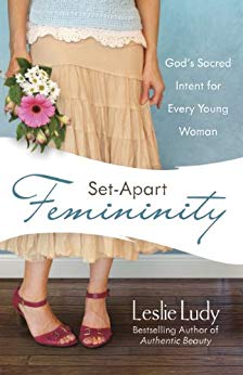
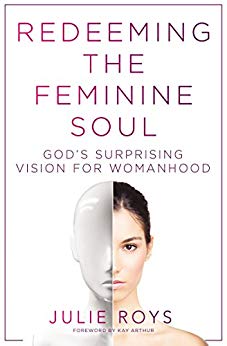
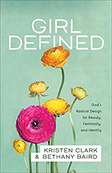
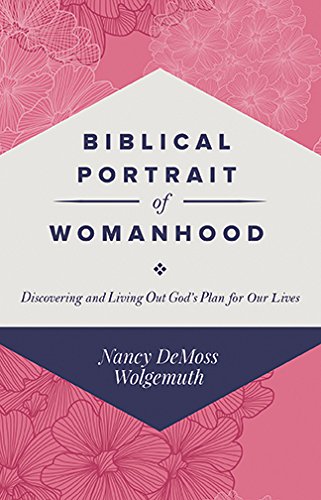
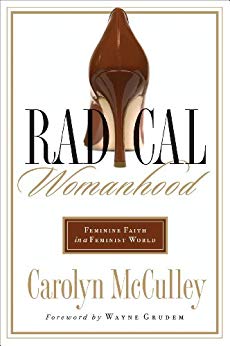
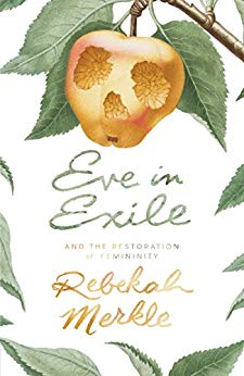
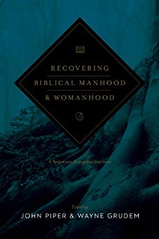
With the exception of Recovering Biblical Manhood & Womanhood, which has a fairly academic vibe to it (and a little bit of the same with Biblical Portrait of Womanhood), the rest have a feel of “light but not humorous” and “gently feminine.”
The lesson I’d take from the examples, then, is to find an image which conveys “femininity,” and use a type treatment which is neither overbearing nor humorous — most of the fonts used above are quite literally light, not bold.
Other comments?
This is pretty lifeless, and the timid byline is not confidence inspiring. None of Nathan’s examples are particularly complex, and some of the bylines are just as small, yet they better present themselves.
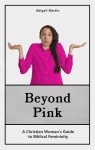
The woman seems to be saying “I had no idea what to put here”.
I think there is too much of a disconnect between the image and the subject of the book as suggested by the subtitle. Think of it this way: imagine your book without the explanatory subtitle: would anyone have a clue as to what the book is about?
The only thing I can really suggest is to go back to square one and rethink the cover. Nathan has provided some great examples to help inspire you.
I get that you’re trying to suggest the book’s for women who aren’t what most people would consider conventionally feminine, but the particular woman you’ve chosen just looks kinda clueless and goofy. My guess would have been that this was an attempt at “slice of life” comedy like Erma Bombeck’s If Life Is a Bowl of Cherries, What Am I Doing in the Pits? Also, the bland layout looks exactly like something amateur authors at Smashwords would typically place on any of their covers; believe me, you do not want to be associated with such a vanity press style, especially if publishing your book independently.
For starters, I would try looking up phrases like “unconventionally attractive” and “unconventionally feminine” on an image search engine to get some idea of what people consider to be a good-looking-though-not-conventionally-so kind of woman. Doing so, I just turned up this picture of a woman wearing something called “tomboy chic” fashions who is nonetheless considered good-looking. (As a kind of generic 40-year-old white guy, I can sort of see the appeal.) You might also try looking up some historical women who were not so conventional, and yet were considered properly feminine all the same such as Margaret Thatcher, Eleanor Roosevelt, and Julia Dent (President Grant’s wife, who was cross-eyed and homely and who he wouldn’t have wanted to be any other way, according to his contemporaries’ biographies of him).
Next, I would swap your byline with your tagline, use a spidery sans font something like the one on the cover of that Redeeming the Feminine Soul book by Julie Roys there for everything, and make your byline a lot bigger. (Don’t engage in false modesty here: successfully writing any kind of book is a very laudable achievement, and you should be proud to affix your name to it.) As with the examples our esteemed host has given you, try experimenting with some simple backgrounds or solid colors to layer in behind a picture of an unconventionally feminine woman, or at least adding a dash of coloring to the text as with Julie Roys’ cover.
As book covers go, the present draft would earn you a BOO-ring tag on Lousy Book Covers; which would mean it was not only lousy, but not even very entertaining in the so-bad-it’s-good way so many other covers on there are. For best results, give us some color (no grays!) and depth and variety at the very least. If the woman’s necessarily not too attractive, at least have her be interesting and photogenic like the aforementioned Eleanor Roosevelt.
5-Minute Redo adding some color and texture…
https://i.imgur.com/4l8tg30.jpg
Here’s a rough redo from me which still has borders, but uses a different model, adds some color gradients, and rearranges the byline, tagline, and title.
Is there a reason that the women have to be dressed unconventionally, or look unconventional or, as in the case of the submitted cover, goofy? Saying that a woman needs to get past cultural stereotypes doesn’t mean that she has to look like an outsider.
Personally, I’d slap a hot babe on there. Yeah, I know, oooo-oooo-oooh, don’t wanna talk sexy around Christianity, but why not? Presumably God made procreation, right? So, sex, sexy.
Or, like the one with the stiletto, why even put the woman on it? What other symbol–based upon what you’ve written–could work on the cover? Don’t forget, it has to be something that the READER will recognize or notice, or something, before they’ve read it.
There are always typical female accoutrement–hair brushes, lipstick, blush, on a countertop, although that might suggest vanity, (no pun intended), which you may not want. Hmph.
I guess a pair of red lips, in lipstick, wouldn’t work? The ubiquitous lipstick kiss? In hot pink? That might work, y’know. BL, RK, Savoy, any of you got a hot pink lippie kiss cover in your bag of tricks for a mockup?
And I second the font discussion from RK–that’s exactly the type of sans-serif title and byline you need.
I would never say unconventional has to equal unappealing. Case in point: I rather thought that Asian gal in my rough draft there was pretty easy on the eyes even in those (not so stereotypically feminine) overalls. As for the goofy gal on the original cover, she looks rather nerdy, but flip that ponytail back over her shoulder, and she’d be pretty easy on the eyes too.
I’m not opposed to having a “hot” or “sexy” gal on the cover (though as with all forms of beauty, “hot” and “sexy” are in the eye of the beholder), but I think the author’s point is that there are more ways of being feminine than just being sexually appealing. Men love and admire women for more than just… shall we say, procreative purposes, you know: every woman out there is someone’s daughter, someone’s sister, someone’s mother, someone’s student, and/or someone’s mentor. As mentioned, Margaret Thatcher and Eleanor Roosevelt and Julia Dent wouldn’t have gotten a second glance from most men (though they must have had some appeal at some point, considering each one managed to land herself a husband), yet they all had admirers and loved ones.
As Weird Al Yankovic once said in his “Girls Just Want To Have Lunch” parody song, “Some girls like to buy new shoes, and others like driving trucks and wearing tattoos.” This book is apparently aimed more at the latter variety. Can trucker women be sexy? I certainly don’t see any reason why not, but (Weird Al Yankovic’s hilarious original “Truck Drivin’ Song” aside), I doubt stereotypically girly-girl things like lipstick or stiletto heels would be very effective at symbolizing that kind of femininity.
As such, it’s probably best to show one of the women from the target audience on the cover, be she a computer nerd, a motorcycle enthusiast, a nun, or whatever. Having some sex appeal is fine, but it’s more important that she have a broader platonic appeal to make the women in the target audience think “Yeah, I’d like to be a gal like that.”
The problem with borders particularly with POD is they instantly reveal poor cropping when the book is manufactured. I included a hint of border by leaving my bleed and trim mask in place, coloring it to match the background, then blurring the snot out of it while reducing the opacity.
Personally, a women who is capable, self-reliant, and not afraid to get her hands dirty is sexier than one who simply adorns herself with an excess of shellac and lacy hardware.
But, see, guys–you seem to be focusing on what she LOOKS like, and whether her looks are unconventional or conventional. The cover and the description don’t say anything about that. It says “get past cultural stereotypes,” which could mean anything. It doesn’t say bupkus about appearance. NADA, zip, zein, zilch. Nuttin’.
Cultural stereotypes could mean anything from “stay at home women are dumb” stereotypes, to “executive women are all hellbitches” (believe me, that’s a stereotype, I’ve lived with it forever) to “Christian women all sit home and read romance novels in the dark” or are “barefoot, pregnant and in the kitchen” or WHATEVER. Nothing this person said, had anything to do with looks/appearance/attractiveness.
YOU guys–guys–brought that to the discussion, by equating “stereotypes” with appearance.
That’s the point I’m trying to make.
Not what she looks like so much as how she presents herself. For me, at least.
That’s why my last mockups don’t even show her face and only suggest an attitude. Even though she’s not dressed in something pink and frilly she’s clearly feminine, rather than bucking the stereotype by dressing in a manner that would be considered manly.
Actually, the cover and description say quite a bit about appearance:
A) The “Pink” in the title refers both literally and metaphorically to a stereotype concerning a woman’s appearance, specifically the kind of clothes and makeup and jewelry she wears.
B) The phrase “a framework for any Christian woman to know how to please with her womanhood” appears in the description. You know how a woman typically (or stereotypically) pleases a man? With her appearance, among other things. Also, in both fiction and nonfiction, a common (if all too often erroneous) instinctive belief among men, women, and children alike is that beauty equals goodness; have a charismatic and charming young gal with lots of sex appeal play a villain in any movie or TV show, and a disturbing percentage of the audience will be rooting for her to succeed at whatever she’s trying to do no matter how horrible it is.
C) That this is a book cover means that it is a visual medium. A visual medium deals with (surprise, surprise) appearances. Since a woman’s beliefs and social status and other such abstractions aren’t visible to the human eye, we have to rely on the implications of her appearance instead i.e. how she does her hair, what kind of clothes she’s wearing, and what expression she has on her face (if her face is showing; not showing her face may imply something about her too).
In short, for good or ill, portraying femininity in any visual medium has a lot to do with a woman’s appearance. While the author hasn’t specified which particular stereotypes her target audience doesn’t fit, those stereotypes and any departure from them will have to be portrayed visually. So… whether it’s a clever and well-educated housewife, an angelically gracious executive woman, a Christian trucker woman who reads science fiction, or a confirmed spinster working as a mechanic, prospective readers are going to have infer these atypical aspects of the woman in question from her appearance on the cover.
Can you steer me toward those trucker women who read science fiction?
If I ever find one, I’ll let you know. (My late mother was a clever and well-educated housewife.)
As was mine. Handy, master chef, designed our house, and impossible to beat at Scrabble.
I think that the entire cover needs to be rethought from scratch…and the image of the puzzled/confused woman abandoned. I don’t think there is any way to redeem it.
As I mentioned in my first comment, imagine both the original cover and even all of the suggested revisions with the subtitle missing—would anyone have any clue as to what the book is actually about…other than having something vaguely to do with women? I think that the image needs to be a lot more focused.
(One thought that occurred to me while typing the above that might be worth experimenting with would be to take a medieval/renaissance depiction of the Biblical Eve—of which there are plenty of public domain examples—and add something very modern to her. That might be one way to get the Biblical connection into the art along with a contrast between traditional and modern values/perceptions.)
An idea with two variations…
https://i.imgur.com/wi72Xnt.jpg
https://i.imgur.com/Nye89xH.jpg
Yeah, I could see the denim and work boots there appealing to cowgirls, trucker women, and the occasional female mechanic.
These look great…but I think that the covers still depend too much on the subtitle…without it, there is no suggestion that the book is a “nonfiction religious instructional book”…or that there is any connection with religion at all. I don’t think it would take very much—perhaps just an additional visual element. For instance, a small Bible or New Testament laying on the jacket or in the space to the left, or perhaps a decorative piece of jewelry featuring a crucifix. (By the way, seeing those boots and denim, it occurs to me that perhaps something involving tattoos might be worth pursuing.)
I wouldn’t include tattoos, but I definitely thought of placing a bible or other symbolic element next to her.
https://i.imgur.com/qcgnf0O.jpg
Tweaked. I prefer the tag on the last one, but like this better overall.
https://i.imgur.com/meq8W5t.jpg
https://i.imgur.com/BMxyFam.jpg
I need to know a little bit more about the angle you’re taking to know the best approach (and, I think, this is why there’s been some disagreement in the comments).
Your comp titles were almost all written by and for women who fit the mold of traditional femininity, so their covers use archetypically feminine imagery (flowers, high heels, pastels). If that’s the type of book you’re writing, then that’s the type of imagery you should use.
On the other hand, your title and blurb seem to suggest that the book is for women who don’t fit that mold–women who are going “But I don’t like high heels and flowers. How do I live as a Christian woman?” If that’s the case, then I think B.L. is on the right track and a picture of alternative-looking women, maybe with a Bible, would give the right sense.
Either way, lose all those black boxes and the white background!
Did you see my latest version? https://i.imgur.com/BMxyFam.jpg
Hi Everybody! Thanks so much for all your comments on my design. It is definitely super helpful to get so much feedback. I specifically kept my description paragraph short and didn’t tell you what I was thinking when I designed the image, because I wanted your raw impressions. At this point though, I am going to try to clarify a few things.
1. The book is about getting thinking PAST stereotypes rather than getting stuck in them but is NOT about throwing out stereotypes.
2. In the book I try to convey HOW to figure out what to do and what to look like, but I specifically DON’T tell them what it is ‘supposed’ to look like.
3. Because of points 1 and 2 I wanted to steer clear of putting any specific stereotype or anti-stereotype on the cover. If I did, it would seem to be making a statement about what women should look like, and that is NOT the point of the book.
4. I understand and appreciate what you all have been saying about the goofiness of the woman on the cover. I hadn’t considered that when I chose the picture. I picked it because I wanted to convey the idea of confusion. Pretty much everyone in my target audience is very confused about the subject of Biblical femininity. I interviewed about a dozen Christian women before writing it and they gave me about as many different definitions for what it means to be feminine. Even in the comments here, there are some pretty big differences in opinion on the subject. I was attempting to acknowledge the confusion and let people know that I understand the complexity of the subject.
5. I considered using some kind of object that would represent femininity (rather than a human) but I couldn’t come up with one that didn’t in some way exclude entire groups of women. The closest thing I could find was the color pink itself – hence the title and the color of the shirt. In the end, I decided that humans catch the eye more than objects, so I thought maybe if I used a picture of a person it would attract more attention.
6. The main problem with using a picture of a woman is that I wanted to avoid making any statements about what a woman could or should look like. That is why I landed on this picture – it seems to avoid that problem simply because it is a bit bland.
7. I was trying to stand out from the comp titles because they are so flowery that they make some people in my target audience cringe. As per the comment from Gwen Katz,
“Your comp titles were almost all written by and for women who fit the mold of traditional femininity, so their covers use archetypically feminine imagery (flowers, high heels, pastels). If that’s the type of book you’re writing, then that’s the type of imagery you should use.
On the other hand, your title and blurb seem to suggest that the book is for women who don’t fit that mold–women who are going “But I don’t like high heels and flowers. How do I live as a Christian woman?”
Gwen Katz is correct in her interpretation of my title and blurb. But I also want to challenge Christians who stick to more traditional ideas. It is for both groups of people – traditional, and non-traditional. How do I fit in with the other books in such a way that both groups of women will be intrigued and neither will be alienated? I did really like B.L. Alley’s 5 minute redo with added colors and textures, because I thought it communicated something that fit in with a feminine cover while still looking like it might have a fresh take on the subject. But maybe I am too attached to the confused woman image.
That is all I can think of right now. Hopefully I have conveyed some of my logic for the design to you all. I would be delighted to hear if you think my logic for how to communicate my ideas is totally flawed, or if the problem has more to do with my inability to properly execute my ideas.
Thanks again!
Abigail Martin
Thanks for the comments, Abby–that’s helpful.
The most obvious idea I have is just to have two women, one who’s traditional-looking and one who’s alternative looking, hanging out looking happy and friendly, and maybe one of them has a Bible.
If that’s too hard to find, the same thing but with props: A Bible
with two pieces of jewelry or accessories on top of it, one that’s traditionally feminine and the other that’s less so.
I appreciate that you’re not trying to push a certain look on women! The trick is how to do that without the book itself looking bland and generic.
What did you think of my last mockup?
I liked how you were able to incorporate a Bible so that the design and the title/subtitle go well together. I didn’t particularly like the boots and denim though, for the reason I listed in point 6 of my original comment – it seems to make a statement about the look of the woman in this image.
Obviously it doesn’t need to be that exact image, but it suggests bucking the stereotype while retaining her femininity. It also eliminates her ethnicity, allowing any woman to identify with her, not just slightly nerdy white women.
It could be leggings or socks she’s wearing, with pairs of heels, sneakers, and boots at the foot of the bed to show she’s more than just the heels.
Oh okay. I am new to this, so I didn’t realize you had so much flexibility with the image.
On the one hand, it looks really professional, and thought-provoking. On the other hand, I’m not crazy about it because the book really isn’t about bucking stereotypes. It is about looking past the stereotypes, the outside, and getting to the heart of the matter. Also, it seems to me that I would have a hard time recognizing the book as something similar to the comp books.
I can appreciate what you said about eliminating ethnicity, but I’m more interested in capturing the seemingly universal aspect of confusion.
I would be very interested in seeing any images of confused/perplexed/searching women of no ethnicity, or uncertain ethnicity.
I picked that particular confused woman because it was the only one I could find on the stock photo site I had access to.
What if she’s sitting on the edge of the bed or at the closet trying to decide which ensemble to wear? Dainty, manly, casual, etc.
I really liked your first option better, actually.
Okay. I tried. Not really knowing what the book is about since you can’t describe it accurately makes it hard to come up with a cover.
Yeah, a lot of the issues just don’t make sense to someone who is not a part of my target audience. Sorry I couldn’t be clearer.
I really wasn’t kidding when I said I liked your first option. I would be seriously interested in pursuing it. Do you have a website or something that I can contact you on?
I do, but in spite of never asking for compensation, every time I’ve helped an author create a better cover I got burned in some way.
Maybe literally split the difference? I’m thinking you could do something like that cover for Redeeming The Feminine Soul by Julie Roys up there with one half of the model shown being a traditional woman, and the other half a not-so-traditional one. As long as you can find two model women in roughly the same pose, you should have relatively little difficulty combining them; and then you have proper representation for both parts of your target audience.
Having the models’ faces also look at least a bit inquisitive would indeed help drive the point home: “‘Should we be traditional or non-traditional?’ you ask me? Honestly, girls, you’re both pretty. Now let’s look to how the Bible’s definition of femininity is to be properly applied to every woman, regardless of her personality and situation.”
The idea of putting two women in opposition, or even a split image really appealed to me when I started designing this. However, I was unable to come up with two opposing stereotypes because there are actually quite a lot of stereotypes on each side of the equation. For instance conventional/traditional femininity could be something pink, lacy, frilly, or it could be a really conservative woman with long hair, long skirt, surrounded by 12 kids, or it could be a Victorian era costume of some kind, or Renaissance, or it could be a really flirtatious or giggly girl, or it could even be someone who is really shy or receding, or, as per the comments above, a hot babe. The unconventional side might look like Eleanor Roosevelt, a cowgirl, a tomboy, a trucker girl, a biker girl, a girl out hunting, or a female executive. As much as I really wanted to do an image like this, it seemed to me that there were too many specific types on each side.
Maybe I just need to think a little more broadly. It might be possible to do a princess type on one side (stereotypically feminine, but no one nowadays actually looks like that, so it wouldn’t be making a statement about what femininity today has to be) and something else on the other side that would be completely the opposite (while still being something a woman might wear), but not something a woman would actually wear in the modern era. Maybe that way I could capture the opposites, but have them disconnected enough from reality so that I can avoid saying what it has to look like? Does that idea have merit?
The reason I landed on simply a confused woman was because it seemed to me to have more universal appeal to my target audience. Whatever else they may be, they are confused.
Well, it does help to have as large an image pool as possible when seeking alternatives. It’s also worthwhile to remember, however, that you don’t need to show every alternative to make the appeal sufficiently broad. Also, in keeping with B.L. Alley’s suggestions, it occurs to me you could work with two images of women below the waist: as in, maybe a pair of wildly mismatched legs, one with the jeans and work boots, one with white tights and dress shoes (with or without long heels).
Given that any number of different rough-and-tumble kinds of women wear those jeans and work boots, while lots of different girly-girl types (and women dressing for formal occasions like business or church or dances) wear those white tights and dress shoes, you’d have a lot of bases covered with just that. This works even better if you have some kind of split background as well: two different kinds of beds (if you can find two of them from an eagle’s-eye view on which to lay each leg) or just different background colors and textures (powdery blue or gray for the leg clad in denim and a work boot, pink or lavender for the leg in the form-fitting silky white tights and dress shoe). Then, if you put a Bible or a cross or the like directly in the center between the two mismatched legs and their backgrounds, you emphasize that the Christianity thereby represented effectively bridges the gap.
Something like this, perhaps
I appreciate your sentiment here, but at some point you can’t make a book cover evoke every possible look. (Even your “confused woman” has a look.) Hence why I’m a fan of the “women with different looks having a Bible study” approach. If you want to make it not look too binary, you could have a group of three women who all have different looks.
I’m not in favor of going with a really exaggerated princess look or what have you because you don’t want to end up looking like Halloween costume catalog. You want the women on the cover to look relatable.
I also kind of don’t love the “confused woman” concept; I just don’t think “we women are so confused” is the best angle to sell your book. I think a confident look that says “you too can be a happy, fulfilled woman of God” is a better angle, IMO.
Possible totally different take: How about the classic “feet walking along the beach” approach? If you just show bare feet from the calves down, that’s about as little as it’s possible to show.
What if…what if you take Gwen’s ideas and moosh ’em together? What about 3-4 different sets of legs? A set of spiky hot heels; a pair of combat books, a pair of loafers and something else. Using a pair of stilettos and something like kitten heels or wedges or whatever would drive home the “feminine” angle and you don’t have to worry about all sorts of stuff that way.
I thought of that, but pairs of legs next to each other on a book cover is shorthand for “They hooked up.”
Maybe if they are radially arranged with their feet in the center
Well, you got me there, Gwen. What about clothes? What about outfits, rather than legs/shoes? A dress, a suit, jumpsuit, jeans…IDK. Just an idea.
What about just the shoes? Rather than implying shipping via lower legs?
That was one of my ideas. Heels, sneakers, boots, etc. I made this crude mockup for Abby but also thought of placing a row or arc of different shoes above her head, along with some Christian-related items next to her.
https://i.imgur.com/OOJCy1W.jpg
If you want something feminine without implying any type, what about a stylized line drawing…?
Something like https://imgur.com/a/1n7vKr2
There you go–that’s not bad at all.
That’s really good