The author says:
“The not so quiet life of librarians…” Life is a book… and every person is a chapter. Everything’s looking up for Robin Walker. It’s 1994 in New York City, and he’s been transferred downtown to the 58th Street Branch Library. Ready to move up the ladder, Robin is excited about the opportunities that await him. But success, personal or professional, is as elusive as a first-edition rare book. Robin struggles with his strange new work environment as this motley crew of employees generates more drama than a runaway bestseller. He doesn’t know who to believe – or who to let in. And as potential romance mingles with devious machinations, there’s no telling where Robin’s story will go. All he knows is that he must see it through to the very last page.
Call Numbers is a captivating and multilayered adult drama. Through realistic dialogue and situations, author Syntell Smith has crafted a modern-day classic about the trials and tribulations of adulthood. Because a library is usually the last place you’d expect high drama, but for these characters…it’s long overdue.
Nathan says:
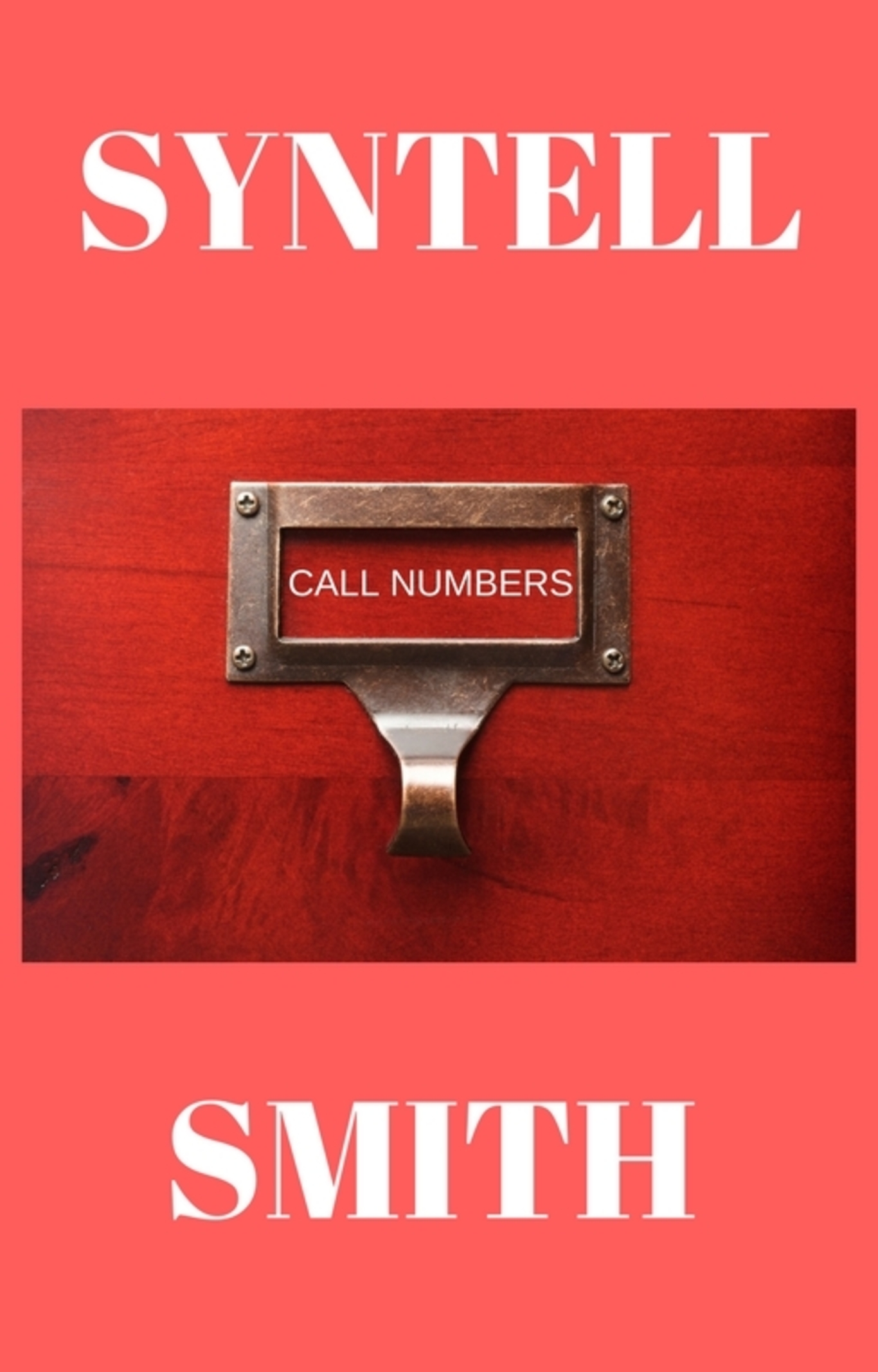
I love the use of the card catalog drawer as the main image, but dividing your name between top and bottom is a weighty demerit. The title, wedged as it is in the window, also becomes almost unnoticeable.
So here’s what I’d do:
- Put the card catalog image at the top, and zoom in — you can crop off that unnecessary margin, and maybe a little more.
- Stack the title in two lines so that the type can be larger in the window.
- Add a gradient taking the lower part of the cover to almost black at the bottom, and put your name there, along with a tagline (eg., “A Novel of Love, Lechery and Librarians”).
In fact, if you can find a usable image containing multiple card drawers, you can have the focal one at the top and then put the gradient over the lower one(s) to put the focus where it needs to be. (Sorry, I’m not at my home computer where I could photoshop a quick mockup.)
Other thoughts?
I don’t think I have ever before run across a book cover where the author’s name is so overwhelmingly larger than the title. If this were a book by a well-known author, where the name alone would attract potential readers, that might be one thing…but apparently it’s not the case here.
The title of the book has been reduced to a minuscule size on the cover, within an image that itself does not fill the available space. Both need to be much larger. As it is, the title of the book completely vanishes at anything even approaching thumbnail size. As Nathan says, the title is unnoticeable.
But the biggest problem with the cover is that it is unengaging and uninformative. There is really nothing about it to specially attract the eye and nothing about it that suggests what the book is about. In short, it suffers from a fatal flaw for a book cover: it is bland.
As Nathan says, the use of the card catalog label is a good one, visually (though one would think that the label should appear to be a card inserted into the holder, rather than type simply superimposed on the wood). But, unfortunately, even the image were to fill the cover it still really wouldn’t convey much about the nature or subject of the book. There needs to be an additional visual element to help get across the idea that the book is “a captivating and multilayered adult drama.”
Nope.
First I thought the title was SYNTELL. Then I realized it’s probably half of the byline.
The title is absurdly undersized.
The layout, colors, and typeface are BORING.
The drawer pull would have a piece of paper or card stock, or an etched brass insert installed slot, and it wouldn’t contain call numbers. Will most potential readers know what a call number is and to what it refers as the title of your book?
On a side not, patting yourself on the back or telling the reader how they will react to your book is not a good look. Your description needs a lot of editing.
My 5-minute redo…
https://i.imgur.com/SgCV8Gg.jpg
No offense but that looks like a title card from the British show, “A Touch of Frost” especially that font.
In other words, something you recognize.
True–due to the distressed font, more than anything else. So, fine, change the font. It’s visually more interesting than the original submission. The mockups that CC.com members and commenters create are meant to be ideas and springboards–not completed covers. 🙂
I do like the idea of the typewriter font for the title, but…if it won’t work, due to TOF similarities, then, we could find something else.
It may look like something from “A Touch of Frost,” but apparently nothing specific (at least nothing that shows up in an image search). But, regardless, the point that B.L. is making is a very valid one: the cover art needs to say something definite about the subject of the book.
It’s this to which the OP refers, the distressing (in the case of the TV Show, the “frost” on the letters) in TOF: https://www.justwatch.com/us/tv-show/a-touch-of-frost
That’s it. That and that the letters in FROST appear to be a typewriter-like font. I mean, sure, if you have Brit customers and Anglophile Mystery lovers that watch TV, they might think of it.
But, then again, better that than nothing. 😉
Thank you all for the input, I made the title fit just like a Dewey Decimal entry that would be on the card catalog. I have heard splitting the author name vertically was a risk, but I gave it a shot, it could have been an ego thing. I kept it simple due to the fact that I couldn’t use the lion statues due to the NYPL copyright. I plan on doing a revision in January, but since this is a series I’m trying to keep the same cover theme. Book 2 is similar but with a picture of a open book dictionary on a book stand.
I wanted to comment about what you said about Patience and Fortitude–who were my friends as a child long ago. They are trademarked–not copyrighted, and you can use them, to a certain extent, in books. I suspect that the library would probably sue if you tried to use them on the cover, but again–I simply wanted to distinguish between the two legal issues. Alamay does have images of them for license for commercial use.
Alamy has many photos of the NYPL lions as stock images with no reference to limitations of use or reference to a trademark status. The library’s trademark would prevent the use of the lions to identify a similar product, which is what trademarks are for. But, as you say, better to be safe than sorry.
In any case, I don’t know if I would count 100% on every potential reader recognizing the lions as to what and where they are.
Agreed. It’s all well and good to think that everyone would recognize Patience and Fortitude, but I just flashed some images at my husband (a scientist) and he has no idea who they are. Unlike me, he didn’t grow up in NYC.
He did guess that they might be in front of a library somewhere when pressed–and promptly commented that despite what New Yorkers think, the entire world doesn’t actually revolve around Manhattan. HA!
Framing the image in a solid colour background is “a” way to create a unified look for a series, but it gives the cover a very amateur look. While we appreciate that a Dewey decimal entry would not be on two lines, the single line title does not work. Librarians around the world will not be horrified if you use two lines. Based on Nathan’s comments, here’s two (rushed) samples of what I think he’s talking about.
https://imgur.com/dHb1qKa
I don’t like the border/bar of solid colour, but for a series branding element there are worse. Others here likely have more insightful suggestions.
https://imgur.com/BQ1dZfz
The script font was just because the colours seemed dark and from the description your story wasn’t dark, just dramatic. You could pick a distinctive font and use that across your series for series/brand recognition.
Finishing your second idea…
https://i.imgur.com/aLVIZwj.jpg
Your more finished version of Sydney’s idea is very good! It solves the main problem with the original cover, which was that it didn’t provide a single clue as to the actual nature of the book or its subject.
(By the way, make sure to spell “librarian” right!)
LOL That’s called irony.
https://i.imgur.com/Bb01rJk.jpg
SNORT!
That first one, Sydney looking promising, going with Nathan’s concept, I was toying around with the gradient in the lower left corner, but couldn’t get it to work. That second one doesn’t work because of that color (Even though brown is the theme for the next book in the series)
Colour changes are pretty easy in most graphics programs, so I wouldn’t let that hold you back if you like everything else. B.L. did a nice job with a tagline more specific to your book.
Also something to bear in mind, in both my mock-ups, the resolution of the card drawer(s) is not good. (it’s even more obvious in B.L.’s example as they enlarged probably the same pixabay image even further to get the bigger impact with the title.) I assume in the case of the red drawer, you have a larger resolution image to work with. Maybe try a gradient fill mask to blend the bottom of the drawer into the salmon colour rather than the sharp delineation?
Best of luck!
There are some very acceptable, crisp card catalogue images for cheap on Depositphotos.com.
Gosh! Maybe you could even go out and find a card catalog and photograph it!
That’s pretty much what I did with Book 2’s cover, I looked everywhere for a picture of a book open on those turning display racks and just said, let me just go to a library until I find that specific shot.
https://imgur.com/a/5jLPGUO
The theme will be a different color that goes with the picture in the middle and each picture something library related, Date Due Card, Newspaper on Sticks, Bust statue of Alexander The Great, A shelving cart, etc…
Color-theming is fine but these are lifeless. The photo for Book 2 looks like something you’d see on a non-fiction cover about Library etiquette and is poorly framed, with bits showing left and bottom and the book spilling off the table surface at the top. The jaundice hue is not doing it any favors, either.
Beyond the image the solid background is uninspired and your typeface is boring. Mixing sans and serif is also tricky.
Here is an example showing one way to improve the visual appeal of a photograph:
https://i.imgur.com/5VhEWO4.jpg
Wow, changing the hue to make the table color darker like cherry wood improves the picture very well! Almost like a callback to the card catalog cover. I can clean up the left and bottom to keep it focused on the table.
And what’s wrong with that typeface? I like it (It’s Abril Fatface, by the way), I tested so many fonts with my unique pen name and this looked the best, the fat vs. skinny lines on the Y, the sharp points on the T, the pointy boot edges on the L.
The byline is probably fine but your titles are too small and Liberation Sans is too plain. It should also be all caps.
By the way, I didn’t simply alter the hue of the photo, I also adjusted the brightness, contrast, color saturation, and lightness. As mentioned elsewhere it also needs something to identify the type of story and that it is fiction . A weapon, undies, lipstick-adorned note, etc on the table, for instance.
The book is the ‘something’, it’s not a crime novel so a weapon wouldn’t do it, it’s not erotica so no panties or love letters…the book as well as the environment behind it all says ‘library’ which is the core of the story. I can make the title bigger as long as the placement stays beneath the book, I tried to put it above the book, but it gets lost in the books on the shelves. I didn’t put the title in all caps on book one, but I’ll see how it looks.
Sticking more closely to your images and layout I added more visual interest.
https://i.imgur.com/8GIbBOu.jpg
https://i.imgur.com/5LcSjP0.jpg
Well, with all due respect, the book isn’t about a library, right? It’s about the lives of the people that are inside the library. It’s about Robin and the others, presumably, LitFic, which is always the hardest cover to design.
I mean…it’s like saying that a crime fiction novel (like the 87th Precinct books) is about the building that the 87th is located in, rather than the lives and day-to-day crime-solving of those that work there, or that GWTW is a novel about Tara. They’re not. The 87th P novels are about the cops that work there and their families and GWTW is about Scarlett, etc.,–not the building she grew up in, other than tangentially.
The focus on “library” might be a disservice to your book, is all I’m saying. If you think about the Ron Miller test–if you saw this cover in a language you didn’t speak, would you know what’s inside the cover?–the card catalogue drawer just doesn’t say much about what to expect. Romance? Murder Mystery? Gay erotica? Could be anything at all. As Ron or RK said, at this moment in time, you are utterly dependent on the tagline.
I agree that the second cover is bland…and, except for the addition of the tagline, has all the faults on the first cover.
Apply this test to your covers: imagine all of the cover text in a language you don’t know. Would you have any idea what the book was about, its nature or themes?
It seems to me that, as with many cover artists designing for the first time, your picture is zoomed in far too close to the subject. While (given the title), I’m sure call numbers and the card catalogue themselves are at least somewhat important to the story, your summary sounds like it’s saying this is more a “slice of life” drama generally focusing on all of the people (patrons, employees, the manager) in a particular library and specifically on the protagonist. In view of the expansive scope of this story, don’t you think your cover image also ought to have a broader scope than just one drawer in the library’s card catalogue?
Much as the story is evidently focused on the people, I can understand why you don’t show them on your cover; even without a human presence, the architecture of libraries has a certain grandeur and mystique unto itself. Take this artwork by a photographer named Lori Nix showing a library in a post-apocalyptic setting, for instance: even in this ruinous state, a library’s interior is an impressive thing to behold. In fact, this was such an amazing image that Fountains of Wayne (the band who did that popular song “Stacy’s Mom” you may have heard) actually used it on the cover of their album Sky Full of Holes.
Since your story is near-contemporary (1994 being 25 years ago when I was 15… man, you’re making me feel old just thinking about it!) and set in a still-functioning library, you obviously won’t have any use for that particular image. 1994 also being back before public libraries used sophisticated computer databases (though I can testify from personal experience some libraries already had their catalogues computerized with some ASCII search forms available for looking up books even then), you’ll doubtless still want to focus on some old-fashioned physical card catalogues. Mundane as they may seem, however, even a picture of those antiquated card catalogues can capture some of the grandeur and mystique of a library: consider this image I found in a few seconds with a simple image search.
See what I mean? Looking head-on at the single card catalogue drawer on your cover submission is boring and nearly puts me to sleep; but viewing at skewed angles what seems to be a whole miniature metropolis of card drawers has my heart picking up its pace a bit and me waxing poetic about a (probably) little-used and much-neglected old back room in a library. An obsolete filing system for libraries has never seemed so exciting to behold!
As such, I’d recommend using a cropped version of the picture I linked or something like it to show your prospective readers there’s a whole roomful of these drawers, and then just slapping your title and byline over the respective top and bottom of the picture. Engaging to the eye as an entire room of card drawers can be, it’s not as if your title and byline could be blocking out anything incredibly important from those locations.
Here’s my 5-minute example.
I’m not so sure about that color(!) but the idea is good one! I would just vignette the image a little so the focus is more on the central area and add an additional visual element that gets across the idea or theme of the book, beyond the setting alone. The eye goes directly to that open drawer, so perhaps something could be added to it, something unexpected and telling—a bouquet of flowers, panty hose or stockings…I dunno. just something additional and significant. https://www.charliehills.com/gallery/picture.php?/543/category/3
I agree about the color, and the idea of adding a single element related to the relationships.
My early covers tried to depict actual scenes from their respective books, and failed. Then I went full abstract, and again failed. while not quite professional-looking, my current covers are a decent compromise between the two, not based on reality while containing a key element or idea from the story.
Good way to go! Book covers really aren’t meant to be illustrations of a book—though, of course, they can be. Their purpose is to sell the book, not illustrate it. One reason for this is that it all too often requires already knowing something about the book to appreciate what’s going on in the cover. And, of course, the cover has to convey its message simply and quickly. Sometimes a book will have a striking, visual set piece that perfectly sums up what the book is about and a literal depiction of this makes a perfect cover—and I can think of a great many examples—but more often than not it is better to create an image that represents the book rather than literally illustrates it. So when you say that your current covers are “not based on reality while containing a key element or idea from the story” I think you have hit exactly the right note!
Just for the heck of it I’ll repost this essay that I did a few years ago… http://black-cat-studios.com/book_cover_design.html
If the color doesn’t suit you (and I can see why it might not; in retrospect, hot-pink-and-mauve are more appropriate to a romance or erotica, which this novel is not), I can always do others. Actually, that whole piece is just a rough example anyway: if you’re paying close attention, the image is a bit blurry since I had to crop and then expand the original picture to make it fit the cover’s ratio and orientation and the 300 dpi resolution. The point is to expand the scope of the cover; as Hitch says, there are loads of more interesting stock images of library card catalogues out there if you know where to look.
Those two B.L. are MONEY!!! Except that tagline on book one, geez….”The not so quiet life of librarians” is LONGER but it’ll look good there, I even like that font.
I need details!!!! RGB and HTML color codes, name of font, you did it, B.L.! I’m sold!
The font I used is TeX Gyre Schola, but I’m not sure of the commercial use license. It’s pretty similar to other ‘Times’ style serif typefaces, however.
It’d almost be easier to redo them at the proper scale if I had the raw images. I also closed them so I don’t have access to the exact colors. Let me see what I can remember…
As I often do, the background gradients and drop shadows are derived from their respective photos.
The drop shadows:
Book 1: Text – #662722 10+/10+ 5% Blur
Image – #400D0A 10+/10+ 5% Blur
Book 2: Text – #532507 10+/10+ 5% Blur
Image – #2F1202 10+/10+ 5% Blur
Smaller Text is 5+/5+ (5 Right, 5 Down)
The Background Gradients:
Book 1: #AB2B20 Lighter / #641A1B Darker / Radial Gradient Light Primary
Book 2: #933907 Lighter / #53270C Darker / Radial Gradient Light Primary
To get the texture I added 25% Random Noise, then applied a Gaussian blur with a radius of 5.
The insert card is a simple rectangle of off-white, slightly noisy, with the edges blurred. I would probably restore the shadow from the holder, but lighter to sell that the card is there.
I’m not thrilled with “Book 2″, but there was no other logical place for it as there was on the first book, and it covers my crude clone removal of the old title and tag from the image.
I’d probably darken the drop shadow, also. It’s barely visible on the bylines due to the gradient.
Of course, even though these are mockups I always build them to scale using proper bleed and trim variance, although I use my paperback size of 5.25″ x 8”. That means everything is centered to my mask, hence the extra space to the right.
Before you commit, see what the others have to say. Someone might have the perfect solution for the book numbers.
That extra space on the right is perfect for that crease that develops with paperbacks as people read, turning the pages. It took so many efforts to space it correctly without it looking lopsided due to that crease. I went with the 6 x 9 size because the book was over 350 pages (357) BUT I’ve heard 5.25 x 8 IS the standard for libraries and bookstores with today’s shelves.
I am loving these designs!
The extra space on the top, right, and bottom is the trim variance where they cut the book to finish size. My masks also include the inner bleed all the way around to help with the crease.
What scale did you use for your paperback text?
I chose 5.25 x 8 because it’s the size of my favorite paperbacks on the shelf, and because it’s easier to pack and less cumbersome than 6 x 9, but easier to hold and read than Mass Market. As it happens, it also allows me to create a single master image and then trim accordingly for Kindle and Paperback without having to resize.
Arbor Day is my longest book at 384 pages and it’s not particularly cumbersome at that trim size.
FYI, Century is pretty close to TeX Gyre Schola
Something else I’d probably do is lower the image and make “Call” as wide as “Numbers”
I do like the direction that the cover is now taking. There is one small thing that is still kind of nagging at me. And that’s the fact that getting across the nature of the book—its subject and theme—depends entirely on the tagline. I wish that there were something in the image itself that also conveyed an idea about the book. For instance, if you are using the close-up of the card catalog drawer, a kiss mark in red lipstick on the card.
I agree. I like the lipstick idea for # 1, and something on the table next to the book for #2. Even in my last redos the book on the table says nothing. Perhaps a fake relationship advice book with the tagline as the title. Maybe a broken ring, or spot of blood, or Dear John letter. A returned apartment key with a note. Anything.
Something like this, but done much better…
https://imgur.com/a/9i3vuZd
Good ideas! I think that I would avoid anything that needs to be read (though “Goodbye” as a single word is certainly brief enough) and look for something visual instead. But whatever it is, it ought to be something that gets its idea across in a glance.
For instance, a Dear John letter would have to be read to have its significance understood, as would a note attached to a key (and what would make the key identifiable as specifically an apartment key?). Still, these ideas are all definitely in the right direction!
(I liked your lipstick idea. What if the open book had something on its pages about love…the title page of a book called “Love Poems” or just a picture of two people kissing…with a bright red X scrawled through it, with the lipstick lying next to the book or on the page?)
“Perhaps a fake relationship advice book with the tagline as the title.” Yeah, like an open copy of “Marriage for Dummies” or “Dating for Dummies” or some such thing…with a red X drawn across the pages.
I think a card catalog drawer is a strong image to have on the cover, and all the fiddling around with other imagery hasn’t really improved it.
I say keep it simple: Card catalog or wall of card catalogs filling the entire cover, bigger title, smaller author name, tagline.
“I think a card catalog drawer is a strong image to have on the cover, and all the fiddling around with other imagery hasn’t really improved it.”
Probably because much of the fiddling has been in the wrong direction.
I don’t think that there is anything at all “strong” about the bare image of a library card catalog. Other than the fact that the book might involve a library in some way (and assuming the potential reader would even recognize a card catalog any more!), it really conveys nothing whatsoever about the nature or themes of the book…certainly not that it is supposed to be a “captivating and multilayered adult drama…about the trials and tribulations of adulthood.”
It’s just a card catalog.
This is why the image needs something additional to connect it specifically with the idea of the book. Otherwise it could just as easily be a biography of Melvil Dewey.
You are entitled to that opinion.
You do not, however, need to respond to every person who has a differing opinion to tell them that they’re wrong.
Interesting response considering you were one of those who made a shit-ton of assumptions about my pursuit of representation. In fact, it was you who blindly concluded I must have not found any becasue I never tried, even though the few examples to the contrary ignored the fact you are all sitting on the other side, often serving as that bridge between unknown and publisher which I lack.
I confess, I don’t love the card catalog by itself idea, either. I just don’t think it’s very compelling and I don’t think it says s**t about WHAT the book is or is about, or anything.
Put everything you just said in bold italics and then underscore it.
Okay, Book 2 looks good with that goodbye, because there is a staff departure at the climax of novel, I may keep that. And thank for for replacing that tagline for Book 1, dunno about the lipstick, but it’s better than the “Book 1” on the white label.
“Okay, Book 2 looks good with that goodbye, because there is a staff departure at the climax of novel”
Just be careful to remember that that particular significance to the word is only apparent to someone who has already read the book. To a newcomer, it may suggest many different possibilities…especially since it is apparently written in lipstick and perhaps even more especially since there is suggestion of vindictiveness in having it written on the table, like an act of vandalism.
If ideas like these don’t misrepresent the book, then all is well.
Okay, you’re kinda OVERTHINKING things Ron Miller, the cover is basically the hook that grabs the reader’s attention, which is why I went with the original design, one, the color red stands out among the spectrum, you put this book in a group of others, it’s the first thing someone may notice, two, I went with the simplicity and mysteriousness approach. A lot of people when they first saw the cover thought that it was a horror novel about some serial killer librarian. I thought, “Let them draw their own conclusions, at least they’ll pick up the book and then read the blurb on the back.”
Going back to what Hitch said, referencing the 87th Precinct series and focusing on the library building over the staff, I didn’t want to use the lions and I couldn’t think what other imagery could represent the staff, other than someone wearing a cardigan sweater or a woman with her hair in a bun…I really didn’t see it as a disservice.
I like book 2’s cover, that might be a lock, but book 1 is still a problem with what to put in the middle where that lipstick print is, I didn’t like the white table card saying ‘Book 1’ and I don’t like the kiss print…maybe it should just be left empty with the tagline underneath.
“Okay, you’re kinda OVERTHINKING things Ron Miller, the cover is basically the hook that grabs the reader’s attention,”
I have some reason to believe that I know what a book cover is for. I also know that it needs to do more than attract attention. It needs to tell the potential reader something significant about the book: its nature, theme or subject. A flashing neon sign will attract attention but you probably would like to know if it’s for a convenience store, motel or bar before you go to all the trouble of going in to find out.
“I went with the simplicity and mysteriousness approach’
There is being mysterious and there is simply being confusing. You should intrigue a potential reader, not have them go “huh?” I think this is, again, where subjectivity is your enemy.
“A lot of people when they first saw the cover thought that it was a horror novel about some serial killer librarian. I thought, “Let them draw their own conclusions, at least they’ll pick up the book and then read the blurb on the back.”
That is misleading. A book cover should fairly represent what sort of book it is or what it is about. If someone would have purchased your book solely on the basis of thinking that it was horror novel you would have done them a disservice.
Everyone here keeps throwing that word ‘disservice’ around…do you know how many books I’ve brought and disliked or couldn’t finish reading because I only looked at the cover? And this was before the internet, before amazon, before google, where the only authority was The New York Times Book Review. I don’t think it’s misleading or a disservice by having a cover that doesn’t 100% relate to the story.
James Patterson wrote a novel in the Alex Cross Series called “Big Bad Wolf”, it’s cover was the front of a silver sports car that happened to have a wolf as the hood ornament. Did the book have anything to do with cars? No, but the villain was called The Wolf, so that’s not misleading or a disservice. These days, people can see a book cover on a shelf, look up the reviews and make the determination if they’ll buy it or not within minutes.
A card catalog is easily associated with the library, literary fiction is a very niche market and doing a workplace drama series about the staff of a library in a hostile work environment is a VERY hard sell so when it come to marketing, a hook, a gimmick, something to make it stand out helps.
“Everyone here keeps throwing that word ‘disservice’ around…do you know how many books I’ve brought and disliked or couldn’t finish reading because I only looked at the cover? And this was before the internet, before amazon, before google, where the only authority was The New York Times Book Review. I don’t think it’s misleading or a disservice by having a cover that doesn’t 100% relate to the story.”
I would not put too much weight on your personal experience…not that I really understand what you are saying. Is it that you are suggesting that the covers of the books you bought and disliked misled you and that is why you put them down? Or that the covers were in fact attractive and accurate but you just didn’t care for the book itself? Your point eludes me.
Saying that you don’t think that a cover needs to relate to the book is a lot like saying you don’t think that the label on a box or can at your grocery store needs to accurately represent what is inside. It may exaggerate, it may make the product look better than it might really be…but you won’t find a picture of a pizza on a package of frozen broccoli.
“A card catalog is easily associated with the library, literary fiction is a very niche market and doing a workplace drama series about the staff of a library in a hostile work environment is a VERY hard sell so when it come to marketing, a hook, a gimmick, something to make it stand out helps.”
Indeed, literary fiction can be hard sell…which is all the more reason to pay attention to its packaging. As you say, “a hook, a gimmick, something to make it stand out helps”—and a photo of a card catalog just does not do that. Where is the hook or gimmick? As I have said several times in earlier posts, the catalog by itself says absolutely nothing about the nature, theme or idea of your book beyond suggesting its setting…and that is not enough. If your story is about a library with a hostile work environment, then create a cover that conveys that idea. It’s what will set your library-set book apart from everything from “The Book Thief” and “The Abortion” to “The Name of the Rose” and “Goodbye Columbus.”
The plain, unadorned card catalog as a cover for the book you describe is a little like putting a bucolic, pastoral scene of a rolling, sunlit, flower-strewn meadow filled with contented sheep on the cover of a dark high fantasy adventure and saying, “That’s where the battle takes place.”
Hey, Ron.
You know, here at CC.com and other places, we’ve seen this idea or strategy from time to time–that using a cover that doesn’t actually relate to the book’s concept or theme is somehow “mysterious” and that readers will look at it and think, “hmmm, what’s that, I’m so intrigued that I’m going to pick that up.” I’m not sure where that idea comes from–but as we all know from experience, the reality is, that doesn’t work.
What happens is, the prospective buyer sees the oddball cover and blows right past it. If you’re shopping for, for example, historical romance, and you go past 50 covers all showing Elizabethan-dressed heroines in front of stately homes with a handsome man lurking somewhere, and then you see one with an expanse of lawn and a martini balanced on that lawn, you’re not going to stop to see what it is; you just assume it’s in the wrong place and keep going. It’s human nature. It’s eisegesis. They come to the search with a preconceived notion of what they’re going to see, that’s what they expect to see and when they don’t see it, they don’t stop and wonder; they just keep on truckin’ right past this oddball object.
People expect to see a certain type of element, a certain type of cover, for books. Granted, LitFic has its own issues and challenges and problems. There aren’t any standards, other than in LitFic, your cover should look like it’s about nothing, and then you’ve probably achieved literary greatness. (A bit of sarcasm about the biz, there…forgive me.)
If the OP is happy using the card catalog..given that this isn’t genre fiction, and he thinks it will work, then…{shrug}. I mean…other than stabbing the card catalog with a knife (to impart “hostile work environment” which would probably actually convey “murder mystery,” which is wrong), what’s he going to do?
I might have gone a different way–something more symbolic, less literal, as “literal” in “literary” is the kiss of death. I might have gone with a desk stacked with books, with something relevant on it–IDK, maybe a poison pen letter. That’s just an instant thought, but something that said “character works here and the work environment is brutal,” rather than focusing on the library. I mean, as we discussed previously, the story isn’t actually about the library. It’s about the people who work there. The building itself is somewhat irrelevant to the story, other than as a framing device. Yes, yes, it’s a setting and location, but it’s also a device.
So…while I think that the catalog is less than helpful, as a cover image, in LitFic, it’s as good as anything else, if you think about it. In genre fiction, as I said, we’d have tried more to set the stage on the cover, to drive clicks, but LitFic turns its nose up at something as trite and pedestrian as–gasp–SALES–so, why not a card catalog? And, as he points out, it can be deployed novel after novel, as a type of branding.
While I think that largely, your points are right, Ron, I think you’re pushing a chain up a hill here, in terms of the OP’s views of the cover, and secondly, as it’s LitFic, I’m not sure that any other “suitable” cover would be massively better. I mean, hell, Gwen thinks it’s a strong image, so…maybe prospective buyers will, too.
I don’t think that this book presents a particularly difficult problem. After all, it’s only a matter of conveying a couple of simple concepts: “hostile work environment” or “trials and tribulations of adulthood” and “library.” There are certainly plenty of other novels—dozens—set in libraries, from “literary fiction” to murder mysteries. The real hurdle with this particular book is one that you have faced much more often than I have: an author’s subjectivity.
Like many of the posts I make here, the comments and suggestions are as much for the author of the book in question as they are object lessons for readers hoping to create their own covers.
I don’t think that there is any really serious problem in coming up with a cover for this book. There have been, after all, dozens of books with libraries as their setting, ranging from “literary fiction” to murder mysteries. There are really only two criteria for this cover and neither are daunting. One is “hostile work environment” and/or “the trials and tribulations of adulthood” and the other is the library setting. The main obstacle is something that you have had to deal with far more often than I: author subjectivity.
As usual, most of the detailed commentary I post in Cover Critics is as much for the author/publisher hoping to create their own cover as it is for whatever book is currently under discussion.
All very true, indeed!
That being said, I don’t think that this book presented such an insurmountable problem. After all, the basic elements are simple enough: a library setting and the theme(s) of hostile workplace and/or adult trials and tribulations. There have, after all, been scores of books with library settings, ranging from fantasies to murder mysteries, from “The Name of the Rose” to “The Book Thief.”
I think that the biggest hurdle this book faced is one that you have to deal with far more often than I do: author subjectivity.
When I post to Cover Critics, I have to admit that I am always keeping in mind that I speaking not to the author in question but to the prospective author/cover creator who may be looking on.