Month: May 2017

Programming Fundamentals in JavaScript

The author says:

A textbook for a college freshman level computer programming course. The goal of the book is to teach programming fundamentals, and it uses JavaScript to do that. This is different from some textbooks which are written to to teach JavaScript.  I am interested in the feedback from others about the comic on the back, which I freely admit is “art for a refrigerator”. However, I wonder if it is appropriate for the audience of the book.

Nathan says:

This is… dull.

Not that a programming primer is supposed to be whiz-bang exciting, but “clean and straightforward” doesn’t mean that it needs to be dull.  Take a look at the other programmings books on Amazon, and take note of the common factors:

  • clear, solid type
  • a simple but pleasant color scheme
  • explanatory subtitles
  • a simple central image

Your cover definitely has clear type, but it falls down on the rest.  And given the description you give above, I think even the title works against you — it still looks like a text on the basics of programming JavaScript itself, and the minimal description on the back does nothing to clarify that.  Something that separate the concepts better — “Using JavaScript to Learn Programming Fundamentals,” “The Fundamentals of Programming: Using Javascript Examples,” etc. — would help.  Then use a subtitle of the length of your back-cover description to explain more fully: “Understand the core concepts of all computer programming, using JavaScript as an example.”  And then put something substantive on the back cover: How this book approaches the subject differently than others, what exactly is covered, and why you’re qualified to explain this.

I think the idea of the cartoon is fine (the art, as you note, isn’t professional-grade), provided that there are some lighthearted moments of wit in the book — if it’s entirely dry-as-toast, then including the cartoon on the cover is false advertising.

Other comments?

Walking on Air

The author says:

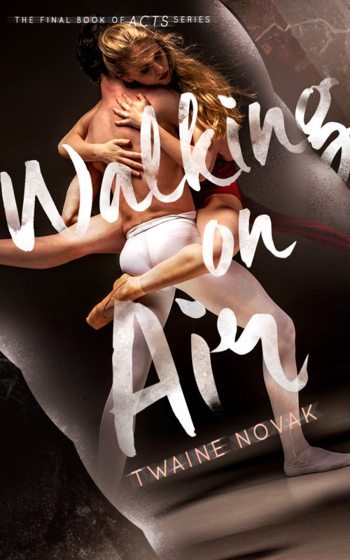
This is the continuation of the book “Breaking the Edge“. Still on the same genre as it is, sport-romance YA-NA, but this time, around dancing. It was said that “Breaking the Edge” was lacking of the ‘romantic’ feeling inside the cover, so I think of something like this?

Nathan says:

Yeah, I’m thinking you’ve definitely got “romantic” covered.

I can see that you deliberately kept the typefaces for both the title and byline, and good for you. That kind of continuity between books in a series is essential for branding.  I don’t know if you changed the position of the byline on the Breaking the Edge cover; if not, you should put the byline in the same place on this cover as well.

Breaking the Edge had a limited color palette — not artificially, but simply because that was the nature of the photograph. I’d suggest that you use a similarly muted color scheme here: have the skin tones be the only vibrant colors here, and desaturate the rest of the cover to a large degree. Breaking the Edge also had distinct grain to the photo; I’d try to mimic that here, to maintain visual continuity.

Other comments?


Watch It Turn

The author says:

The Amazon Book Description:

“The job of this world is to turn and you must learn to just watch it turn.” Before Gautam Singh could hear and understand those words, he had to live a whole life. A life whose focus shifts from friendship and love to success and ambition. A life which culminates in a spiritual quest, undertaken in the most unlikely place with the most unlikely teacher. “Watch It Turn” is an Indian novel, set in the backdrop of the rise of the Indian IT industry, with characters that captivate and events that bring you face to face with your own self.

Length – 284 pages (in 12pt print)
Genre – Literary fiction

My Questions
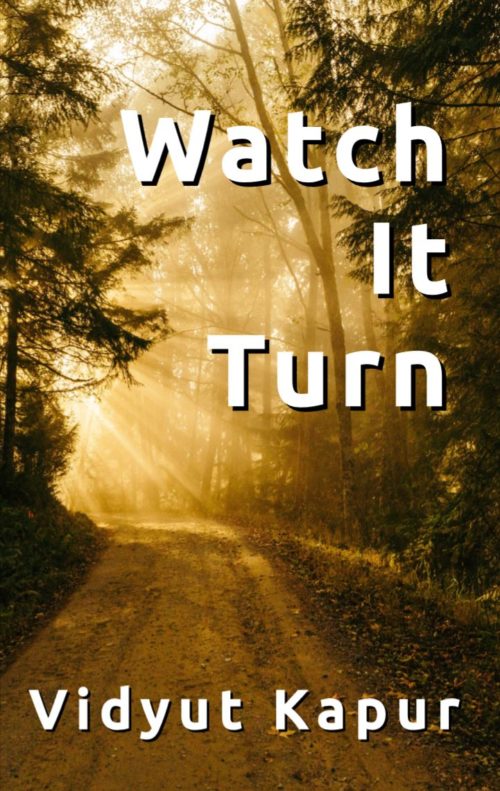
– Is the photo too complex?
– Are the colours striking enough?
– Are the fonts and sizes of the text ok?
– Any other criticism/suggestion which the good folk here can give will be appreciated.

Nathan says:

I’ve snarkily commented elsewhere that the covers of literary novels try mightily to make the book look like it’s “about nothing.”  I fear that might have been taken as advice here; your cover — while it certainly has no major technical flaws — doesn’t actually tell us anything about the book.  Or, as I usually put it, it doesn’t tell the target audience for this book that it’s meant for them.

The problem is that a dirt road in a forest, while picturesque, is awfully generic.  There’s nothing here to give a hint about setting or genre — if it weren’t for your byline, there wouldn’t even be a hint of an Indian angle.

If it’s set in India, how about a sunset shot of the urban Mumbai skyline?  If it’s about a spiritual quest against the backdrop of the IT industry, how about a spiritually resonant image of some sort, contrasted with a typeface with the kind of high-tech edge that companies like to give their logos?

There’s nothing wrong with this cover, but there’s nothing really right with it.  Imagine the thumbnail with several other thumbnail-sized covers on either side of it — since that’s how most potential readers will first encounter it — and say to yourself, “What can I do to make this more attractive and click-worthy?”

Other comments?

The Worst Man on Mars [resubmit]

The author says:

This is a resubmission for ‘The Worst Man on Mars’

[original submission and comments]

Nathan says:

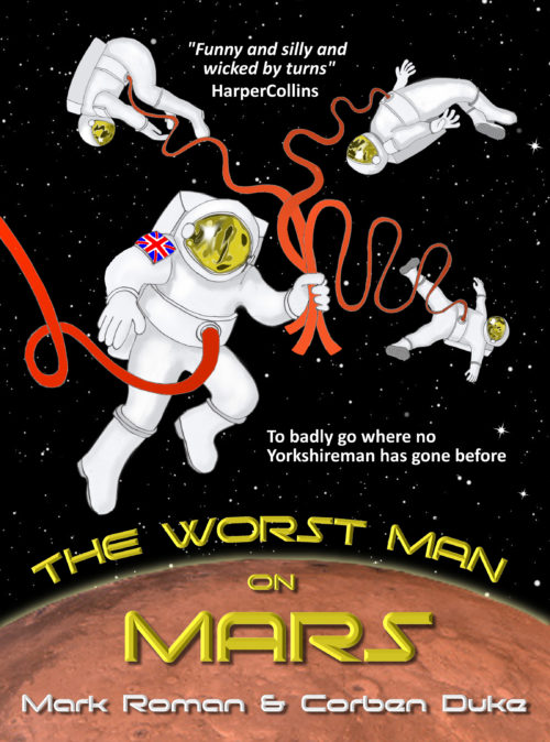
I like the concept of this one a lot more — there’s both humor and action in the image.

Here’s what I’d do to tweak it:

  • Reduce the size of the main astronaut a little, and the background astronauts more.
  • Move the Mars horizon further up.
  • Find a taller font (or a taller version of the font) for the title, so that the title is more discernible in the thumbnail. Ditto for the byline, which is unreadable at thumbnail and still not easily read at full size. (That’s one of the reasons for moving the horizon up — you’ll have more room for bigger letters.)
  • Reduce the beveling on the text, and instead work on contrast with the background.
  • Find better places for the pullquote and subtitle; as it is, they look like they were crammed in there as an afterthought.

Other suggestions?

???

The author says:

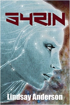
It has been 50 years since humans were introduced to the fantastic beings that shared their galaxy. Technology has been thrust to futuristic depths, producing an elaborate space station that orbits Earth where Tara lives with her mother and sister. But it is not quite the melting pot of cultures that idealists had hoped for. A tragedy on Earth pushes Tara and her family to abandon everything they know to escape being tied into the conspiracy. But who labeled them as traitors in the first place? As they run deeper into uncharted space, the mystery grows as thick as the tangles of trouble they find themselves in.

Nathan says:

Honestly, I can’t that title. I’m not being hyperbolic for emphasis; I literally have no idea what it says. THIS IS A PROBLEM, especially because your synopsis doesn’t give me any clues. Readers simply won’t buy your book if they can’t read your title.

Given that you only sent a small version of the cover, I can’t tell if the texture on the face is an interesting effect or the consequence of scanning a too-small image from printed material.  However, I can tell you that the story you describe — intrigue aboard a space station and beyond — isn’t really indicated by the cover.  If it weren’t for the angular (unreadable) title font, I would assume that this is fantasy or nhew-agey paranormal fiction.

My advice to you:

COMMUNICATE with your cover. Make it readable, and make it reflect the story, so that the people who would like your novel will realize from the cover that this book is for them.