Category: Covers

Arcadia’s Daughter

The author says:

Abigail Johnston died of scarlet fever on a remote farm in Maine in 1872. On the day of her death at 19, her grieving parents posed with her lifeless body for a memento mori, a picture of the dead taken by an itinerant photographer. The picture trapped her soul in Gehenna, a place of torment ruled by Queen Lilith, Adam’s disobedient first wife. A century later, David Austin, finds her photo in an antique store in rural Maine and becomes obsessed with discovering her identity. He finds her forgotten grave in a forest after an improbably lucky search. While he is holding her photo in the cool spring twilight, a woman steps out of the shadows and extends her hand to him. “Sir, I need your help.” It is Abigail. She has crossed over to the land of the living to ask David to find and destroy Moloch’s chalice, the supreme power talisman of the shadowy demon Aamon to prevent his consort Queen Lilith and her children, the Lilim, from annihilating humankind and occupying Earth. Abigail’s touch creates a psychic bond between them which grows ever stronger. David, fighting to overcome self-doubts, searches the world from Jerusalem to Idaho, following a gossamer trail of clues while being pursued by the Black Sun assassins. He is aided by a secret brotherhood founded by Moses dedicated to the destruction of the Lilim. In a classic hero’s journey, David realize his hidden courage, and risks everything to succeed.

FinalCover2

FinalCover2


Nathan says:

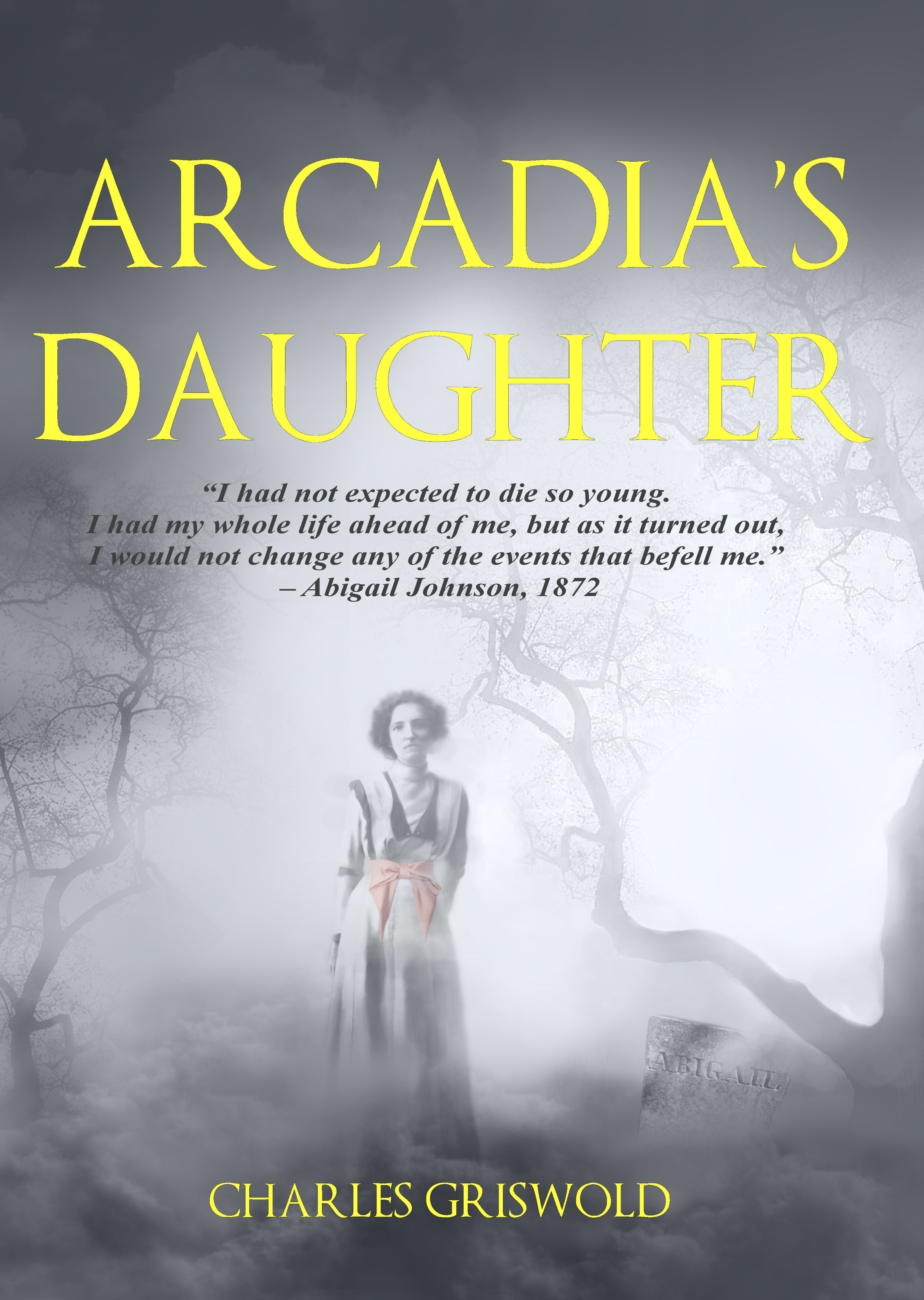
Aside from the gravestone, the historical photo of the girl is well composited into the foggy background.  My real complaints are:

1. Ditch the character quote.  It’s a lot of words that doesn’t actually tell us anything about the story.

2. Waaay too much empty space. There are lots of covers that have small focal figures on them, yes, but they either have a detailed or meaningful background or surrounding that conveys useful information, or isolate the character so starkly that the white space around them carries weight. Yours does neither.  You could trim it down to this size…

FinalCover2-Nathan

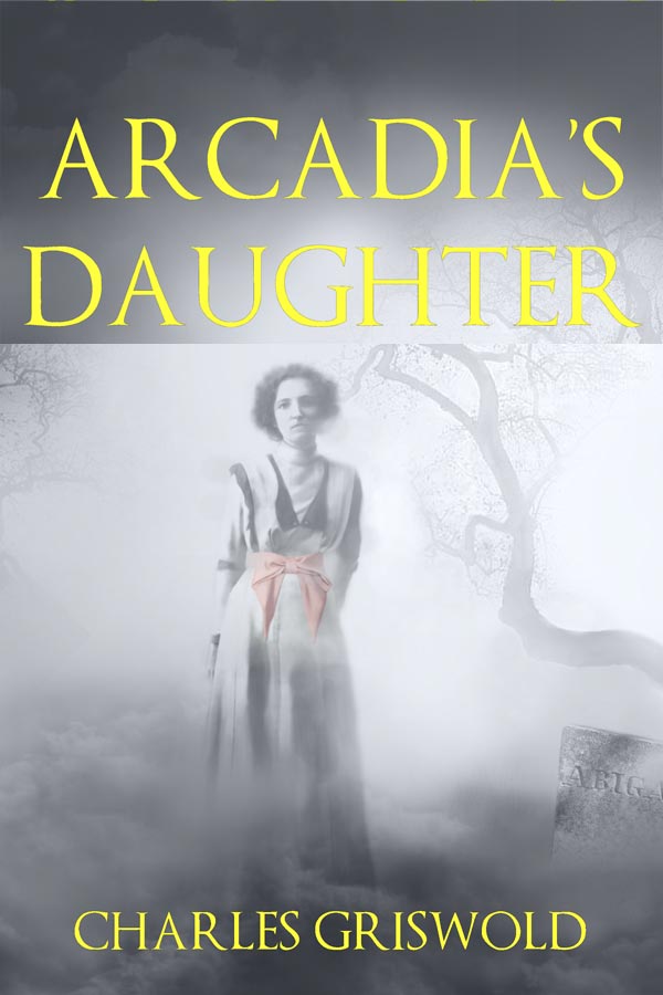
…and lose absolutely nothing. This also lets your name be larger because, hey, you wrote a book — there’s no reason to by shy about it.

Also, a slight drop shadow or dark halo would make the yellow title stand out against the pale background.

(I know it’s not germane to the discussion of your cover, but your “elevator pitch” needs plenty of work. It takes forever to get to what the actual meat of the story is.)

Other comments? (Only about the cover — I don’t want the entire thread to be dominated by a discussion of the description.)

Ascent of the Nebula

The author says:

A dystopian high-tech novel set on another world. The main character has had his memory wiped by a group of scientists called the Developers and is struggling to stop them and rediscover his identity. This is book 3 in a 3 book series.

Synopsis: With the Developers’ plans to reengineer the human race in disarray, this may be the one chance Adan and the Sentient renegades have of saving the desert world of the Vast. Using the chronotrace, a device capable of looking back into time, Adan discovers their next point of attack, but a window to the past can’t prepare him for what the future has in store. He will have to risk his life, his future, and everything he’s fought for if he hopes to survive.

ascentCoverLarge

ascentCoverLarge

Nathan says:

As we’ve seen before, with later volumes in a series, brand continuity with the earlier books is as important as the quality of that particular volume’s cover, so here are the two earlier books in this series:

cover[6]  cover[1]

Honestly, I don’t think there’s much I would change. The branding is consistent across all three volumes, but the changing color scheme keeps them distinct, and the motif of strong typography over textured background works for me.

If I were to try to tweak anything, I’d see if I could adjust the kerning on “Nebula” (and while I was at it, on “Viscera” on the second book) so that I could enlarge that whole word — I like the way that “Vast” takes up the space on the first cover, and I’d want to imitate that more.  But aside from that one thing…

Anyone else have a different take?

Guarding Genny

The author says:

Will the plane crash that killed her husband two years earlier also claim Genny Stevens as a victim? When the insurance company demands their money back she hires Taylor Coleman to prove her husband’s innocence and protect her and her two small children. Someone else has a different plan for Genny, one that doesn’t involve her staying alive. She wonders if help from an unexpected source can possibly manage to arrive in time.

Guarding Genny weaves suspense, intrigue and fantasy into a modern day romance while straddling the worlds of the mystical and reality. This is a draft for the first of four books in the Moonlight Magic Series. It can be considered a Clean and Wholesome romantic story but with enough suspense, intrigue and mysticism to appeal to the YA through the senior citizen set. At this time we are leaning towards the Romantic Suspense category but are still researching which option is best. The book is finished, we just need the cover to publish. Thank you for any input that will better the cover.

Pageflex Persona [document: PRS0000446_00065]

Pageflex Persona [document: PRS0000446_00065]

Nathan says:

I have to tell you, if I saw this cover on Amazon I’d seriously consider putting it up on LousyBookCovers.Com.  Why?  Here’s what I see:

A bear’s butt.  In a moon.  With a smiling woman. But mostly a bear’s butt.

Does this tell me what the genre is?  Who the intended reader is?  What kind of story I’ll find behind the cover?  No, none of that.

And your description takes it further afield. You’re describing a suspense thriller, but suspense thrillers aren’t marketed with smiling people and gentle color schemes and bears’ butts.  Suspense thrillers are marketed with bold fonts and ominous shadows, and the people definitely aren’t smiling. Heck, you even mention a plane crash in your synopsis!  Plane crashes are exciting and dramatic! So why am I staring at a bear’s butt instead?  (And if your answer is, “It makes sense once you read the book,” you’re doing it wrong.  Nobody reads the book so that the cover will make sense to them.  The cover needs to appeal to readers before they know anything else about your book.)

The thing is that suspense thriller covers, especially “woman in jeopardy” covers, are really quite simple.  Go to Amazon and look at Tess Gerritsen’s covers, or Tami Hoag’s covers, or Lisa Jackson’s covers.  These are the readers you’re going after, so you need to catch the readers’ eyes by marketing to them in the same way.

Other comments?


Face Lift

The author says:

Face Lift is an urban fantasy set in a near future where there’s still a bit of magic in the shadows. Gregorios, a rare facetaker, infiltrates an island medical compound in search of his missing wife. The “doctors” claim to possess the scientific secret to eternal youth, but Gregorios discovers instead old enemies, old magic, and a plot of astronomical proportions.

Face Lift

Face Lift

Nathan says:

Zzzzzz… Sorry, what?

Okay, that was uncalled for. But it seems that everything about this cover is intended to be innocuous and deferential.  The color, what there is of it, doesn’t stand out from the monochrome image, which is all shades of gray instead of having any clear blacks or whites.  The fonts are thin and indecisive.  There’s nothing here which tells me what the genre is, who it appeals to, or whether this book has any adrenaline or “juice” to it.

You could take several corrective actions here — add a color overlay to the background image after you’ve played with the levels, make the fonts bolder and more decisive — but this cover could probably best be served by going back to square one.  Really, you could go to a free image site like Pixabay.com or Deathtothestockphoto.com, find the first image that captures your attention, and work from there to create a better cover… because “captures your attention” is what this cover is lacking.

Am I wrong? Anyone else?

Bloody Night

The author says:

An adult paranormal romance set in present-day USA in which a vampire assassin and the prince of the werewolves fight their desire for one another while trying to prevent a war between their clashing factions. It’s the first book in a series aimed at women over the age of eighteen. It’s in a similar vein as Kresley Cole and Sherrilyn Kenyon.

Bloody Night 500px

Bloody Night 500px

Nathan says:

Nice cover for a steamy romance — but where’s the paranormal?  Nothing on this cover indicates “werewolf,” “vampire,” “supernatural,” or anything but two hot people getting groiny. Far be it for me to defend the “photobombing wolf” we see far too often on covers at LBC, but at least they serve the purpose of letting potential readers know that the book isn’t just 100,000 words of standard hookups.

What can you do with the color scheme to make it look not just warm and fuzzy?  If you make the figures smaller, could you put something in the background, like crypts or vaulted cathedral ceilings?  Could you convey something in your fonts — old Germanic, or clawed scratches?

Other ideas?