The designer says:
Commission work for a client.
Book summary: In a world ruled by fairies, humans have developed a rudimentary communication system akin to the Internet using fairy mirrors. After a social experiment involving those mirrors spins out, two teens must decide whether to come out with the truth and face the consequences, or watch their world burn with the fire of revolution. YA magical realism thriller involving fairies and Magic mirrors, with some satirical undertones that raises questions about the role and safety of the Internet in the 21st century. Could be described as Macbeth meets The Crucible meets a magical Internet.
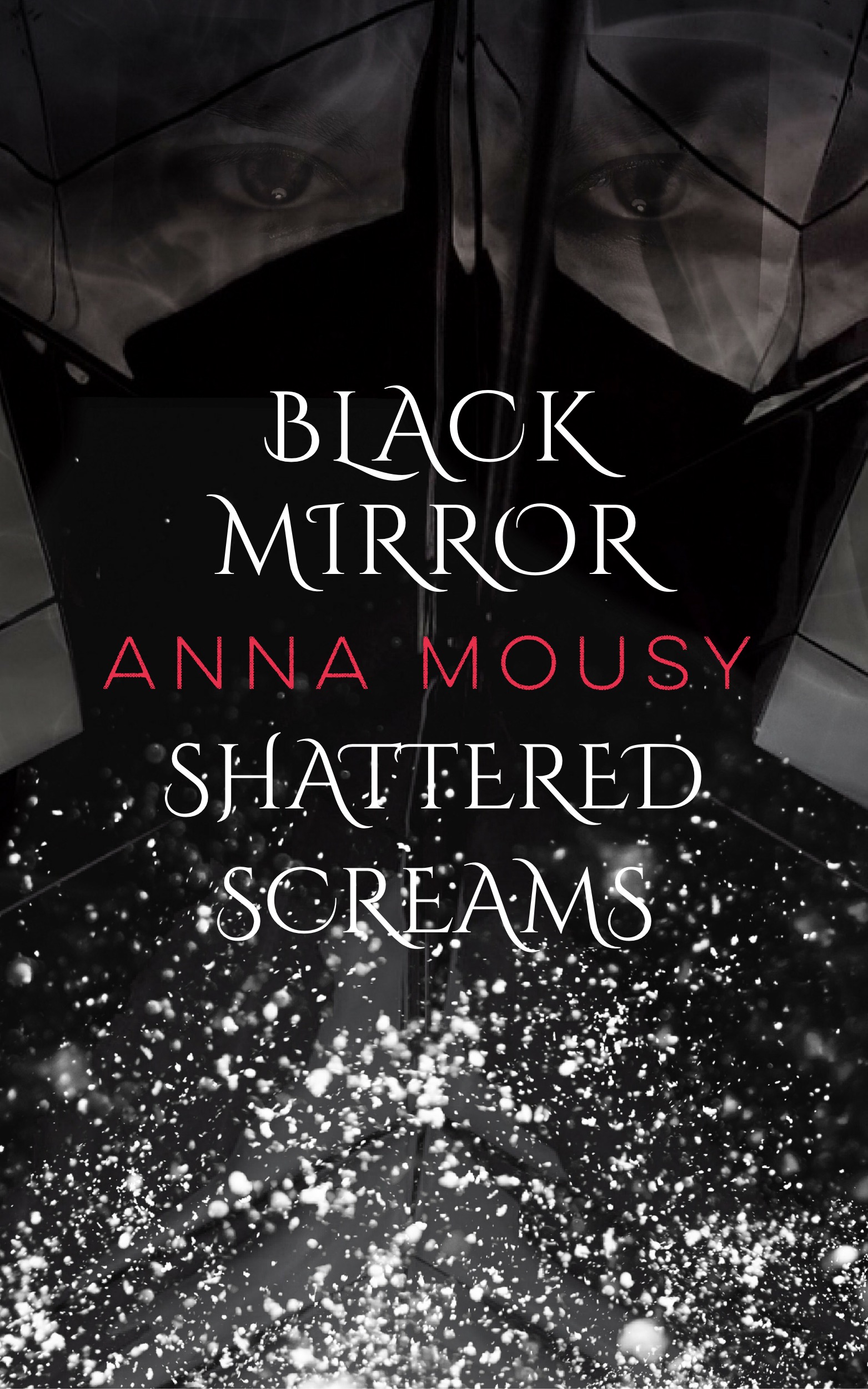
Designer’s note: I took inspiration from the simplistic cover of Gone Girl. While I do realize that’s an adult thriller while this is YA, I don’t think there’s too much of a difference in (cover art) style between adult and YA. The top part is supposed to be the magic mirrors involved in the book, while the bottom part is supposed to be shattered mirrors/glass. I hope those are recognizable on the thumbnail. A larger image will show the eyes in the mirror, which I hope looks creepy and mysterious. Hopefully the slightly orate font will hint at the fantasy elements, in what otherwise looks like a contemporary thriller cover.
Also, a question: I’m thinking about drawing blood in between the cracks of the top mirror part, and also have it drip down towards the title, in the style of Victoria Aveyard’s Red Queen. Would that be too much though? Thanks for all your help!
Nathan says:
No offense, but without you telling me that it’s supposed to be shattered mirrors, I would have had no clue what I’m looking at. A large part of what makes shattered mirrors look like shattered mirrors is the glinting glass along the edges, as well as the distortion of what is being reflected (see here). Instead of trying to freehand something that looks like a shattered mirror, my advice would be to take a photo of an actual shattered mirror, and then take an image — perhaps the heroine’s face, or some other striking image — and break it up between the shards, the way that a real shattered mirror reflects.
(Gotta tell you, “floating eyes” is a cliche we often see over at LBC.com — it’s been used poorly so often that I don’t know if it can be done right anymore.)
I also have a real problem with the title being divided by the byline. It seems like an attempt to be overly clever, at the expense of readability.
And then there’s the fact that the title and byline are crunched into the center. It’s not as if there’s stunning artwork that you don’t want to cover up, nor that it looks like an intentional use of negative space, what with all the meaningless detail/texture filling the rest (is that snow?).
I’d say make the text bigger (with the title separate from the byline), use an actual shattered mirror, add what you want into the mirror shards, and call it a day.
Anyone say different?