The author says:
Tommy Travers is a teenaged recluse who dreams of entering a book and never coming back. When he turns 15 his wish is granted but unlike reading, the consequences are real. YA/Adult novel
Nathan says:
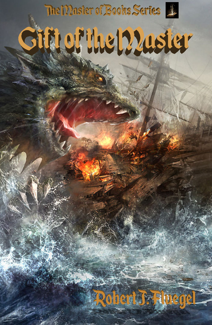
The artwork’s terrific. The type treatment, not so much.
As you can see from the thumbnail, the title retreats into the background, and the byline is practically invisible. It’s even worse on a black-and-white ereader device:
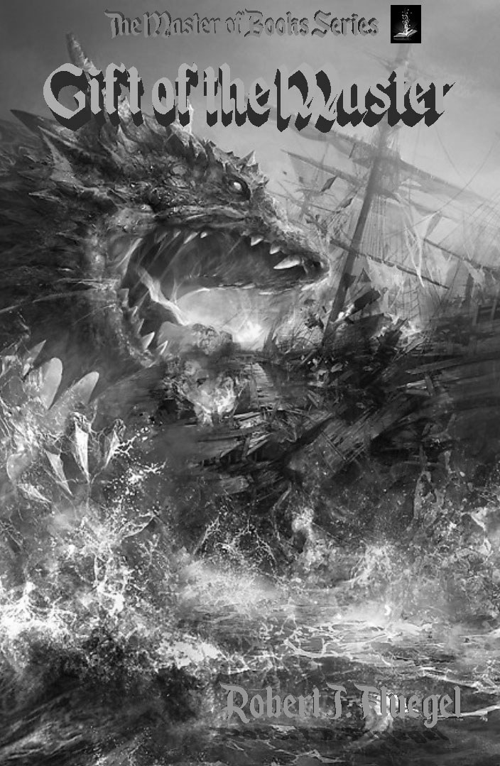
The bottom half of the image, under not-Godzilla and the ship, has no essential detail in there. Rather than try to crowd the title over not-Godzilla’s head, I would leave the series title up there (with a larger and clearer icon of an open book worked into it), then put the title below, in clear bold letters on two lines:
GIFTS of
the MASTER
I’d probably try putting the text in a white or cream with a dark border or outline. And then I’d extend the byline across the width of the image. For both of these, you’d want a wide font, rather than the current tall one.
Other suggestions?