Category: Covers

Traakenholt

The author says:

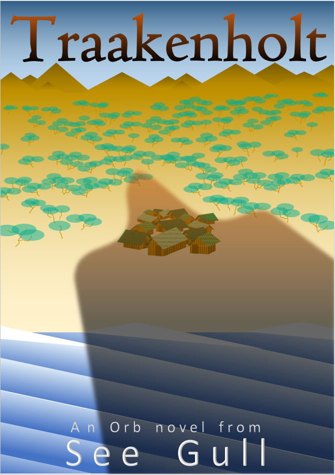
Book Micro blurb: ‘When two young fisher sons dare each other to visit the forbidden island of Traakenholt their destinies become entwined in the curse of the ’First and Final Dragon’. Now they must sacrifice everything as they battle the terrible force they have unleashed.’

This book is intended to be part of a hard sci-fi/hard fantasy series. The series is very wide ranging in plots and settings. Nevertheless, I wanted to try and find a graphical style that is simplistic and flexible enough to retain a certain level of commonality across the whole series.

book-cover_r01-png

book-cover_r01-png

Nathan says:

Here’s the problem: Nothing I see could be interpreted as signifying a hard SF novel.  You want to take the long view with series branding, and that’s fine, but you’ve got to get readers to open the first book in the series first, and there’s nothing here to tell hard SF readers, “This is a book aimed at you.” (While there’s also nothing that’s “hard fantasy” about this either, at least it doesn’t have the vibe of “definitely not hard fantasy” like is has with hard SF.)

There are other design tweaks we could go into, but until we correct the problem of the initial visual concept not being aimed at your target audience, it’s all straightening deck chairs on the Titanic.

(I will point out, though, that your pseudonym is unbearably twee.  Hard SF readers are not a readership known for their endearment to such things.)

Waiting For You

The author says:

Waiting for You is a contemporary Women’s Fiction novel set in Charleston, SC. Shortly after Kylie Lewis meets Adam, an aspiring musician with a history of his own loss, her mother is diagnosed with terminal breast cancer. Stricken with the fear of her inevitable loss, she struggles with her budding relationship with Adam, despite his empathy. This novel is aimed at women, mainly aged between 25-35.

9_2_16cover_blue

9_2_16cover_blue

Nathan says:

With the caveat that I’m not the target audience, here are my comments:

  • Any time you wrap, distort or otherwise modify text, it adds as much emphasis to it as bolding it.  Thus, your title comes across as “Waiting FOR You.” It also renders the hourglass less immediately recognizable as an object, because it pulls the lower bulb into the mental space of reading the title while leaving the upper bulb in the background. My advice would be to let the “FOR” be in the same unaltered font as “WAITING” and “YOU,” and don’t worry about it exactly overlapping the lower bulb.
  • The title font has a problem: the capital “I” has cross-strokes on the top and bottom fully as long as the top of the “T,” rendering the latter harder to read.  I’d experiment with using the font’s lowercase “L” in place of the capital “I” both times.
  • Your byline is hard to read even at full size, and in thumbnail it’s utterly invisible.  I don’t know how married you are to that font, but at the very least I’d enlarge it so it rivals “WAITING” in width, use uppercase for the start of both names, and maybe play with making it bolder.

I’ll leave other comments to the rest of y’all.

Renegades at Sea

The author says:

Renegades at Sea is vol one of the Adventures of Chas from Tas. Chas has sailed on racing yachts all his life , racing and delivering them to all the oceans of the world. The book is about the scary,dangerous, amusing,or downright hilarious adventures that he has had.He is a true gypsy of the sea.

CHAS BOOK COVER

CHAS BOOK COVER

Nathan says:

You’ve got a very good, very active illustration. You need to make sure that the type supports instead of conflicting with it.

  1. You’re using very sedate fonts (which is a nice way to say “dull”). These would be great fonts for interior text, but they underperform on the cover.
  2. At the very least, you should be able to read some words from the title at thumbnail size. Here, thanks to the combination of thin lines and color blend, I can barely tell that the title exists at thumbnail size.
  3. You already have Chaz’s face overlapping the main image; you don’t want the second intrusion, the white square with the blurb from Simon Le Bon (!) to clutter it further.
  4. Remember, the point of the cover is to intrigue the reader enough to either flip the book over and read the back or scroll down and read the online description, depending on the venue. Trim down the blurb, the credits for the forewords, etc. so that the impact of the main image isn’t diluted.

Any other comments?


Eternity’s Island

The author says:

A science fantasy series for children, The Plumseed Chronicles: Eternity’s Island takes place in a world of machines. Eternity’s Island focuses on a nameless girl who arrives on a drifting island with no memory of who she is. As she explores the island that is her home alongside her newly-adopted family and the sleepy village they live in, the girl soon discovers that something else far more dangerous and sinister followed her to this little island. Inspired by A Wrinkle in Time, Doctor Who, and The Golden Compass, The Plumseed Chronicles as a whole is intended for those who love stories that deal with scientific concepts played around with magic.

ES_ConceptA

ES_ConceptA

Nathan says:

This is a competent (though not terribly exciting) cover markup, but it completely misses your target audience.

Let’s do some market research. I pulled up Amazon’s page for science fiction and fantasy, ages 9 – 12.  These are the bestsellers:

children

Now, I’ll grant you that it’s very skewed toward name recognition; the only book on here that isn’t related to Harry Potter or Percy Jackson is Lois Lowry’s The Giver.  But still, these are the books that your target audience already knows that they like.  And how does that target audience expect books aimed at them to look?

  • Big words, slightly ornate but still very readable
  • Clear imagery, showing characters in adventurous situations (there are a couple that rely only on an iconic image, but they can do that because they’re Harry Potter books, and readers already recognize the owl or round-glasses-and-scar imagery; you don’t have that recognition)

Compare that to your cover: An unusual but sedate typeface (which is, by the way, completely wrong for your back-cover copy — that needs to be readable, readable, and readable), an abstracted pseudo-landscape in tones of blue, and — if you look really close — something that might be the main character:

ES_ConceptA

This is not how the target audience for your book is accustomed to being marketed to.  It will not snare the attention of the people whose attention you want to snare.

My advice, simply, is to start over.

(And semi-related: You want to give that back-cover copy another scrub. It’s ungainly, and some of the grammar is questionable at best.)

Other opinions?


Blood-Lines [resubmit]

The author says:

This is a freshly minted resubmit of an earlier cover for Blood-Lines, Book I of my Tales of the Weird Wild West series that I will be self-publishing at some point in the near future. Although admittedly I’m still very much using a pre-made template (for a newbie at this, it’s also just that much easier for someone of my artistic level to accomplish what they can 8)), this version seems to have a much better look and feel to it for what I wanted the cover to tell someone at first glance. Hopefully just the right mix of a little bit of hook, some line and a sinker as it were 8)

cover_bloodlines9

cover_bloodlines9

[original submission and comments here]

Nathan says:

It’s true that someone can tell the genre much easier from this cover. Unfortunately — and this sounds a lot crueler than it really is — someone can also tell that you have limited skill/experience in cover design, and that this book is self-published, by which I mean the cover isn’t up to professional levels.  And given that you’re releasing your book to compete against the Big Boys, you can’t afford giving any indication from the get-go that your book isn’t as worthy of a customer’s money as a traditionally published novel.

Indicator #1: The Bleeding Cowboys font.  Yes, I told you previously to find a distressed Western font. But don’t use this one.  It’s been so overused and overexposed in the past decade, on all sorts of inappropriate projects, that no one with any familiarity with book cover design would touch it.  A pity, because this is the kind of book it would have been good for before it became a punchline.

Indicator #2: The floating zombie girl head.  Over at LousyBookCovers.com, this would fall into the running gag of “Photobombing [something]!” — where an element that’s obviously extraneous to the main image has been added.  In this case, you’ve taken an otherwise non-weird Western scene, and added an element that is unrelated to the rest of the image in both style and layout.  Yes, a zombie head is a good indication that this isn’t a typical Western, but again, it’s also an indication that a non-professional put this cover together.

I know that indie writers like the “do-it-yourself” ethic, but remember that you’re not just the writer, you’re the publisher. That means that you need to do the best you can to make sure that the book has a chance on the open market. And I know the budgetary strictures that self-pubbers can be under, but the slogan for this site is true: “In self-publishing, there’s nothing more expensive than a bad cover.” Because a bad cover will cost you sales, and you can’t afford that.

Other comments?